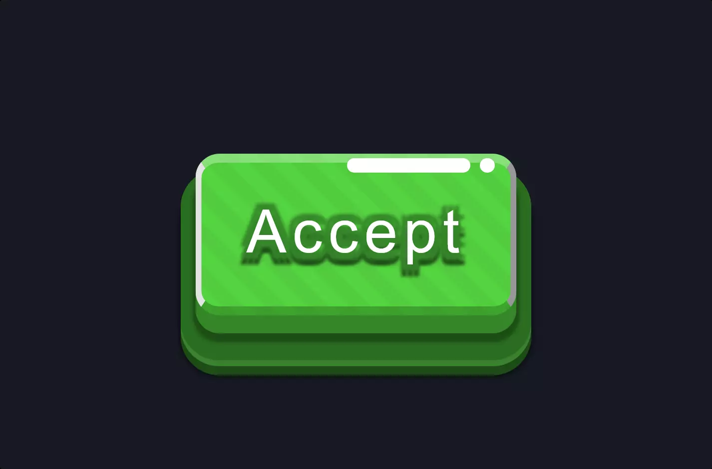
Button #19
- 3.64 KB
- HTML, CSS
- Button
- MIT License
<button class="coin-btn">Coin</button>
.coin-btn {
    font-family: Arial;
    -webkit-box-sizing: border-box;
    -moz-box-sizing: border-box;
    box-sizing: border-box;
    cursor: pointer;
    position: relative;
    border: none;
    width: 80px;
    height: 80px;
    font-size: 24px;
    -webkit-border-radius: 50%;
    -moz-border-radius: 50%;
    border-radius: 50%;
    line-height: 1em;
    -webkit-box-shadow: inset 0 0 10px #0008, inset 2px 2px 4px #5d4b3099, inset 0px 0px 10px #5d4b3099, inset 8px -8px 30px #40432999;
    -moz-box-shadow: inset 0 0 10px #0008, inset 2px 2px 4px #5d4b3099, inset 0px 0px 10px #5d4b3099, inset 8px -8px 30px #40432999;
    box-shadow: inset 0 0 10px #0008, inset 2px 2px 4px #5d4b3099, inset 0px 0px 10px #5d4b3099, inset 8px -8px 30px #40432999;
    color: #9d8657;
    text-shadow: -1px -1px 0px #dfc790, 1px 1px 0px #67511f, 1px 1px 5px #67511f;
    font-weight: bold;
    background-color: #9f8858;
    background: -webkit-linear-gradient(309deg, #b19a68 0%, #756142 2%, #a18658 16%, #b79b61 38%, #7f6b3c 60%);
    background: -moz-linear-gradient(309deg, #b19a68 0%, #756142 2%, #a18658 16%, #b79b61 38%, #7f6b3c 60%);
    background: -o-linear-gradient(309deg, #b19a68 0%, #756142 2%, #a18658 16%, #b79b61 38%, #7f6b3c 60%);
    background: linear-gradient(141deg, #b19a68 0%, #756142 2%, #a18658 16%, #b79b61 38%, #7f6b3c 60%);
}

@-webkit-keyframes coin {
    0% {
        background-position: 0% 0%;
    }
    100% {
        background-position: 400% 400%;
    }
}

@-moz-keyframes coin {
    0% {
        background-position: 0% 0%;
    }
    100% {
        background-position: 400% 400%;
    }
}

@-o-keyframes coin {
    0% {
        background-position: 0% 0%;
    }
    100% {
        background-position: 400% 400%;
    }
}

@keyframes coin {
    0% {
        background-position: 0% 0%;
    }
    100% {
        background-position: 400% 400%;
    }
}
.coin-btn::before {
    -webkit-box-sizing: border-box;
    -moz-box-sizing: border-box;
    box-sizing: border-box;
    content: "";
    position: absolute;
    top: -3px;
    left: -3px;
    right: -3px;
    bottom: -3px;
    z-index: -1;
    background: -webkit-linear-gradient(295deg, #bfac82 0%, #fff4e2 12%, #fff4e2 18%, #c1a364 32%, #d1b36e 60%);
    background: -moz-linear-gradient(295deg, #bfac82 0%, #fff4e2 12%, #fff4e2 18%, #c1a364 32%, #d1b36e 60%);
    background: -o-linear-gradient(295deg, #bfac82 0%, #fff4e2 12%, #fff4e2 18%, #c1a364 32%, #d1b36e 60%);
    background: linear-gradient(155deg, #bfac82 0%, #fff4e2 12%, #fff4e2 18%, #c1a364 32%, #d1b36e 60%);
    -webkit-background-size: 400% 400%;
    -moz-background-size: 400%;
    -o-background-size: 400%;
    background-size: 400%;
    -webkit-border-radius: 50%;
    -moz-border-radius: 50%;
    border-radius: 50%;
    -webkit-animation: coin 16s linear infinite;
    -moz-animation: coin 16s linear infinite;
    -o-animation: coin 16s linear infinite;
    animation: coin 16s linear infinite;
    -webkit-box-shadow: 3px 6px 2px 2px #1a140e99, 3px 6px 14px #1a140e99;
    -moz-box-shadow: 3px 6px 2px 2px #1a140e99, 3px 6px 14px #1a140e99;
    box-shadow: 3px 6px 2px 2px #1a140e99, 3px 6px 14px #1a140e99;
}
.coin-btn::after {
    -webkit-box-sizing: border-box;
    -moz-box-sizing: border-box;
    box-sizing: border-box;
    content: "";
    position: absolute;
    display: block;
    top: 10px;
    left: 10px;
    right: 10px;
    bottom: 9px;
    -webkit-border-radius: 50%;
    -moz-border-radius: 50%;
    border-radius: 50%;
    border-bottom: 1px solid #ffffff36;
    border-top: 1px solid #411e0475;
}
The code snippet provided creates a visually appealing, interactive button styled to resemble a coin using HTML and CSS. At its core, the HTML part consists of a single button element with a class attribute set to “coin-btn”. This simplicity in HTML lays the foundation for more complex visual styling applied through CSS.
In the CSS section, the “.coin-btn” class is defined with a variety of properties that contribute to the button’s appearance and interactivity. Notable among these properties is the use of box-shadow and text-shadow to give the button a three-dimensional look and a glowing text effect. The shadows create an illusion of depth, making the button stand out as if it were embossed on the screen. The use of border-radius set to 50% transforms the shape of the button into a perfect circle, enhancing its coin-like appearance.
Furthermore, the code employs CSS animations @keyframes to add a dynamic visual effect to the button, simulating the shifting reflections and luster of a coin in motion. These animations are triggered by changes in the button’s background position over time, creating a captivating and continuous movement effect. This combination of CSS properties and animations not only makes the button visually striking but also invites user interaction, embodying a blend of aesthetic appeal and functionality.