Button #17
- 3.14 KB
- HTML, CSS
- Button
- MIT License
<button class="delete-button">Delete</button>
.delete-button {
    font-family: Arial;
    -webkit-box-sizing: border-box;
    -moz-box-sizing: border-box;
    box-sizing: border-box;
    position: relative;
    top: 0;
    cursor: pointer;
    text-decoration: none !important;
    outline: none !important;
    font-family: "Carter One", sans-serif;
    font-size: 20px;
    line-height: 1.5em;
    letter-spacing: 0.1em;
    background: -webkit-repeating-linear-gradient(45deg, #ff4f4c, #ff4f4c 5px, #ff4643 5px, #ff4643 10px);
    background: -moz-repeating-linear-gradient(45deg, #ff4f4c, #ff4f4c 5px, #ff4643 5px, #ff4643 10px);
    background: -o-repeating-linear-gradient(45deg, #ff4f4c, #ff4f4c 5px, #ff4643 5px, #ff4643 10px);
    background: repeating-linear-gradient(45deg, #ff4f4c, #ff4f4c 5px, #ff4643 5px, #ff4643 10px);
    -webkit-box-shadow: 0 6px 0 #ae2725, 0 8px 1px 1px rgba(0, 0, 0, 0.3), 0 10px 0 5px #831614, 0 12px 0 5px #a33634, 0 15px 0 5px #631716, 0 15px 1px 6px rgba(0, 0, 0, 0.3);
    -moz-box-shadow: 0 6px 0 #ae2725, 0 8px 1px 1px rgba(0, 0, 0, 0.3), 0 10px 0 5px #831614, 0 12px 0 5px #a33634, 0 15px 0 5px #631716, 0 15px 1px 6px rgba(0, 0, 0, 0.3);
    box-shadow: 0 6px 0 #ae2725, 0 8px 1px 1px rgba(0, 0, 0, 0.3), 0 10px 0 5px #831614, 0 12px 0 5px #a33634, 0 15px 0 5px #631716, 0 15px 1px 6px rgba(0, 0, 0, 0.3);
    border-bottom: 3px solid rgba(160, 25, 23, 0.5);
    text-shadow: 2px 2px 1px #d72d21, -2px 2px 1px #d72d21, 2px -2px 1px #d72d21, -2px -2px 1px #d72d21, 0px 2px 1px #d72d21, 0px -2px 1px #d72d21, 0px 4px 1px #930704, 2px 4px 1px #930704, -2px 4px 1px #930704;
    border-top: 3px solid rgba(255, 255, 255, 0.3);
    color: #fff !important;
    -webkit-border-radius: 8px;
    -moz-border-radius: 8px;
    border-radius: 8px;
    padding: 8px 15px 10px;
}
.delete-button:hover {
    -webkit-box-sizing: border-box;
    -moz-box-sizing: border-box;
    box-sizing: border-box;
    top: 2px;
    -webkit-box-shadow: 0 4px 0 #ae2725, 0 6px 1px 1px rgba(0, 0, 0, 0.3), 0 8px 0 5px #831614, 0 10px 0 5px #a33634, 0 13px 0 5px #631716, 0 13px 1px 6px rgba(0, 0, 0, 0.3);
    -moz-box-shadow: 0 4px 0 #ae2725, 0 6px 1px 1px rgba(0, 0, 0, 0.3), 0 8px 0 5px #831614, 0 10px 0 5px #a33634, 0 13px 0 5px #631716, 0 13px 1px 6px rgba(0, 0, 0, 0.3);
    box-shadow: 0 4px 0 #ae2725, 0 6px 1px 1px rgba(0, 0, 0, 0.3), 0 8px 0 5px #831614, 0 10px 0 5px #a33634, 0 13px 0 5px #631716, 0 13px 1px 6px rgba(0, 0, 0, 0.3);
}
.delete-button::before {
    -webkit-box-sizing: border-box;
    -moz-box-sizing: border-box;
    box-sizing: border-box;
    content: "";
    height: 10%;
    position: absolute;
    width: 40%;
    background: #fff;
    right: 13%;
    top: -3%;
    -webkit-border-radius: 99px;
    -moz-border-radius: 99px;
    border-radius: 99px;
}
.delete-button::after {
    -webkit-box-sizing: border-box;
    -moz-box-sizing: border-box;
    box-sizing: border-box;
    content: "";
    height: 10%;
    position: absolute;
    width: 5%;
    background: #fff;
    right: 5%;
    top: -3%;
    -webkit-border-radius: 99px;
    -moz-border-radius: 99px;
    border-radius: 99px;
}
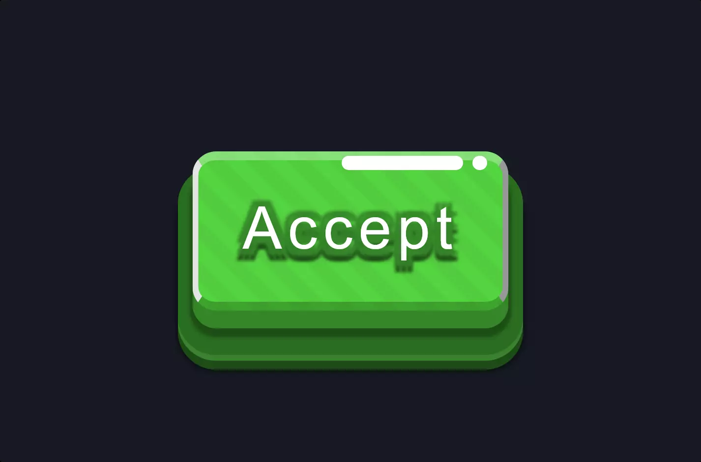
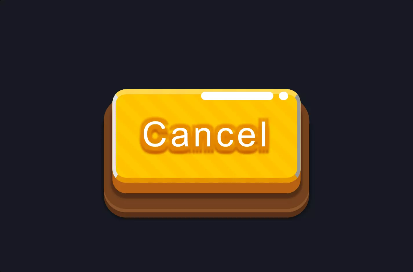
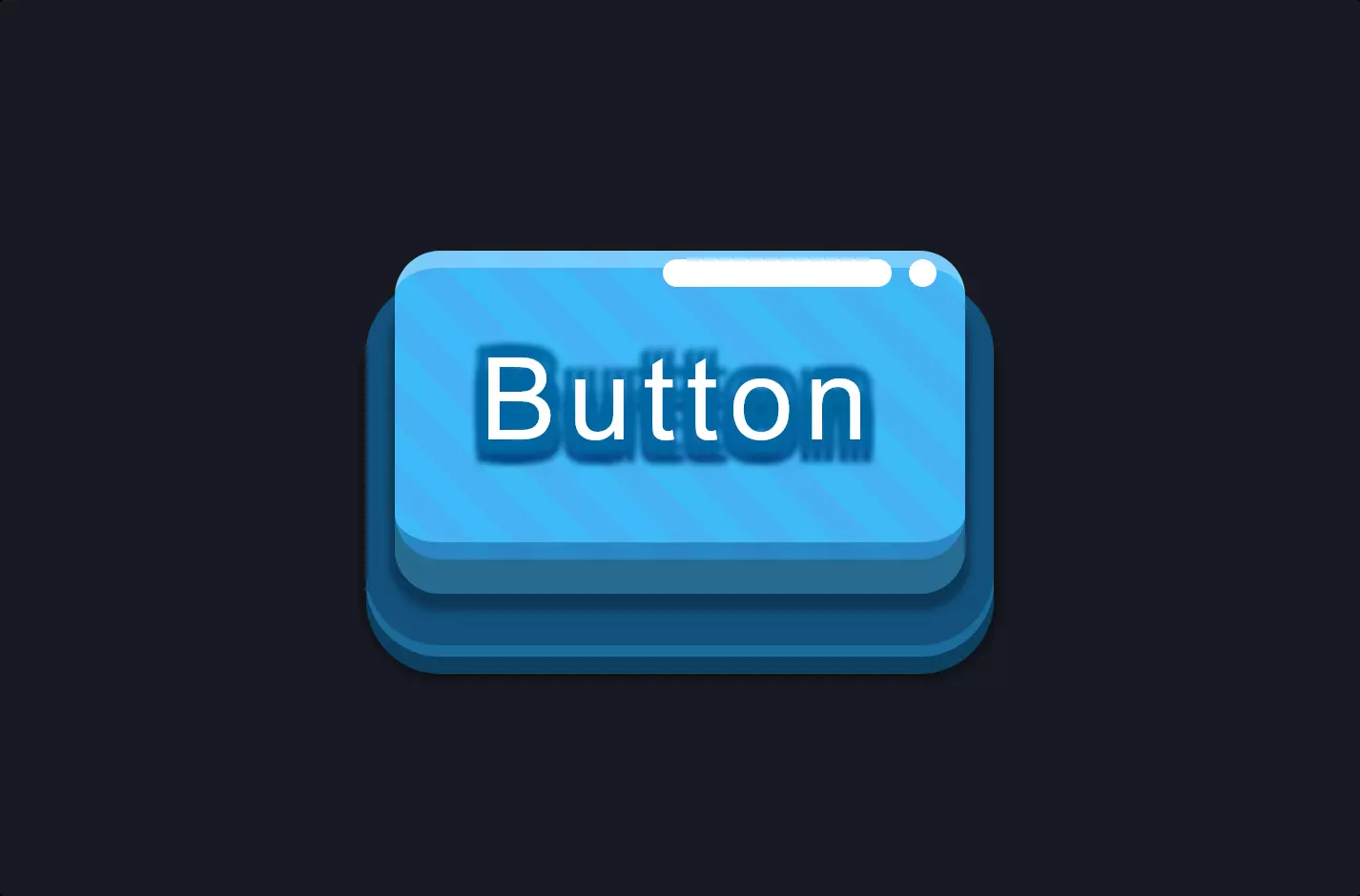
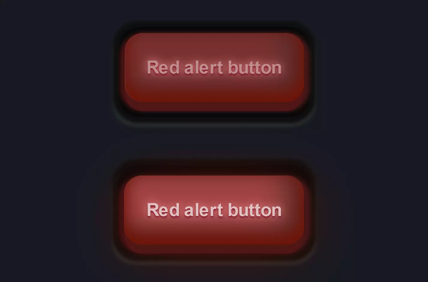
The code snippet presents a stylish and interactive “Delete” button crafted with HTML and CSS, designed to capture the user’s attention and enhance the visual appeal of web interfaces. This button is not just a simple clickable element; it’s a small masterpiece of design that leverages advanced CSS techniques to create depth, texture, and responsiveness.
Starting with the HTML, we have a single <button> element with a class attribute set to “delete-button”. This simplicity in HTML is deceptive, as the real magic happens in the CSS, where the button is transformed into a visually striking component.
The CSS defines the .delete-button class with multiple properties that contribute to its unique appearance. It employs a combination of font styles, box sizing, positioning, and a gradient background to achieve a vibrant look. The use of repeating linear gradients creates a striped effect, while box shadows add depth, making the button appear to pop out from the screen. The text shadow enhances legibility and adds to the button’s three-dimensional effect.
One of the key features of this button is its interactivity, demonstrated through the :hover pseudo-class. When the user hovers over the button, its position slightly changes, and the shadow effects are adjusted to simulate a pressing action. This responsiveness not only makes the button more engaging but also provides visual feedback to the user, enhancing the overall user experience.
Additionally, the use of pseudo-elements ::before and ::after introduces subtle decorative touches that further elevate the button’s design. These elements are styled to create additional shapes that complement the button’s aesthetic, adding layers and complexity to its appearance.
This example showcases how HTML and CSS can be used together to create interactive, visually appealing web elements that go beyond functionality to deliver an engaging user experience. Through careful styling and attention to detail, a simple button is transformed into an element that captures attention and adds value to the user interface.