Button #15
- 3.18 KB
- HTML, CSS
- Button
- MIT License
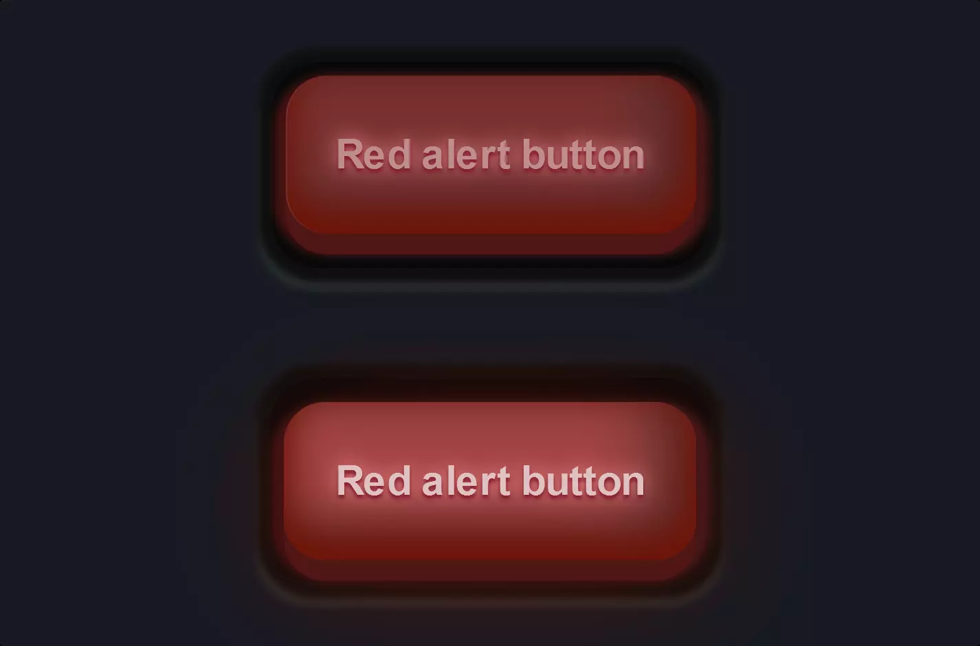
<button class="game-button">Button</button>
.game-button {
    font-family: Arial;
    -webkit-box-sizing: border-box;
    -moz-box-sizing: border-box;
    box-sizing: border-box;
    position: relative;
    top: 0;
    cursor: pointer;
    text-decoration: none !important;
    outline: none !important;
    font-family: "Carter One", sans-serif;
    font-size: 20px;
    line-height: 1.5em;
    letter-spacing: 0.1em;
    text-shadow: 2px 2px 1px #0066a2, -2px 2px 1px #0066a2, 2px -2px 1px #0066a2, -2px -2px 1px #0066a2, 0px 2px 1px #0066a2, 0px -2px 1px #0066a2, 0px 4px 1px #004a87, 2px 4px 1px #004a87, -2px 4px 1px #004a87;
    border: none;
    margin: 15px 15px 30px;
    background: -webkit-repeating-linear-gradient(45deg, #3ebbf7, #3ebbf7 5px, #45b1f4 5px, #45b1f4 10px);
    background: -moz-repeating-linear-gradient(45deg, #3ebbf7, #3ebbf7 5px, #45b1f4 5px, #45b1f4 10px);
    background: -o-repeating-linear-gradient(45deg, #3ebbf7, #3ebbf7 5px, #45b1f4 5px, #45b1f4 10px);
    background: repeating-linear-gradient(45deg, #3ebbf7, #3ebbf7 5px, #45b1f4 5px, #45b1f4 10px);
    border-bottom: 3px solid rgba(16, 91, 146, 0.5);
    border-top: 3px solid rgba(255, 255, 255, 0.3);
    color: #fff !important;
    -webkit-border-radius: 8px;
    -moz-border-radius: 8px;
    border-radius: 8px;
    padding: 8px 15px 10px;
    -webkit-box-shadow: 0 6px 0 #266b91, 0 8px 1px 1px rgba(0, 0, 0, 0.3), 0 10px 0 5px #12517d, 0 12px 0 5px #1a6b9a, 0 15px 0 5px #0c405e, 0 15px 1px 6px rgba(0, 0, 0, 0.3);
    -moz-box-shadow: 0 6px 0 #266b91, 0 8px 1px 1px rgba(0, 0, 0, 0.3), 0 10px 0 5px #12517d, 0 12px 0 5px #1a6b9a, 0 15px 0 5px #0c405e, 0 15px 1px 6px rgba(0, 0, 0, 0.3);
    box-shadow: 0 6px 0 #266b91, 0 8px 1px 1px rgba(0, 0, 0, 0.3), 0 10px 0 5px #12517d, 0 12px 0 5px #1a6b9a, 0 15px 0 5px #0c405e, 0 15px 1px 6px rgba(0, 0, 0, 0.3);
}
.game-button:hover {
    -webkit-box-sizing: border-box;
    -moz-box-sizing: border-box;
    box-sizing: border-box;
    top: 2px;
    -webkit-box-shadow: 0 4px 0 #266b91, 0 6px 1px 1px rgba(0, 0, 0, 0.3), 0 8px 0 5px #12517d, 0 10px 0 5px #1a6b9a, 0 13px 0 5px #0c405e, 0 13px 1px 6px rgba(0, 0, 0, 0.3);
    -moz-box-shadow: 0 4px 0 #266b91, 0 6px 1px 1px rgba(0, 0, 0, 0.3), 0 8px 0 5px #12517d, 0 10px 0 5px #1a6b9a, 0 13px 0 5px #0c405e, 0 13px 1px 6px rgba(0, 0, 0, 0.3);
    box-shadow: 0 4px 0 #266b91, 0 6px 1px 1px rgba(0, 0, 0, 0.3), 0 8px 0 5px #12517d, 0 10px 0 5px #1a6b9a, 0 13px 0 5px #0c405e, 0 13px 1px 6px rgba(0, 0, 0, 0.3);
}
.game-button::before {
    -webkit-box-sizing: border-box;
    -moz-box-sizing: border-box;
    box-sizing: border-box;
    content: "";
    height: 10%;
    position: absolute;
    width: 40%;
    background: #fff;
    right: 13%;
    top: -3%;
    -webkit-border-radius: 99px;
    -moz-border-radius: 99px;
    border-radius: 99px;
}
.game-button::after {
    -webkit-box-sizing: border-box;
    -moz-box-sizing: border-box;
    box-sizing: border-box;
    content: "";
    height: 10%;
    position: absolute;
    width: 5%;
    background: #fff;
    right: 5%;
    top: -3%;
    -webkit-border-radius: 99px;
    -moz-border-radius: 99px;
    border-radius: 99px;
}
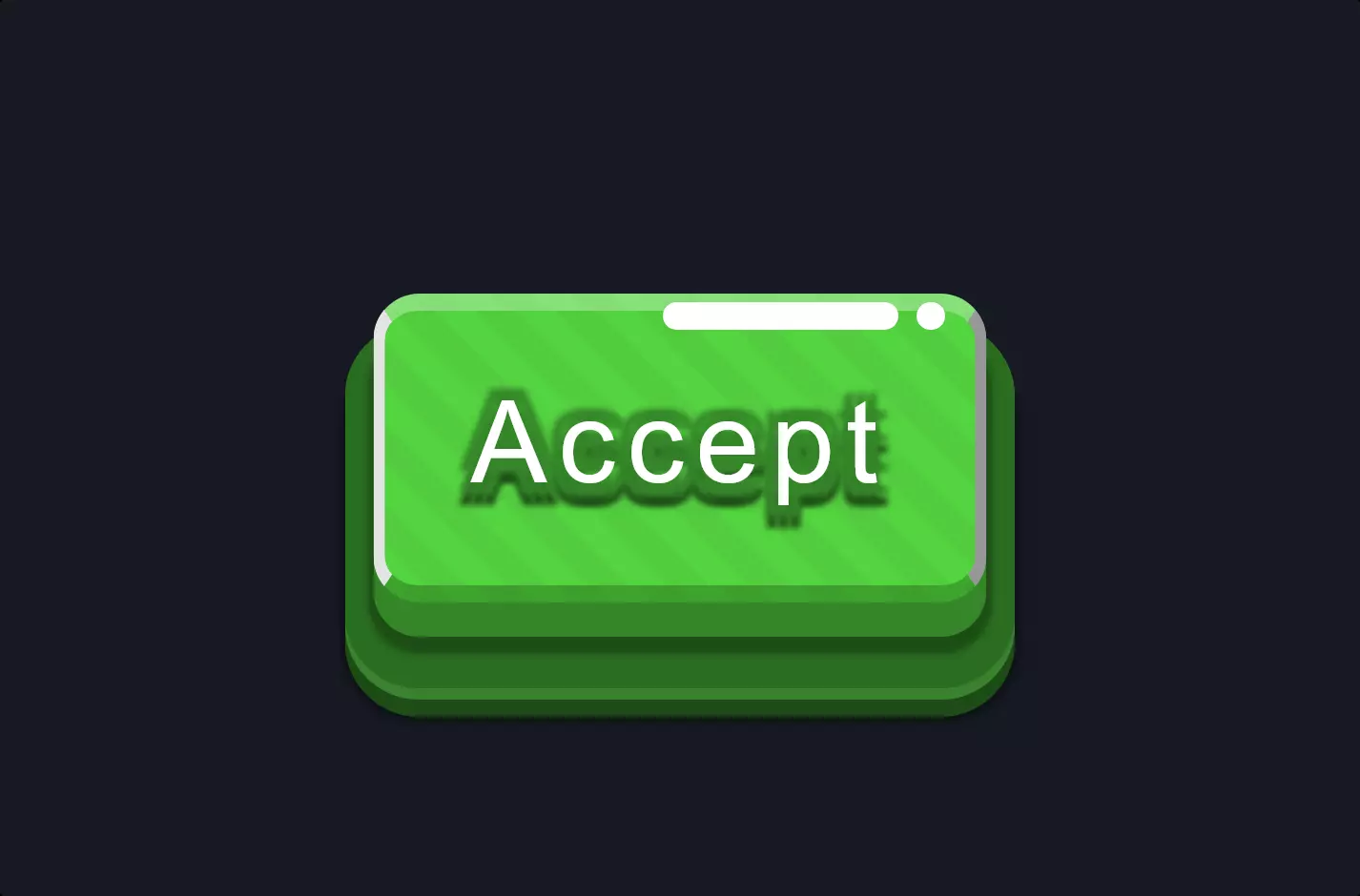
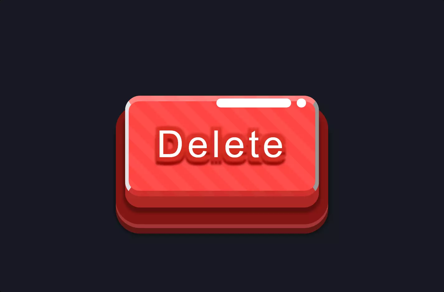
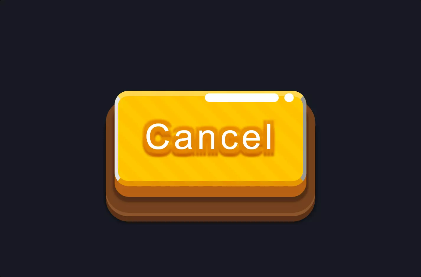
The code snippet begins with a simple HTML element, a button, identified by the class .game-button. This element serves as the foundation for applying CSS styles, transforming a basic button into a visually appealing interactive element on a webpage.
Diving into the CSS, the .game-button class is styled to create a unique visual appearance. The text-shadow property is used to add a multi-directional shadow to the text, enhancing its depth and making it stand out. Moreover, the background property employs a repeating-linear-gradient to produce a striped effect, giving the button a dynamic and textured look. The use of border properties adds further dimension with a subtle 3D effect, while the border-radius property rounds the corners for a modern, soft appearance.
The CSS also includes pseudo-elements ::before and ::after for the button, creating additional decorative elements that appear in specific positions relative to the button. These pseudo-elements are styled with a high degree of customization, including rounded borders and specific positioning, to add complexity and visual interest to the button’s overall design. The box-shadow property is extensively applied to give the button a pronounced shadow effect, contributing to a sense of depth and making the button appear to lift off the page when hovered over. This shadow effect is a key aspect of the design, creating a tactile feel that invites interaction.