Button #18
- 3.13 KB
- HTML, CSS
- Button
- MIT License
<button class="game-button">Accept</button>
.game-button {
    font-family: Arial;
    -webkit-box-sizing: border-box;
    -moz-box-sizing: border-box;
    box-sizing: border-box;
    position: relative;
    top: 0;
    cursor: pointer;
    text-decoration: none !important;
    outline: none !important;
    font-family: "Carter One", sans-serif;
    font-size: 20px;
    line-height: 1.5em;
    letter-spacing: 0.1em;
    background: -webkit-repeating-linear-gradient(45deg, #54d440, #54d440 5px, #52cc3f 5px, #52cc3f 10px);
    background: -moz-repeating-linear-gradient(45deg, #54d440, #54d440 5px, #52cc3f 5px, #52cc3f 10px);
    background: -o-repeating-linear-gradient(45deg, #54d440, #54d440 5px, #52cc3f 5px, #52cc3f 10px);
    background: repeating-linear-gradient(45deg, #54d440, #54d440 5px, #52cc3f 5px, #52cc3f 10px);
    -webkit-box-shadow: 0 6px 0 #348628, 0 8px 1px 1px rgba(0, 0, 0, 0.3), 0 10px 0 5px #2a6d20, 0 12px 0 5px #39822e, 0 15px 0 5px #1d4c16, 0 15px 1px 6px rgba(0, 0, 0, 0.3);
    -moz-box-shadow: 0 6px 0 #348628, 0 8px 1px 1px rgba(0, 0, 0, 0.3), 0 10px 0 5px #2a6d20, 0 12px 0 5px #39822e, 0 15px 0 5px #1d4c16, 0 15px 1px 6px rgba(0, 0, 0, 0.3);
    box-shadow: 0 6px 0 #348628, 0 8px 1px 1px rgba(0, 0, 0, 0.3), 0 10px 0 5px #2a6d20, 0 12px 0 5px #39822e, 0 15px 0 5px #1d4c16, 0 15px 1px 6px rgba(0, 0, 0, 0.3);
    border-bottom: 3px solid rgba(40, 117, 29, 0.5);
    text-shadow: 2px 2px 1px #348628, -2px 2px 1px #348628, 2px -2px 1px #348628, -2px -2px 1px #348628, 0px 2px 1px #348628, 0px -2px 1px #348628, 0px 4px 1px #1d4c16, 2px 4px 1px #1d4c16, -2px 4px 1px #1d4c16;
    border-top: 3px solid rgba(255, 255, 255, 0.3);
    color: #fff !important;
    -webkit-border-radius: 8px;
    -moz-border-radius: 8px;
    border-radius: 8px;
    padding: 8px 15px 10px;
}
.game-button:hover {
    -webkit-box-sizing: border-box;
    -moz-box-sizing: border-box;
    box-sizing: border-box;
    top: 2px;
    -webkit-box-shadow: 0 4px 0 #348628, 0 6px 1px 1px rgba(0, 0, 0, 0.3), 0 8px 0 5px #2a6d20, 0 10px 0 5px #39822e, 0 13px 0 5px #1d4c16, 0 13px 1px 6px rgba(0, 0, 0, 0.3);
    -moz-box-shadow: 0 4px 0 #348628, 0 6px 1px 1px rgba(0, 0, 0, 0.3), 0 8px 0 5px #2a6d20, 0 10px 0 5px #39822e, 0 13px 0 5px #1d4c16, 0 13px 1px 6px rgba(0, 0, 0, 0.3);
    box-shadow: 0 4px 0 #348628, 0 6px 1px 1px rgba(0, 0, 0, 0.3), 0 8px 0 5px #2a6d20, 0 10px 0 5px #39822e, 0 13px 0 5px #1d4c16, 0 13px 1px 6px rgba(0, 0, 0, 0.3);
}
.game-button::before {
    -webkit-box-sizing: border-box;
    -moz-box-sizing: border-box;
    box-sizing: border-box;
    content: "";
    height: 10%;
    position: absolute;
    width: 40%;
    background: #fff;
    right: 13%;
    top: -3%;
    -webkit-border-radius: 99px;
    -moz-border-radius: 99px;
    border-radius: 99px;
}
.game-button::after {
    -webkit-box-sizing: border-box;
    -moz-box-sizing: border-box;
    box-sizing: border-box;
    content: "";
    height: 10%;
    position: absolute;
    width: 5%;
    background: #fff;
    right: 5%;
    top: -3%;
    -webkit-border-radius: 99px;
    -moz-border-radius: 99px;
    border-radius: 99px;
}
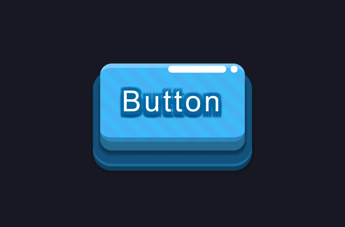
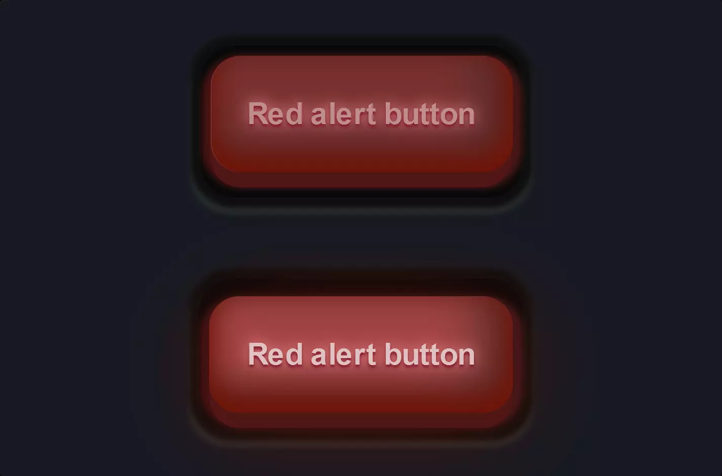
The code snippet we’re diving into is all about styling a button using HTML and CSS, making it visually appealing and interactive. This button, identified by the class “game-button”, is more than just a clickable element; it’s designed to catch the eye and encourage interaction.
In the CSS part, the button’s visual style is meticulously crafted. The use of gradients, shadows, and a specific font enhances its appearance, making it not just a functional element but also a piece of the page’s aesthetic. The gradients create a lively background, shifting between shades of green, which gives the button a vibrant, dynamic look. The magic happens with the “box-shadow” property, creating a sense of depth through multiple layers of shadows. This shadow effect makes the button seem to lift off the page, adding a 3D appearance that’s both modern and engaging.
Moreover, the CSS includes :hover and ::before, ::after pseudo-elements, which introduce interactivity and additional visual effects. When a user hovers over the button, it slightly shifts position and its shadow adjusts accordingly, enhancing the feeling of interaction. The ::before and ::after pseudo-elements add extra visual flair, creating decorative highlights that contribute to the button’s standout look. These subtle, yet powerful CSS techniques work together to make the button not just a functional part of the interface but also a focal point of user engagement, demonstrating how CSS can transform basic HTML into something visually captivating and interactive.