Button #13
- 3.64 KB
- HTML, CSS
- Button
- MIT License
<a class="redalert-btn" data-title="Red alert Button">Red alert Button</a>
.redalert-btn {
    -webkit-box-sizing: border-box;
    -moz-box-sizing: border-box;
    box-sizing: border-box;
    font-family: Arial;
    background-color: #080808;
    color: #6b778400;
    text-align: center;
    position: relative;
    height: 60px;
    text-decoration: none;
    padding: 10px 20px;
    display: inline-block;
    -webkit-box-shadow: 0px 0px 2px 4px #0d0e0d, 2px 4px 2px 2px #292c2a, 2px 0px 2px 2px #222423, -2px 4px 2px 2px #2b3230;
    -moz-box-shadow: 0px 0px 2px 4px #0d0e0d, 2px 4px 2px 2px #292c2a, 2px 0px 2px 2px #222423, -2px 4px 2px 2px #2b3230;
    box-shadow: 0px 0px 2px 4px #0d0e0d, 2px 4px 2px 2px #292c2a, 2px 0px 2px 2px #222423, -2px 4px 2px 2px #2b3230;
    -webkit-border-radius: 13px;
    -moz-border-radius: 13px;
    border-radius: 13px;
    z-index: 1;
    font-size: 12px;
    line-height: 1em;
    -webkit-transition: 0.2s;
    -o-transition: 0.2s;
    -moz-transition: 0.2s;
    transition: 0.2s;
    cursor: pointer;
}
.redalert-btn::after {
    -webkit-box-sizing: border-box;
    -moz-box-sizing: border-box;
    box-sizing: border-box;
    content: attr(data-title);
    position: absolute;
    z-index: -1;
    background-color: #7a3131;
    color: #bf8d8d;
    text-shadow: 0px 1px 1px #7e1629, 0px 0px 6px #ff9696;
    font-weight: bold;
    top: 4px;
    left: 4px;
    right: 4px;
    bottom: 10px;
    -webkit-border-radius: 12px;
    -moz-border-radius: 12px;
    border-radius: 12px;
    opacity: 1;
    -webkit-box-shadow: inset 0px -5px 10px #6e1306, inset -3px -5px 14px #6c190e, inset -10px -7px 22px #4e2d2d, 0 6px 0 #501616, -1px 3px 3px 2px #461111, 1px 3px 3px 3px #4a1a1a, 0 5px 40px #6e130600;
    -moz-box-shadow: inset 0px -5px 10px #6e1306, inset -3px -5px 14px #6c190e, inset -10px -7px 22px #4e2d2d, 0 6px 0 #501616, -1px 3px 3px 2px #461111, 1px 3px 3px 3px #4a1a1a, 0 5px 40px #6e130600;
    box-shadow: inset 0px -5px 10px #6e1306, inset -3px -5px 14px #6c190e, inset -10px -7px 22px #4e2d2d, 0 6px 0 #501616, -1px 3px 3px 2px #461111, 1px 3px 3px 3px #4a1a1a, 0 5px 40px #6e130600;
    -webkit-transition: 0.4s;
    -o-transition: 0.4s;
    -moz-transition: 0.4s;
    transition: 0.4s;
    display: -webkit-box;
    display: -webkit-flex;
    display: -moz-box;
    display: flex;
    -webkit-box-align: center;
    -webkit-align-items: center;
    -moz-box-align: center;
    align-items: center;
    -webkit-box-pack: center;
    -webkit-justify-content: center;
    -moz-box-pack: center;
    justify-content: center;
}
.redalert-btn:hover::after {
    -webkit-box-sizing: border-box;
    -moz-box-sizing: border-box;
    box-sizing: border-box;
    color: #dfc1c1;
    background-color: #a54343;
    -webkit-transform: scale(0.97);
    -moz-transform: scale(0.97);
    -o-transform: scale(0.97);
    transform: scale(0.97);
    -webkit-transform: translateY(3px);
    -moz-transform: translateY(3px);
    -o-transform: translateY(3px);
    transform: translateY(3px);
    -webkit-box-shadow: inset 0px -5px 10px #6e1306, inset -3px -5px 14px #6c190e, inset -10px -7px 22px #4e2d2d, 0 6px 0 #501616, -1px 3px 3px 2px #461111, 1px 3px 3px 3px #4a1a1a, 0 5px 40px #6e1306aa;
    -moz-box-shadow: inset 0px -5px 10px #6e1306, inset -3px -5px 14px #6c190e, inset -10px -7px 22px #4e2d2d, 0 6px 0 #501616, -1px 3px 3px 2px #461111, 1px 3px 3px 3px #4a1a1a, 0 5px 40px #6e1306aa;
    box-shadow: inset 0px -5px 10px #6e1306, inset -3px -5px 14px #6c190e, inset -10px -7px 22px #4e2d2d, 0 6px 0 #501616, -1px 3px 3px 2px #461111, 1px 3px 3px 3px #4a1a1a, 0 5px 40px #6e1306aa;
}
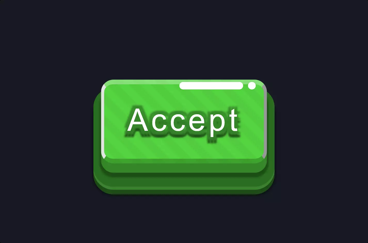
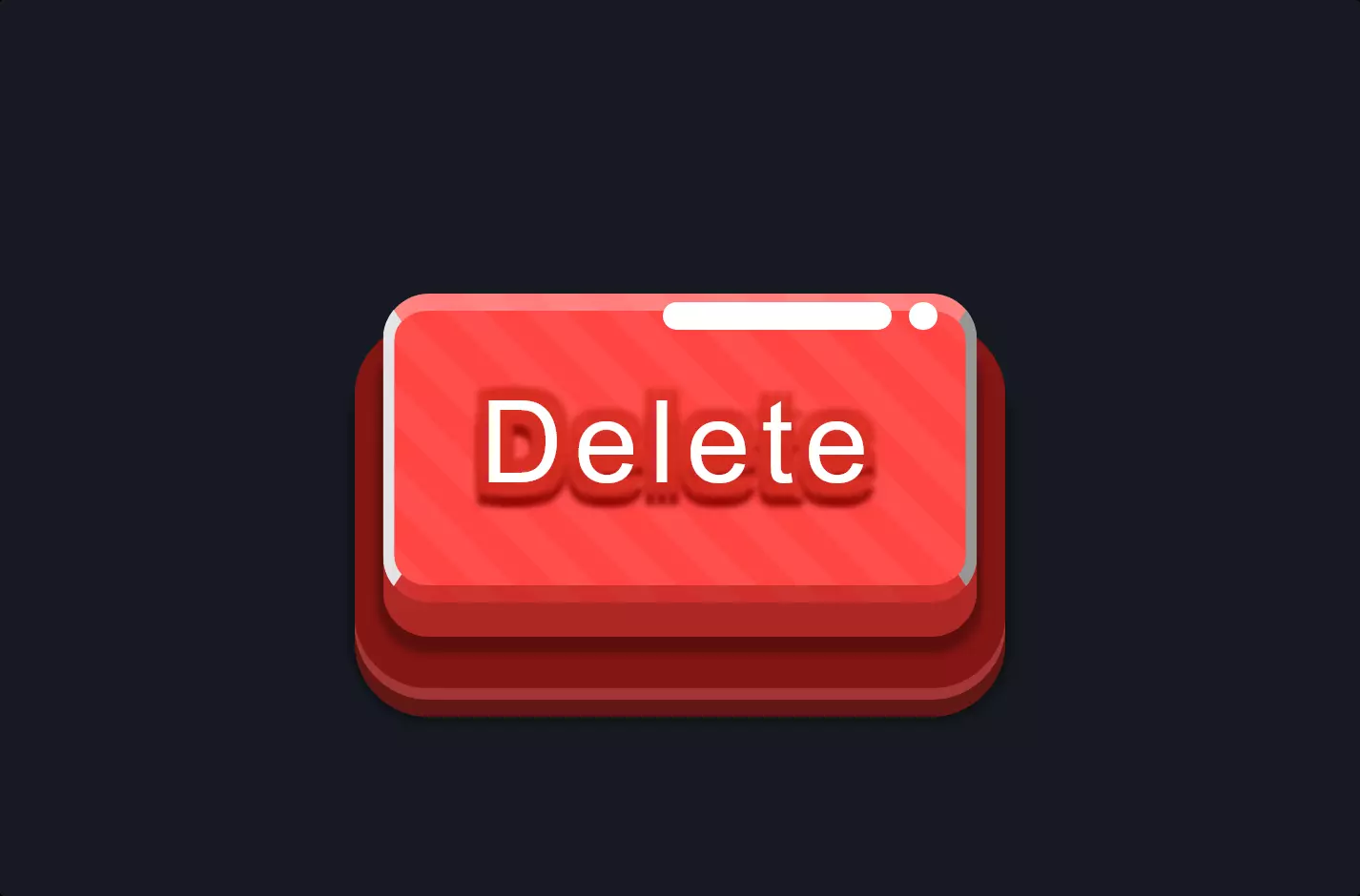
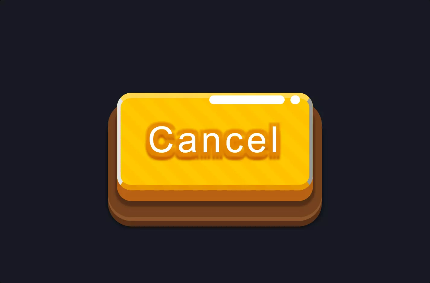
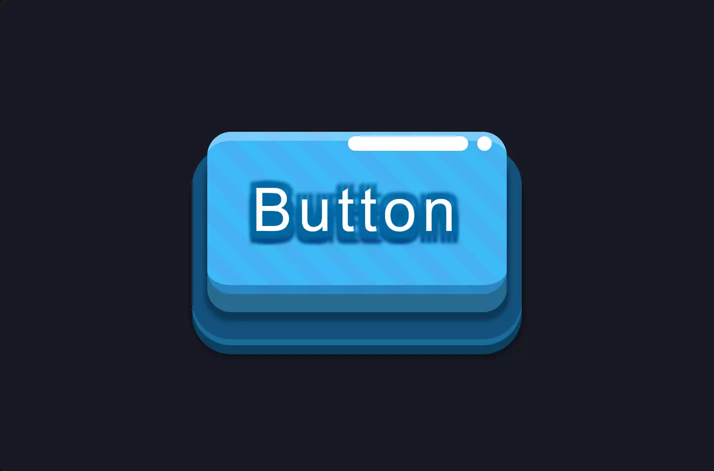
The code snippet introduces a visually captivating button with a unique visual effect created through HTML and CSS. At the heart of this design is the use of shadows to enhance the button’s appearance, making it not just a functional element but also a piece of art. The CSS properties for box-shadow are meticulously crafted to create a layered shadow effect that gives depth and dimension to the button. This shadow play is not limited to just the outer edges; it extends into the button’s interior, creating an inset shadow effect that adds to the overall allure.
The use of CSS transitions ensures that the button reacts to user interactions, such as hovering, by subtly changing its appearance. This interaction is not just a change in color or size but a sophisticated transformation involving scale and shadow intensity adjustments. Such details make the button more interactive and engaging, inviting users to click not just out of necessity but out of curiosity and fascination with its design.
Moreover, the implementation of CSS pseudo-elements adds another layer of complexity and creativity. By using ::after, the design introduces additional text and styling that appears over the button, further enriching the visual experience. This technique demonstrates an advanced understanding of CSS, leveraging its capabilities to create complex visual effects that enhance user interface elements beyond their basic functionality.