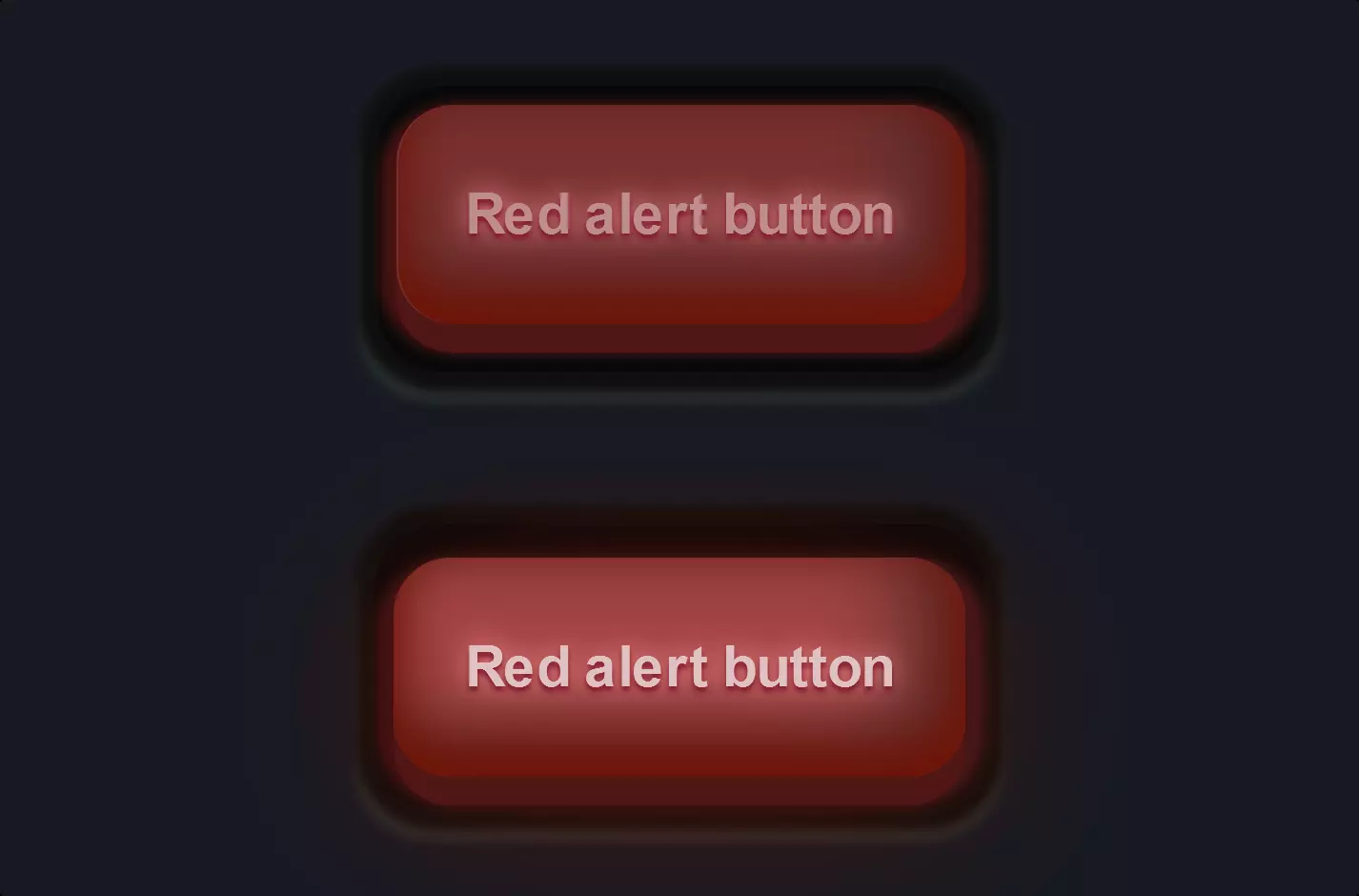
Button #16
- 3.04 KB
- HTML, CSS
- Button
- MIT License
<button class="game-button">Cancel</button>
.game-button {
font-family: Arial;
-webkit-box-sizing: border-box;
-moz-box-sizing: border-box;
box-sizing: border-box;
position: relative;
top: 0;
cursor: pointer;
text-decoration: none !important;
outline: none !important;
font-family: 'Carter One', sans-serif;
font-size: 20px;
line-height: 1.5em;
letter-spacing: .1em;
background: -webkit-repeating-linear-gradient( 45deg, #ffc800, #ffc800 5px, #ffc200 5px, #ffc200 10px);
background: -moz-repeating-linear-gradient( 45deg, #ffc800, #ffc800 5px, #ffc200 5px, #ffc200 10px);
background: -o-repeating-linear-gradient( 45deg, #ffc800, #ffc800 5px, #ffc200 5px, #ffc200 10px);
background: repeating-linear-gradient( 45deg, #ffc800, #ffc800 5px, #ffc200 5px, #ffc200 10px);
-webkit-box-shadow: 0 6px 0 #b76113, 0 8px 1px 1px rgba(0,0,0,.3), 0 10px 0 5px #75421f, 0 12px 0 5px #8a542b, 0 15px 0 5px #593116, 0 15px 1px 6px rgba(0,0,0,.3);
-moz-box-shadow: 0 6px 0 #b76113, 0 8px 1px 1px rgba(0,0,0,.3), 0 10px 0 5px #75421f, 0 12px 0 5px #8a542b, 0 15px 0 5px #593116, 0 15px 1px 6px rgba(0,0,0,.3);
box-shadow: 0 6px 0 #b76113, 0 8px 1px 1px rgba(0,0,0,.3), 0 10px 0 5px #75421f, 0 12px 0 5px #8a542b, 0 15px 0 5px #593116, 0 15px 1px 6px rgba(0,0,0,.3);
border-bottom: 3px solid rgba(205, 102, 0, 0.5);
text-shadow: 2px 2px 1px #e78700, -2px 2px 1px #e78700, 2px -2px 1px #e78700, -2px -2px 1px #e78700, 0px 2px 1px #e78700, 0px -2px 1px #e78700, 0px 4px 1px #c96100, 2px 4px 1px #c96100, -2px 4px 1px #c96100;
border-top: 3px solid rgba(255,255,255,.3);
color: #fff !important;
-webkit-border-radius: 8px;
-moz-border-radius: 8px;
border-radius: 8px;
padding: 8px 15px 10px;
}
.game-button:hover {
-webkit-box-sizing: border-box;
-moz-box-sizing: border-box;
box-sizing: border-box;
top:2px;
-webkit-box-shadow: 0 4px 0 #b76113, 0 6px 1px 1px rgba(0,0,0,.3), 0 8px 0 5px #75421f, 0 10px 0 5px #8a542b, 0 13px 0 5px #593116, 0 13px 1px 6px rgba(0,0,0,.3);
-moz-box-shadow: 0 4px 0 #b76113, 0 6px 1px 1px rgba(0,0,0,.3), 0 8px 0 5px #75421f, 0 10px 0 5px #8a542b, 0 13px 0 5px #593116, 0 13px 1px 6px rgba(0,0,0,.3);
box-shadow: 0 4px 0 #b76113, 0 6px 1px 1px rgba(0,0,0,.3), 0 8px 0 5px #75421f, 0 10px 0 5px #8a542b, 0 13px 0 5px #593116, 0 13px 1px 6px rgba(0,0,0,.3);
}
.game-button::before {
-webkit-box-sizing: border-box;
-moz-box-sizing: border-box;
box-sizing: border-box;
content: '';
height: 10%;
position: absolute;
width: 40%;
background: #fff;
right: 13%;
top: -3%;
-webkit-border-radius: 99px;
-moz-border-radius: 99px;
border-radius: 99px;
}
.game-button::after {
-webkit-box-sizing: border-box;
-moz-box-sizing: border-box;
box-sizing: border-box;
content: '';
height: 10%;
position: absolute;
width: 5%;
background: #fff;
right: 5%;
top: -3%;
-webkit-border-radius: 99px;
-moz-border-radius: 99px;
border-radius: 99px;
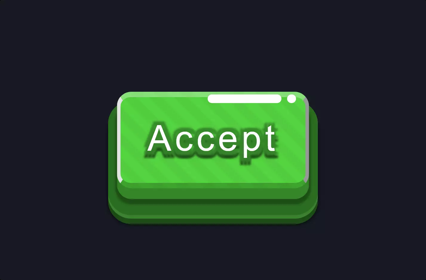
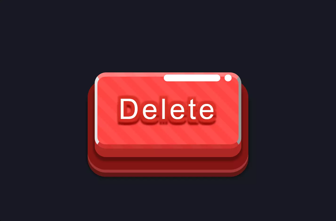
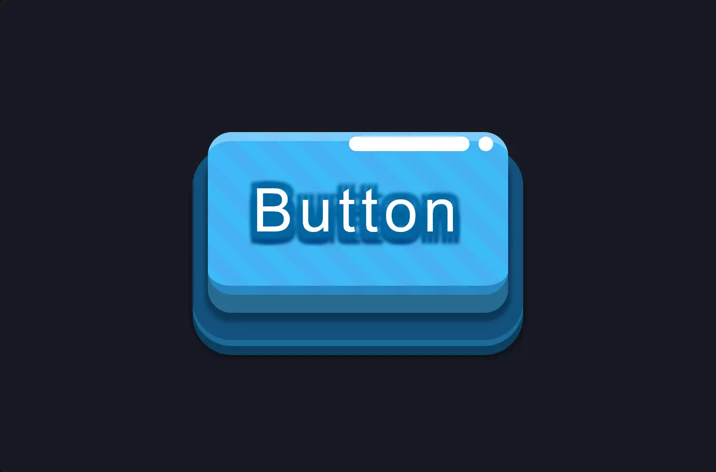
}The code snippet we’re looking at is a stylish way to create a button for a game, employing HTML and CSS to craft an eye-catching visual effect. At its core, the HTML part is straightforward—a button element with a class “game-button”. This simplicity in HTML is a canvas for the CSS magic that follows.
CSS takes this canvas and transforms it into something vibrant and dynamic. It starts with basic styling like font and size, but quickly moves into the realm of visual effects with gradients and shadows. The use of repeating-linear-gradient creates a striped background effect, giving the button a lively appearance. However, the real standout feature is the use of box-shadow to create a multi-layered shadow effect. This doesn’t just add depth to the button; it creates a sense of elevation, making the button pop out from the screen. The shadows are carefully crafted to simulate light casting over the button, adding realism and drawing the eye.
Moreover, the CSS pseudo-elements ::before and ::after are cleverly used to add extra visual elements to the button, further enhancing its three-dimensional appearance. These elements are styled to look like highlights or reflections, contributing to the button’s tactile feel. This attention to detail in the CSS not only makes the button more engaging but also demonstrates how CSS can be used to create intricate designs that go beyond basic web elements. This approach to styling, especially the use of shadow and light effects, showcases the power of CSS in creating interactive and visually appealing web components.