Button #14
- 3.27 KB
- HTML, CSS
- Button
- glow
- MIT License
<a class="rainbow-btn">Rainbow glow button</a>
.rainbow-btn {
    font-family: Arial;
    -webkit-box-sizing: border-box;
    -moz-box-sizing: border-box;
    box-sizing: border-box;
    color: #fff;
    cursor: pointer;
    position: relative;
    padding: 20px 30px;
    text-decoration: none;
    -webkit-border-radius: 8px;
    -moz-border-radius: 8px;
    border-radius: 8px;
    -webkit-transition: 0.5s;
    -o-transition: 0.5s;
    -moz-transition: 0.5s;
    transition: 0.5s;
    background: -webkit-gradient(linear, left top, right top, from(#03a9f4), color-stop(#f441a5), color-stop(#ffeb3b), to(#03a9f4));
    background: -webkit-linear-gradient(left, #03a9f4, #f441a5, #ffeb3b, #03a9f4);
    background: -moz-linear-gradient(left, #03a9f4, #f441a5, #ffeb3b, #03a9f4);
    background: -o-linear-gradient(left, #03a9f4, #f441a5, #ffeb3b, #03a9f4);
    background: linear-gradient(90deg, #03a9f4, #f441a5, #ffeb3b, #03a9f4);
    -webkit-background-size: 400% 400%;
    -moz-background-size: 400%;
    -o-background-size: 400%;
    background-size: 400%;
    -webkit-animation: rainbow 8s linear infinite;
    -moz-animation: rainbow 8s linear infinite;
    -o-animation: rainbow 8s linear infinite;
    animation: rainbow 8s linear infinite;
}
@-webkit-keyframes rainbow {
    0% {
        background-position: 0%;
    }
    100% {
        background-position: 400%;
    }
}
@-moz-keyframes rainbow {
    0% {
        background-position: 0%;
    }
    100% {
        background-position: 400%;
    }
}
@-o-keyframes rainbow {
    0% {
        background-position: 0%;
    }
    100% {
        background-position: 400%;
    }
}
@keyframes rainbow {
    0% {
        background-position: 0%;
    }
    100% {
        background-position: 400%;
    }
}
.rainbow-btn:before {
    -webkit-box-sizing: border-box;
    -moz-box-sizing: border-box;
    box-sizing: border-box;
    content: "";
    position: absolute;
    top: -5px;
    left: -5px;
    right: -5px;
    bottom: -5px;
    z-index: -1;
    background: -webkit-gradient(linear, left top, right top, from(#03a9f4), color-stop(#f441a5), color-stop(#ffeb3b), to(#03a9f4));
    background: -webkit-linear-gradient(left, #03a9f4, #f441a5, #ffeb3b, #03a9f4);
    background: -moz-linear-gradient(left, #03a9f4, #f441a5, #ffeb3b, #03a9f4);
    background: -o-linear-gradient(left, #03a9f4, #f441a5, #ffeb3b, #03a9f4);
    background: linear-gradient(90deg, #03a9f4, #f441a5, #ffeb3b, #03a9f4);
    -webkit-background-size: 400% 400%;
    -moz-background-size: 400%;
    -o-background-size: 400%;
    background-size: 400%;
    -webkit-border-radius: 8px;
    -moz-border-radius: 8px;
    border-radius: 8px;
    opacity: 0.5;
    -webkit-transition: 0.5s;
    -o-transition: 0.5s;
    -moz-transition: 0.5s;
    transition: 0.5s;
    -webkit-animation: rainbow 8s linear infinite;
    -moz-animation: rainbow 8s linear infinite;
    -o-animation: rainbow 8s linear infinite;
    animation: rainbow 8s linear infinite;
    -webkit-filter: blur(5px);
    filter: blur(5px);
}
.rainbow-btn:hover:before {
    -webkit-box-sizing: border-box;
    -moz-box-sizing: border-box;
    box-sizing: border-box;
    -webkit-filter: blur(20px);
    filter: blur(20px);
    opacity: 1;
}
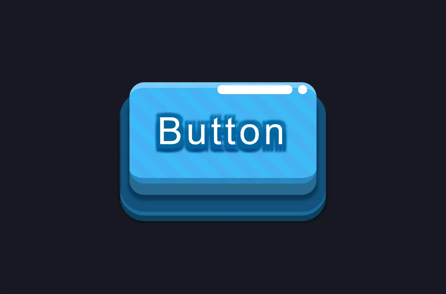
The code snippet introduces a visually stunning rainbow glow button, using HTML and CSS, creating an interactive element that truly stands out on the page. At its core, the button is designed with a gradient background that seamlessly transitions through a spectrum of colors, resembling a rainbow. This effect is not static; it’s animated to move across the button, giving it a dynamic, glowing appearance that catches the eye.
The CSS magic that makes this button glow and animate involves a combination of gradients, animations, and transitions. The background is initially set with a linear gradient, smoothly blending several colors across the button. This gradient is not fixed; it’s designed to shift position over time, creating the moving glow effect. This movement is achieved through keyframe animations that continuously change the background’s position, making the colors flow across the button in an endless loop.
Moreover, the button incorporates an interactive element through a pseudo-element that intensifies the glow when hovered over. This is achieved by adjusting the blur filter and opacity properties, making the glow stronger and more pronounced upon interaction. This effect not only adds to the visual appeal but also provides a tactile feedback to users, enhancing the user experience. The combination of vibrant colors, smooth transitions, and interactive feedback makes this button a compelling element for any web page, encouraging engagement in a visually appealing manner.