Button #9
- 1.19 KB
- HTML, CSS
- Button
- submit
- MIT License
<a hreef="#" class="btn-plastic">Submit</a>
.btn-plastic {
    font-family: Arial;
    cursor: pointer;
    text-transform: none;
    font-size: 20px;
    font-weight: 400;
    color: #fff;
    background: #3b9850;
    letter-spacing: 0.5px;
    text-shadow: 0 -1px 0 #243967;
    padding: 15px 30px;
    display: inline-block;
    -webkit-border-radius: 4px;
    -moz-border-radius: 4px;
    border-radius: 4px;
    border: 1px solid rgba(0, 0, 0, 0.5);
    -webkit-box-shadow: 0 0 0 2px rgba(0, 0, 0, 0.2), inset 0 3px 3px -2px rgba(255, 255, 255, 0.21), inset 0 -3px 3px -2px rgba(0, 0, 0, 0.6), inset 0 0 0 1px rgba(202, 202, 202, 0.15);
    -moz-box-shadow: 0 0 0 2px rgba(0, 0, 0, 0.2), inset 0 3px 3px -2px rgba(255, 255, 255, 0.21), inset 0 -3px 3px -2px rgba(0, 0, 0, 0.6), inset 0 0 0 1px rgba(202, 202, 202, 0.15);
    box-shadow: 0 0 0 2px rgba(0, 0, 0, 0.2), inset 0 3px 3px -2px rgba(255, 255, 255, 0.21), inset 0 -3px 3px -2px rgba(0, 0, 0, 0.6), inset 0 0 0 1px rgba(202, 202, 202, 0.15);
    -webkit-transition: 0.2s;
    -o-transition: 0.2s;
    -moz-transition: 0.2s;
    transition: 0.2s;
}
.btn-plastic:hover {
    background: #4ca961;
    color: #fff;
}
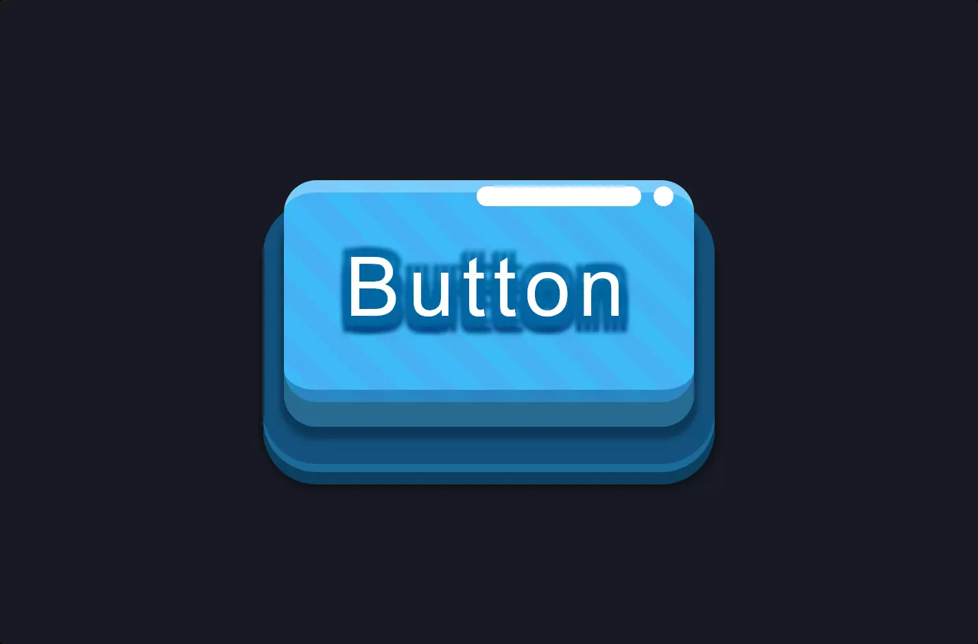
The code snippet we’re diving into is a beautiful blend of HTML and CSS, crafting a visually appealing “Submit” button that’s not just a button but a little piece of art on your webpage. Picture this: you’re designing a form, and at the end of it, you want your users to click on something that feels satisfying, almost as if they’re putting the final stamp on their effort. This is where our “Submit” button comes into play.
Starting with the HTML part, we’ve got a simple anchor tag designed to look and feel like a button. This might seem a tad unconventional because we usually see <button> tags in action for submit buttons. But here’s the twist: using an <a> tag gives us versatility, allowing this button to act not just within forms but also as a standalone link if needed. The class “btn-plastic” is what ties our humble anchor to its splendid wardrobe of styles defined in the CSS.
Now, let’s waltz into the CSS, where the real magic happens. The class “btn-plastic” is swathed in styles that make our button pop. The background color, padding, and border-radius contribute to its tactile, clickable appeal, making it stand out on the page. The text inside is crisply visible, thanks to the contrasting color and shadow, ensuring that users won’t miss it. The hover effect is the cherry on top, subtly changing the background color to indicate interactivity. This interaction isn’t just functional; it’s a nod to good design, enhancing the user’s journey through your site.
In essence, this code snippet isn’t just about making a button. It’s about creating an experience, a moment of satisfaction for the user as they complete their task. Through a thoughtful combination of HTML and CSS, it transforms a simple action into a significant conclusion.
