Button #8
- 7.23 KB
- HTML, CSS, JS
- Button
- MIT License
<div class="container">
    <div class="button">
        <div class="left-click-trigger"></div>
        <div class="right-click-trigger"></div>
        <div class="switch">
            <div class="inner"></div>
        </div>
        <div class="icon-on"></div>
        <div class="icon-off"></div>
    </div>
</div>
.button {
    -webkit-box-shadow: -4px -4px 20px rgba(255, 255, 255, 0.15), 4px 4px 20px rgba(0, 0, 0, 0.9);
    -moz-box-shadow: -4px -4px 20px rgba(255, 255, 255, 0.15), 4px 4px 20px rgba(0, 0, 0, 0.9);
    box-shadow: -4px -4px 20px rgba(255, 255, 255, 0.15), 4px 4px 20px rgba(0, 0, 0, 0.9);
}

html,
body {
    margin: 0;
    padding: 0;
}

.container {
    background: #1c1c1e;
    width: 100vw;
    height: 100vh;
    position: relative;
}
.container .button {
    cursor: pointer;
    background: -webkit-linear-gradient(320deg, #212123, #171719);
    background: -moz-linear-gradient(320deg, #212123, #171719);
    background: -o-linear-gradient(320deg, #212123, #171719);
    background: linear-gradient(130deg, #212123, #171719);
    position: absolute;
    top: 50%;
    left: 50%;
    -webkit-transform: translate(-50%, -50%);
    -moz-transform: translate(-50%, -50%);
    -o-transform: translate(-50%, -50%);
    transform: translate(-50%, -50%);
    width: 300px;
    height: 140px;
    -webkit-border-radius: 150px;
    -moz-border-radius: 150px;
    border-radius: 150px;
}
.container .button .left-click-trigger,
.container .button .right-click-trigger {
    position: absolute;
    left: 0;
    z-index: 50;
    width: 50%;
    height: 100%;
    top: 0;
}
.container .button .right-click-trigger {
    left: 50%;
}
.container .button .switch {
    background: -webkit-gradient(linear, left top, right top, from(#2b2b2e), to(#0d0d0e));
    background: -webkit-linear-gradient(left, #2b2b2e, #0d0d0e);
    background: -moz-linear-gradient(left, #2b2b2e, #0d0d0e);
    background: -o-linear-gradient(left, #2b2b2e, #0d0d0e);
    background: linear-gradient(90deg, #2b2b2e, #0d0d0e);
    -webkit-border-radius: 150px;
    -moz-border-radius: 150px;
    border-radius: 150px;
    position: absolute;
    top: 50%;
    left: 50%;
    -webkit-transform: translate(-50%, -50%);
    -moz-transform: translate(-50%, -50%);
    -o-transform: translate(-50%, -50%);
    transform: translate(-50%, -50%);
    width: 80%;
    height: 70%;
    -webkit-box-shadow: 0 0 10px rgba(0, 0, 0, 0.2);
    -moz-box-shadow: 0 0 10px rgba(0, 0, 0, 0.2);
    box-shadow: 0 0 10px rgba(0, 0, 0, 0.2);
}
.container .button .switch .inner {
    background: -webkit-gradient(linear, left top, right top, color-stop(45%, #171719), color-stop(55%, #212123));
    background: -webkit-linear-gradient(left, #171719 45%, #212123 55%);
    background: -moz-linear-gradient(left, #171719 45%, #212123 55%);
    background: -o-linear-gradient(left, #171719 45%, #212123 55%);
    background: linear-gradient(90deg, #171719 45%, #212123 55%);
    width: 94%;
    height: 100%;
    -webkit-transition: 0.5s cubic-bezier(0.9, 0, 0, 1);
    -o-transition: 0.5s cubic-bezier(0.9, 0, 0, 1);
    -moz-transition: 0.5s cubic-bezier(0.9, 0, 0, 1);
    transition: 0.5s cubic-bezier(0.9, 0, 0, 1);
    position: absolute;
    left: 6%;
    -webkit-border-radius: 150px;
    -moz-border-radius: 150px;
    border-radius: 150px;
}
.container .button .switch .inner::after {
    content: "";
    position: absolute;
    top: 0;
    left: 0;
    width: 100%;
    height: 100%;
    background: -webkit-gradient(linear, left top, right top, color-stop(45%, #212123), color-stop(55%, #171719));
    background: -webkit-linear-gradient(left, #212123 45%, #171719 55%);
    background: -moz-linear-gradient(left, #212123 45%, #171719 55%);
    background: -o-linear-gradient(left, #212123 45%, #171719 55%);
    background: linear-gradient(90deg, #212123 45%, #171719 55%);
    -webkit-transition: 0.5s cubic-bezier(0.9, 0, 0, 1);
    -o-transition: 0.5s cubic-bezier(0.9, 0, 0, 1);
    -moz-transition: 0.5s cubic-bezier(0.9, 0, 0, 1);
    transition: 0.5s cubic-bezier(0.9, 0, 0, 1);
    -webkit-border-radius: 150px;
    -moz-border-radius: 150px;
    border-radius: 150px;
    opacity: 0;
}
.container .button .icon-on {
    position: absolute;
    top: 50%;
    left: 70%;
    -webkit-transform: translate(-50%, -50%);
    -moz-transform: translate(-50%, -50%);
    -o-transform: translate(-50%, -50%);
    transform: translate(-50%, -50%);
    background: #a1f1f2;
    width: 5px;
    height: 30px;
    -webkit-border-radius: 20px;
    -moz-border-radius: 20px;
    border-radius: 20px;
    -webkit-box-shadow: 0 0 30px 2px rgba(161, 241, 242, 0.8);
    -moz-box-shadow: 0 0 30px 2px rgba(161, 241, 242, 0.8);
    box-shadow: 0 0 30px 2px rgba(161, 241, 242, 0.8);
    -webkit-transition: 0.5s cubic-bezier(0.9, 0, 0, 1);
    -o-transition: 0.5s cubic-bezier(0.9, 0, 0, 1);
    -moz-transition: 0.5s cubic-bezier(0.9, 0, 0, 1);
    transition: 0.5s cubic-bezier(0.9, 0, 0, 1);
}
.container .button .icon-off {
    position: absolute;
    top: 50%;
    left: 33%;
    -webkit-transform: translate(-45%, -50%) rotate3d(0, 1, 0, 25deg);
    -moz-transform: translate(-45%, -50%) rotate3d(0, 1, 0, 25deg);
    transform: translate(-45%, -50%) rotate3d(0, 1, 0, 25deg);
    background: #171719;
    width: 25px;
    height: 25px;
    -webkit-border-radius: 50%;
    -moz-border-radius: 50%;
    border-radius: 50%;
    -webkit-transition: 0.5s cubic-bezier(0.9, 0, 0, 1);
    -o-transition: 0.5s cubic-bezier(0.9, 0, 0, 1);
    -moz-transition: 0.5s cubic-bezier(0.9, 0, 0, 1);
    transition: 0.5s cubic-bezier(0.9, 0, 0, 1);
    -webkit-box-shadow: 0 0 30px rgba(0, 0, 0, 0.8), inset 0 0 15px rgba(0, 0, 0, 0.5);
    -moz-box-shadow: 0 0 30px rgba(0, 0, 0, 0.8), inset 0 0 15px rgba(0, 0, 0, 0.5);
    box-shadow: 0 0 30px rgba(0, 0, 0, 0.8), inset 0 0 15px rgba(0, 0, 0, 0.5);
    border: 5px solid #2d2d30;
}
.container .button.off .icon-on {
    left: 67%;
    -webkit-box-shadow: 0 0 25px rgba(0, 0, 0, 0.9);
    -moz-box-shadow: 0 0 25px rgba(0, 0, 0, 0.9);
    box-shadow: 0 0 25px rgba(0, 0, 0, 0.9);
    background: #2d2d30;
    -webkit-transform: translate(-50%, -50%) rotate3d(0, 1, 0, 25deg);
    -moz-transform: translate(-50%, -50%) rotate3d(0, 1, 0, 25deg);
    transform: translate(-50%, -50%) rotate3d(0, 1, 0, 25deg);
}
.container .button.off .icon-off {
    left: 30%;
    background: #212123;
    border-color: #f2a2a1;
    -webkit-box-shadow: 0 0 30px rgba(242, 162, 161, 0.8), inset 0 0 15px rgba(242, 162, 161, 0.5);
    -moz-box-shadow: 0 0 30px rgba(242, 162, 161, 0.8), inset 0 0 15px rgba(242, 162, 161, 0.5);
    box-shadow: 0 0 30px rgba(242, 162, 161, 0.8), inset 0 0 15px rgba(242, 162, 161, 0.5);
    -webkit-transform: translate(-50%, -50%) rotate3d(0, 1, 0, 0deg);
    -moz-transform: translate(-50%, -50%) rotate3d(0, 1, 0, 0deg);
    transform: translate(-50%, -50%) rotate3d(0, 1, 0, 0deg);
}
.container .button.off .switch .inner {
    left: 0;
}
.container .button.off .switch .inner::after {
    opacity: 1;
}
$(".left-click-trigger").click(function (e) {
  $(".button").addClass("off");
});
$(".right-click-trigger").click(function (e) {
  $(".button").removeClass("off");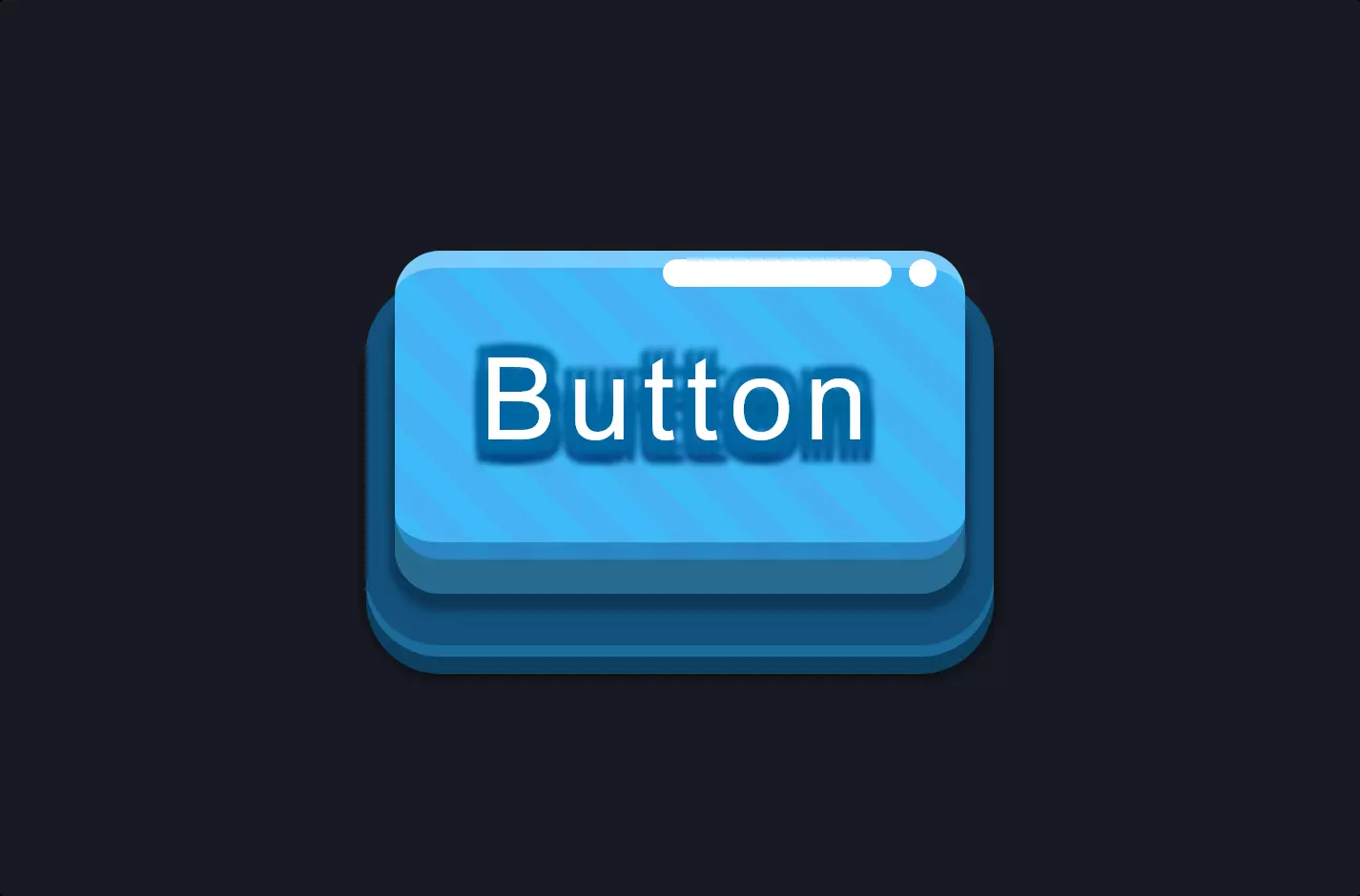
});The code snippet brings to life a sleek and interactive web element, designed with a combination of HTML, CSS, and JavaScript to create a visually appealing and functional user interface component.
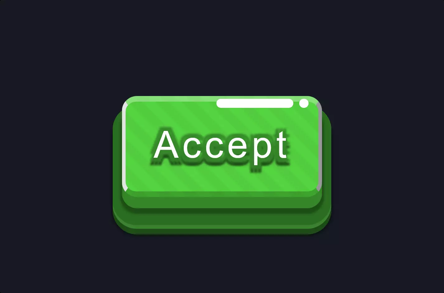
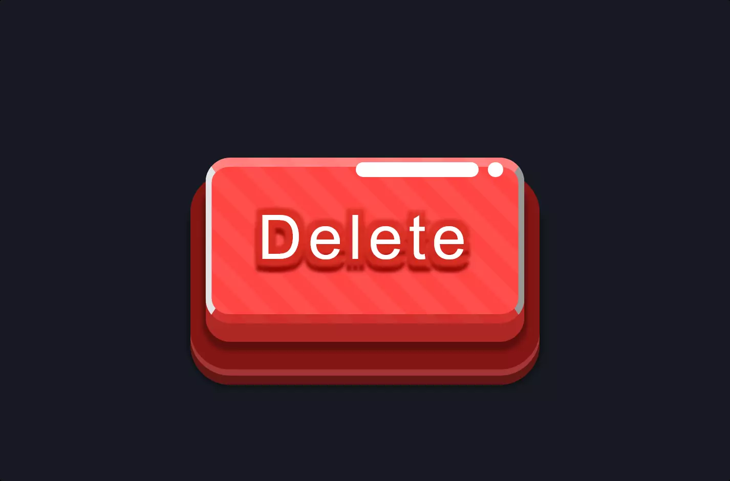
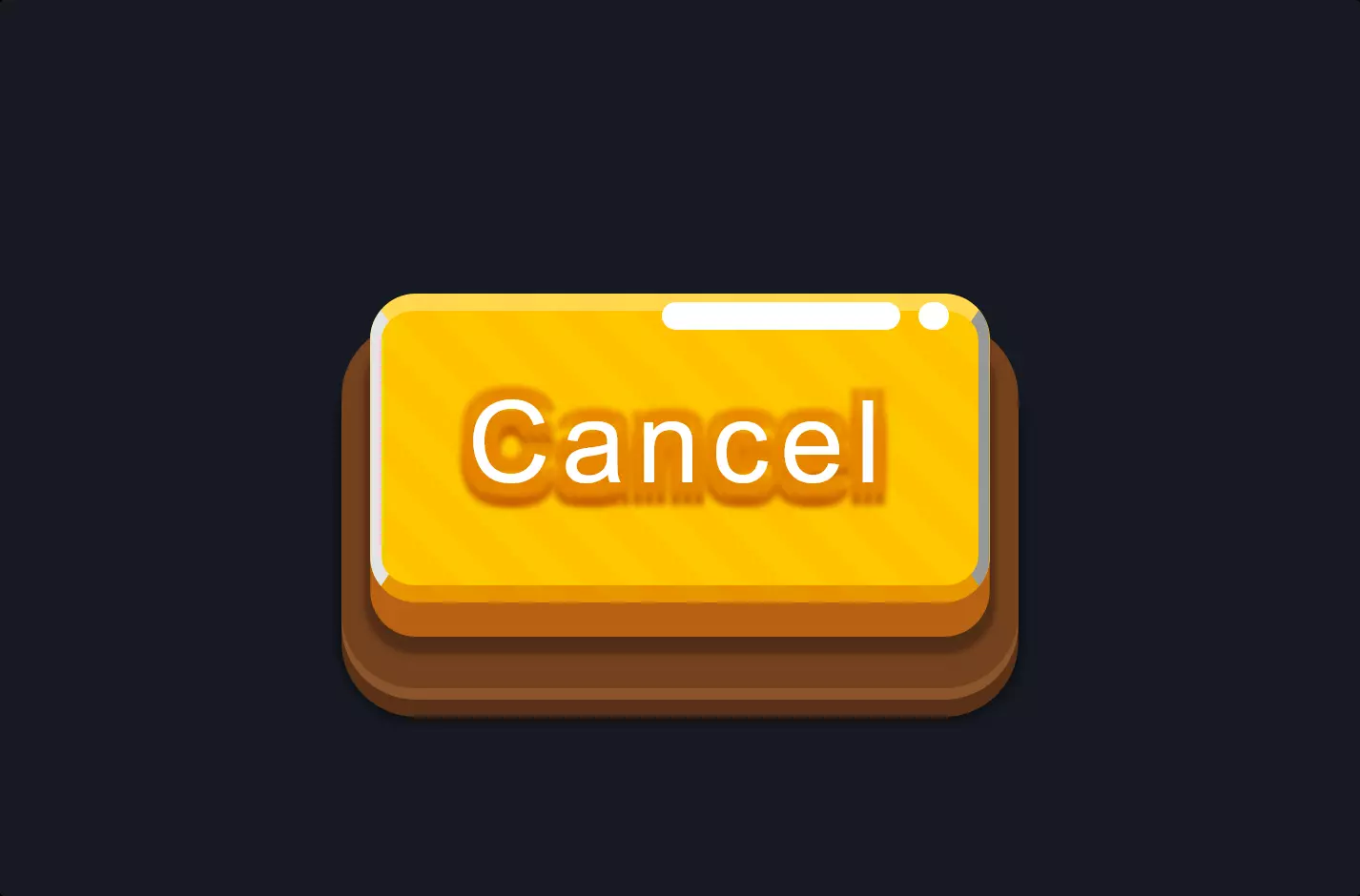
Starting with the HTML, it defines a structured layout with a <div> element classed as .container that encapsulates another <div> with the class .button. This button is further broken down into smaller <div> elements for specific features like triggers for left and right clicks and a switch with an inner part, including icons for “on” and “off” states. This structure serves as the skeleton of our interactive component, providing a clear hierarchy and organization for the visual elements we’ll style and animate.
Moving to the CSS, the magic of styling comes into play, especially with the use of box-shadow to add depth and dimension to the elements. The box-shadow property is utilized multiple times across different elements, creating a sense of realism through subtle shadows and light effects. For instance, it’s applied to the “button” to give it a pressed or floating look depending on the light source simulation, enhancing the user’s visual experience. The use of gradients, border-radius, and transitions in conjunction with box-shadow further contributes to the aesthetic appeal and interactivity of the button, making it not just visually engaging but also responsive to user actions with smooth animations.
JavaScript ties everything together by adding interactivity to the button. It listens for click events on the left and right triggers, dynamically adding or removing the “off” class based on the interaction. This simple yet effective script enables the switch between the “on” and “off” states, demonstrating how HTML, CSS, and JavaScript work in harmony to create interactive web components. The use of jQuery for event handling simplifies the process, making the code more readable and easier to maintain.
In essence, this code snippet is a prime example of how combining HTML structure, CSS styling, and JavaScript functionality can produce a compelling user interface component that’s both beautiful and interactive.