Button #7
- 5.80 KB
- HTML, CSS
- Button
- animation, neon
- MIT License
<a href="#">
    <span></span>
    <span></span>
    <span></span>
    <span></span>
    Neon button
</a>
@import url("https://fonts.googleapis.com/css2?family=Tektur&display=swap");
a {
    position: relative;
    padding: 25px 30px;
    color: #03e9f4;
    text-decoration: none;
    text-transform: uppercase;
    -webkit-transition: 0.5s;
    -o-transition: 0.5s;
    -moz-transition: 0.5s;
    transition: 0.5s;
    letter-spacing: 4px;
    overflow: hidden;
    font-family: "Tektur", sans-serif;
}
a:hover {
    background: #03e9f4;
    color: #050801;
    -webkit-box-shadow: 0 0 5px #03e9f4, 0 0 25px #03e9f4, 0 0 50px #03e9f4, 0 0 200px #03e9f4;
    -moz-box-shadow: 0 0 5px #03e9f4, 0 0 25px #03e9f4, 0 0 50px #03e9f4, 0 0 200px #03e9f4;
    box-shadow: 0 0 5px #03e9f4, 0 0 25px #03e9f4, 0 0 50px #03e9f4, 0 0 200px #03e9f4;
    -webkit-box-reflect: below 1px linear-gradient(transparent, #0005);
}
a span {
    position: absolute;
    display: block;
}
a span:nth-child(1) {
    top: 0;
    left: 0;
    width: 100%;
    height: 2px;
    background: -webkit-gradient(linear, left top, right top, from(transparent), to(#03e9f4));
    background: -webkit-linear-gradient(left, transparent, #03e9f4);
    background: -moz-linear-gradient(left, transparent, #03e9f4);
    background: -o-linear-gradient(left, transparent, #03e9f4);
    background: linear-gradient(90deg, transparent, #03e9f4);
    -webkit-animation: animate1 1s linear infinite;
    -moz-animation: animate1 1s linear infinite;
    -o-animation: animate1 1s linear infinite;
    animation: animate1 1s linear infinite;
}
@-webkit-keyframes animate1 {
    0% {
        left: -100%;
    }
    50%,
    100% {
        left: 100%;
    }
}
@-moz-keyframes animate1 {
    0% {
        left: -100%;
    }
    50%,
    100% {
        left: 100%;
    }
}
@-o-keyframes animate1 {
    0% {
        left: -100%;
    }
    50%,
    100% {
        left: 100%;
    }
}
@keyframes animate1 {
    0% {
        left: -100%;
    }
    50%,
    100% {
        left: 100%;
    }
}
a span:nth-child(2) {
    top: -100%;
    right: 0;
    width: 2px;
    height: 100%;
    background: -webkit-gradient(linear, left top, left bottom, from(transparent), to(#03e9f4));
    background: -webkit-linear-gradient(top, transparent, #03e9f4);
    background: -moz-linear-gradient(top, transparent, #03e9f4);
    background: -o-linear-gradient(top, transparent, #03e9f4);
    background: linear-gradient(180deg, transparent, #03e9f4);
    -webkit-animation: animate2 1s linear infinite;
    -moz-animation: animate2 1s linear infinite;
    -o-animation: animate2 1s linear infinite;
    animation: animate2 1s linear infinite;
    -webkit-animation-delay: 0.25s;
    -moz-animation-delay: 0.25s;
    -o-animation-delay: 0.25s;
    animation-delay: 0.25s;
}
@-webkit-keyframes animate2 {
    0% {
        top: -100%;
    }
    50%,
    100% {
        top: 100%;
    }
}
@-moz-keyframes animate2 {
    0% {
        top: -100%;
    }
    50%,
    100% {
        top: 100%;
    }
}
@-o-keyframes animate2 {
    0% {
        top: -100%;
    }
    50%,
    100% {
        top: 100%;
    }
}
@keyframes animate2 {
    0% {
        top: -100%;
    }
    50%,
    100% {
        top: 100%;
    }
}
a span:nth-child(3) {
    bottom: 0;
    right: 0;
    width: 100%;
    height: 2px;
    background: -webkit-gradient(linear, right top, left top, from(transparent), to(#03e9f4));
    background: -webkit-linear-gradient(right, transparent, #03e9f4);
    background: -moz-linear-gradient(right, transparent, #03e9f4);
    background: -o-linear-gradient(right, transparent, #03e9f4);
    background: linear-gradient(270deg, transparent, #03e9f4);
    -webkit-animation: animate3 1s linear infinite;
    -moz-animation: animate3 1s linear infinite;
    -o-animation: animate3 1s linear infinite;
    animation: animate3 1s linear infinite;
    -webkit-animation-delay: 0.5s;
    -moz-animation-delay: 0.5s;
    -o-animation-delay: 0.5s;
    animation-delay: 0.5s;
}
@-webkit-keyframes animate3 {
    0% {
        right: -100%;
    }
    50%,
    100% {
        right: 100%;
    }
}
@-moz-keyframes animate3 {
    0% {
        right: -100%;
    }
    50%,
    100% {
        right: 100%;
    }
}
@-o-keyframes animate3 {
    0% {
        right: -100%;
    }
    50%,
    100% {
        right: 100%;
    }
}
@keyframes animate3 {
    0% {
        right: -100%;
    }
    50%,
    100% {
        right: 100%;
    }
}

a span:nth-child(4) {
    bottom: -100%;
    left: 0;
    width: 2px;
    height: 100%;
    background: -webkit-gradient(linear, left bottom, left top, from(transparent), to(#03e9f4));
    background: -webkit-linear-gradient(bottom, transparent, #03e9f4);
    background: -moz-linear-gradient(bottom, transparent, #03e9f4);
    background: -o-linear-gradient(bottom, transparent, #03e9f4);
    background: linear-gradient(360deg, transparent, #03e9f4);
    -webkit-animation: animate4 1s linear infinite;
    -moz-animation: animate4 1s linear infinite;
    -o-animation: animate4 1s linear infinite;
    animation: animate4 1s linear infinite;
    -webkit-animation-delay: 0.75s;
    -moz-animation-delay: 0.75s;
    -o-animation-delay: 0.75s;
    animation-delay: 0.75s;
}
@-webkit-keyframes animate4 {
    0% {
        bottom: -100%;
    }
    50%,
    100% {
        bottom: 100%;
    }
}
@-moz-keyframes animate4 {
    0% {
        bottom: -100%;
    }
    50%,
    100% {
        bottom: 100%;
    }
}
@-o-keyframes animate4 {
    0% {
        bottom: -100%;
    }
    50%,
    100% {
        bottom: 100%;
    }
}
@keyframes animate4 {
    0% {
        bottom: -100%;
    }
    50%,
    100% {
        bottom: 100%;
    }
}
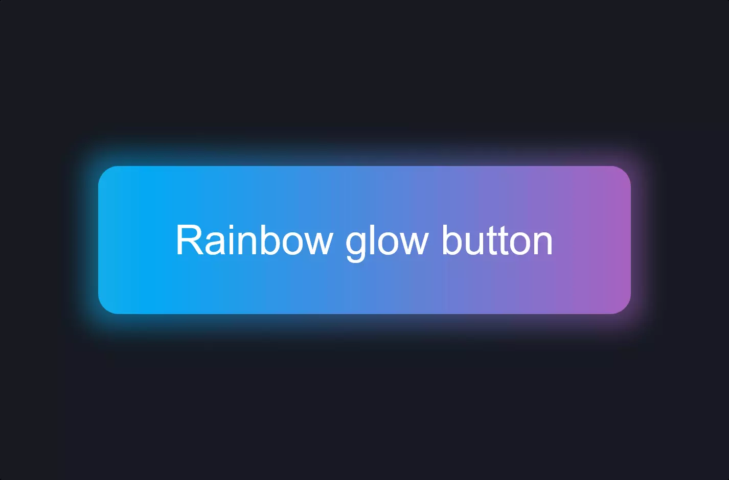
The code snippet creates a visually striking neon button effect using HTML and CSS, showcasing a modern and engaging web design technique. Initially, the HTML structure is minimalist, focusing on an anchor element <a href="#"> surrounded by four span elements. These spans play a crucial role in the animation of the button and it’s visual flair, serving as dynamic elements that light up and animate to give the neon effect.
The CSS part kicks off with an import statement for a specific font from Google Fonts, setting the stage for a stylish text presentation within the button. The anchor tag is styled to have a neon-like color #03e9f4, with various states and transitions defined to enhance user interaction. The hover state, in particular, is where the magic happens, with the background color changing and a glowing effect achieved through the use of box-shadow. This shadow is layered in different intensities to create a deep, glowing neon effect, further accentuated by a reflection effect created with -webkit-box-reflect.
Animations are defined for each of the span elements, with keyframes that move these elements in specific patterns to simulate a shimmering neon light border around the button. Each animation is set with a slight delay variation, creating a sequence that keeps the button alive and engaging. The use of gradients within these spans, transitioning from transparent to the neon color, along with the linear animations, contributes to a dynamic, glowing perimeter that catches the eye.
Overall, this snippet exemplifies how CSS can be leveraged to create engaging, interactive web elements that enhance user experience. The combination of animation, box-shadow, and color transitions not only makes the button stand out but also adds a layer of modern aesthetics to the web page.