Button #6
- 2.04 KB
- HTML, CSS
- Button
- animation, submit
- MIT License
<div class="panel borderless">
  <button>Submit</button>
</div>
@import "https://fonts.googleapis.com/css?family=Comfortaa:300,400,700&subset=cyrillic,cyrillic-ext,latin-ext";
button {
    color: #9b51e0;
    background: transparent;
    border-width: 2px;
    border-style: solid;
    border-color: #9b51e0;
    position: relative;
    margin: 1em;
    display: inline-block;
    padding: 0.5em 1em;
    -webkit-transition: all 0.3s ease-in-out;
    -o-transition: all 0.3s ease-in-out;
    -moz-transition: all 0.3s ease-in-out;
    transition: all 0.3s ease-in-out;
    text-align: center;
    font-family: comfortaa;
    font-weight: bold;
}
.panel * {
    -webkit-box-sizing: border-box;
    -moz-box-sizing: border-box;
    box-sizing: border-box;
}
button:before,
button:after {
    content: "";
    display: block;
    position: absolute;
    border-color: #9b51e0;
    -webkit-box-sizing: border-box;
    -moz-box-sizing: border-box;
    box-sizing: border-box;
    border-style: solid;
    width: 1em;
    height: 1em;
    -webkit-transition: all 0.3s ease-in-out;
    -o-transition: all 0.3s ease-in-out;
    -moz-transition: all 0.3s ease-in-out;
    transition: all 0.3s ease-in-out;
}
button:before {
    top: -6px;
    left: -6px;
    border-width: 2px 0 0 2px;
    z-index: 5;
}
button:after {
    bottom: -6px;
    right: -6px;
    border-width: 0 2px 2px 0;
}

button:hover {
    cursor: pointer;
}
.borderless button {
    border-color: rgba(0, 0, 0, 0);
    color: #3071a5;
}
.borderless button:hover {
    border-color: #4ba9f3;
    background-color: transparent;
    color: #4ba9f3;
}
.borderless button:before,
.borderless button:after {
    border-color: transparent;
}
.borderless button:hover:before,
.borderless button:hover:after {
    width: -webkit-calc(100% + 12px);
    width: -moz-calc(100% + 12px);
    width: calc(100% + 12px);
    height: -webkit-calc(100% + 12px);
    height: -moz-calc(100% + 12px);
    height: calc(100% + 12px);
    border-color: #4ba9f3;
}
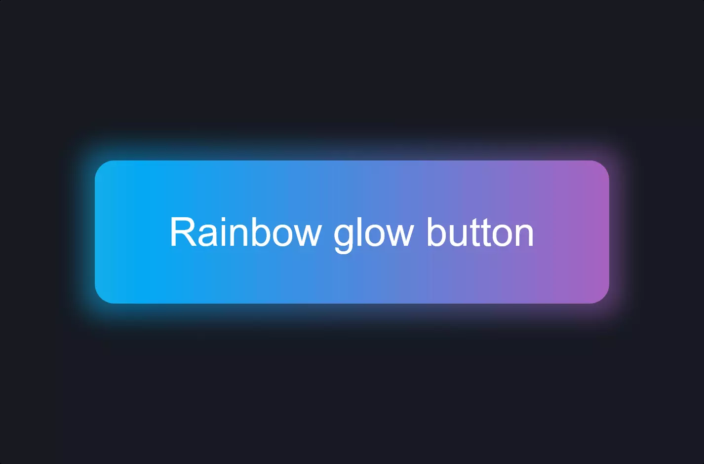
Let’s talk about a neat little trick to make a website button not just functional but also stylish and engaging. Imagine we’re jazzing up a submit button. First off, we’re keeping the design simple yet elegant with a border and a pop of color, specifically a lovely shade of purple. Now, here’s where the magic happens: when you hover over the button, it doesn’t just sit there; it transforms. We add tiny animated button details on the corners, making the button look like it’s ready to leap into action. This isn’t just any animation; it’s a subtle expansion that draws the eye and adds a layer of interactivity without being too in-your-face.
We achieve this by using CSS transitions, allowing the button’s color to shift and its border decorations to expand outward upon hovering, making the interaction feel dynamic and responsive. The trick lies in how these elements are styled and animated, blending seamlessly with the website’s overall aesthetic. This technique enhances the user experience by providing visual feedback, making the user’s journey through the website more engaging and intuitive.
What’s cool about this is how a few lines of CSS can significantly impact how users interact with a web page. It’s a testament to the power of thoughtful design in creating a memorable user experience. So, next time you’re on a website and notice a button doing a little dance under your cursor, you’ll know there’s a whole world of thought and creativity behind that subtle interaction.