Button #3
- 1.77 KB
- HTML, CSS
- Button
- animation, submit
- MIT License
<div class="panel">
  <button>Submit</button>
</div>
@import "https://fonts.googleapis.com/css?family=Comfortaa:300,400,700&subset=cyrillic,cyrillic-ext,latin-ext";
button {
    color: #9b51e0;
    background: transparent;
    border-width: 2px;
    border-style: solid;
    border-color: #9b51e0;
    position: relative;
    margin: 1em;
    display: inline-block;
    padding: 0.5em 1em;
    -webkit-transition: all 0.3s ease-in-out;
    -o-transition: all 0.3s ease-in-out;
    -moz-transition: all 0.3s ease-in-out;
    transition: all 0.3s ease-in-out;
    text-align: center;
    font-family: comfortaa;
    font-weight: bold;
}
.panel * {
    -webkit-box-sizing: border-box;
    -moz-box-sizing: border-box;
    box-sizing: border-box;
}
button:before,
button:after {
    content: "";
    display: block;
    position: absolute;
    border-color: #9b51e0;
    -webkit-box-sizing: border-box;
    -moz-box-sizing: border-box;
    box-sizing: border-box;
    border-style: solid;
    width: 1em;
    height: 1em;
    -webkit-transition: all 0.3s ease-in-out;
    -o-transition: all 0.3s ease-in-out;
    -moz-transition: all 0.3s ease-in-out;
    transition: all 0.3s ease-in-out;
}
button:before {
    top: -6px;
    left: -6px;
    border-width: 2px 0 0 2px;
    z-index: 5;
}
button:after {
    bottom: -6px;
    right: -6px;
    border-width: 0 2px 2px 0;
}
button:hover:before,
button:hover:after {
    width: -webkit-calc(100% + 12px);
    width: -moz-calc(100% + 12px);
    width: calc(100% + 12px);
    height: -webkit-calc(100% + 12px);
    height: -moz-calc(100% + 12px);
    height: calc(100% + 12px);
    border-color: #fff;
}
button:hover {
    background-color: #fff;
    border-color: #fff;
    cursor: pointer;
}
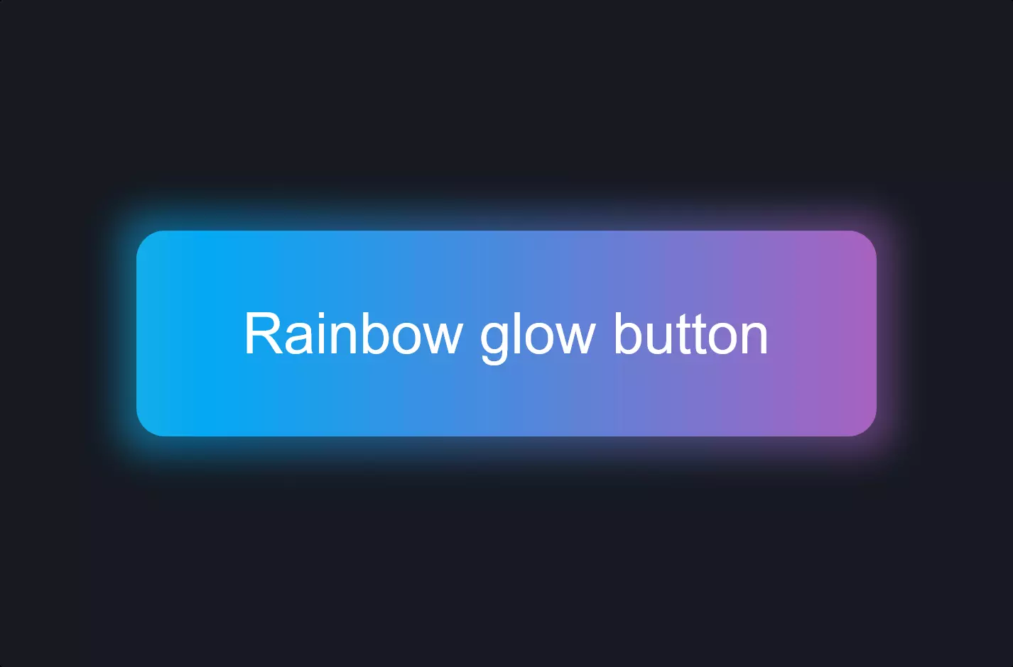
Imagine you’re designing a website and you want a cool, animated submit button that catches the eye. You start with a simple button inside a panel. It’s plain now, but you’re about to jazz it up with some CSS magic!
First, you import a fancy font from Google Fonts because you want your button text to look smooth and inviting. Then, you get down to styling your button. You give it a lovely purple border and text color, but keep the background transparent for that modern look. The button is positioned carefully with some margin and padding to make sure it doesn’t look too cramped or too sparse.
But here’s where the fun begins: animations! With a few lines of CSS, you make it so that when someone hovers over the button, it transforms. The border and text color change to white, making the button pop against any background. Plus, you add these neat little diagonal lines at the corners of the button that expand on hover, adding a dynamic, almost 3D effect to it.
These animations aren’t just for show; they’re designed to make the button more interactive and engaging, encouraging users to click. And the best part? This stylish button is all CSS, which means it loads fast and works smoothly across different browsers and devices.
By adding these elements, you’ve turned a basic HTML button into a stylish, animated submit button that not only looks great but also enhances user experience on your website.