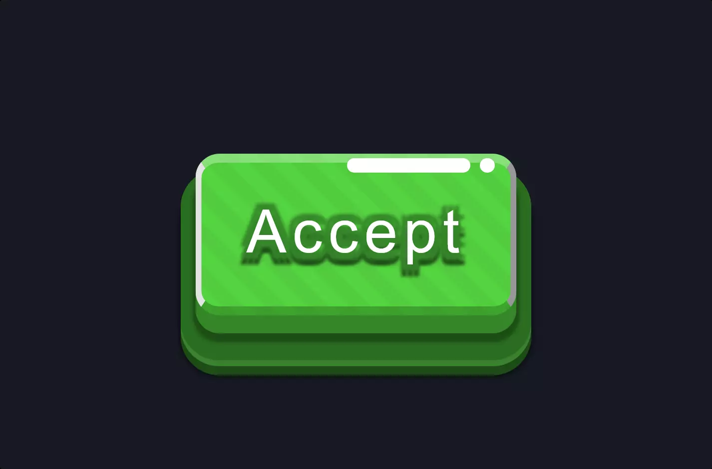
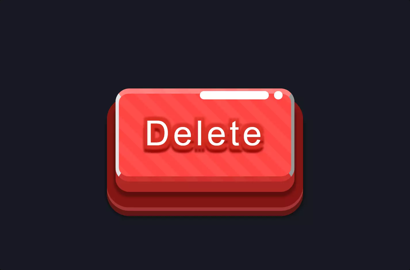
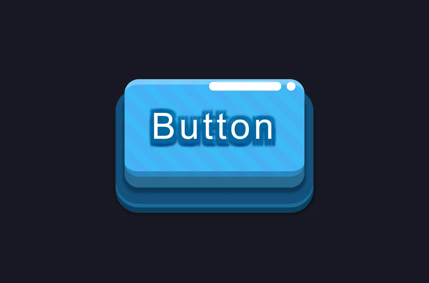
Button #11
- 4.75 KB
- HTML, CSS
- Button
- glow
- MIT License
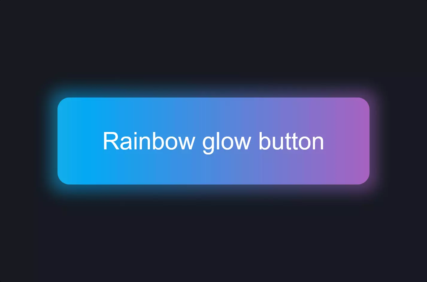
<a class="btn-glow btn-hover-shine">Glow button</a>
.btn-glow {
    font-family: Arial;
    color: #fff !important;
    background: rgb(138, 97, 248);
    background: -moz-linear-gradient(left, rgba(138, 97, 248, 1) 0%, rgba(236, 95, 231, 1) 100%);
    background: -webkit-linear-gradient(left, rgba(138, 97, 248, 1) 0%, rgba(236, 95, 231, 1) 100%);
    background: -webkit-gradient(linear, left top, right top, from(rgba(138, 97, 248, 1)), to(rgba(236, 95, 231, 1)));
    background: -moz-linear-gradient(left, rgba(138, 97, 248, 1) 0%, rgba(236, 95, 231, 1) 100%);
    background: -o-linear-gradient(left, rgba(138, 97, 248, 1) 0%, rgba(236, 95, 231, 1) 100%);
    background: linear-gradient(to right, rgba(138, 97, 248, 1) 0%, rgba(236, 95, 231, 1) 100%);
    filter: progid:DXImageTransform.Microsoft.gradient( startColorstr='#8a61f8', endColorstr='#ec5fe7',GradientType=1 );
    border: none;
    cursor: pointer;
    text-align: center;
    font-weight: bold;
    font-size: 16px;
    line-height: 56px;
    letter-spacing: 0.07em;
    text-decoration: none !important;
    text-transform: uppercase;
    padding: 0 30px;
    -webkit-transition: 0.3s;
    -o-transition: 0.3s;
    -moz-transition: 0.3s;
    transition: 0.3s;
    -webkit-box-shadow: none;
    -moz-box-shadow: none;
    box-shadow: none;
    -webkit-animation: glow 3s infinite;
    -moz-animation: glow 3s infinite;
    -o-animation: glow 3s infinite;
    animation: glow 3s infinite;
    -webkit-animation-timing-function: ease-out;
    -moz-animation-timing-function: ease-out;
    -o-animation-timing-function: ease-out;
    animation-timing-function: ease-out;
    position: relative;
}
.btn-glow:hover {
    -webkit-box-shadow: 0 0 0 10px #3daaa200;
    -moz-box-shadow: 0 0 0 10px #3daaa200;
    box-shadow: 0 0 0 10px #3daaa200;
    -webkit-transition: 0.8s;
    -o-transition: 0.8s;
    -moz-transition: 0.8s;
    transition: 0.8s;
}
@-webkit-keyframes glow {
    0% {
        -webkit-box-shadow: 0 0 20px #8b61f844;
        box-shadow: 0 0 20px #8b61f844;
        text-shadow: 0 0 0px #fff;
    }
    40% {
        -webkit-box-shadow: 0 0 100px #8b61f8ee;
        box-shadow: 0 0 100px #8b61f8ee;
        text-shadow: 0 0 20px #fff;
    }
    100% {
        -webkit-box-shadow: 0 0 20px #8b61f844;
        box-shadow: 0 0 20px #8b61f844;
        text-shadow: 0 0 1px #fff;
    }
}
@-moz-keyframes glow {
    0% {
        -moz-box-shadow: 0 0 20px #8b61f844;
        box-shadow: 0 0 20px #8b61f844;
        text-shadow: 0 0 0px #fff;
    }
    40% {
        -moz-box-shadow: 0 0 100px #8b61f8ee;
        box-shadow: 0 0 100px #8b61f8ee;
        text-shadow: 0 0 20px #fff;
    }
    100% {
        -moz-box-shadow: 0 0 20px #8b61f844;
        box-shadow: 0 0 20px #8b61f844;
        text-shadow: 0 0 1px #fff;
    }
}
@-o-keyframes glow {
    0% {
        box-shadow: 0 0 20px #8b61f844;
        text-shadow: 0 0 0px #fff;
    }
    40% {
        box-shadow: 0 0 100px #8b61f8ee;
        text-shadow: 0 0 20px #fff;
    }
    100% {
        box-shadow: 0 0 20px #8b61f844;
        text-shadow: 0 0 1px #fff;
    }
}
@keyframes glow {
    0% {
        -webkit-box-shadow: 0 0 20px #8b61f844;
        -moz-box-shadow: 0 0 20px #8b61f844;
        box-shadow: 0 0 20px #8b61f844;
        text-shadow: 0 0 0px #fff;
    }
    40% {
        -webkit-box-shadow: 0 0 100px #8b61f8ee;
        -moz-box-shadow: 0 0 100px #8b61f8ee;
        box-shadow: 0 0 100px #8b61f8ee;
        text-shadow: 0 0 20px #fff;
    }
    100% {
        -webkit-box-shadow: 0 0 20px #8b61f844;
        -moz-box-shadow: 0 0 20px #8b61f844;
        box-shadow: 0 0 20px #8b61f844;
        text-shadow: 0 0 1px #fff;
    }
}
.btn-hover-shine {
    position: relative;
}
.btn-hover-shine:after {
    content: "";
    position: absolute;
    display: block;
    top: 0;
    height: 100%;
    right: 80%;
    width: 1px;
    background-color: #ffffff00;
    -webkit-box-shadow: 0 0 20px #ffd2fe00, 0 0 10px #ffd2fe00, 0 0 5px #ffd2fe00, 0 0 2px #ffd2fe00;
    -moz-box-shadow: 0 0 20px #ffd2fe00, 0 0 10px #ffd2fe00, 0 0 5px #ffd2fe00, 0 0 2px #ffd2fe00;
    box-shadow: 0 0 20px #ffd2fe00, 0 0 10px #ffd2fe00, 0 0 5px #ffd2fe00, 0 0 2px #ffd2fe00;
    opacity: 1;
}
.btn-hover-shine:hover:after {
    right: 2%;
    background-color: #ffffffff;
    -webkit-box-shadow: 0 0 30px #ffd2feff, 0 0 15px #ffd2feff, 0 0 7px #ffd2feff, 0 0 3px #ffd2feff;
    -moz-box-shadow: 0 0 30px #ffd2feff, 0 0 15px #ffd2feff, 0 0 7px #ffd2feff, 0 0 3px #ffd2feff;
    box-shadow: 0 0 30px #ffd2feff, 0 0 15px #ffd2feff, 0 0 7px #ffd2feff, 0 0 3px #ffd2feff;
    opacity: 0;
    -o-transition: 0.6s;
    -moz-transition: 0.6s;
    transition: 0.6s;
    -webkit-transition: 0.6s;
}
The code snippet we’re diving into today is all about making a web button glow with style and flare, particularly focusing on HTML and CSS.
Starting with the HTML part, it’s quite straightforward. We have an anchor tag defined with a class named btn-glow btn-hover-shine. This tag represents our button on the webpage. The simplicity of HTML here is deceptive because the real magic happens in the CSS, where the visual aspects of the button are defined.
Moving on to the CSS, this is where our button gets its personality. The .btn-glow class sets up the initial look of the button with a gradient background, making it vibrant. The color transitions smoothly from one shade to another, creating a mesmerizing effect. The button’s text is styled to be bold, uppercase, and centered, ensuring that it’s not just the background that draws the eye but the message it carries as well. But what really sets this button apart is its glow effect, achieved through keyframe animations that cyclically adjust the button’s shadow, giving it a pulsating glow that seems to breathe life into the page.
Moreover, the .btn-hover-shine class adds an additional layer of interaction. When a user hovers over the button, it triggers a transition effect that changes the button’s shadow and brightness, making it look as if the button momentarily shines brighter. This interaction not only makes the button more engaging but also intuitively guides users towards clicking it, enhancing the user experience on the website.
In essence, this combination of HTML and CSS showcases how a few lines of code can dramatically enhance the visual appeal and interactivity of web elements. The “glow Button” is a perfect example of how creativity and technology can merge to create elements that are not just functional but also a delight to interact with.