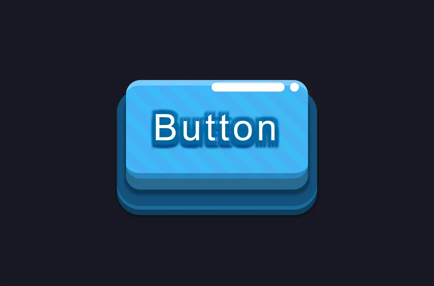
Button #10
- 895.00 B
- HTML, CSS
- Button
- neon
- MIT License
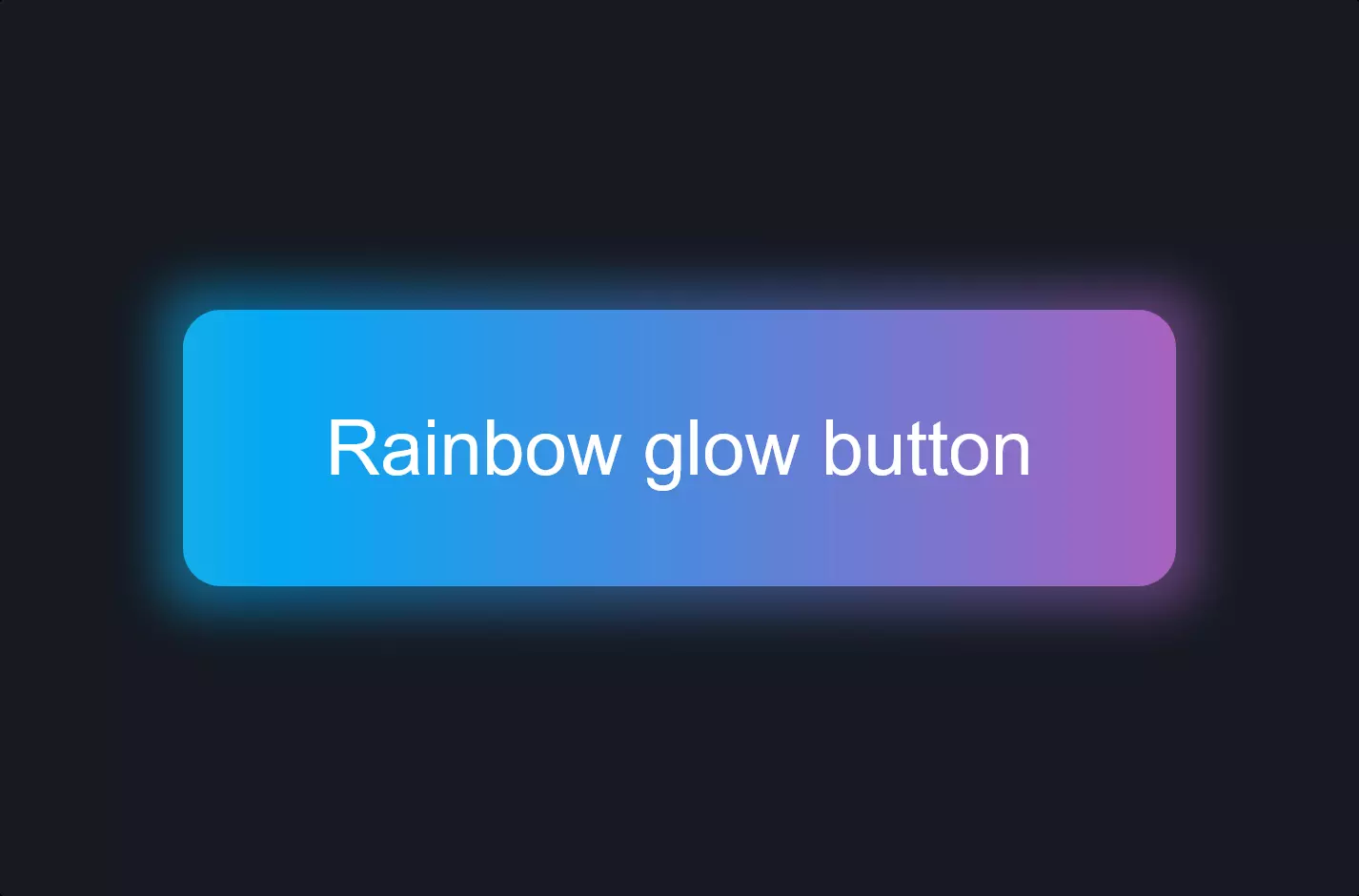
<a class="btn-neon">Button</a>
.btn-neon {
    font-family: Arial;
    border: 2px solid #404040;
    background-color: rgba(70, 70, 70, 0.25);
    -webkit-box-shadow: none;
    -moz-box-shadow: none;
    box-shadow: none;
    color: #565656;
    text-shadow: 0 0 0px transparent;
    font-size: 16px;
    -webkit-transition: 0.2s;
    -o-transition: 0.2s;
    -moz-transition: 0.2s;
    transition: 0.2s;
    padding: 6px 30px;
    line-height: 40px;
    margin: 0;
    -webkit-border-radius: 0;
    -moz-border-radius: 0;
    border-radius: 0;
    cursor: pointer;
}
.btn-neon:hover {
    border: 2px solid #d615c6;
    color: #d615c6;
    text-shadow: 0 0 4px #d615c6;
    -webkit-box-shadow: inset 0 0 6px #d615c6, 0 0 6px #d615c6;
    -moz-box-shadow: inset 0 0 6px #d615c6, 0 0 6px #d615c6;
    box-shadow: inset 0 0 6px #d615c6, 0 0 6px #d615c6;
}
The code snippet provided is a neat example of how HTML and CSS can work together to create visually appealing elements on a webpage, specifically focusing on a button with a neon effect. The HTML part of the code is quite straightforward; it uses an anchor tag <a> with a class name “btn-neon” to represent the button. This simplicity in HTML is key to maintaining the readability and structure of a webpage, allowing for the actual appearance and behavior of the button to be defined separately in CSS.
Now, diving into the CSS, the styling for .btn-neon starts with basics such as font family, border, background color, and font size. These properties ensure the button has a consistent look and feel, aligning with the overall design aesthetic of the page. The use of RGBA for background color offers a subtle transparency, making the design more intricate and modern. Transitions are applied to make changes smooth when the button state changes, such as on hover, enhancing the user experience by providing visual feedback.
The magic really happens with the :hover pseudo-class, transforming the button into a glowing neon beauty upon mouse-over. The border color, text color, and text-shadow are all switched to a vibrant neon color, and box shadows are added (both inset and regular) to create a glowing effect. These shadows not only add depth to the button’s appearance but also emulate the glow of real neon lights, showcasing the power of CSS to create dynamic, engaging web elements that can significantly enhance the user interface without the need for images or heavy JavaScript.