Button #1
- 5.13 KB
- CSS, HTML
- Button
- animation, neon
- MIT License
<a class="button-1" href="#">
    <span></span>
    <span></span>
    <span></span>
    <span></span>
    Button
</a>
:root {
    --color--button-1: #ff1867;
}
.button-1 {
    position: relative;
    padding: 16px 30px;
    font-size: 1.5rem;
    color: var(--color--button-1);
    border: 2px solid rgba(0, 0, 0, 0.5);
    -webkit-border-radius: 4px;
    -moz-border-radius: 4px;
    border-radius: 4px;
    text-shadow: 0 0 15px var(--color--button-1);
    text-decoration: none;
    text-transform: uppercase;
    letter-spacing: 0.1rem;
    -webkit-transition: 0.5s;
    -o-transition: 0.5s;
    -moz-transition: 0.5s;
    transition: 0.5s;
    z-index: 1;
}

.button-1:hover {
    color: #fff;
    border: 2px solid rgba(0, 0, 0, 0);
    -webkit-box-shadow: 0 0 0px var(--color--button-1);
    -moz-box-shadow: 0 0 0px var(--color--button-1);
    box-shadow: 0 0 0px var(--color--button-1);
}

.button-1::before {
    content: "";
    position: absolute;
    top: 0;
    left: 0;
    width: 100%;
    height: 100%;
    background: var(--color--button-1);
    z-index: -1;
    -webkit-transform: scale(0);
    -moz-transform: scale(0);
    -o-transform: scale(0);
    transform: scale(0);
    -webkit-transition: 0.5s;
    -o-transition: 0.5s;
    -moz-transition: 0.5s;
    transition: 0.5s;
}

.button-1:hover::before {
    -webkit-transform: scale(1);
    -moz-transform: scale(1);
    -o-transform: scale(1);
    transform: scale(1);
    -webkit-transition-delay: 0.5s;
    -moz-transition-delay: 0.5s;
    -o-transition-delay: 0.5s;
    transition-delay: 0.5s;
    -webkit-box-shadow: 0 0 10px var(--color--button-1), 0 0 30px var(--color--button-1), 0 0 60px var(--color--button-1);
    -moz-box-shadow: 0 0 10px var(--color--button-1), 0 0 30px var(--color--button-1), 0 0 60px var(--color--button-1);
    box-shadow: 0 0 10px var(--color--button-1), 0 0 30px var(--color--button-1), 0 0 60px var(--color--button-1);
}

.button-1 span {
    position: absolute;
    background: var(--color--button-1);
    pointer-events: none;
    -webkit-border-radius: 2px;
    -moz-border-radius: 2px;
    border-radius: 2px;
    -webkit-box-shadow: 0 0 10px var(--color--button-1), 0 0 20px var(--color--button-1), 0 0 30px var(--color--button-1), 0 0 50px var(--color--button-1), 0 0 100px var(--color--button-1);
    -moz-box-shadow: 0 0 10px var(--color--button-1), 0 0 20px var(--color--button-1), 0 0 30px var(--color--button-1), 0 0 50px var(--color--button-1), 0 0 100px var(--color--button-1);
    box-shadow: 0 0 10px var(--color--button-1), 0 0 20px var(--color--button-1), 0 0 30px var(--color--button-1), 0 0 50px var(--color--button-1), 0 0 100px var(--color--button-1);
    -webkit-transition: 0.5s ease-in-out;
    -o-transition: 0.5s ease-in-out;
    -moz-transition: 0.5s ease-in-out;
    transition: 0.5s ease-in-out;
    -webkit-transition-delay: 0.25s;
    -moz-transition-delay: 0.25s;
    -o-transition-delay: 0.25s;
    transition-delay: 0.25s;
}

.button-1:hover span {
    opacity: 0;
    -webkit-transition-delay: 0s;
    -moz-transition-delay: 0s;
    -o-transition-delay: 0s;
    transition-delay: 0s;
}

.button-1 span:nth-child(1),
.button-1 span:nth-child(3) {
    width: 40px;
    height: 4px;
}

.button-1:hover span:nth-child(1),
.button-1:hover span:nth-child(3) {
    -webkit-transform: translateX(0);
    -moz-transform: translateX(0);
    -o-transform: translateX(0);
    transform: translateX(0);
}

.button-1 span:nth-child(2),
.button-1 span:nth-child(4) {
    width: 4px;
    height: 40px;
}

.button-1:hover span:nth-child(1),
.button-1:hover span:nth-child(3) {
    -webkit-transform: translateY(0);
    -moz-transform: translateY(0);
    -o-transform: translateY(0);
    transform: translateY(0);
}

.button-1 span:nth-child(1) {
    top: -webkit-calc(50% - 2px);
    top: -moz-calc(50% - 2px);
    top: calc(50% - 2px);
    left: -50px;
    -webkit-transform-origin: left;
    -moz-transform-origin: left;
    -o-transform-origin: left;
    transform-origin: left;
}

.button-1:hover span:nth-child(1) {
    left: 50%;
}

.button-1 span:nth-child(3) {
    top: -webkit-calc(50% - 2px);
    top: -moz-calc(50% - 2px);
    top: calc(50% - 2px);
    right: -50px;
    -webkit-transform-origin: right;
    -moz-transform-origin: right;
    -o-transform-origin: right;
    transform-origin: right;
}

.button-1:hover span:nth-child(3) {
    right: 50%;
}

.button-1 span:nth-child(2) {
    left: -webkit-calc(50% - 2px);
    left: -moz-calc(50% - 2px);
    left: calc(50% - 2px);
    top: -50px;
    -webkit-transform-origin: top;
    -moz-transform-origin: top;
    -o-transform-origin: top;
    transform-origin: top;
}

.button-1:hover span:nth-child(2) {
    top: 50%;
}

.button-1 span:nth-child(4) {
    left: -webkit-calc(50% - 2px);
    left: -moz-calc(50% - 2px);
    left: calc(50% - 2px);
    bottom: -50px;
    -webkit-transform-origin: bottom;
    -moz-transform-origin: bottom;
    -o-transform-origin: bottom;
    transform-origin: bottom;
}

.button-1:hover span:nth-child(4) {
    bottom: 50%;
}
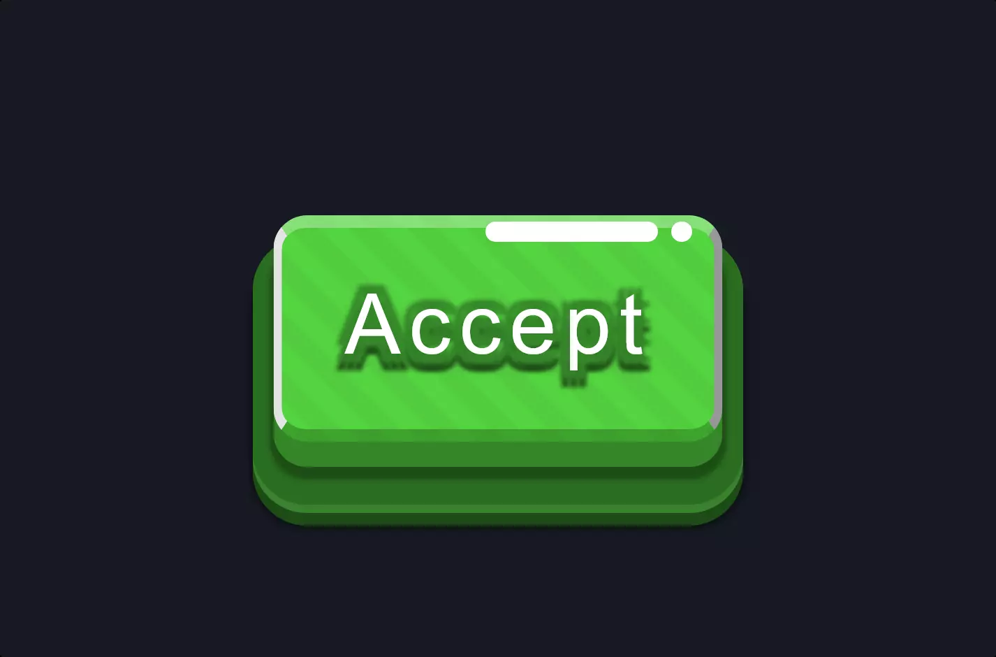
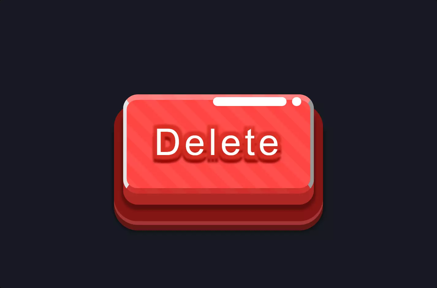
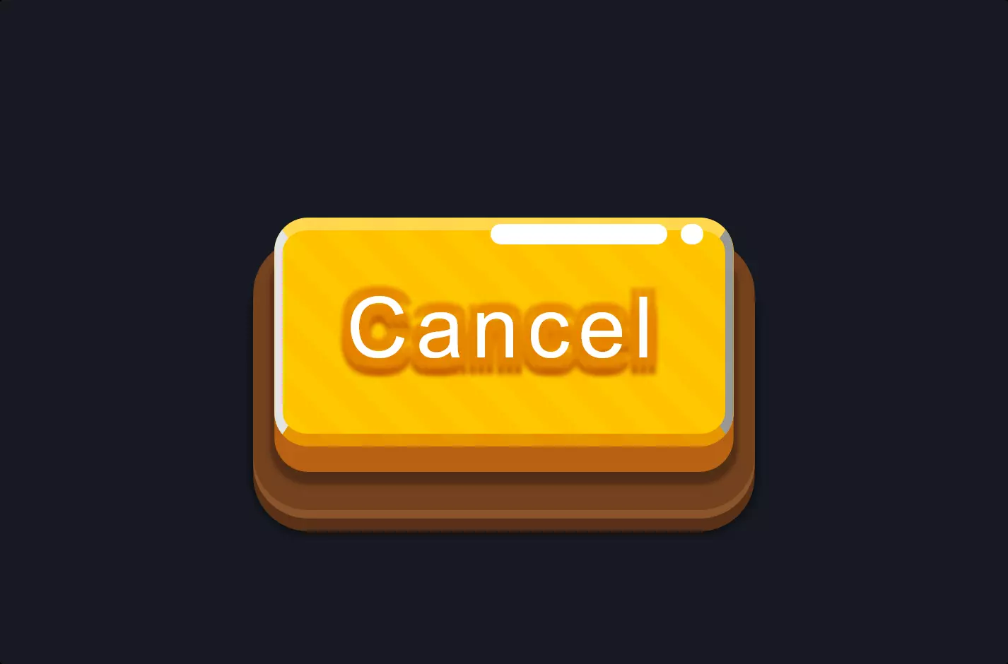
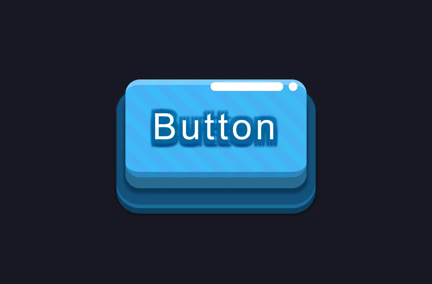
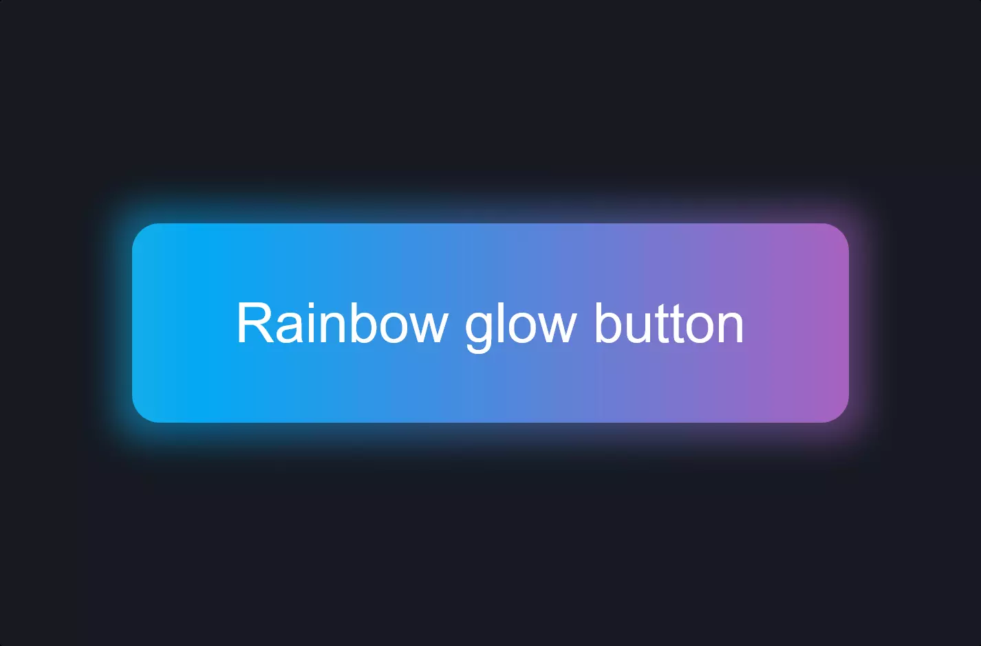
Imagine a button on a website that not just sits there waiting to be clicked, but actually draws your attention with a cool neon glow and an inviting animation, like something out of a futuristic movie. This button, when not hovered over, has a sleek design with a hint of neon color peeking through its borders, hinting at what’s to come. The moment you hover your mouse over it, magic happens. The neon glow intensifies, the color fills the button entirely, and it seems to come alive, pulsating with light and inviting you to click.
This isn’t just any button; it’s a masterpiece of CSS trickery. The button starts off with a basic structure, but with the addition of four little spans inside, it’s prepped for a transformation. These spans are hidden initially, serving as the secret agents of animation. With a dash of CSS, they are configured to spring into action upon hovering, moving into place to create a captivating visual effect that frames the button in a neon blaze.
The neon effect is achieved through carefully crafted CSS properties. Colors, shadows, and animations are meticulously adjusted to ensure that when the button is hovered over, it not only changes color but also radiates a neon glow that expands beyond its borders. This glow is not static; it’s dynamic, created through a combination of box shadows and transitions that make the light appear to pulsate around the button.
The animation is subtle yet complex, involving scaling and transforming the button’s background and its hidden spans to achieve that perfect neon sign look. This involves coordinating the timing and extent of transformations to ensure a smooth, eye-catching transition from a simple button to a glowing invitation to interact.
In essence, this button is not just a clickable element on a webpage. It’s an invitation to interact, a beacon that stands out against the static backdrop of the internet. Through a blend of CSS properties, it transforms from a simple interactive element into a glowing piece of art that enhances the user’s experience, making the act of clicking a button not just functional, but a visually engaging experience.