Text #8
- 4.93 KB
- HTML, CSS
- Text
- animation, neon
- MIT License
<h1 contenteditable spellcheck="false">open</h1>
@import url(https://fonts.googleapis.com/css?family=Exo+2:200i);

:root {
    --neon-text-color: #f40;
    --neon-border-color: #08f;
}

body {
    font-family: "Exo 2", sans-serif;
    display: -webkit-box;
    display: -webkit-flex;
    display: -moz-box;
    display: flex;
    -webkit-box-pack: center;
    -webkit-justify-content: center;
    -moz-box-pack: center;
    justify-content: center;
    -webkit-box-align: center;
    -webkit-align-items: center;
    -moz-box-align: center;
    align-items: center;
}

h1 {
    font-size: 13rem;
    font-weight: 200;
    font-style: italic;
    color: #fff;
    padding: 4rem 6rem 5.5rem;
    border: 0.4rem solid #fff;
    -webkit-border-radius: 2rem;
    -moz-border-radius: 2rem;
    border-radius: 2rem;
    text-transform: uppercase;
    -webkit-animation: flicker 1.5s infinite alternate;
    -moz-animation: flicker 1.5s infinite alternate;
    -o-animation: flicker 1.5s infinite alternate;
    animation: flicker 1.5s infinite alternate;
}

h1::-moz-selection {
    background-color: var(--neon-border-color);
    color: var(--neon-text-color);
}

h1::selection {
    background-color: var(--neon-border-color);
    color: var(--neon-text-color);
}

h1:focus {
    outline: none;
}

@-webkit-keyframes flicker {
    0%,
    19%,
    21%,
    23%,
    25%,
    54%,
    56%,
    100% {
        text-shadow: -0.2rem -0.2rem 1rem #fff, 0.2rem 0.2rem 1rem #fff, 0 0 2rem var(--neon-text-color), 0 0 4rem var(--neon-text-color), 0 0 6rem var(--neon-text-color), 0 0 8rem var(--neon-text-color), 0 0 10rem var(--neon-text-color);

        -webkit-box-shadow: 0 0 0.5rem #fff, inset 0 0 0.5rem #fff, 0 0 2rem var(--neon-border-color), inset 0 0 2rem var(--neon-border-color), 0 0 4rem var(--neon-border-color), inset 0 0 4rem var(--neon-border-color);

        box-shadow: 0 0 0.5rem #fff, inset 0 0 0.5rem #fff, 0 0 2rem var(--neon-border-color), inset 0 0 2rem var(--neon-border-color), 0 0 4rem var(--neon-border-color), inset 0 0 4rem var(--neon-border-color);
    }

    20%,
    24%,
    55% {
        text-shadow: none;
        -webkit-box-shadow: none;
        box-shadow: none;
    }
}

@-moz-keyframes flicker {
    0%,
    19%,
    21%,
    23%,
    25%,
    54%,
    56%,
    100% {
        text-shadow: -0.2rem -0.2rem 1rem #fff, 0.2rem 0.2rem 1rem #fff, 0 0 2rem var(--neon-text-color), 0 0 4rem var(--neon-text-color), 0 0 6rem var(--neon-text-color), 0 0 8rem var(--neon-text-color), 0 0 10rem var(--neon-text-color);

        -moz-box-shadow: 0 0 0.5rem #fff, inset 0 0 0.5rem #fff, 0 0 2rem var(--neon-border-color), inset 0 0 2rem var(--neon-border-color), 0 0 4rem var(--neon-border-color), inset 0 0 4rem var(--neon-border-color);

        box-shadow: 0 0 0.5rem #fff, inset 0 0 0.5rem #fff, 0 0 2rem var(--neon-border-color), inset 0 0 2rem var(--neon-border-color), 0 0 4rem var(--neon-border-color), inset 0 0 4rem var(--neon-border-color);
    }

    20%,
    24%,
    55% {
        text-shadow: none;
        -moz-box-shadow: none;
        box-shadow: none;
    }
}

@-o-keyframes flicker {
    0%,
    19%,
    21%,
    23%,
    25%,
    54%,
    56%,
    100% {
        text-shadow: -0.2rem -0.2rem 1rem #fff, 0.2rem 0.2rem 1rem #fff, 0 0 2rem var(--neon-text-color), 0 0 4rem var(--neon-text-color), 0 0 6rem var(--neon-text-color), 0 0 8rem var(--neon-text-color), 0 0 10rem var(--neon-text-color);

        box-shadow: 0 0 0.5rem #fff, inset 0 0 0.5rem #fff, 0 0 2rem var(--neon-border-color), inset 0 0 2rem var(--neon-border-color), 0 0 4rem var(--neon-border-color), inset 0 0 4rem var(--neon-border-color);
    }

    20%,
    24%,
    55% {
        text-shadow: none;
        box-shadow: none;
    }
}

@keyframes flicker {
    0%,
    19%,
    21%,
    23%,
    25%,
    54%,
    56%,
    100% {
        text-shadow: -0.2rem -0.2rem 1rem #fff, 0.2rem 0.2rem 1rem #fff, 0 0 2rem var(--neon-text-color), 0 0 4rem var(--neon-text-color), 0 0 6rem var(--neon-text-color), 0 0 8rem var(--neon-text-color), 0 0 10rem var(--neon-text-color);

        -webkit-box-shadow: 0 0 0.5rem #fff, inset 0 0 0.5rem #fff, 0 0 2rem var(--neon-border-color), inset 0 0 2rem var(--neon-border-color), 0 0 4rem var(--neon-border-color), inset 0 0 4rem var(--neon-border-color);

        -moz-box-shadow: 0 0 0.5rem #fff, inset 0 0 0.5rem #fff, 0 0 2rem var(--neon-border-color), inset 0 0 2rem var(--neon-border-color), 0 0 4rem var(--neon-border-color), inset 0 0 4rem var(--neon-border-color);

        box-shadow: 0 0 0.5rem #fff, inset 0 0 0.5rem #fff, 0 0 2rem var(--neon-border-color), inset 0 0 2rem var(--neon-border-color), 0 0 4rem var(--neon-border-color), inset 0 0 4rem var(--neon-border-color);
    }

    20%,
    24%,
    55% {
        text-shadow: none;
        -webkit-box-shadow: none;
        -moz-box-shadow: none;
        box-shadow: none;
    }
}
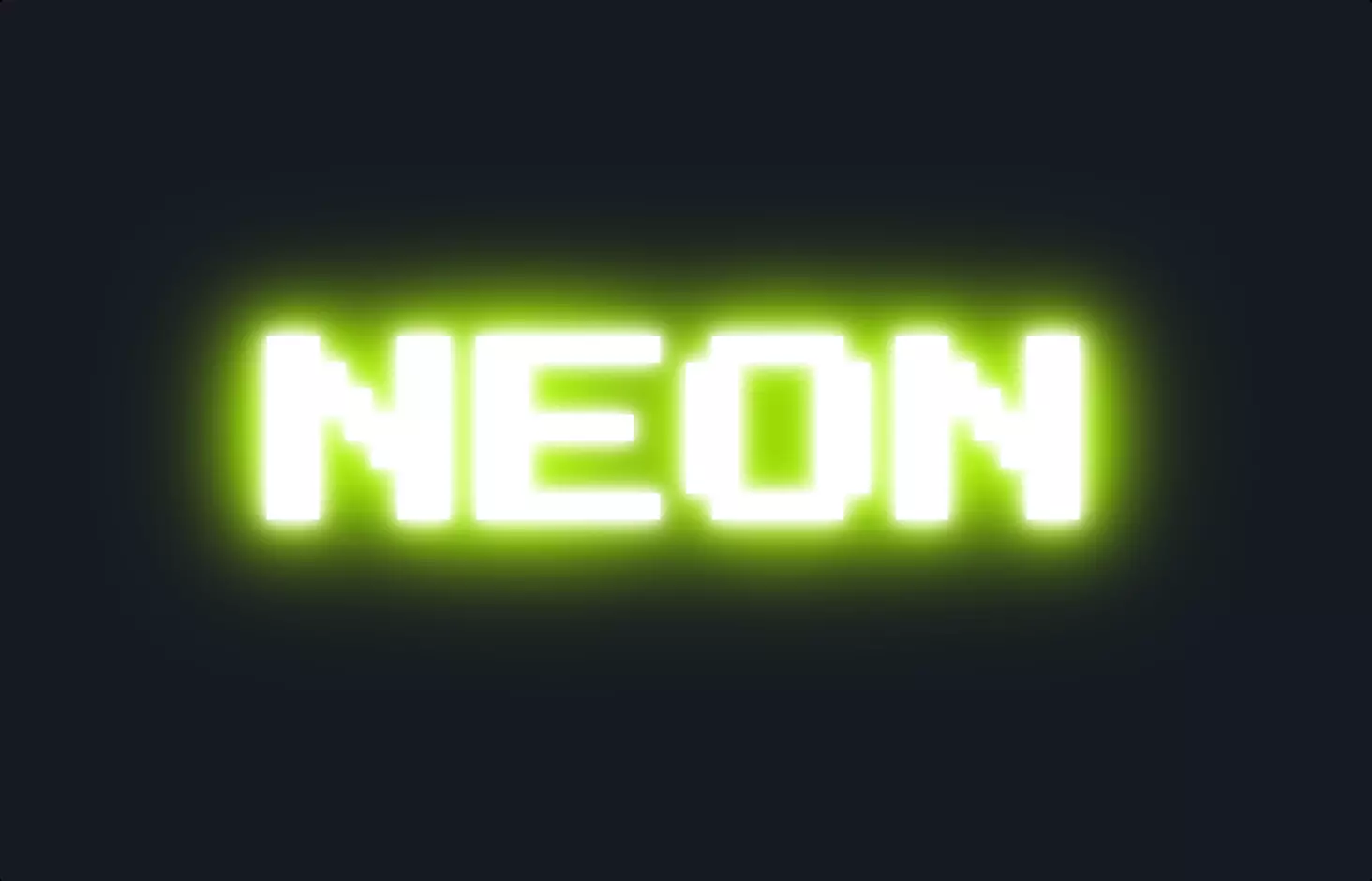
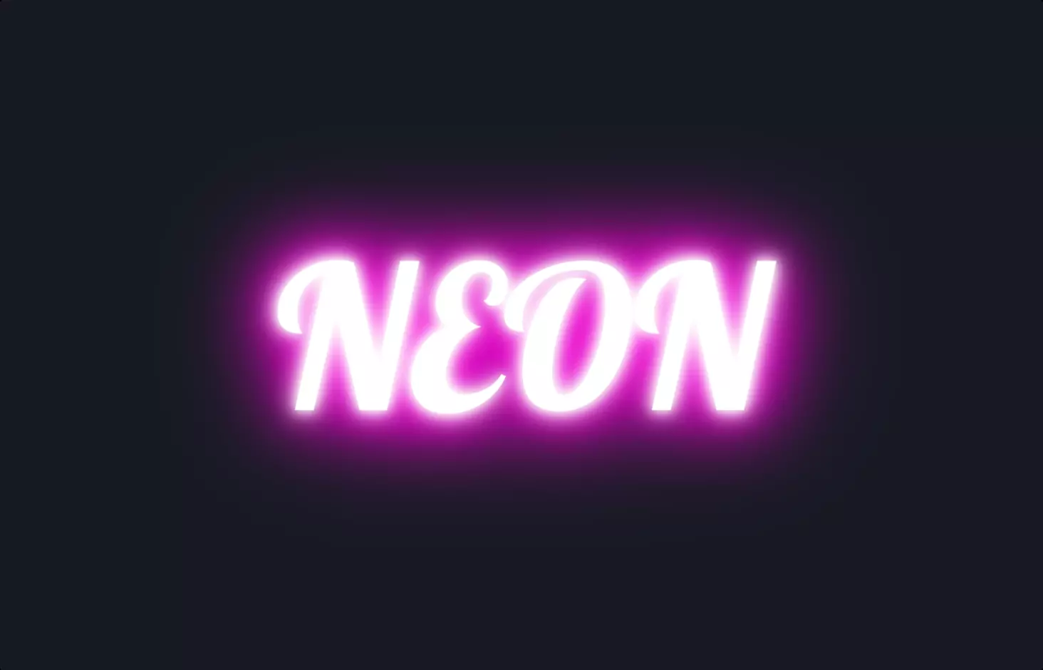
The code snippet provided is a stylish way to create a neon text effect using HTML and CSS. It starts by defining a heading <h1> element that is editable and does not check for spelling errors, setting the stage for the content that will be styled. The CSS part is where the magic happens, bringing this neon effect to life.
Firstly, the CSS uses the @import rule to include a specific font from Google Fonts, setting a creative and modern vibe right from the start. Then, it employs CSS custom properties (variables) to define colors for the neon text and its border, allowing for easy adjustments and a consistent theme throughout the style.
The core of the neon effect is achieved through CSS text animations named flicker. This animation alters the text-shadow and box-shadow properties over time, creating a dynamic, flickering neon light effect. The text-shadow and box-shadow properties are meticulously crafted to mimic the glow and depth of real neon lights, with multiple layers of shadows and glows that enhance the neon effect. This animation is applied to the <h1> element, making the text appear as if it’s a flickering neon sign.
This approach of combining CSS animations with shadows not only creates an eye-catching visual but also demonstrates the power of CSS to transform static text into something vibrant and lively. The neon effect is a fun way to add personality and flair to web designs, showcasing how simple text can be transformed into a piece of art with the right CSS techniques.