Text #6
- 2.00 KB
- HTML, CSS
- Text
- animation, glow, neon
- MIT License
<a href="#">Neon</a>
@import url("https://fonts.googleapis.com/css2?family=Press+Start+2P&display=swap");
a {
    text-transform: uppercase;
    font-size: 7rem;
    line-height: 1;
    text-decoration: none;
    color: #fff;
    font-family: "Press Start 2P", system-ui;
    -webkit-animation: neon 1.5s ease-in-out infinite alternate;
    -moz-animation: neon 1.5s ease-in-out infinite alternate;
    -o-animation: neon 1.5s ease-in-out infinite alternate;
    animation: neon 1.5s ease-in-out infinite alternate;
}
@-webkit-keyframes neon {
    from {
        text-shadow: 0 0 10px #fff, 0 0 20px #fff, 0 0 30px #fff, 0 0 40px #b6ff00, 0 0 70px #b6ff00, 0 0 80px #b6ff00, 0 0 100px #b6ff00, 0 0 150px #b6ff00;
    }
    to {
        text-shadow: 0 0 5px #fff, 0 0 10px #fff, 0 0 15px #fff, 0 0 20px #b6ff00, 0 0 35px #b6ff00, 0 0 40px #b6ff00, 0 0 50px #b6ff00, 0 0 75px #b6ff00;
    }
}
@-moz-keyframes neon {
    from {
        text-shadow: 0 0 10px #fff, 0 0 20px #fff, 0 0 30px #fff, 0 0 40px #b6ff00, 0 0 70px #b6ff00, 0 0 80px #b6ff00, 0 0 100px #b6ff00, 0 0 150px #b6ff00;
    }
    to {
        text-shadow: 0 0 5px #fff, 0 0 10px #fff, 0 0 15px #fff, 0 0 20px #b6ff00, 0 0 35px #b6ff00, 0 0 40px #b6ff00, 0 0 50px #b6ff00, 0 0 75px #b6ff00;
    }
}
@-o-keyframes neon {
    from {
        text-shadow: 0 0 10px #fff, 0 0 20px #fff, 0 0 30px #fff, 0 0 40px #b6ff00, 0 0 70px #b6ff00, 0 0 80px #b6ff00, 0 0 100px #b6ff00, 0 0 150px #b6ff00;
    }
    to {
        text-shadow: 0 0 5px #fff, 0 0 10px #fff, 0 0 15px #fff, 0 0 20px #b6ff00, 0 0 35px #b6ff00, 0 0 40px #b6ff00, 0 0 50px #b6ff00, 0 0 75px #b6ff00;
    }
}
@keyframes neon {
    from {
        text-shadow: 0 0 10px #fff, 0 0 20px #fff, 0 0 30px #fff, 0 0 40px #b6ff00, 0 0 70px #b6ff00, 0 0 80px #b6ff00, 0 0 100px #b6ff00, 0 0 150px #b6ff00;
    }
    to {
        text-shadow: 0 0 5px #fff, 0 0 10px #fff, 0 0 15px #fff, 0 0 20px #b6ff00, 0 0 35px #b6ff00, 0 0 40px #b6ff00, 0 0 50px #b6ff00, 0 0 75px #b6ff00;
    }
}
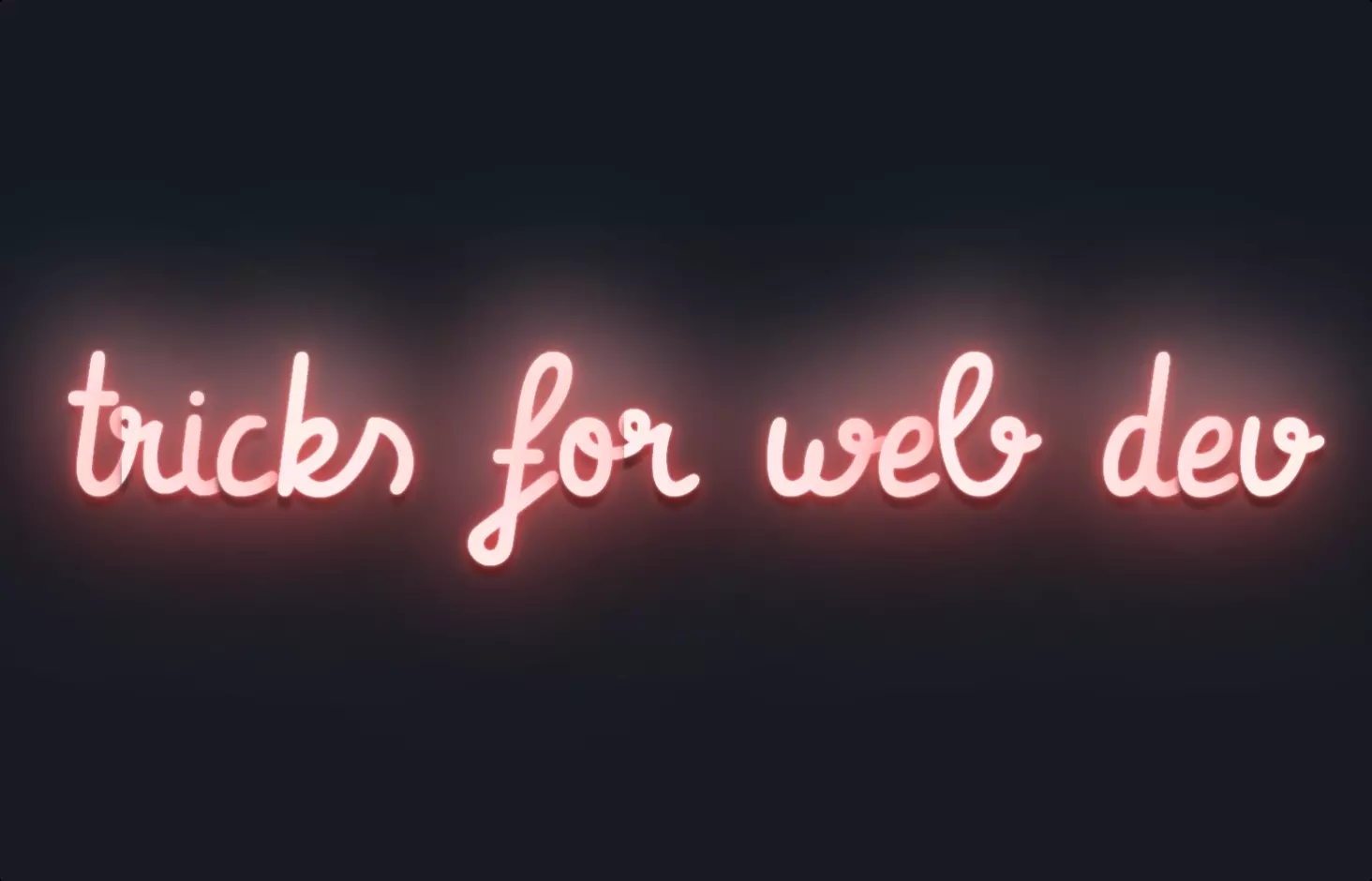
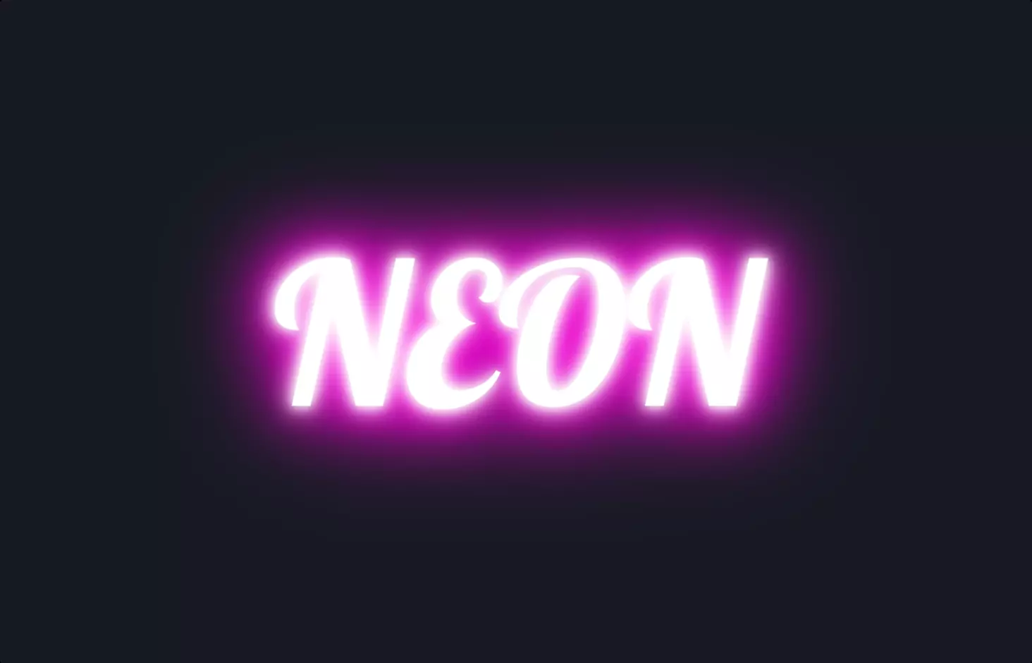
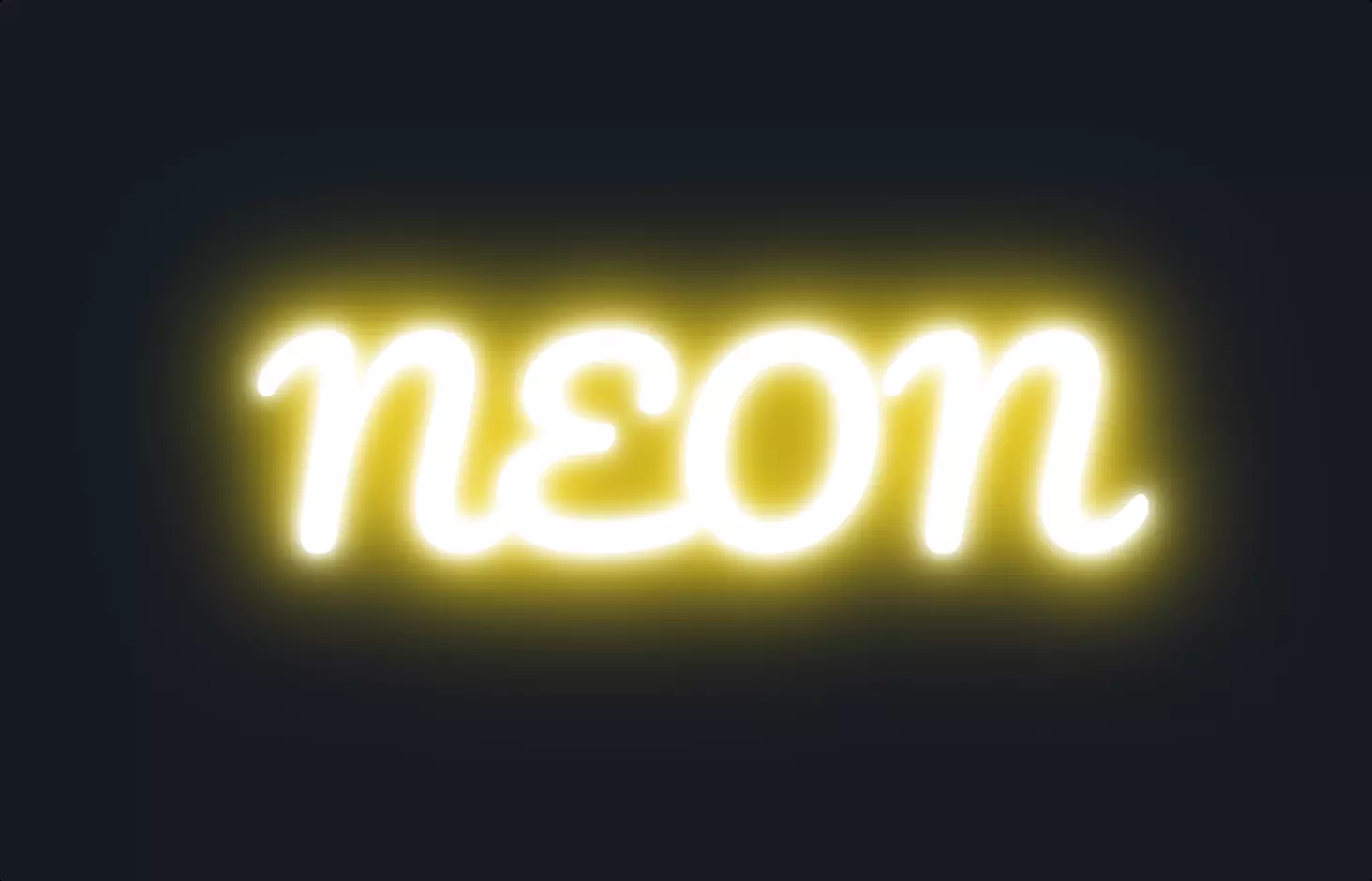
The code snippet we’re exploring today is all about creating a visually striking effect for web text, making it pop with a neon glow animation. Imagine the buzzing neon signs that light up the night in a bustling city street; that’s the vibe we’re aiming for with our web text.
Starting with the HTML part, we have a simple anchor tag <a href="#"> with the text “Neon.” This is the skeleton of our project, the text that we want to light up in the neon style. Now, the magic happens in the CSS, where we define how this text will transform into something eye-catching.
In the CSS, there’s a significant focus on animation and text styling. We use a custom font imported from Google Fonts to give our text a unique appearance right off the bat. The font, “Press Start 2P,” has a pixelated, retro game vibe, complementing the neon effect we’re after. The CSS rules for the anchor tag set up the stage for the neon effect by making the text uppercase, adjusting its size to be larger, and setting its color to white, which is crucial for the glow effect.
The heart of the neon text is in the animation and text-shadow properties. The animation named “neon” is defined to last 1.5 seconds, with an ease-in-out timing function, creating a smooth transition between animation frames and an infinite loop to keep the animation running. The keyframes for the “neon” animation fluctuate the text shadow to simulate a glowing effect, transitioning from a more intense glow to a subtler one and back. The colors used in the text shadow—white and a vibrant lime green—create the iconic neon sign glow, with varying blur radii to enhance the illusion of depth and brightness.
This snippet cleverly combines modern web technologies to recreate a nostalgic and visually appealing effect. By manipulating text shadows and animation, a simple piece of text is transformed into a glowing neon spectacle, demonstrating how CSS can be used creatively to enhance the visual appeal of web content.