Text #7
- 3.11 KB
- HTML, CSS
- Text
- animation, glow, neon
- MIT License
<div class="logo">
    <b> t<span>ri</span>c<span></span>ks </b>
    <b> f<span>o</span>r<span></span> </b>
    <b> w<span>e</span><span></span>b </b>
    <b> <span>d</span>e<span>v</span> </b>
</div>
@import url(//fonts.googleapis.com/css?family=Vibur);
.logo {
    -webkit-user-select: none;
    -moz-user-select: none;
    -ms-user-select: none;
    user-select: none;
}

.logo b {
    font: 400 19vh "Vibur";
    color: #fee;
    text-shadow: 0 -40px 100px, 0 0 2px, 0 0 1em #ff4444, 0 0 0.5em #ff4444, 0 0 0.1em #ff4444, 0 10px 3px #000;
}
.logo b span {
    -webkit-animation: blink linear infinite 2s;
    -moz-animation: blink linear infinite 2s;
    -o-animation: blink linear infinite 2s;
    animation: blink linear infinite 2s;
}
.logo b span:nth-of-type(2) {
    -webkit-animation: blink linear infinite 3s;
    -moz-animation: blink linear infinite 3s;
    -o-animation: blink linear infinite 3s;
    animation: blink linear infinite 3s;
}
@-webkit-keyframes blink {
    78% {
        color: inherit;
        text-shadow: inherit;
    }
    79% {
        color: #333;
    }
    80% {
        text-shadow: none;
    }
    81% {
        color: inherit;
        text-shadow: inherit;
    }
    82% {
        color: #333;
        text-shadow: none;
    }
    83% {
        color: inherit;
        text-shadow: inherit;
    }
    92% {
        color: #333;
        text-shadow: none;
    }
    92.5% {
        color: inherit;
        text-shadow: inherit;
    }
}
@-moz-keyframes blink {
    78% {
        color: inherit;
        text-shadow: inherit;
    }
    79% {
        color: #333;
    }
    80% {
        text-shadow: none;
    }
    81% {
        color: inherit;
        text-shadow: inherit;
    }
    82% {
        color: #333;
        text-shadow: none;
    }
    83% {
        color: inherit;
        text-shadow: inherit;
    }
    92% {
        color: #333;
        text-shadow: none;
    }
    92.5% {
        color: inherit;
        text-shadow: inherit;
    }
}
@-o-keyframes blink {
    78% {
        color: inherit;
        text-shadow: inherit;
    }
    79% {
        color: #333;
    }
    80% {
        text-shadow: none;
    }
    81% {
        color: inherit;
        text-shadow: inherit;
    }
    82% {
        color: #333;
        text-shadow: none;
    }
    83% {
        color: inherit;
        text-shadow: inherit;
    }
    92% {
        color: #333;
        text-shadow: none;
    }
    92.5% {
        color: inherit;
        text-shadow: inherit;
    }
}
@keyframes blink {
    78% {
        color: inherit;
        text-shadow: inherit;
    }
    79% {
        color: #333;
    }
    80% {
        text-shadow: none;
    }
    81% {
        color: inherit;
        text-shadow: inherit;
    }
    82% {
        color: #333;
        text-shadow: none;
    }
    83% {
        color: inherit;
        text-shadow: inherit;
    }
    92% {
        color: #333;
        text-shadow: none;
    }
    92.5% {
        color: inherit;
        text-shadow: inherit;
    }
}
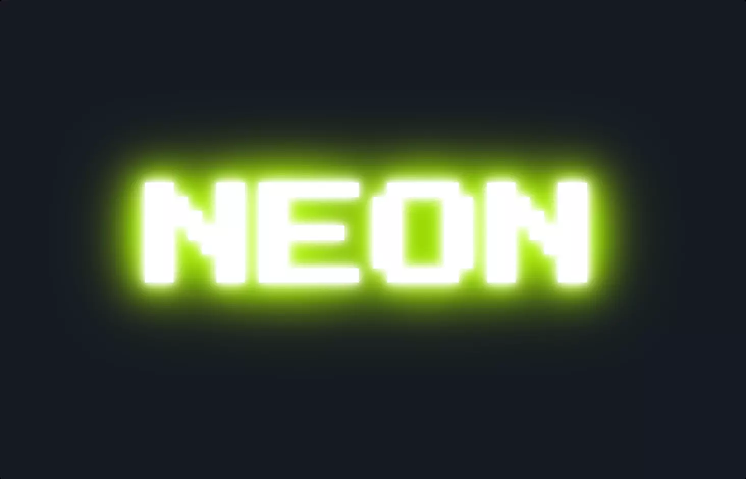
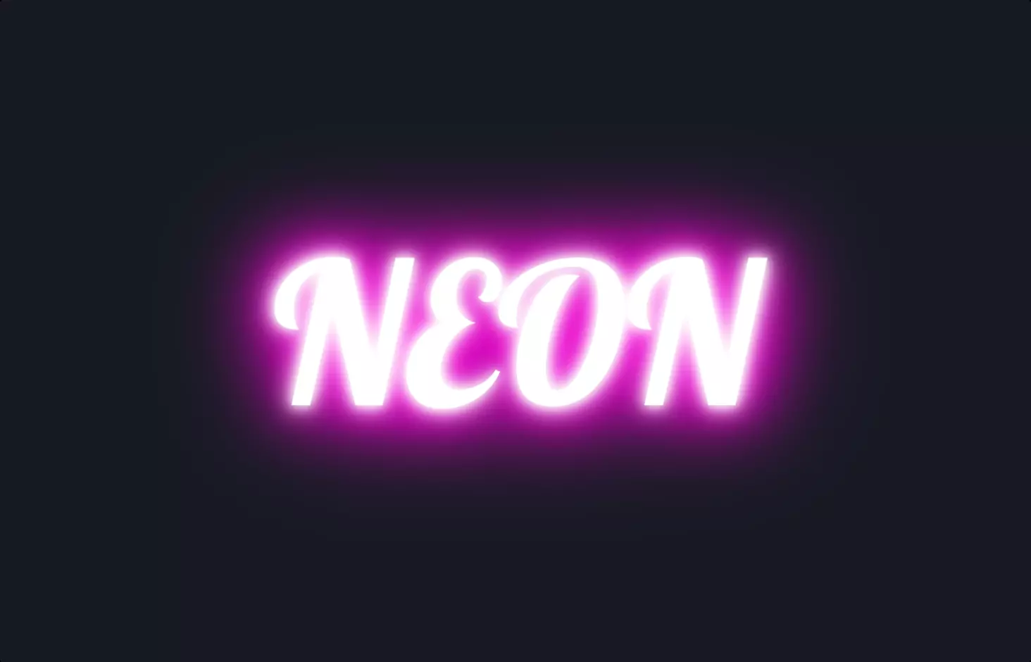
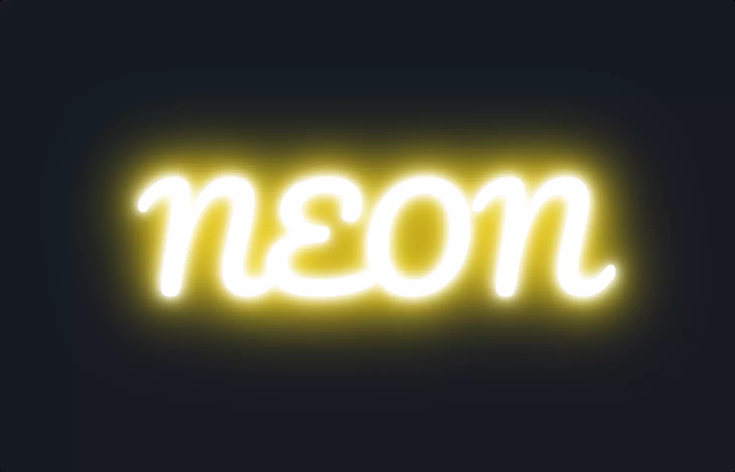
The code snippet we’re diving into is a creative blend of HTML and CSS, designed to produce a visually captivating effect reminiscent of neon signs, specifically focusing on animation and text glow to create that neon text allure.
Starting off, the HTML structure is straightforward yet effective. It employs a <div> element classed as .logo inside of which bold tags <b> wrap around the text. This text is broken into spans to allow for individual animation effects on parts of the text, simulating the flickering and glowing characteristic of neon signs. This method of segmenting the text not only enhances the visual appeal but also provides a granular control over the animation timing and style of each part of the text.
On the CSS side, the magic happens with the @keyframes rule named blink which is responsible for the animation effect. The rule defines a sequence of styling changes over time, creating a blinking effect that mimics the flickering of a neon sign. The animation is applied to the <span> elements within the text, with different animation durations set to create a staggered, more natural glow neon effect. Additionally, the text shadow property is extensively used to create the glow around the text, with multiple layers of shadows in varying opacities and spreads to simulate the diffuse glow of real neon lights. The choice of colors, shadow intensity, and animation timing are crucial here, as they combine to evoke the classic neon aesthetic.
This creative use of CSS animations and styling to simulate neon lighting effects showcases the power of CSS to create engaging and visually appealing web content. It’s a brilliant example of how combining basic HTML structures with advanced CSS techniques can bring text to life, making it not just informative but also a visually immersive experience.