Text #5
- 1.98 KB
- HTML, CSS
- Text
- animation, glow, neon
- MIT License
<a href="#">Neon</a>
@import url("https://fonts.googleapis.com/css2?family=Pacifico&display=swap");
a {
    text-transform: uppercase;
    font-size: 7rem;
    line-height: 1;
    text-decoration: none;
    color: #fff;
    font-family: Pacifico;
    -webkit-animation: neon 1.5s ease-in-out infinite alternate;
    -moz-animation: neon 1.5s ease-in-out infinite alternate;
    -o-animation: neon 1.5s ease-in-out infinite alternate;
    animation: neon 1.5s ease-in-out infinite alternate;
}
@-webkit-keyframes neon {
    from {
        text-shadow: 0 0 10px #fff, 0 0 20px #fff, 0 0 30px #fff, 0 0 40px #ffdd1b, 0 0 70px #ffdd1b, 0 0 80px #ffdd1b, 0 0 100px #ffdd1b, 0 0 150px #ffdd1b;
    }
    to {
        text-shadow: 0 0 5px #fff, 0 0 10px #fff, 0 0 15px #fff, 0 0 20px #ffdd1b, 0 0 35px #ffdd1b, 0 0 40px #ffdd1b, 0 0 50px #ffdd1b, 0 0 75px #ffdd1b;
    }
}
@-moz-keyframes neon {
    from {
        text-shadow: 0 0 10px #fff, 0 0 20px #fff, 0 0 30px #fff, 0 0 40px #ffdd1b, 0 0 70px #ffdd1b, 0 0 80px #ffdd1b, 0 0 100px #ffdd1b, 0 0 150px #ffdd1b;
    }
    to {
        text-shadow: 0 0 5px #fff, 0 0 10px #fff, 0 0 15px #fff, 0 0 20px #ffdd1b, 0 0 35px #ffdd1b, 0 0 40px #ffdd1b, 0 0 50px #ffdd1b, 0 0 75px #ffdd1b;
    }
}
@-o-keyframes neon {
    from {
        text-shadow: 0 0 10px #fff, 0 0 20px #fff, 0 0 30px #fff, 0 0 40px #ffdd1b, 0 0 70px #ffdd1b, 0 0 80px #ffdd1b, 0 0 100px #ffdd1b, 0 0 150px #ffdd1b;
    }
    to {
        text-shadow: 0 0 5px #fff, 0 0 10px #fff, 0 0 15px #fff, 0 0 20px #ffdd1b, 0 0 35px #ffdd1b, 0 0 40px #ffdd1b, 0 0 50px #ffdd1b, 0 0 75px #ffdd1b;
    }
}
@keyframes neon {
    from {
        text-shadow: 0 0 10px #fff, 0 0 20px #fff, 0 0 30px #fff, 0 0 40px #ffdd1b, 0 0 70px #ffdd1b, 0 0 80px #ffdd1b, 0 0 100px #ffdd1b, 0 0 150px #ffdd1b;
    }
    to {
        text-shadow: 0 0 5px #fff, 0 0 10px #fff, 0 0 15px #fff, 0 0 20px #ffdd1b, 0 0 35px #ffdd1b, 0 0 40px #ffdd1b, 0 0 50px #ffdd1b, 0 0 75px #ffdd1b;
    }
}
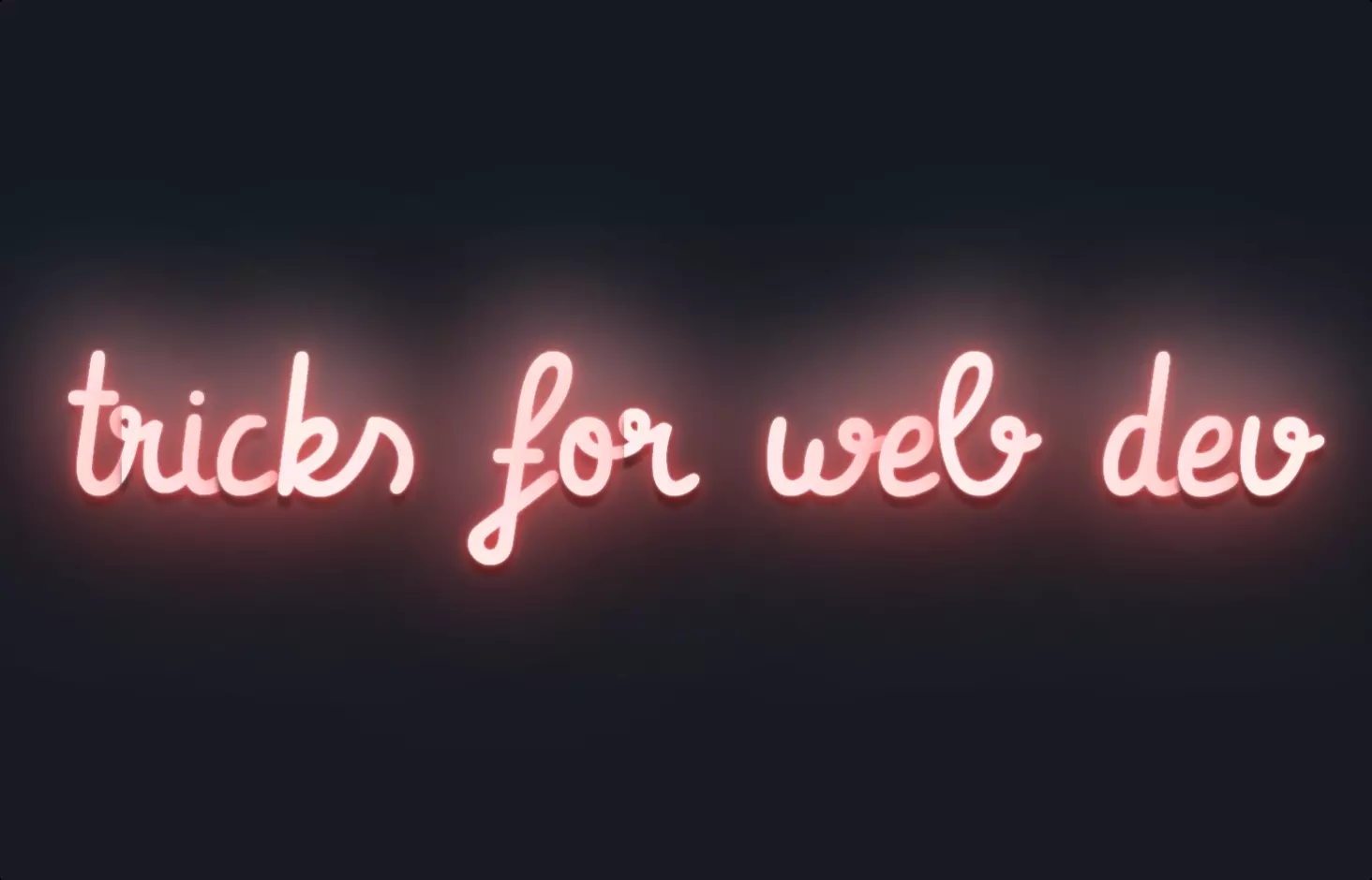
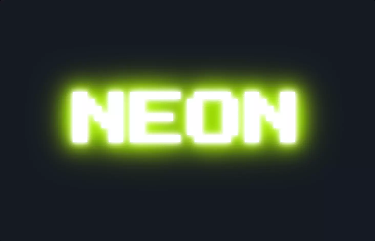
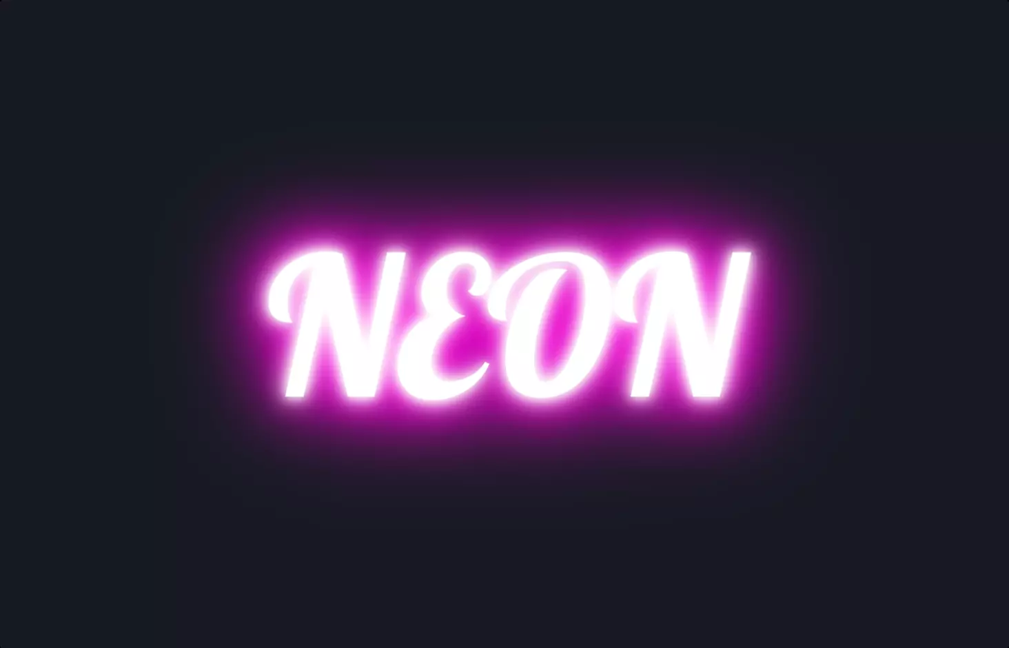
The code snippet we’re diving into is all about bringing some flashy style to web design using HTML and CSS, specifically focusing on creating a neon glow effect for text, which can add a cool, retro vibe to any webpage. It kicks off with a simple HTML anchor tag, <a href="#">Neon</a>, which is your standard hyperlink. But here, it’s not just any link; it’s the canvas for our neon effect, destined to stand out with its bright, glowing appearance.
Now, onto the CSS magic that turns our plain text into a neon sign. The CSS starts by importing a fancy font from Google Fonts, giving our text that authentic neon look. The real fun begins with the <a> selector, where we set the stage: uppercase text, a massive font size for impact, and crucially, the animation property linked to a neon keyframe. This animation cycles through two states, giving our text a pulsing glow effect that mimics real neon signs.
The glow is achieved through the @keyframes neon part, where from and to states define the glow’s intensity and spread. It uses text-shadow with varying blurs and colors, transitioning from a wide, intense glow to a more subdued one, and back again. This cycling creates the animated glow effect, bringing the neon text to life. Whether you’re a web design newbie or a seasoned pro, adding this kind of animated text effect can make your projects pop with personality and style.