Text #4
- 1.98 KB
- HTML, CSS
- Text
- animation, glow, neon
- MIT License
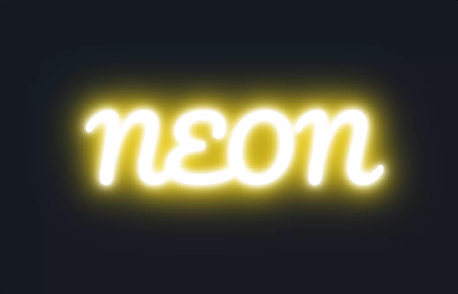
<a href="#">Neon</a>
@import url("https://fonts.googleapis.com/css2?family=Lobster&display=swap");
a {
    text-transform: uppercase;
    font-size: 7rem;
    line-height: 1;
    text-decoration: none;
    color: #fff;
    font-family: Lobster;
    -webkit-animation: neon 1.5s ease-in-out infinite alternate;
    -moz-animation: neon 1.5s ease-in-out infinite alternate;
    -o-animation: neon 1.5s ease-in-out infinite alternate;
    animation: neon 1.5s ease-in-out infinite alternate;
}
@-webkit-keyframes neon {
    from {
        text-shadow: 0 0 10px #fff, 0 0 20px #fff, 0 0 30px #fff, 0 0 40px #ff00de, 0 0 70px #ff00de, 0 0 80px #ff00de, 0 0 100px #ff00de, 0 0 150px #ff00de;
    }
    to {
        text-shadow: 0 0 5px #fff, 0 0 10px #fff, 0 0 15px #fff, 0 0 20px #ff00de, 0 0 35px #ff00de, 0 0 40px #ff00de, 0 0 50px #ff00de, 0 0 75px #ff00de;
    }
}
@-moz-keyframes neon {
    from {
        text-shadow: 0 0 10px #fff, 0 0 20px #fff, 0 0 30px #fff, 0 0 40px #ff00de, 0 0 70px #ff00de, 0 0 80px #ff00de, 0 0 100px #ff00de, 0 0 150px #ff00de;
    }
    to {
        text-shadow: 0 0 5px #fff, 0 0 10px #fff, 0 0 15px #fff, 0 0 20px #ff00de, 0 0 35px #ff00de, 0 0 40px #ff00de, 0 0 50px #ff00de, 0 0 75px #ff00de;
    }
}
@-o-keyframes neon {
    from {
        text-shadow: 0 0 10px #fff, 0 0 20px #fff, 0 0 30px #fff, 0 0 40px #ff00de, 0 0 70px #ff00de, 0 0 80px #ff00de, 0 0 100px #ff00de, 0 0 150px #ff00de;
    }
    to {
        text-shadow: 0 0 5px #fff, 0 0 10px #fff, 0 0 15px #fff, 0 0 20px #ff00de, 0 0 35px #ff00de, 0 0 40px #ff00de, 0 0 50px #ff00de, 0 0 75px #ff00de;
    }
}
@keyframes neon {
    from {
        text-shadow: 0 0 10px #fff, 0 0 20px #fff, 0 0 30px #fff, 0 0 40px #ff00de, 0 0 70px #ff00de, 0 0 80px #ff00de, 0 0 100px #ff00de, 0 0 150px #ff00de;
    }
    to {
        text-shadow: 0 0 5px #fff, 0 0 10px #fff, 0 0 15px #fff, 0 0 20px #ff00de, 0 0 35px #ff00de, 0 0 40px #ff00de, 0 0 50px #ff00de, 0 0 75px #ff00de;
    }
}
The code snippet presents an exciting way to add a neon glow effect to text using HTML and CSS, creating an animation that makes the text appear as if it’s pulsating with a neon light. It starts with a simple HTML anchor tag, styled to transform the appearance into an eye-catching neon effect. The CSS part is where the magic happens, employing @keyframes to animate the text’s glow. This animation creates a dynamic visual by alternating the intensity and spread of the text’s shadow, mimicking the flickering of a neon sign.
The CSS code uses text-shadow in combination with keyframes named neon to achieve this effect. It specifies a range of shadow effects that vary in size and intensity, transitioning smoothly from a more spread out and intense glow to a subtler one. This is done using the from and to properties within the keyframes, which dictate the starting and ending states of the animation, respectively.
Moreover, the use of -webkit-, -moz-, and -o- prefixes before animation and @keyframes ensures cross-browser compatibility, allowing this beautiful glow neon text effect to work across different web browsers. This attention to detail ensures that the neon text animation can be enjoyed by a wider audience, regardless of their browser choice. The inclusion of a custom font from Google Fonts further enhances the visual appeal, making the neon effect even more pronounced and stylish.