Menu #21
- 12+
- 26+
- 16+
- 12.1+
- 9+
- 26+
- 16+
- 14+
- 9+
- 1.5+
- 37+
- 1.62 KB
- HTML, CSS
- Menu
- sidebar, sliding, vertical
- MIT License
<link rel="stylesheet" href="https://maxcdn.bootstrapcdn.com/font-awesome/4.6.3/css/font-awesome.min.css" />
<ul class="side-menu">
    <li>
        <a href="#"><span class="fa fa-code"></span>Superguide</a>
    </li>
    <li>
        <a href="#"><span class="fa fa-cog"></span>Instalação e Dependências</a>
    </li>
    <li>
        <a href="#"><span class="fa fa-font"></span>Tipografia</a>
    </li>
    <li>
        <a href="#"><span class="fa fa-caret-square-o-right"></span>Botões</a>
    </li>
    <li>
        <a href="#"><span class="fa fa-check-square"></span>Formulários</a>
    </li>
    <li>
        <a href="#"><span class="fa fa-square"></span>Cards</a>
    </li>
    <li>
        <a href="#"><span class="fa fa-bars"></span>Menu</a>
    </li>
</ul>
@import "https://fonts.googleapis.com/css?family=Roboto";
.side-menu {
    font-family: "Roboto", sans-serif;
    position: fixed;
    top: 0;
    left: 0;
    margin: 0;
    padding: 0;
    height: 100%;
    width: 60px;
    list-style-type: none;
    background: #f32c52;
    overflow: hidden;
    -webkit-transition: width 0.3s;
    -o-transition: width 0.3s;
    -moz-transition: width 0.3s;
    transition: width 0.3s;
}

.side-menu:hover {
    width: 300px;
}

.side-menu li {
    width: 300px;
}

.side-menu li span {
    font-size: 1rem;
    margin: 20px 30px 0 22px;
}

.side-menu li a {
    display: block;
    font-size: 0.9rem;
    text-decoration: none;
    color: #fff;
    height: 60px;
}

.side-menu li a:hover,
.side-menu li:first-child a {
    background: #14081d;
    display: block;
}
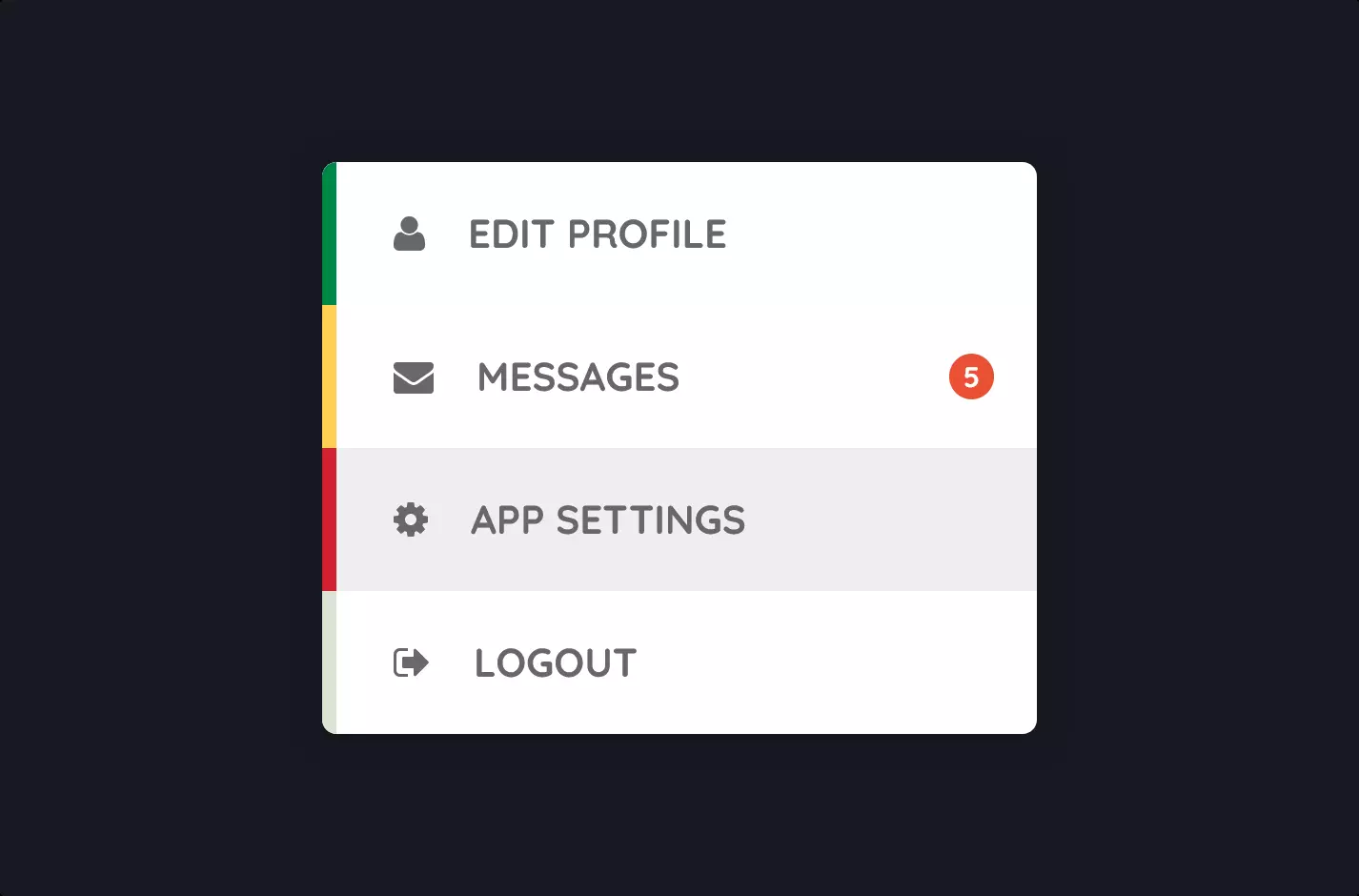
Imagine you’re crafting a digital masterpiece, a website. You decide it needs a slick sidebar for navigation, something that not only functions well but looks fantastic. Enter this code – it’s your paintbrush and canvas for creating that sidebar.
The HTML lays down the structure – a list of items like “Settings”, “Typography”, and “Media”. Each item is an artist’s stroke, defining what your sidebar will offer. The icons from Font Awesome? They’re like the color splashes, giving each menu item a visual cue, making it not just a text but a visual menu.
Switching gears to CSS, this is where your sidebar starts to come to life. You tell the browser, “Hey, I want this sidebar to be a gorgeous shade of red, and I want it to play a little game of hide and seek with the user.” The CSS listens and obeys. With a bit of styling magic, your sidebar sits quietly at the side, compact and unobtrusive. But the moment a user hovers over it, it expands like a welcoming hand, revealing the full extent of its options.
There’s no JavaScript here, and that’s okay. The sidebar we’re talking about is stylish and responsive, relying solely on the power of CSS to create a dynamic user experience. It’s proof that sometimes, simplicity is the ultimate sophistication. This code snippet is all about making navigation on your website not just a journey, but a delightful adventure.

