Menu #20
- 79+
- 54+
- 81+
- 41+
- 9+
- 54+
- 81+
- 41+
- 9+
- 6+
- 54+
- 4.94 KB
- HTML, CSS
- Menu
- sliding, vertical
- MIT License
<link rel="stylesheet" href="https://code.getmdl.io/1.2.1/material.indigo-pink.min.css" />
<link href="https://use.fontawesome.com/931d0381fb.css" media="all" rel="stylesheet" />
<script src="https://code.getmdl.io/1.2.1/material.min.js"></script>
<div class="vertical-menu mdl-tabs mdl-js-tabs">
    <nav class="menu">
        <div class="mdl-tabs__tab-bar">
            <a href="#" class="vertical-menu-header">
                <span class="mdl-chip__contact mdl-color--blue-grey-50 mdl-color-text--blue-grey-500"><i class="fa fa-users" aria-hidden="true"></i> </span> MENU TITLE <i class="fa fa-angle-right fa-fw" aria-hidden="true"></i>
            </a>
            <div class="vertical-scroll">
                <a href="#starks-panel" class="mdl-tabs__tab is-active"><span class="mdl-chip__contact">S</span> Starks</a>
                <a href="#lannisters-panel" class="mdl-tabs__tab"><span class="mdl-chip__contact">L</span> Lannisters</a>
                <a href="#targaryens-panel" class="mdl-tabs__tab"><span class="mdl-chip__contact">T</span> Targaryens</a>
            </div>
        </div>
    </nav>
    <div class="mdl-grid">
        <div class="mdl-cell mdl-cell--12-col">
            <div class="mdl-tabs__panel is-active" id="starks-panel">
                <ul>
                    <li>Eddard</li>
                    <li>Catelyn</li>
                    <li>Robb</li>
                    <li>Sansa</li>
                    <li>Brandon</li>
                    <li>Arya</li>
                    <li>Rickon</li>
                </ul>
            </div>
            <div class="mdl-tabs__panel" id="lannisters-panel">
                <ul>
                    <li>Tywin</li>
                    <li>Cersei</li>
                    <li>Jamie</li>
                    <li>Tyrion</li>
                </ul>
            </div>
            <div class="mdl-tabs__panel" id="targaryens-panel">
                <ul>
                    <li>Viserys</li>
                    <li>Daenerys</li>
                </ul>
            </div>
        </div>
    </div>
</div>
.mdl-cell--12-col {
    background: gainsboro;
}
.vertical-menu .mdl-tabs__tab-bar {
    -webkit-flex-direction: column;
    -webkit-box-orient: vertical;
    -webkit-box-direction: normal;
    -moz-box-orient: vertical;
    -moz-box-direction: normal;
    flex-direction: column;
    -webkit-box-pack: start;
    -webkit-justify-content: flex-start;
    -moz-box-pack: start;
    justify-content: flex-start;
    height: 100%;
    border-bottom: none;
}

.vertical-menu .menu a.vertical-menu-header {
    border-left: 4px solid transparent;
    padding: 10px 24px 10px 10px;
    text-transform: capitalize;
    width: 240px;
    text-align: left;
    color: #455a64;
    text-decoration: none;
    letter-spacing: 2px;
}

.vertical-menu .mdl-tabs__tab-bar .mdl-tabs__tab {
    border-left: 4px solid transparent;
    padding: 0 24px 0 10px;
    text-transform: capitalize;
    width: 240px;
    text-align: left;
    color: #455a64;
}

.vertical-menu .mdl-tabs__tab-bar .mdl-tabs__tab .mdl-chip__contact {
    background-color: #607d8b;
    color: #cfd8dc;
}

.vertical-menu .mdl-tabs__tab-bar .mdl-tabs__tab:hover {
    color: rgba(0, 0, 0, 0.87);
    border-left: 4px solid transparent;
}

.vertical-menu .mdl-tabs__tab-bar .mdl-tabs__tab:hover .mdl-chip__contact {
    color: #fff;
    background-color: #546e7a;
}

.vertical-menu .mdl-tabs__tab-bar .mdl-tabs__tab.is-active {
    color: rgba(0, 0, 0, 0.97);
    border-left: 4px solid #ff6e40;
}

.vertical-menu .mdl-tabs__tab-bar .mdl-tabs__tab.is-active .mdl-chip__contact {
    color: #fff;
}

.vertical-menu.mdl-tabs.is-upgraded .mdl-tabs__tab.is-active:after {
    display: none;
}

.menu:hover,
nav.menu.expanded {
    width: 240px;
    overflow: hidden;
}

nav.menu {
    background: #eceff1;
    border-right: 1px solid #cfd8dc;
    position: absolute;
    top: 0;
    bottom: 0;
    height: 100%;
    left: 0;
    width: 58px;
    overflow: hidden;
    -webkit-transition: width 0.06s linear;
    -webkit-transition: width 0.09s linear;
    -o-transition: width 0.09s linear;
    -moz-transition: width 0.09s linear;
    transition: width 0.09s linear;
    -webkit-transform: translateZ(0) scale(1, 1);
    z-index: 1000;
}

nav.menu .mdl-tabs__tab-bar a {
    -webkit-transform: translateZ(0) scale(1, 1);
    -webkit-transition: all 0.1s linear;
    -o-transition: all 0.1s linear;
    -moz-transition: all 0.1s linear;
    transition: all 0.1s linear;
}

.no-touch .scrollable.hover {
    overflow-y: hidden;
}

.no-touch .scrollable.hover:hover {
    overflow-y: auto;
    overflow: visible;
}

a:hover,
a:focus {
    text-decoration: none;
}

nav.patient-menu {
    -webkit-user-select: none;
    -moz-user-select: none;
    -ms-user-select: none;
    -o-user-select: none;
    user-select: none;
}

.mdl-grid {
    margin-left: 60px;
}
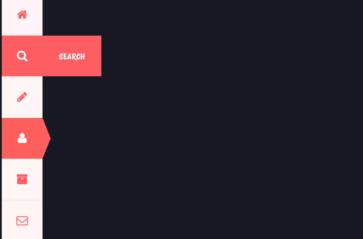
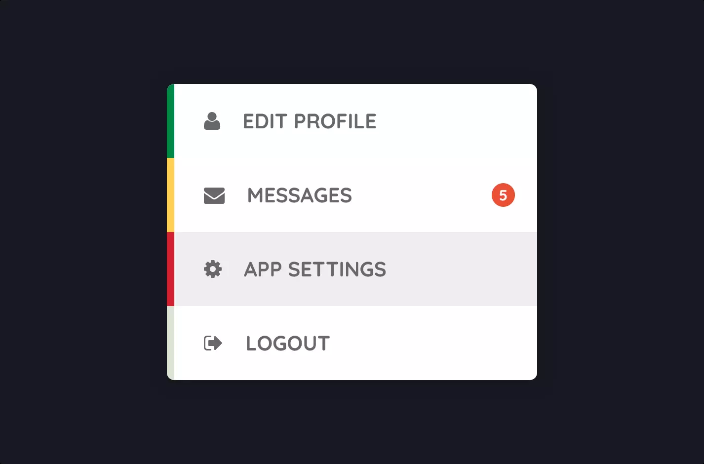
Imagine stepping into a digital castle, where each room is themed after famous families from a beloved fantasy saga. This code snippet is the magical gateway that guides you through these rooms, each representing the Starks, Lannisters, and Targaryens.
The journey begins with a sleek, vertical menu crafted using HTML and CSS, bringing to life a sliding, interactive experience. It’s designed with the modern Material Design Lite (MDL) framework, ensuring a visually appealing and responsive layout. The menu is anchored with icons and titles that invite you to explore further. Upon selection, it gracefully slides to reveal the members of each family, listed in their own unique panels. These panels are part of a larger grid, making sure that the content is neatly organized and accessible.
The CSS magic behind this menu ensures it’s not just a list but a smooth, sliding gateway. The styles dictate how each element behaves and appears, from the color schemes reminiscent of the houses to the transition effects that make the menu slide open and closed. It’s a blend of aesthetics and functionality, with a touch of customization allowing for a seamless user experience on any device.
This menu isn’t just a navigational tool; it’s a storytelling element. With each click, you’re not just moving through links; you’re stepping into the histories and legacies of these iconic families, all while enjoying a seamless and engaging online experience.