Loader #5
- 1.28 KB
- HTML, CSS
- Loader
- spinner
- MIT License
<div class="spinner"></div>@-webkit-keyframes spinner {
to {
-webkit-transform: rotate(360deg);
transform: rotate(360deg);
}
}
@-moz-keyframes spinner {
to {
-moz-transform: rotate(360deg);
transform: rotate(360deg);
}
}
@-o-keyframes spinner {
to {
-o-transform: rotate(360deg);
transform: rotate(360deg);
}
}
@keyframes spinner {
to {
-webkit-transform: rotate(360deg);
-moz-transform: rotate(360deg);
-o-transform: rotate(360deg);
transform: rotate(360deg);
}
}
.spinner:before {
content: "";
-webkit-box-sizing: border-box;
-moz-box-sizing: border-box;
box-sizing: border-box;
position: absolute;
top: 50%;
left: 50%;
width: 4rem;
height: 4rem;
margin-top: -2rem;
margin-left: -2rem;
-webkit-border-radius: 50%;
-moz-border-radius: 50%;
border-radius: 50%;
border: 0.3rem solid #f6f;
border-top-color: #0e0;
border-right-color: #0dd;
border-bottom-color: #f90;
-webkit-animation: spinner 0.6s linear infinite;
-moz-animation: spinner 0.6s linear infinite;
-o-animation: spinner 0.6s linear infinite;
animation: spinner 0.6s linear infinite;
}
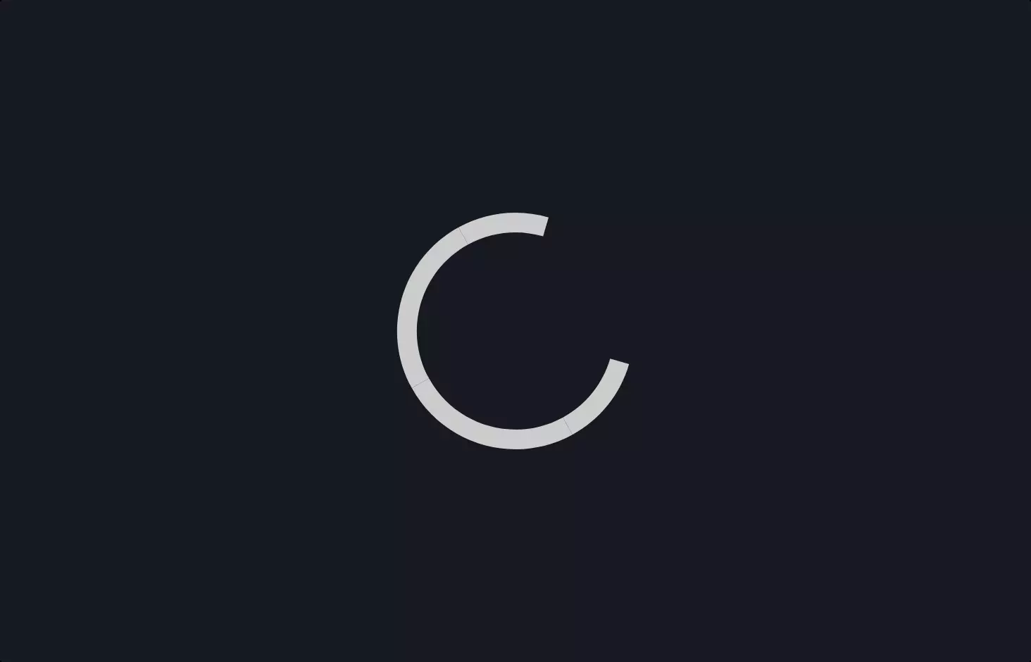
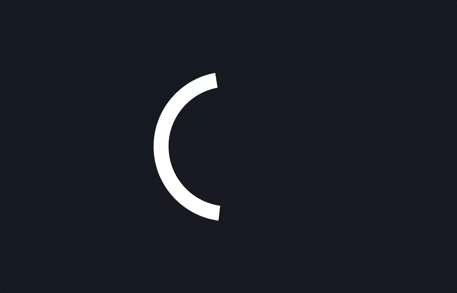
Imagine you’re browsing a website, waiting eagerly for a page to load or a video to start, and you see this captivating little circle spinning around. That’s the spinner loader we’re diving into today! It’s a neat visual cue that tells you, “Hey, something’s happening, hang tight!” Let’s unravel how this magic circle comes to life on your screen, step by step.
First off, you’ve got this simple line <div class="spinner"></div>, a sort of digital seed from which our spinner will grow. This is HTML, the backbone of web pages, marking the spot for our loader with a class named spinner. It’s like saying, “This is where the action happens!”
Next, we venture into the realm of CSS, the stylist of the web, where we define how things look. Here, we encounter a series of @keyframes named spinner. These are like choreography for our spinner, dictating a full 360-degree twirl. It’s akin to telling a dancer to spin around completely, but for our spinner, ensuring it looks the same at the start and end of its dance.
But how do we get our spinner to actually start dancing? That’s where we style the spinner class, specifically its before pseudo-element. We give it dimensions, position it right in the center, and style it to look like a circle with borders colored differently on each side. It’s like dressing our dancer in a flashy outfit so you can clearly see the spin.
The real magic happens when we apply the animation. By linking our spinner choreography with a duration and an infinite loop, we set our circle into perpetual motion. It spins endlessly, thanks to the animation properties that breathe life into our CSS-defined outfit, making the spinner a mesmerizing sight as it does its job, telling users that their request is in process.
And there you have it—a spinner loader that not only looks cool but also serves a crucial role in user experience, all achieved with some clever HTML and CSS. It’s a small but mighty hero of the web world, keeping users informed and entertained, one spin at a time.