Loader #1
- 3.09 KB
- CSS, HTML
- Loader
- spinner
- MIT License
<div class="spinner-1">Loading...</div>:root {
--backgroundColor: #161a22;
--color: #fff;
}
.spinner-1,
.spinner-1:before,
.spinner-1:after {
-webkit-border-radius: 50%;
-moz-border-radius: 50%;
border-radius: 50%;
}
.spinner-1 {
color: var(--color);
text-indent: -99999em;
margin: auto;
position: relative;
width: 10rem;
height: 10rem;
-webkit-box-shadow: inset 0 0 0 1em;
-moz-box-shadow: inset 0 0 0 1em;
box-shadow: inset 0 0 0 1em;
-webkit-transform: translateZ(0);
-moz-transform: translateZ(0);
transform: translateZ(0);
}
.spinner-1:before,
.spinner-1:after {
position: absolute;
content: "";
}
.spinner-1:before {
width: 5.2em;
height: 10.2em;
background: var(--backgroundColor);
-webkit-border-radius: 10.2em 0 0 10.2em;
-moz-border-radius: 10.2em 0 0 10.2em;
border-radius: 10.2em 0 0 10.2em;
top: -0.1em;
left: -0.1em;
-webkit-transform-origin: 5.1em 5.1em;
-moz-transform-origin: 5.1em 5.1em;
-o-transform-origin: 5.1em 5.1em;
transform-origin: 5.1em 5.1em;
-webkit-animation: load2 2s infinite ease 1.5s;
-moz-animation: load2 2s infinite ease 1.5s;
-o-animation: load2 2s infinite ease 1.5s;
animation: load2 2s infinite ease 1.5s;
}
.spinner-1:after {
width: 5.2em;
height: 10.2em;
background: var(--backgroundColor);
-webkit-border-radius: 0 10.2em 10.2em 0;
-moz-border-radius: 0 10.2em 10.2em 0;
border-radius: 0 10.2em 10.2em 0;
top: -0.1em;
left: 4.9em;
-webkit-transform-origin: 0.1em 5.1em;
-moz-transform-origin: 0.1em 5.1em;
-o-transform-origin: 0.1em 5.1em;
transform-origin: 0.1em 5.1em;
-webkit-animation: load2 2s infinite ease;
-moz-animation: load2 2s infinite ease;
-o-animation: load2 2s infinite ease;
animation: load2 2s infinite ease;
}
@-webkit-keyframes load2 {
0% {
-webkit-transform: rotate(0deg);
transform: rotate(0deg);
}
100% {
-webkit-transform: rotate(360deg);
transform: rotate(360deg);
}
}
@-moz-keyframes load2 {
0% {
-webkit-transform: rotate(0deg);
-moz-transform: rotate(0deg);
transform: rotate(0deg);
}
100% {
-webkit-transform: rotate(360deg);
-moz-transform: rotate(360deg);
transform: rotate(360deg);
}
}
@-o-keyframes load2 {
0% {
-webkit-transform: rotate(0deg);
-o-transform: rotate(0deg);
transform: rotate(0deg);
}
100% {
-webkit-transform: rotate(360deg);
-o-transform: rotate(360deg);
transform: rotate(360deg);
}
}
@keyframes load2 {
0% {
-webkit-transform: rotate(0deg);
-moz-transform: rotate(0deg);
-o-transform: rotate(0deg);
transform: rotate(0deg);
}
100% {
-webkit-transform: rotate(360deg);
-moz-transform: rotate(360deg);
-o-transform: rotate(360deg);
transform: rotate(360deg);
}
}
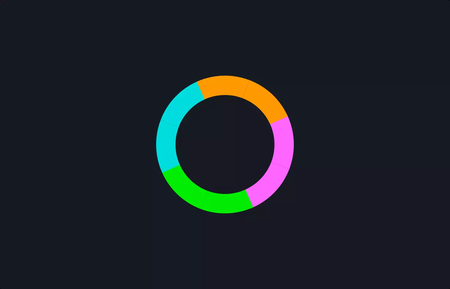
The code snippet is a CSS-based animation for creating a loading spinner. This spinner is a visual cue, a kind of digital “Please wait” sign, designed to keep you informed that something is happening in the background, like a webpage loading or data being fetched.
Imagine two halves of a circle, each spinning around a central point, much like the hands of a clock gone wild. These halves are colored differently from the background, making them stand out as they rotate. This rotation is smooth and continuous, creating a mesmerizing effect that’s both engaging and informative.
The magic behind this spinning spectacle lies in CSS animations and transformations. CSS, or Cascading Style Sheets, is the wizardry web developers use to style websites. In this case, it’s used to tell the spinner halves to rotate around their center. This is done through keyframes, which are like waypoints in the animation journey, telling the browser how to move from point A (not spinning) to point B (full spin).
The code cleverly uses CSS variables for colors, making it easy to customize the spinner’s appearance. It’s a neat trick to ensure that the spinner fits any theme or color scheme with minimal fuss.
In essence, this piece of code is a small but vital part of making web experiences smoother and visually appealing, keeping users in the loop while they wait for content to arrive.