Loader #3
- 1.25 KB
- HTML, CSS
- Loader
- spinner
- MIT License
<div class="spinner"></div>@-webkit-keyframes spinner {
to {
-webkit-transform: rotate(360deg);
transform: rotate(360deg);
}
}
@-moz-keyframes spinner {
to {
-moz-transform: rotate(360deg);
transform: rotate(360deg);
}
}
@-o-keyframes spinner {
to {
-o-transform: rotate(360deg);
transform: rotate(360deg);
}
}
@keyframes spinner {
to {
-webkit-transform: rotate(360deg);
-moz-transform: rotate(360deg);
-o-transform: rotate(360deg);
transform: rotate(360deg);
}
}
.spinner:before {
content: "";
-webkit-box-sizing: border-box;
-moz-box-sizing: border-box;
box-sizing: border-box;
position: absolute;
top: 50%;
left: 50%;
width: 4rem;
height: 4rem;
margin-top: -2rem;
margin-left: -2rem;
-webkit-border-radius: 50%;
-moz-border-radius: 50%;
border-radius: 50%;
border: 4px solid transparent;
border-top-color: #07d;
border-bottom-color: #07d;
-webkit-animation: spinner 0.8s ease infinite;
-moz-animation: spinner 0.8s ease infinite;
-o-animation: spinner 0.8s ease infinite;
animation: spinner 0.8s ease infinite;
}
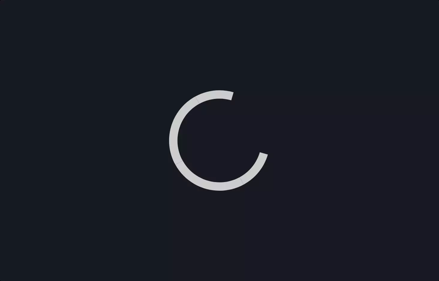
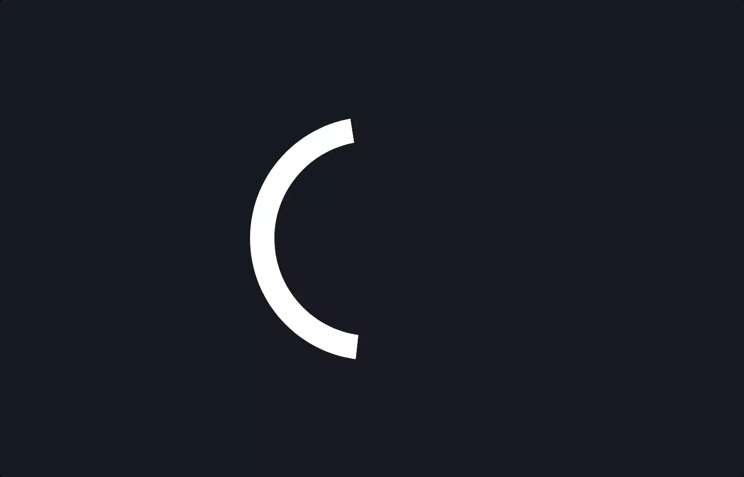
Let’s dive into this piece of code, which is all about making a cool, spinning loader animation you often see on websites while waiting for content to load. It’s like that little spinner keeps you company, telling you, “Hang tight, the good stuff is coming!”
This code snippet is a perfect blend of HTML and CSS magic. It starts with a simple HTML tag, <div class="spinner"></div>, which is our stage for the spinner. Think of it as a placeholder where our spinner will perform its dance.
Then, the real fun begins in the CSS, where we define how this spinner is going to twirl. CSS animations are like choreographing a dance, and here, we’re setting up a spin move that goes all the way around, 360 degrees. The @keyframes spinner part is where we specify this move. It’s like telling a dancer to spin around completely, starting and ending at the same spot.
But it’s not just any spin; it’s a smooth, continuous one, thanks to the animation property applied to .spinner:before. This part is about getting ready for the show—setting the stage (size, position), dressing up the spinner with colors, and finally, making it spin with a certain speed and style 0.8s ease infinite. The ease makes the spin start slow, speed up, then slow down at the end, while infinite means it keeps dancing until the content is fully loaded.
The use of vendor prefixes (like -webkit, -moz, -o) is like speaking different languages to make sure all browsers understand the instructions and display the spinner smoothly.
And there you have it, a spinning loader that keeps your audience entertained while they wait. It’s a small touch, but it makes the experience on a website feel more polished and engaging.