Loader #4
- 1.24 KB
- HTML, CSS
- Loader
- spinner
- MIT License
<div class="spinner"></div>@-webkit-keyframes spinner {
to {
-webkit-transform: rotate(360deg);
transform: rotate(360deg);
}
}
@-moz-keyframes spinner {
to {
-moz-transform: rotate(360deg);
transform: rotate(360deg);
}
}
@-o-keyframes spinner {
to {
-o-transform: rotate(360deg);
transform: rotate(360deg);
}
}
@keyframes spinner {
to {
-webkit-transform: rotate(360deg);
-moz-transform: rotate(360deg);
-o-transform: rotate(360deg);
transform: rotate(360deg);
}
}
.spinner:before {
content: "";
-webkit-box-sizing: border-box;
-moz-box-sizing: border-box;
box-sizing: border-box;
position: absolute;
top: 50%;
left: 50%;
width: 4rem;
height: 4rem;
margin-top: -2rem;
margin-left: -2rem;
-webkit-border-radius: 50%;
-moz-border-radius: 50%;
border-radius: 50%;
border-top: 4px solid #07d;
border-right: 4px solid transparent;
-webkit-animation: spinner 0.6s linear infinite;
-moz-animation: spinner 0.6s linear infinite;
-o-animation: spinner 0.6s linear infinite;
animation: spinner 0.6s linear infinite;
}
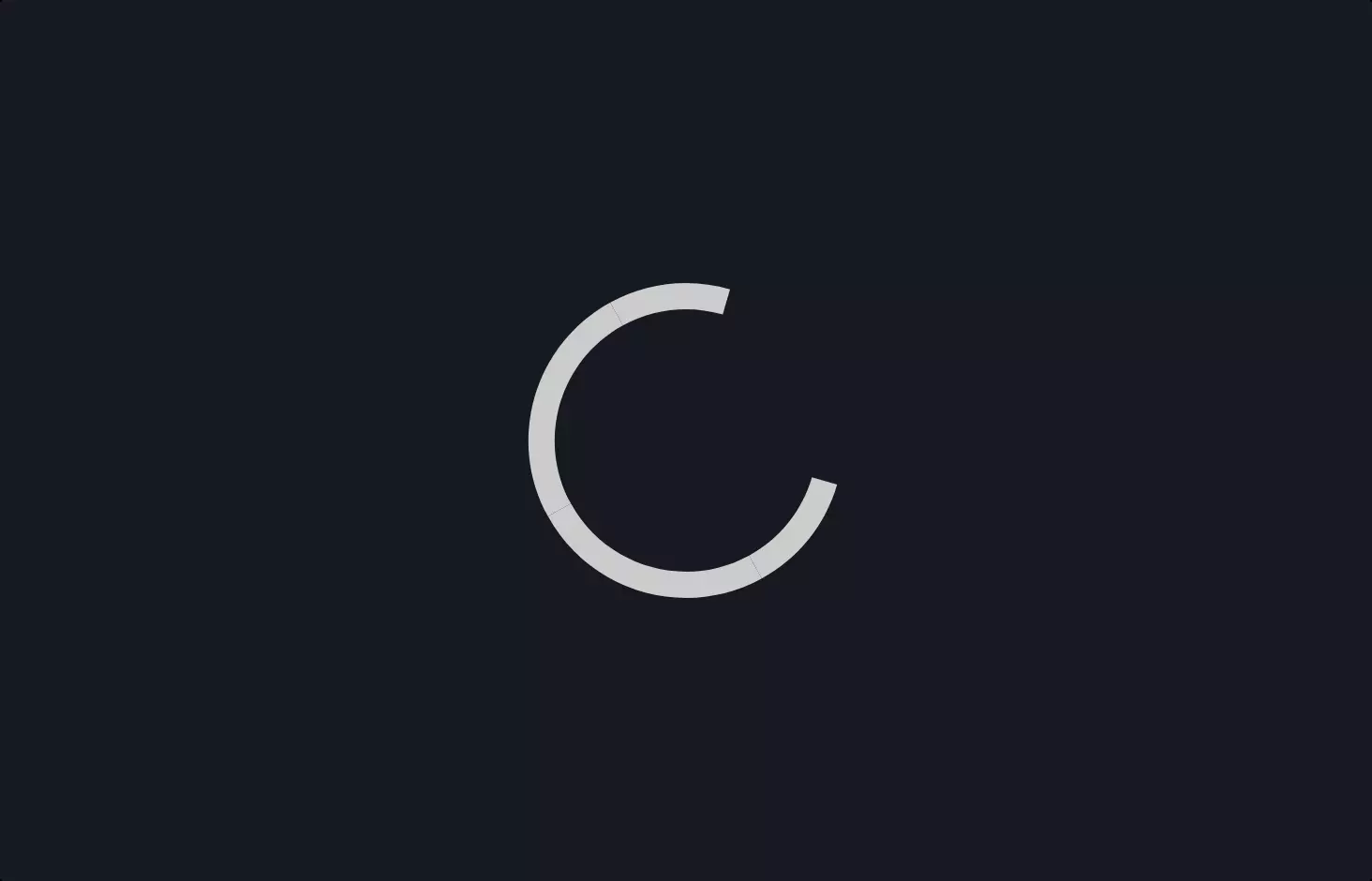
Alright, let’s dive into a cool piece of code that creates a spinner animation using CSS. Imagine you’re on a website, waiting for something to load, and you see this little circle spinning around – that’s what we’re talking about here.
First off, there’s a bit of HTML with a <div> tagged as “spinner.” This is like drawing a tiny, invisible box on your webpage where our spinner will live.
Now, the magic happens in the CSS part. CSS is like the wardrobe for our webpage; it decides how everything looks. Here, we’ve defined some keyframes animations named spinner. Keyframes in CSS are like checkpoints in a race; they tell the browser what to do at certain times. For our spinner, we’ve got a simple goal: rotate a full 360 degrees. That’s what gives it the spinning effect.
We’ve included this rotation command for different browser engines because not all browsers speak the same language fluently. That’s why you see -webkit, -moz, and -o prefixes. It’s like saying “spin” in English, French, and German so all browsers understand.
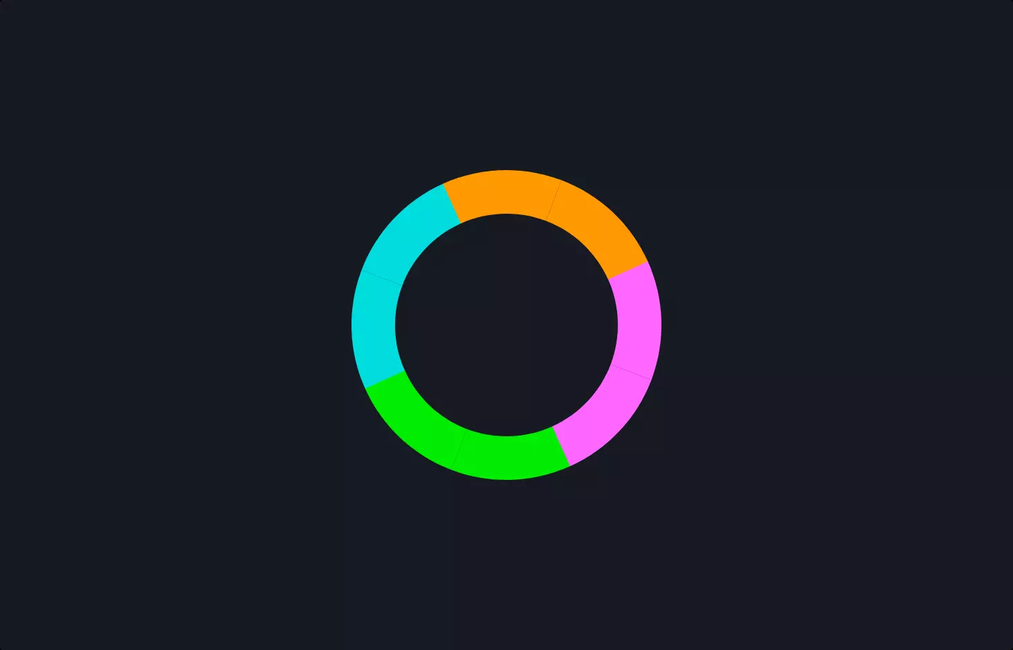
The .spinner:before part is where we design our spinner. We make it a perfect circle with a border, but only the top part of the border is colored, making it look like a pie with one slice differently shaded. This is positioned right in the center of our invisible box.
Finally, we tell this circle to keep spinning using the animation property, linking it to the spinner keyframes we defined earlier. The 0.6s linear infinite bit means the spinner will rotate smoothly and keep doing so forever, taking 0.6 seconds for a full rotation.
And there you have it, a simple yet effective way to create a loading spinner animation that can make waiting a bit more bearable, or at least a bit prettier!