Loader #2
- 1.23 KB
- HTML, CSS
- Loader
- spinner
- MIT License
<div class="spinner"></div>@-webkit-keyframes spinner {
to {
-webkit-transform: rotate(360deg);
transform: rotate(360deg);
}
}
@-moz-keyframes spinner {
to {
-moz-transform: rotate(360deg);
transform: rotate(360deg);
}
}
@-o-keyframes spinner {
to {
-o-transform: rotate(360deg);
transform: rotate(360deg);
}
}
@keyframes spinner {
to {
-webkit-transform: rotate(360deg);
-moz-transform: rotate(360deg);
-o-transform: rotate(360deg);
transform: rotate(360deg);
}
}
.spinner:before {
content: "";
-webkit-box-sizing: border-box;
-moz-box-sizing: border-box;
box-sizing: border-box;
position: absolute;
top: 50%;
left: 50%;
width: 3rem;
height: 3rem;
margin-top: -1.5rem;
margin-left: -1.5rem;
-webkit-border-radius: 50%;
-moz-border-radius: 50%;
border-radius: 50%;
border: 4px solid #ccc;
border-top-color: rgb(22, 26, 34);
-webkit-animation: spinner 0.6s linear infinite;
-moz-animation: spinner 0.6s linear infinite;
-o-animation: spinner 0.6s linear infinite;
animation: spinner 0.6s linear infinite;
}
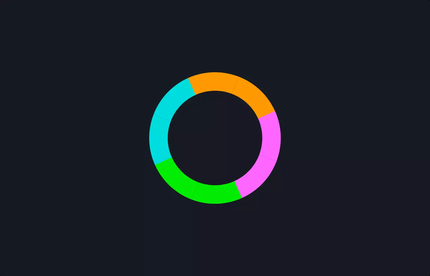
Imagine you’re sitting at your computer, browsing through a website, when you notice a small circle spinning around, signaling that the page is loading. That’s exactly what this piece of code is all about – creating that spinning circle, often called a spinner, which is a common sight on the web.
The code snippet kicks off with a simple HTML element, a div, specifically designed to be our spinner. This div doesn’t do much on its own; it’s just a placeholder waiting to be transformed into something visually engaging through the magic of CSS.
Next, we dive into the heart of the action with some CSS styling. The styling section begins by defining animations for the spinner. These animations are where the real magic happens, making our spinner rotate 360 degrees, giving it that familiar spinning effect. The code is meticulous, ensuring compatibility with different web browsers by using prefixes like -webkit-, -moz-, and -o- before the animation properties. This is like speaking multiple languages to ensure everyone understands you, no matter what browser they’re using.
Further down, we set up the visual aspects of our spinner. We make it a perfect circle with border-radius: 50%, give it a solid border with a different color on the top to emphasize the spinning motion, and use absolute positioning to center it on the screen. The dimensions, border styles, and even the animation speed are carefully chosen to make the spinner noticeable yet not too distracting.
Finally, the animation is set to run infinitely with a linear speed, creating a smooth, continuous rotation that signals the website is working on loading something. This is akin to a busy indicator on your computer or phone, providing a visual cue that it’s processing your request.
In essence, this code is a blend of HTML and CSS, working together to create a visual representation of an action in progress. It’s a small but crucial part of user experience design, making web browsing more intuitive and less confusing.