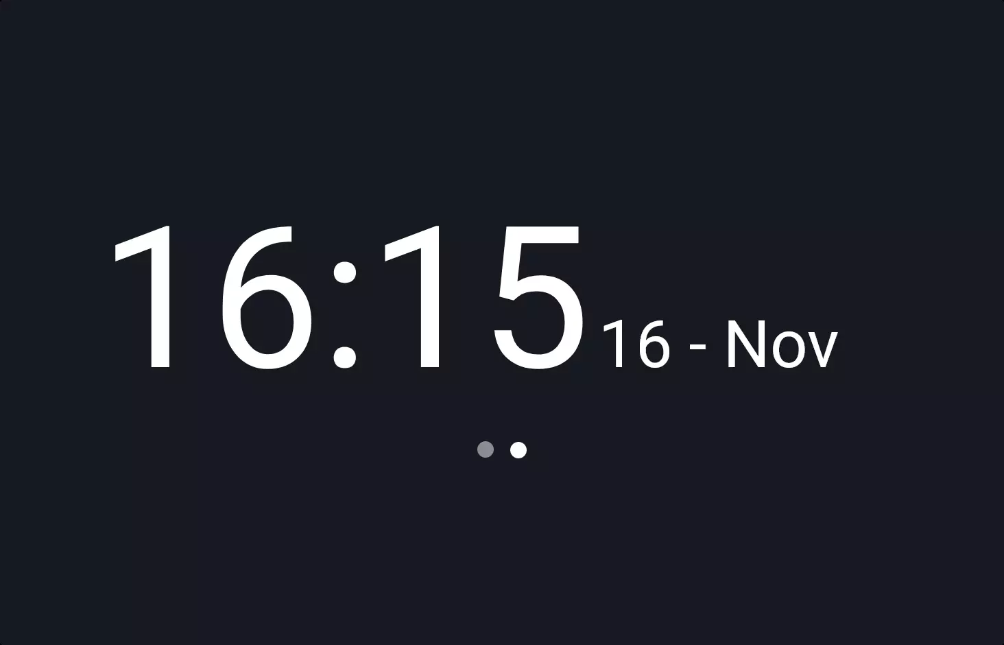
Clock #2
- 11.77 KB
- CSS, HTML, JS
- Clock
- analogue
- MIT License
<div class="main-wrapper">
    <div class="clock">
        <div class="hour">1</div>
        <div class="hour">2</div>
        <div class="hour">3</div>
        <div class="hour">4</div>
        <div class="hour">5</div>
        <div class="hour">6</div>
        <div class="hour">7</div>
        <div class="hour">8</div>
        <div class="hour">9</div>
        <div class="hour">10</div>
        <div class="hour">11</div>
        <div class="hour">12</div>
        <div class="hours-wrapper">
            <div class="hours-hand"></div>
        </div>
        <div class="minutes-wrapper">
            <div class="minutes-hand"></div>
        </div>
        <div class="seconds-wrapper">
            <div class="seconds-hand"></div>
        </div>
    </div>
</div>
@font-face {
    font-family: "Quicksand";
    font-style: normal;
    font-weight: 400;
    src: url(https://fonts.gstatic.com/s/quicksand/v30/6xK-dSZaM9iE8KbpRA_LJ3z8mH9BOJvgkP8o58a-xw.ttf) format("truetype");
}
body {
    overflow: hidden;
}
@-webkit-keyframes rotate-center {
    0% {
        -webkit-transform: rotate(0);
        transform: rotate(0);
    }
    100% {
        -webkit-transform: rotate(360deg);
        transform: rotate(360deg);
    }
}
@-moz-keyframes rotate-center {
    0% {
        -moz-transform: rotate(0);
        transform: rotate(0);
    }
    100% {
        -moz-transform: rotate(360deg);
        transform: rotate(360deg);
    }
}
@-o-keyframes rotate-center {
    0% {
        -o-transform: rotate(0);
        transform: rotate(0);
    }
    100% {
        -o-transform: rotate(360deg);
        transform: rotate(360deg);
    }
}
@keyframes rotate-center {
    0% {
        -webkit-transform: rotate(0);
        -moz-transform: rotate(0);
        -o-transform: rotate(0);
        transform: rotate(0);
    }
    100% {
        -webkit-transform: rotate(360deg);
        -moz-transform: rotate(360deg);
        -o-transform: rotate(360deg);
        transform: rotate(360deg);
    }
}
.main-wrapper {
    position: absolute;
    top: 0;
    bottom: 0;
    left: 0;
    right: 0;
    display: -webkit-box;
    display: -webkit-flex;
    display: -moz-box;
    display: flex;
    -webkit-box-pack: center;
    -webkit-justify-content: center;
    -moz-box-pack: center;
    justify-content: center;
    -webkit-box-align: center;
    -webkit-align-items: center;
    -moz-box-align: center;
    align-items: center;
    -webkit-box-orient: vertical;
    -webkit-box-direction: normal;
    -webkit-flex-direction: column;
    -moz-box-orient: vertical;
    -moz-box-direction: normal;
    flex-direction: column;
}
.clock {
    width: 320px;
    height: 320px;
    min-height: 320px;
    -webkit-border-radius: 50%;
    -moz-border-radius: 50%;
    border-radius: 50%;
    position: relative;
    background: #525252;
    background-image: -webkit-radial-gradient(70% 10%, circle farthest-corner, #525252 0, #2e2e2e 80%);
    background-image: -moz-radial-gradient(70% 10%, circle farthest-corner, #525252 0, #2e2e2e 80%);
    background-image: -o-radial-gradient(70% 10%, circle farthest-corner, #525252 0, #2e2e2e 80%);
    background-image: radial-gradient(circle farthest-corner at 70% 10%, #525252 0, #2e2e2e 80%);
    -webkit-box-shadow: 1px 6px 25px 0 rgba(0, 0, 0, 0.6);
    -moz-box-shadow: 1px 6px 25px 0 rgba(0, 0, 0, 0.6);
    box-shadow: 1px 6px 25px 0 rgba(0, 0, 0, 0.6);
}
.hours-wrapper,
.minutes-wrapper,
.seconds-wrapper {
    position: absolute;
    -webkit-border-radius: 50%;
    -moz-border-radius: 50%;
    border-radius: 50%;
    top: 0;
    right: 0;
    bottom: 0;
    left: 0;
    display: -webkit-box;
    display: -webkit-flex;
    display: -moz-box;
    display: flex;
    -webkit-box-pack: center;
    -webkit-justify-content: center;
    -moz-box-pack: center;
    justify-content: center;
    -webkit-box-align: center;
    -webkit-align-items: center;
    -moz-box-align: center;
    align-items: center;
}
.hours-wrapper {
    z-index: 1;
}
.hours-wrapper.running {
    -webkit-animation: rotate-center 86400s linear infinite forwards;
    -moz-animation: rotate-center 86400s linear infinite forwards;
    -o-animation: rotate-center 86400s linear infinite forwards;
    animation: rotate-center 86400s linear infinite forwards;
}
.minutes-wrapper {
    z-index: 2;
}
.minutes-wrapper.running {
    -webkit-animation: rotate-center 3600s linear infinite forwards;
    -moz-animation: rotate-center 3600s linear infinite forwards;
    -o-animation: rotate-center 3600s linear infinite forwards;
    animation: rotate-center 3600s linear infinite forwards;
}
.minutes-wrapper::after {
    content: "";
    display: block;
    position: absolute;
    width: 10px;
    height: 10px;
    background: #ffffff;
    -webkit-box-shadow: 3px 3px 2px 0px rgba(0, 0, 0, 0.2);
    -moz-box-shadow: 3px 3px 2px 0px rgba(0, 0, 0, 0.2);
    box-shadow: 3px 3px 2px 0px rgba(0, 0, 0, 0.2);
    -webkit-border-radius: 50%;
    -moz-border-radius: 50%;
    border-radius: 50%;
    left: 50%;
    top: 50%;
    margin-top: -5px;
    margin-left: -5px;
}
.seconds-wrapper {
    z-index: 3;
}
.seconds-wrapper.running {
    -webkit-animation: rotate-center 60s steps(60, end) infinite forwards;
    -moz-animation: rotate-center 60s steps(60, end) infinite forwards;
    -o-animation: rotate-center 60s steps(60, end) infinite forwards;
    animation: rotate-center 60s steps(60, end) infinite forwards;
}
.seconds-wrapper::after {
    content: "";
    display: block;
    position: absolute;
    width: 6px;
    height: 6px;
    background: #fdd100;
    -webkit-border-radius: 50%;
    -moz-border-radius: 50%;
    border-radius: 50%;
    left: 50%;
    top: 50%;
    margin-top: -3px;
    margin-left: -3px;
}
.hours-hand,
.minutes-hand,
.seconds-hand {
    background: #ffffff;
    -webkit-box-shadow: 3px 3px 2px 0px rgba(0, 0, 0, 0.2);
    -moz-box-shadow: 3px 3px 2px 0px rgba(0, 0, 0, 0.2);
    box-shadow: 3px 3px 2px 0px rgba(0, 0, 0, 0.2);
    z-index: 5;
}
.hours-hand {
    width: 0.8%;
    height: 26%;
}
.minutes-hand {
    width: 0.8%;
    height: 32%;
}
.seconds-hand {
    background: #fdd100;
    width: 0.4%;
    height: 40%;
}
.hour {
    display: block;
    position: absolute;
    width: 2vw;
    height: 2vw;
    top: 50%;
    left: 50%;
    margin-top: -1vw;
    margin-left: -1vw;
    font-family: "Quicksand", sans-serif;
    font-weight: 400;
    color: #ffffff;
    text-align: center;
    font-size: 1.15em;
    line-height: 2vw;
}
.hour:nth-child(12) {
    -webkit-transform: translateX(0px) translateY(-130px);
    -moz-transform: translateX(0px) translateY(-130px);
    -o-transform: translateX(0px) translateY(-130px);
    transform: translateX(0px) translateY(-130px);
}
.hour:nth-child(11) {
    -webkit-transform: translateX(-65px) translateY(-112.58330249px);
    -moz-transform: translateX(-65px) translateY(-112.58330249px);
    -o-transform: translateX(-65px) translateY(-112.58330249px);
    transform: translateX(-65px) translateY(-112.58330249px);
}
.hour:nth-child(10) {
    -webkit-transform: translateX(-112.58330249px) translateY(-65px);
    -moz-transform: translateX(-112.58330249px) translateY(-65px);
    -o-transform: translateX(-112.58330249px) translateY(-65px);
    transform: translateX(-112.58330249px) translateY(-65px);
}
.hour:nth-child(9) {
    -webkit-transform: translateX(-130px) translateY(0px);
    -moz-transform: translateX(-130px) translateY(0px);
    -o-transform: translateX(-130px) translateY(0px);
    transform: translateX(-130px) translateY(0px);
}
.hour:nth-child(8) {
    -webkit-transform: translateX(-112.58330249px) translateY(65px);
    -moz-transform: translateX(-112.58330249px) translateY(65px);
    -o-transform: translateX(-112.58330249px) translateY(65px);
    transform: translateX(-112.58330249px) translateY(65px);
}
.hour:nth-child(7) {
    -webkit-transform: translateX(-65px) translateY(112.58330249px);
    -moz-transform: translateX(-65px) translateY(112.58330249px);
    -o-transform: translateX(-65px) translateY(112.58330249px);
    transform: translateX(-65px) translateY(112.58330249px);
}
.hour:nth-child(6) {
    -webkit-transform: translateX(0px) translateY(130px);
    -moz-transform: translateX(0px) translateY(130px);
    -o-transform: translateX(0px) translateY(130px);
    transform: translateX(0px) translateY(130px);
}
.hour:nth-child(5) {
    -webkit-transform: translateX(65px) translateY(112.58330249px);
    -moz-transform: translateX(65px) translateY(112.58330249px);
    -o-transform: translateX(65px) translateY(112.58330249px);
    transform: translateX(65px) translateY(112.58330249px);
}
.hour:nth-child(4) {
    -webkit-transform: translateX(112.58330249px) translateY(65px);
    -moz-transform: translateX(112.58330249px) translateY(65px);
    -o-transform: translateX(112.58330249px) translateY(65px);
    transform: translateX(112.58330249px) translateY(65px);
}
.hour:nth-child(3) {
    -webkit-transform: translateX(130px) translateY(0px);
    -moz-transform: translateX(130px) translateY(0px);
    -o-transform: translateX(130px) translateY(0px);
    transform: translateX(130px) translateY(0px);
}
.hour:nth-child(2) {
    -webkit-transform: translateX(112.58330249px) translateY(-65px);
    -moz-transform: translateX(112.58330249px) translateY(-65px);
    -o-transform: translateX(112.58330249px) translateY(-65px);
    transform: translateX(112.58330249px) translateY(-65px);
}
.hour:nth-child(1) {
    -webkit-transform: translateX(65px) translateY(-112.58330249px);
    -moz-transform: translateX(65px) translateY(-112.58330249px);
    -o-transform: translateX(65px) translateY(-112.58330249px);
    transform: translateX(65px) translateY(-112.58330249px);
}
.hour:nth-child(0) {
    -webkit-transform: translateX(0px) translateY(-130px);
    -moz-transform: translateX(0px) translateY(-130px);
    -o-transform: translateX(0px) translateY(-130px);
    transform: translateX(0px) translateY(-130px);
}
.hour:nth-child(-1) {
    -webkit-transform: translateX(-65px) translateY(-112.58330249px);
    -moz-transform: translateX(-65px) translateY(-112.58330249px);
    -o-transform: translateX(-65px) translateY(-112.58330249px);
    transform: translateX(-65px) translateY(-112.58330249px);
}
var hHand = document.querySelector(".hours-hand");
var hWrapper = document.querySelector(".hours-wrapper");
var mHand = document.querySelector(".minutes-hand");
var mWrapper = document.querySelector(".minutes-wrapper");
var sHand = document.querySelector(".seconds-hand");
var sWrapper = document.querySelector(".seconds-wrapper");

function setTime() {
    var d = new Date();
    var h = d.getHours();
    var m = d.getMinutes();
    var s = d.getSeconds();
    var currentSec = h * 60 * 60 + m * 60 + s;
    var totalSec = 24 * 60 * 60;
    var hProgress = currentSec / totalSec;
    var hAngle = hProgress * 720;
    var mProgress = (m * 60 + s) / (60 * 60);
    var mAngle = mProgress * 360;
    var sProgress = s / 60;
    var sAngle = sProgress * 360;

    hHand.style.transform = "rotate(" + hAngle + "deg) translateY(-36%)";
    mHand.style.transform = "rotate(" + mAngle + "deg) translateY(-38%)";
    sHand.style.transform = "rotate(" + sAngle + "deg) translateY(-34%)";

    triggerReflow();

    // console.log('time set');
}

function triggerReflow() {
    hWrapper.classList.remove("running");
    hWrapper.offsetHeight;
    hWrapper.classList.add("running");

    mWrapper.classList.remove("running");
    mWrapper.offsetHeight;
    mWrapper.classList.add("running");

    sWrapper.classList.remove("running");
    sWrapper.offsetHeight;
    sWrapper.classList.add("running");
}

setTime();

window.onfocus = setTime;
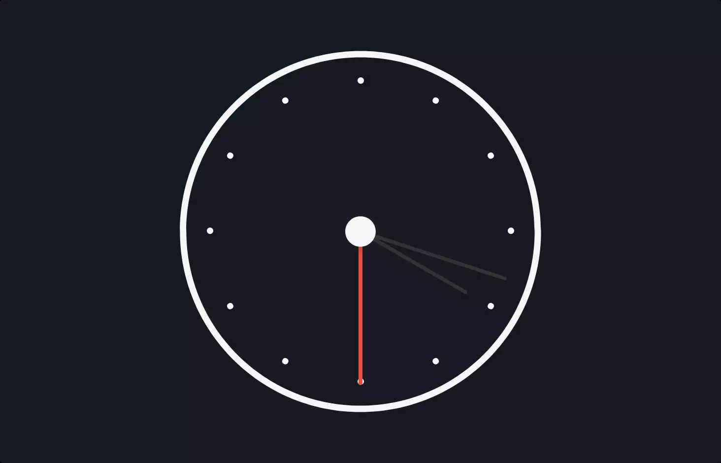
Imagine we’re building a digital version of an old-school analogue clock, the kind with hands that move around a circle to tell you the time. The heart of our clock is HTML, CSS, and JavaScript, creating a visual and functional masterpiece right in your web browser.
First up, the HTML structure is like laying out the clock’s face. We place hour markers, from 1 to 12, around a circular clock face. Then, we add wrappers for the hour, minute, and second hands. These are like invisible circles inside the clock that will hold and rotate the hands.
Now, to make this clock look good, we dive into CSS. We start by adding a sleek, modern font and ensuring our clock won’t overflow the screen. Then comes the magic of making it look like a real clock. We use radial gradients to give the clock face depth and shadows for a 3D effect. The hands are styled with precise dimensions and colors, ensuring they stand out against the clock face. We also use CSS animations to rotate these hands around the clock, mimicking how real clock hands move smoothly.
Lastly, JavaScript brings our clock to life. It’s like the clock’s brain, constantly updating the hands to match the current time. We calculate the exact position for each hand based on the current hour, minute, and second. Then, we apply a rotation to each hand, so they move to their correct positions. This script also ensures that every time you glance at the clock or come back to the tab, it resets the hands to the current time, keeping the clock accurate.
In simple terms, we’ve built a clock that not only looks like its analogue ancestor but also ticks away time just as reliably, all from the comfort of your web browser.