Clock #1
- 3.28 KB
- CSS, HTML, JS
- Clock
- analogue
- MIT License
<div class="clock">
	<div class="middle"></div>
	<div class="clock-face">
		<div class="dots">
			<div class="dot"></div>
			<div class="dot"></div>
			<div class="dot"></div>
			<div class="dot"></div>
			<div class="dot"></div>
			<div class="dot"></div>
		</div>
		<div class="hand hour-hand"></div>
		<div class="hand min-hand"></div>
		<div class="hand second-hand"></div>
	</div>
</div>@import url("https://fonts.googleapis.com/css?family=UnifrakturMaguntia");
html {
font-family: "helvetica neue";
}
.clock {
position: relative;
width: 30rem;
height: 30rem;
margin: 3.125rem auto;
padding: 2rem;
border: 0.625rem solid #f5f5f5;
border-radius: 50%;
}
.clock .middle {
position: absolute;
top: 50%;
left: 50%;
width: 3rem;
height: 3rem;
background-color: #f5f5f5;
border-radius: 50%;
box-shadow: 0 0 1.25rem rgba(51, 51, 51, 0.4);
transform: translate(-50%, -50%);
z-index: 9;
}
.clock .clock-face {
position: relative;
width: 100%;
height: 100%;
transform: translateY(-3px);
/* account for the height of the clock hands */
}
.clock .clock-face .dots {
position: absolute;
content: "";
top: 0;
left: 0;
width: 100%;
height: 100%;
border-radius: 50%;
}
.clock .clock-face .dots .dot {
position: absolute;
top: calc(50% - 0.1875rem);
width: 100%;
height: 0.625rem;
}
.clock .clock-face .dots .dot:before, .clock .clock-face .dots .dot:after {
position: absolute;
content: "";
width: 0.625rem;
height: 0.625rem;
background-color: #f5f5f5;
border-radius: 50%;
}
.clock .clock-face .dots .dot:before {
left: 0;
}
.clock .clock-face .dots .dot:after {
right: 0;
}
.clock .clock-face .dots .dot:nth-of-type(1) {
transform: rotate(0deg);
}
.clock .clock-face .dots .dot:nth-of-type(2) {
transform: rotate(30deg);
}
.clock .clock-face .dots .dot:nth-of-type(3) {
transform: rotate(60deg);
}
.clock .clock-face .dots .dot:nth-of-type(4) {
transform: rotate(90deg);
}
.clock .clock-face .dots .dot:nth-of-type(5) {
transform: rotate(120deg);
}
.clock .clock-face .dots .dot:nth-of-type(6) {
transform: rotate(150deg);
}
.clock .clock-face .hand {
position: absolute;
top: 50%;
width: 50%;
height: 0.375rem;
background: #333;
border-radius: 6.1875rem;
transform-origin: 100%;
transform: rotate(90deg);
transition: all 0.05s;
transition-timing-function: cubic-bezier(0.1, 2.7, 0.58, 1);
}
.clock .clock-face .hand.second-hand {
background: #e74c3c;
}
.clock .clock-face .hand.hour-hand {
left: 10%;
width: 40%;
}const secondHand = document.querySelector('.second-hand');
const minuteHand = document.querySelector('.min-hand');
const hourHand = document.querySelector('.hour-hand');
function setDate() {
const now = new Date();
const seconds = now.getSeconds();
const secondsDegrees = ((seconds / 60) * 360) + 90;
secondHand.style.transform = `rotate(${secondsDegrees}deg)`;
const minutes = now.getMinutes();
const minutesDegrees = ((minutes / 60) * 360) + 90;
minuteHand.style.transform = `rotate(${minutesDegrees}deg)`;
const hours = now.getHours();
const hoursDegrees = ((hours / 12) * 360) + 90;
hourHand.style.transform = `rotate(${hoursDegrees}deg)`;
}
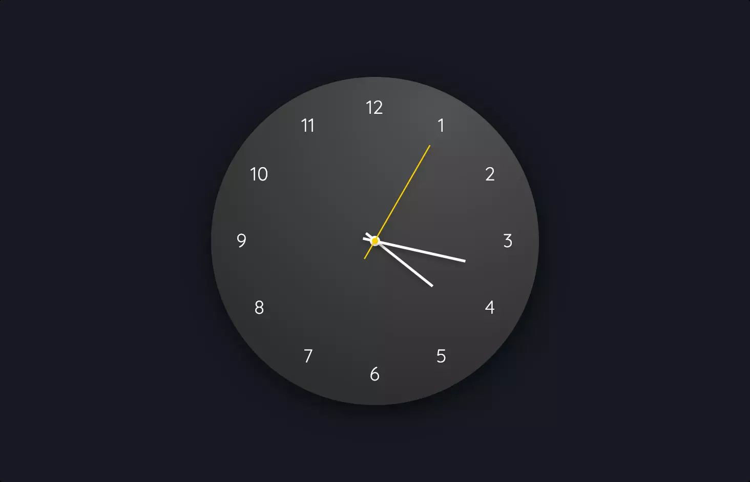
setInterval(setDate,1000);Let’s take a stroll through a snippet of code that crafts an analogue clock on a webpage, shall we? This code is a beautiful blend of HTML, CSS, and JavaScript, each playing its part to bring to life a ticking clock right on your screen.
Starting with the HTML, we’ve got a structure resembling an actual clock, with div elements representing the clock face, including the dots (for the hours) and hands for the seconds, minutes, and hours. It’s like setting up the bones of our clock, laying out all the parts where they need to be.
Moving on to the CSS, this is where our clock starts to get its charm. We style the clock to look circular, complete with a face and hands that mimic those of a traditional analogue clock. The CSS also takes care of positioning each element precisely, ensuring the hands can rotate smoothly to tell the time. The styling includes making sure the clock looks good too, with colors and sizes that make it pop out on the page.
Then, the magic happens with JavaScript. This is where we give life to our clock. The script grabs the current time and then moves the clock’s hands to match the real-world seconds, minutes, and hours. It’s like the heartbeat of our clock, making sure it ticks in sync with time itself. The script continuously updates the time, so our clock keeps up, never missing a beat.
So, in essence, this code snippet is a perfect example of how HTML, CSS, and JavaScript come together to create something functional and beautiful – an analogue clock that not only tells time but does so with style.