Menu #7
- 12+
- 43+
- 16+
- 30+
- 9+
- 43+
- 95+
- 30+
- 9+
- 4+
- 43+
- 12.00 KB
- HTML, CSS
- Menu
- dropdown, vertical
- MIT License
<div class="container">
    <ul>
        <li class="dropdown">
            <input type="checkbox" />
            <a href="#" data-toggle="dropdown">First Menu</a>
            <ul class="dropdown-menu">
                <li><a href="#">Home</a></li>
                <li><a href="#">About Us</a></li>
                <li><a href="#">Services</a></li>
                <li><a href="#">Contact</a></li>
            </ul>
        </li>
        <li class="dropdown">
            <input type="checkbox" />
            <a href="#" data-toggle="dropdown">Second Menu</a>
            <ul class="dropdown-menu">
                <li><a href="#">Home</a></li>
                <li><a href="#">About Us</a></li>
                <li><a href="#">Services</a></li>
                <li><a href="#">Contact</a></li>
            </ul>
        </li>
        <li class="dropdown">
            <input type="checkbox" />
            <a href="#" data-toggle="dropdown">Third Menu</a>
            <ul class="dropdown-menu">
                <li><a href="#">Home</a></li>
                <li><a href="#">About Us</a></li>
                <li><a href="#">Services</a></li>
                <li><a href="#">Contact</a></li>
            </ul>
        </li>
    </ul>
</div>
@import url("https://fonts.googleapis.com/css?family=Lato:300,400,700,900");
body {
    font-family: "Lato", Helvetica, Arial;
    font-size: 16px;
}
.container {
    min-width: 350px;
}
.container > ul {
    list-style: none;
    padding: 0;
    margin: 0;
}
.dropdown {
    position: relative;
}
.dropdown a {
    text-decoration: none;
}
.dropdown [data-toggle="dropdown"] {
    display: block;
    color: white;
    background: #c0392b;
    -moz-box-shadow: 0 1px 0 #d65548 inset, 0 -1px 0 #962d22 inset;
    -webkit-box-shadow: 0 1px 0 #d65548 inset, 0 -1px 0 #962d22 inset;
    box-shadow: 0 1px 0 #d65548 inset, 0 -1px 0 #962d22 inset;
    text-shadow: 0 -1px 0 rgba(0, 0, 0, 0.3);
    padding: 10px;
}
.dropdown [data-toggle="dropdown"]:hover {
    background: #cd3d2e;
}
.dropdown [data-toggle="dropdown"]:before {
    position: absolute;
    display: block;
    content: "\25BC";
    font-size: 0.7em;
    color: #fff;
    top: 13px;
    right: 10px;
    -moz-transform: rotate(0deg);
    -webkit-transform: rotate(0deg);
    -o-transform: rotate(0deg);
    transform: rotate(0deg);
    -moz-transition: -moz-transform 0.6s;
    -o-transition: -o-transform 0.6s;
    -webkit-transition: -webkit-transform 0.6s;
    transition: -webkit-transform 0.6s;
    -moz-transition: transform 0.6s, -moz-transform 0.6s;
    transition: transform 0.6s;
    transition: transform 0.6s, -webkit-transform 0.6s, -moz-transform 0.6s, -o-transform 0.6s;
}
.dropdown > .dropdown-menu {
    max-height: 0;
    overflow: hidden;
    list-style: none;
    padding: 0;
    margin: 0;
    -moz-transform: scaleY(0);
    -webkit-transform: scaleY(0);
    -o-transform: scaleY(0);
    transform: scaleY(0);
    -moz-transform-origin: 50% 0%;
    -webkit-transform-origin: 50% 0%;
    -o-transform-origin: 50% 0%;
    transform-origin: 50% 0%;
    -moz-transition: max-height 0.6s ease-out;
    -o-transition: max-height 0.6s ease-out;
    -webkit-transition: max-height 0.6s ease-out;
    transition: max-height 0.6s ease-out;
    -o-animation: hideAnimation 0.4s ease-out;
    animation: hideAnimation 0.4s ease-out;
    -moz-animation: hideAnimation 0.4s ease-out;
    -webkit-animation: hideAnimation 0.4s ease-out;
}
.dropdown > .dropdown-menu li {
    padding: 0;
}
.dropdown > .dropdown-menu li a {
    display: block;
    color: #6f6f6f;
    background: #eee;
    -moz-box-shadow: 0 1px 0 white inset, 0 -1px 0 #d5d5d5 inset;
    -webkit-box-shadow: 0 1px 0 white inset, 0 -1px 0 #d5d5d5 inset;
    box-shadow: 0 1px 0 white inset, 0 -1px 0 #d5d5d5 inset;
    text-shadow: 0 -1px 0 rgba(255, 255, 255, 0.3);
    padding: 10px 10px;
}
.dropdown > .dropdown-menu li a:hover {
    background: #f6f6f6;
}
.dropdown > input[type="checkbox"] {
    opacity: 0;
    display: block;
    position: absolute;
    top: 0;
    width: 100%;
    height: 100%;
    cursor: pointer;
}
.dropdown > input[type="checkbox"]:checked ~ .dropdown-menu {
    max-height: 9999px;
    display: block;
    -moz-transform: scaleY(1);
    -webkit-transform: scaleY(1);
    -o-transform: scaleY(1);
    transform: scaleY(1);
    -o-animation: showAnimation 0.5s ease-in-out;
    animation: showAnimation 0.5s ease-in-out;
    -moz-animation: showAnimation 0.5s ease-in-out;
    -webkit-animation: showAnimation 0.5s ease-in-out;
    -moz-transition: max-height 2s ease-in-out;
    -o-transition: max-height 2s ease-in-out;
    -webkit-transition: max-height 2s ease-in-out;
    transition: max-height 2s ease-in-out;
}
.dropdown > input[type="checkbox"]:checked + a[data-toggle="dropdown"]:before {
    -moz-transform: rotate(-180deg);
    -webkit-transform: rotate(-180deg);
    -o-transform: rotate(-180deg);
    transform: rotate(-180deg);
    -moz-transition: -moz-transform 0.6s;
    -o-transition: -o-transform 0.6s;
    -webkit-transition: -webkit-transform 0.6s;
    transition: -webkit-transform 0.6s;
    -moz-transition: transform 0.6s, -moz-transform 0.6s;
    transition: transform 0.6s;
    transition: transform 0.6s, -webkit-transform 0.6s, -moz-transform 0.6s, -o-transform 0.6s;
}

@-o-keyframes showAnimation {
    0% {
        -moz-transform: scaleY(0.1);
        -webkit-transform: scaleY(0.1);
        -o-transform: scaleY(0.1);
        transform: scaleY(0.1);
    }
    40% {
        -moz-transform: scaleY(1.04);
        -webkit-transform: scaleY(1.04);
        -o-transform: scaleY(1.04);
        transform: scaleY(1.04);
    }
    60% {
        -moz-transform: scaleY(0.98);
        -webkit-transform: scaleY(0.98);
        -o-transform: scaleY(0.98);
        transform: scaleY(0.98);
    }
    80% {
        -moz-transform: scaleY(1.04);
        -webkit-transform: scaleY(1.04);
        -o-transform: scaleY(1.04);
        transform: scaleY(1.04);
    }
    100% {
        -moz-transform: scaleY(0.98);
        -webkit-transform: scaleY(0.98);
        -o-transform: scaleY(0.98);
        transform: scaleY(0.98);
    }
    80% {
        -moz-transform: scaleY(1.02);
        -webkit-transform: scaleY(1.02);
        -o-transform: scaleY(1.02);
        transform: scaleY(1.02);
    }
    100% {
        -moz-transform: scaleY(1);
        -webkit-transform: scaleY(1);
        -o-transform: scaleY(1);
        transform: scaleY(1);
    }
}

@keyframes showAnimation {
    0% {
        -moz-transform: scaleY(0.1);
        -webkit-transform: scaleY(0.1);
        -o-transform: scaleY(0.1);
        transform: scaleY(0.1);
    }
    40% {
        -moz-transform: scaleY(1.04);
        -webkit-transform: scaleY(1.04);
        -o-transform: scaleY(1.04);
        transform: scaleY(1.04);
    }
    60% {
        -moz-transform: scaleY(0.98);
        -webkit-transform: scaleY(0.98);
        -o-transform: scaleY(0.98);
        transform: scaleY(0.98);
    }
    80% {
        -moz-transform: scaleY(1.04);
        -webkit-transform: scaleY(1.04);
        -o-transform: scaleY(1.04);
        transform: scaleY(1.04);
    }
    100% {
        -moz-transform: scaleY(0.98);
        -webkit-transform: scaleY(0.98);
        -o-transform: scaleY(0.98);
        transform: scaleY(0.98);
    }
    80% {
        -moz-transform: scaleY(1.02);
        -webkit-transform: scaleY(1.02);
        -o-transform: scaleY(1.02);
        transform: scaleY(1.02);
    }
    100% {
        -moz-transform: scaleY(1);
        -webkit-transform: scaleY(1);
        -o-transform: scaleY(1);
        transform: scaleY(1);
    }
}
@-moz-keyframes showAnimation {
    0% {
        -moz-transform: scaleY(0.1);
        -webkit-transform: scaleY(0.1);
        transform: scaleY(0.1);
    }
    40% {
        -moz-transform: scaleY(1.04);
        -webkit-transform: scaleY(1.04);
        transform: scaleY(1.04);
    }
    60% {
        -moz-transform: scaleY(0.98);
        -webkit-transform: scaleY(0.98);
        transform: scaleY(0.98);
    }
    80% {
        -moz-transform: scaleY(1.04);
        -webkit-transform: scaleY(1.04);
        transform: scaleY(1.04);
    }
    100% {
        -moz-transform: scaleY(0.98);
        -webkit-transform: scaleY(0.98);
        transform: scaleY(0.98);
    }
    80% {
        -moz-transform: scaleY(1.02);
        -webkit-transform: scaleY(1.02);
        transform: scaleY(1.02);
    }
    100% {
        -moz-transform: scaleY(1);
        -webkit-transform: scaleY(1);
        transform: scaleY(1);
    }
}
@-webkit-keyframes showAnimation {
    0% {
        -moz-transform: scaleY(0.1);
        -webkit-transform: scaleY(0.1);
        transform: scaleY(0.1);
    }
    40% {
        -moz-transform: scaleY(1.04);
        -webkit-transform: scaleY(1.04);
        transform: scaleY(1.04);
    }
    60% {
        -moz-transform: scaleY(0.98);
        -webkit-transform: scaleY(0.98);
        transform: scaleY(0.98);
    }
    80% {
        -moz-transform: scaleY(1.04);
        -webkit-transform: scaleY(1.04);
        transform: scaleY(1.04);
    }
    100% {
        -moz-transform: scaleY(0.98);
        -webkit-transform: scaleY(0.98);
        transform: scaleY(0.98);
    }
    80% {
        -moz-transform: scaleY(1.02);
        -webkit-transform: scaleY(1.02);
        transform: scaleY(1.02);
    }
    100% {
        -moz-transform: scaleY(1);
        -webkit-transform: scaleY(1);
        transform: scaleY(1);
    }
}
@-o-keyframes hideAnimation {
    0% {
        -moz-transform: scaleY(1);
        -webkit-transform: scaleY(1);
        -o-transform: scaleY(1);
        transform: scaleY(1);
    }
    60% {
        -moz-transform: scaleY(0.98);
        -webkit-transform: scaleY(0.98);
        -o-transform: scaleY(0.98);
        transform: scaleY(0.98);
    }
    80% {
        -moz-transform: scaleY(1.02);
        -webkit-transform: scaleY(1.02);
        -o-transform: scaleY(1.02);
        transform: scaleY(1.02);
    }
    100% {
        -moz-transform: scaleY(0);
        -webkit-transform: scaleY(0);
        -o-transform: scaleY(0);
        transform: scaleY(0);
    }
}
@keyframes hideAnimation {
    0% {
        -moz-transform: scaleY(1);
        -webkit-transform: scaleY(1);
        -o-transform: scaleY(1);
        transform: scaleY(1);
    }
    60% {
        -moz-transform: scaleY(0.98);
        -webkit-transform: scaleY(0.98);
        -o-transform: scaleY(0.98);
        transform: scaleY(0.98);
    }
    80% {
        -moz-transform: scaleY(1.02);
        -webkit-transform: scaleY(1.02);
        -o-transform: scaleY(1.02);
        transform: scaleY(1.02);
    }
    100% {
        -moz-transform: scaleY(0);
        -webkit-transform: scaleY(0);
        -o-transform: scaleY(0);
        transform: scaleY(0);
    }
}
@-moz-keyframes hideAnimation {
    0% {
        -moz-transform: scaleY(1);
        -webkit-transform: scaleY(1);
        transform: scaleY(1);
    }
    60% {
        -moz-transform: scaleY(0.98);
        -webkit-transform: scaleY(0.98);
        transform: scaleY(0.98);
    }
    80% {
        -moz-transform: scaleY(1.02);
        -webkit-transform: scaleY(1.02);
        transform: scaleY(1.02);
    }
    100% {
        -moz-transform: scaleY(0);
        -webkit-transform: scaleY(0);
        transform: scaleY(0);
    }
}
@-webkit-keyframes hideAnimation {
    0% {
        -moz-transform: scaleY(1);
        -webkit-transform: scaleY(1);
        transform: scaleY(1);
    }
    60% {
        -moz-transform: scaleY(0.98);
        -webkit-transform: scaleY(0.98);
        transform: scaleY(0.98);
    }
    80% {
        -moz-transform: scaleY(1.02);
        -webkit-transform: scaleY(1.02);
        transform: scaleY(1.02);
    }
    100% {
        -moz-transform: scaleY(0);
        -webkit-transform: scaleY(0);
        transform: scaleY(0);
    }
}
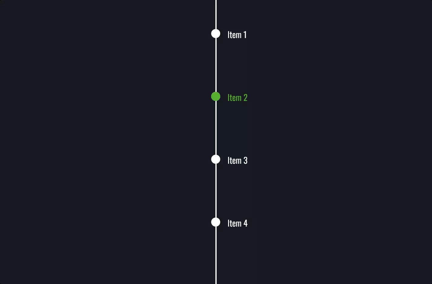
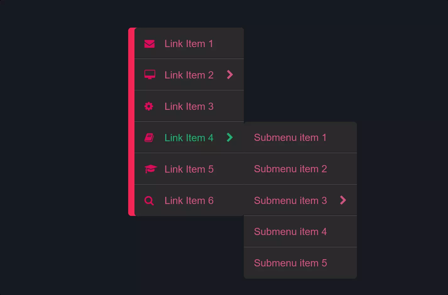
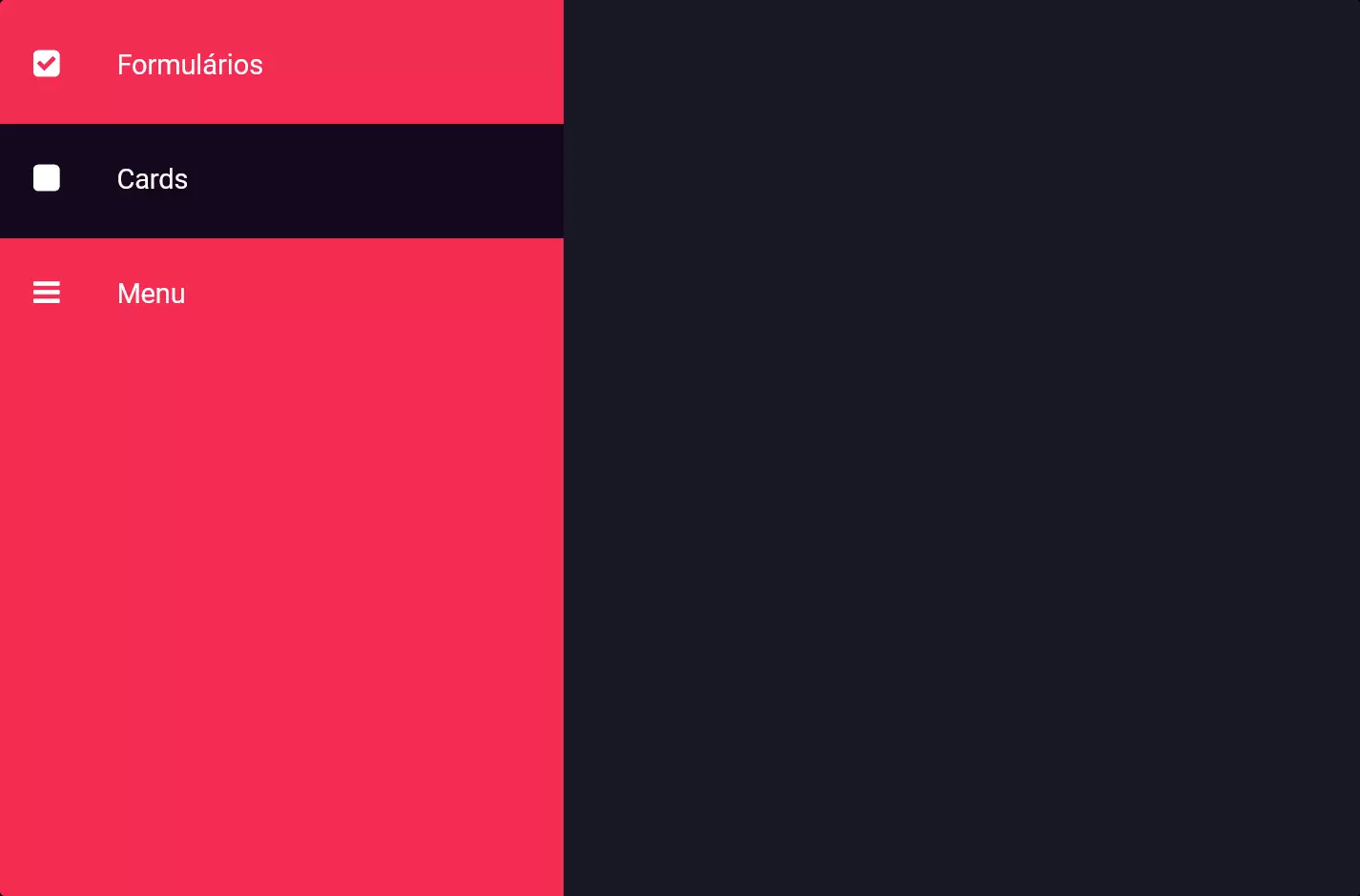
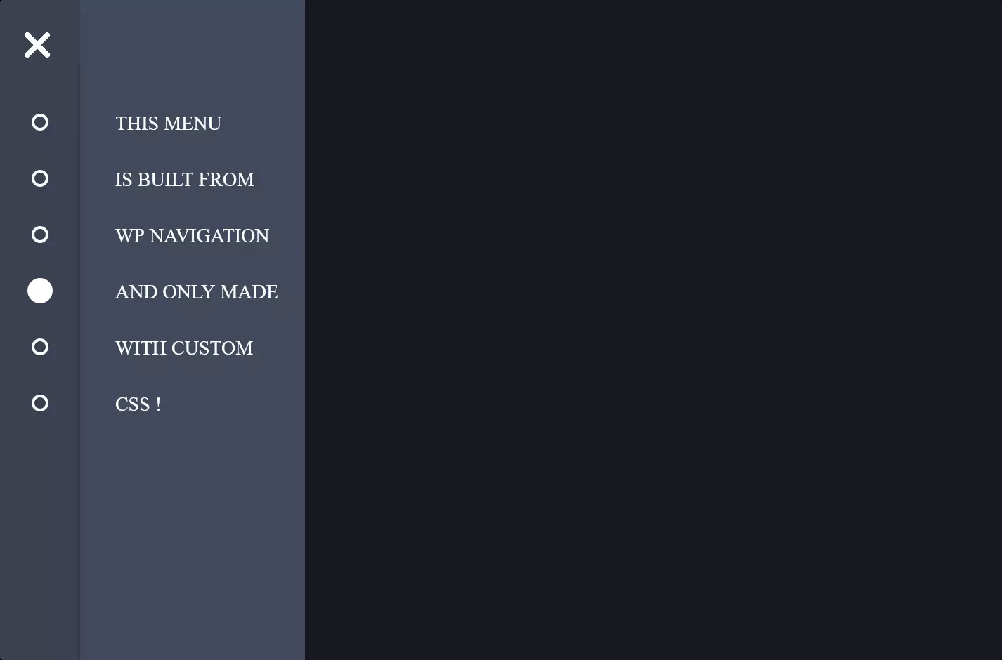
The code snippet we’re looking at is all about creating a sleek and interactive dropdown menu using HTML and CSS, perfect for adding a polished touch to any website. Imagine you’ve got a vertical menu on your site, and you want to make it more dynamic, allowing users to click and see more options without leaving the page. This is where the magic happens!
At the heart of this setup are <div> and <ul> elements, organized in a tidy structure to hold our menu items. Each item within this vertical menu is wrapped in a <li> tag with a class of “dropdown,” signifying that there’s more to see. The real kicker is the use of a hidden checkbox trick, combined with a label (styled as a clickable area) to toggle the visibility of the nested menu items. This clever use of basic HTML elements creates a user-friendly dropdown experience without the need for complex JavaScript.
On the styling front, CSS plays a crucial role in bringing our dropdown menu to life. The styling is designed to be visually appealing and functional, with a focus on ease of use. CSS properties like :checked selector and animations are used to smoothly reveal and hide the dropdown content. The menu’s appearance is customized with shadows, colors, and transitions, making the dropdown feel dynamic and responsive. This combination of HTML structure and CSS styling creates a vertical dropdown menu that’s not only practical but also adds a modern touch to the website’s design.