Menu #6
- 12+
- 36+
- 81+
- 23+
- 9+
- 36+
- 95+
- 24+
- 9+
- 3+
- 37+
- 3.92 KB
- HTML, CSS
- Menu
- animation, hamburger, mobile
- MIT License
<input id="test" type="checkbox" />
<label for="test">
    <svg class="burger" width="86" height="60" viewbox="0 0 150 150">
        <g stroke-width="12">
            <line x1="6" y1="6" x2="80" y2="6"></line>
            <line x1="6" y1="28" x2="80" y2="28"></line>
            <line x1="6" y1="50" x2="80" y2="50"></line>
        </g>
    </svg>
    <svg class="close" width="86" height="60" viewbox="0 0 150 150">
        <g stroke-width="12">
            <line x1="42" y1="6" x2="42" y2="80"></line>
            <line x1="6" y1="42" x2="80" y2="42"></line>
        </g>
    </svg>
</label>
<div class="menu">
    <div>Home</div>
    <div>About</div>
    <div>Hello</div>
    <div>Contact</div>
</div>

<span class="main">
    <span>Pure CSS Menu</span>
</span>
label {
    position: absolute;
    z-index: 1;
}

input {
    display: none;
}

input:checked ~ label {
    right: 0;
}

.burger {
    position: fixed;
    top: 2rem;
    left: 2rem;
    cursor: pointer;
}

.burger g {
    stroke: #ffffff;
    -webkit-transition: stroke 0.25s ease-in-out;
    -o-transition: stroke 0.25s ease-in-out;
    -moz-transition: stroke 0.25s ease-in-out;
    transition: stroke 0.25s ease-in-out;
}

.burger g:hover {
    stroke: #cccccc;
}

input:checked ~ label .burger {
    opacity: 0;
}

.close {
    position: fixed;
    top: 2rem;
    left: 2rem;
    cursor: pointer;
    opacity: 0;
}

.close g:hover {
    stroke: #cccccc;
}

.close g {
    stroke: #ffffff;
    -webkit-transition: stroke 0.25s ease-in-out;
    -o-transition: stroke 0.25s ease-in-out;
    -moz-transition: stroke 0.25s ease-in-out;
    transition: stroke 0.25s ease-in-out;
}

.close line {
    -webkit-transform-origin: 0%;
    -moz-transform-origin: 0%;
    -o-transform-origin: 0%;
    transform-origin: 0%;
}

.close g {
    -webkit-transform: rotateZ(45deg);
    -moz-transform: rotateZ(45deg);
    -o-transform: rotateZ(45deg);
    transform: rotateZ(45deg);
    -webkit-transform-origin: 50%;
    -moz-transform-origin: 50%;
    -o-transform-origin: 50%;
    transform-origin: 50%;
}

input:checked ~ label .close {
    opacity: 1;
}

.menu {
    display: -webkit-box;
    display: -webkit-flex;
    display: -moz-box;
    display: flex;
    -webkit-box-orient: vertical;
    -webkit-box-direction: normal;
    -webkit-flex-direction: column;
    -moz-box-orient: vertical;
    -moz-box-direction: normal;
    flex-direction: column;
    -webkit-box-align: center;
    -webkit-align-items: center;
    -moz-box-align: center;
    align-items: center;
    -webkit-justify-content: space-around;
    justify-content: space-around;
    position: absolute;
    opacity: 0;
    width: 100vw;
    height: 100vh;
    background-color: tomato;
    -webkit-transition: opacity 0.8s cubic-bezier(0.175, 0.885, 0.32, 1.275);
    -o-transition: opacity 0.8s cubic-bezier(0.175, 0.885, 0.32, 1.275);
    -moz-transition: opacity 0.8s cubic-bezier(0.175, 0.885, 0.32, 1.275);
    transition: opacity 0.8s cubic-bezier(0.175, 0.885, 0.32, 1.275);
    color: #ffffff;
    text-transform: uppercase;
    font-size: 24px;
    font-weight: bold;
    font-family: Arial, Helvetica, sans-serif;
}

input:checked ~ .menu {
    opacity: 1;
}

.menu div {
    margin-top: 50px;
    -webkit-transition: margin 0.8s cubic-bezier(0.175, 0.885, 0.32, 1.275);
    -o-transition: margin 0.8s cubic-bezier(0.175, 0.885, 0.32, 1.275);
    -moz-transition: margin 0.8s cubic-bezier(0.175, 0.885, 0.32, 1.275);
    transition: margin 0.8s cubic-bezier(0.175, 0.885, 0.32, 1.275);
}

input:checked ~ .menu div {
    margin-top: 0px;
}

.main {
    display: -webkit-box;
    display: -webkit-flex;
    display: -moz-box;
    display: flex;
    width: 100vw;
    height: 100vh;
}

.main span {
    margin: auto;
    font-size: 40px;
    color: #ffffff;
    font-family: "Pacifico", cursive;
}
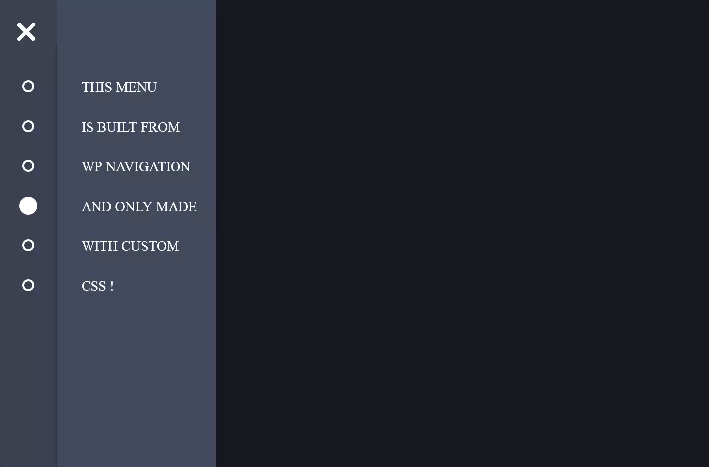
The code snippet we’re diving into is all about bringing to life a sleek, user-friendly navigation experience on smaller screens, like those of smartphones or tablets. Imagine you’re browsing your favorite website on your phone, and you tap on this little icon that looks like three stacked lines—often called a hamburger menu. That’s exactly what this code is designed to do: it toggles a mobile-friendly menu with a neat animation.
At the heart of this setup, we have a clever use of HTML and CSS to create a hamburger menu icon that morphs into a close (X) icon when the menu is activated. This transformation is all about visual feedback and making sure you, the user, know that you’ve successfully opened the menu. With just a few lines of HTML, we have an input checkbox that works like a hidden switch, controlling whether the menu is shown or hidden, alongside SVG graphics for the hamburger and close icons. This checkbox trick is pure CSS magic, eliminating the need for JavaScript to handle the menu’s state.
CSS takes the stage to style and animate our menu and icons. When the hamburger icon is tapped (meaning the checkbox is checked), CSS rules transform it, fading it out, and bringing the close icon into view with a smooth, rotating animation. This visual cue is crucial—it tells you that you’ve initiated an action and that the menu has responded by opening up. Simultaneously, the mobile menu itself slides into view or fades in, depending on how it’s styled, with options like “Home,” “About,” etc., becoming accessible. This entire animation sequence not only looks cool but also feels intuitive, enhancing the overall user experience.
Lastly, the CSS magic doesn’t stop with just showing and hiding elements. It goes a step further by styling the menu container and its contents, making sure they’re visually appealing and easy to interact with on touchscreens. The menu is designed to take up the full screen, ensuring that the navigation options are front and center for you, making it easier to choose where to go next on the site without squinting at tiny links.
In essence, this snippet is a smart, stylish solution for modern web navigation needs, particularly for mobile users. It leverages basic HTML and sophisticated CSS techniques to create an interactive, animated menu that’s not just functional but also a delight to use.