Menu #5
- 12+
- 36+
- 16+
- 23+
- 9+
- 36+
- 95+
- 24+
- 9+
- 3+
- 37+
- 7.48 KB
- HTML, CSS
- Menu
- animation, hamburger, mobile, responsive, sliding
- MIT License
<main>
    <h1>
        Fullscreen menu
        <span> with cool links </span>
    </h1>
    <input type="checkbox" id="myInput" />
    <label for="myInput">
        <span class="bar top"></span>
        <span class="bar middle"></span>
        <span class="bar bottom"></span>
    </label>
    <aside>
        <div class="aside-section aside-left">
            <div class="aside-content">
                <p>Some text that will make you click the cta</p>
                <button class="button">CTA</button>
            </div>
        </div>
        <div class="aside-section aside-right">
            <ul class="aside-list">
                <li><a href="" class="aside-anchor">Link</a></li>
                <li><a href="" class="aside-anchor">Link</a></li>
                <li><a href="" class="aside-anchor">Link</a></li>
                <li><a href="" class="aside-anchor">Link</a></li>
            </ul>
        </div>
    </aside>
</main>
@import url("https://fonts.googleapis.com/css?family=Montserrat");

body,
html {
    height: 100%;
    width: 100%;
    padding: 0;
    margin: 0;
    font-family: "Montserrat", sans-serif;
    color: #9c9fa3;
}

main {
    height: 100%;
    width: 100%;
    position: relative;
    overflow: hidden;
}

.aside-section {
    top: 0;
    bottom: 0;
    position: absolute;
}

.aside-left {
    display: none;
    width: 40%;
    left: 0;
    background-color: #ff5964;
    -webkit-transform: translateY(-100%);
    -moz-transform: translateY(-100%);
    -o-transform: translateY(-100%);
    transform: translateY(-100%);
    -webkit-transition: -webkit-transform 0.4s ease-in-out;
    transition: -webkit-transform 0.4s ease-in-out;
    -o-transition: -o-transform 0.4s ease-in-out;
    -moz-transition: transform 0.4s ease-in-out, -moz-transform 0.4s ease-in-out;
    transition: transform 0.4s ease-in-out;
    transition: transform 0.4s ease-in-out, -webkit-transform 0.4s ease-in-out, -moz-transform 0.4s ease-in-out, -o-transform 0.4s ease-in-out;
}

.aside-right {
    width: 100%;
    right: 0;
    background-color: #38618c;
    -webkit-transform: translateX(100%);
    -moz-transform: translateX(100%);
    -o-transform: translateX(100%);
    transform: translateX(100%);
    -webkit-transition: -webkit-transform 0.4s ease-in-out;
    transition: -webkit-transform 0.4s ease-in-out;
    -o-transition: -o-transform 0.4s ease-in-out;
    -moz-transition: transform 0.4s ease-in-out, -moz-transform 0.4s ease-in-out;
    transition: transform 0.4s ease-in-out;
    transition: transform 0.4s ease-in-out, -webkit-transform 0.4s ease-in-out, -moz-transform 0.4s ease-in-out, -o-transform 0.4s ease-in-out;
}

.aside-list {
    list-style: none;
    padding: 0;
    margin: 0;
    margin-top: 150px;
    text-align: left;
    padding-left: 50px;
}

.aside-content {
    margin-top: 150px;
    padding: 0 40px;
    position: relative;
    color: white;
    text-align: center;
}

.aside-list li {
    margin-bottom: 20px;
}

.aside-anchor::after {
    content: "";
    position: absolute;
    bottom: 0;
    background-color: #ff5964;
    left: 0;
    right: 0;
    height: 3px;
    -webkit-border-radius: 3px;
    -moz-border-radius: 3px;
    border-radius: 3px;
}

.aside-anchor::before {
    -webkit-border-radius: 3px;
    -moz-border-radius: 3px;
    border-radius: 3px;
    content: "";
    position: absolute;
    bottom: 0;
    background-color: #fff;
    left: 0;
    height: 3px;
    z-index: 1;
    width: 50%;
    -webkit-transition: transform 0.2s ease-in-out;
    -o-transition: transform 0.2s ease-in-out;
    -webkit-transition: -webkit-transform 0.2s ease-in-out;
    transition: -webkit-transform 0.2s ease-in-out;
    -o-transition: -o-transform 0.2s ease-in-out;
    -moz-transition: transform 0.2s ease-in-out, -moz-transform 0.2s ease-in-out;
    transition: transform 0.2s ease-in-out;
    transition: transform 0.2s ease-in-out, -webkit-transform 0.2s ease-in-out, -moz-transform 0.2s ease-in-out, -o-transform 0.2s ease-in-out;
}

.aside-anchor:hover:before {
    -webkit-transform: translateX(100%);
    -moz-transform: translateX(100%);
    -o-transform: translateX(100%);
    transform: translateX(100%);
}

.aside-anchor {
    padding-bottom: 7px;
    color: #fff;
    text-decoration: none;
    font-size: 30px;
    position: relative;
    font-weight: 500;
}

input[type="checkbox"] {
    display: none;
}

input[type="checkbox"]:checked ~ aside .aside-left {
    -webkit-transform: translateY(0%);
    -moz-transform: translateY(0%);
    -o-transform: translateY(0%);
    transform: translateY(0%);
}

input[type="checkbox"]:checked ~ aside .aside-right {
    -webkit-transform: translateX(0%);
    -moz-transform: translateX(0%);
    -o-transform: translateX(0%);
    transform: translateX(0%);
}

input[type="checkbox"]:checked ~ label .bar {
    background-color: #fff;
}

input[type="checkbox"]:checked ~ label .top {
    -webkit-transform: translateY(0px) rotateZ(45deg);
    -moz-transform: translateY(0px) rotateZ(45deg);
    -o-transform: translateY(0px) rotateZ(45deg);
    transform: translateY(0px) rotateZ(45deg);
}

input[type="checkbox"]:checked ~ label .bottom {
    -webkit-transform: translateY(-15px) rotateZ(-45deg);
    -moz-transform: translateY(-15px) rotateZ(-45deg);
    -o-transform: translateY(-15px) rotateZ(-45deg);
    transform: translateY(-15px) rotateZ(-45deg);
}

input[type="checkbox"]:checked ~ label .middle {
    width: 0;
}

.middle {
    margin: 0 auto;
}

label {
    top: 10px;
    display: inline-block;
    padding: 7px 10px;
    background-color: transparent;
    cursor: pointer;
    margin: 10px;
    z-index: 3;
    position: fixed;
}

.bar {
    display: block;
    background-color: #38618c;
    width: 30px;
    height: 3px;
    -webkit-border-radius: 5px;
    -moz-border-radius: 5px;
    border-radius: 5px;
    margin: 5px auto;
    -webkit-transition: background-color 0.4s ease-in, width 0.4s ease-in, -webkit-transform 0.4s ease-in;
    transition: background-color 0.4s ease-in, width 0.4s ease-in, -webkit-transform 0.4s ease-in;
    -o-transition: background-color 0.4s ease-in, width 0.4s ease-in, -o-transform 0.4s ease-in;
    -moz-transition: background-color 0.4s ease-in, transform 0.4s ease-in, width 0.4s ease-in, -moz-transform 0.4s ease-in;
    transition: background-color 0.4s ease-in, transform 0.4s ease-in, width 0.4s ease-in;
    transition: background-color 0.4s ease-in, transform 0.4s ease-in, width 0.4s ease-in, -webkit-transform 0.4s ease-in, -moz-transform 0.4s ease-in, -o-transform 0.4s ease-in;
}

h1 {
    margin: 0;
    position: relative;
    top: 50%;
    left: 0;
    right: 0;
    -webkit-transform: translateY(-50%);
    -moz-transform: translateY(-50%);
    -o-transform: translateY(-50%);
    transform: translateY(-50%);
    text-align: center;
    font-size: 30px;
}

h1 span {
    font-size: 20px;
    display: block;
}

p {
    font-size: 30px;
}

.button {
    display: inline-block;
    background-image: none;
    border: none;
    background-color: transparent;
    padding-bottom: 7px;
    position: relative;
    cursor: pointer;
    font-size: 20px;
    color: white;
    padding: 7px 50px;
    border: 2px solid white;
}

@media (min-width: 992px) {
    h1 {
        font-size: 40px;
    }
    .aside-left {
        display: block;
    }

    .aside-right {
        width: 60%;
    }
}
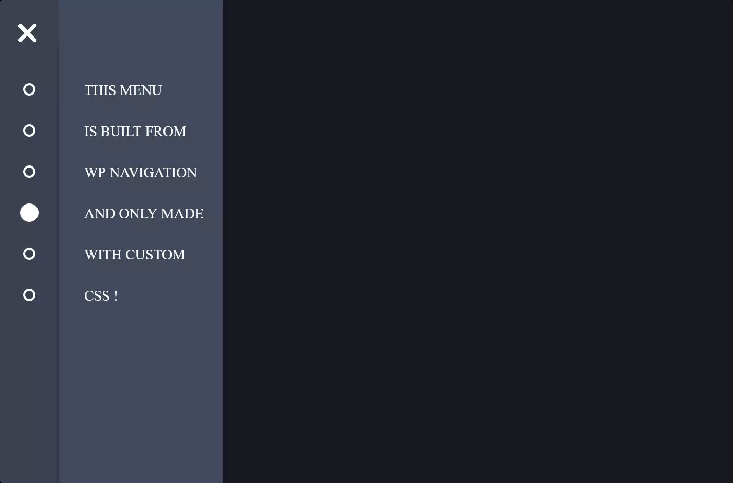
The code snippet we’re looking at is all about bringing a cool, interactive menu to life on a webpage, specifically tailored for a fantastic user experience across devices, from desktops to mobiles. Imagine you’re crafting a sleek, modern website and you want to include a menu that not only looks good but also works smoothly across different screen sizes. This code is your go-to solution for creating a responsive, sliding menu that adapts beautifully to the user’s device, enhancing the overall browsing experience.
At the heart of this design is the concept of a hamburger menu, which is a popular choice for mobile sites due to its compact and space-saving nature. When you tap or click on this hamburger icon, a full-screen menu magically slides in, offering a list of navigational links without cluttering the screen. This transition isn’t just a simple appearance; it’s an animation that transforms the menu from a minimalistic set of bars into a full-screen navigation guide, making the user interaction smooth and visually appealing.
To achieve this engaging user experience, the code employs CSS for styling and animations, alongside HTML for structure. CSS animations bring the menu to life, sliding it in and out of view with just the right timing, ensuring the menu feels responsive and intuitive. The use of media queries in CSS also makes the menu responsive, meaning it adjusts its layout and functionality to provide an optimal viewing experience on different devices, from the narrow screens of smartphones to the wider displays of desktop computers. This adaptability is key in today’s web design, where a “one-size-fits-all” approach just doesn’t cut it.