Menu #23
- 12+
- 36+
- 16+
- 23+
- 9+
- 36+
- 95+
- 24+
- 9+
- 3+
- 37+
- 9.83 KB
- HTML, CSS, JS
- Menu
- vertical
- MIT License
<script src="https://cdnjs.cloudflare.com/ajax/libs/gsap/1.19.0/TweenMax.min.js"></script>
<nav class="vertical-navigation">
    <ul class="vertical-menu">
        <li class="link in"><span class="dot in"></span> <a href="#">Item 1</a></li>
        <li class="link"><span class="dot"></span> <a href="#">Item 2</a></li>
        <li class="link"><span class="dot"></span> <a href="#">Item 3</a></li>
        <li class="link last"><span class="dot"></span> <a href="#">Item 4</a></li>

        <li class="link track top"></li>
    </ul>
</nav>
@import url(https://fonts.googleapis.com/css?family=Oswald);

.vertical-navigation {
    font-family: "Oswald", sans-serif;
    position: absolute;
    top: 0;
    left: 50%;
    margin: 0 0 0 -1px;
    height: 0%;
    width: 2px;
    background: #fff;
    -webkit-transition: height 1s ease-in-out;
    -o-transition: height 1s ease-in-out;
    -moz-transition: height 1s ease-in-out;
    transition: height 1s ease-in-out;
}
.vertical-navigation.entrance {
    height: 100%;
}
.vertical-navigation .vertical-menu {
    position: absolute;
    list-style-type: none;
    padding: 0;
    width: 150px;
    height: -webkit-calc(100% - 70px);
    height: -moz-calc(100% - 70px);
    height: calc(100% - 70px);
    top: 70px;
    margin: 0 0 0 -7px;
    -webkit-transition: "opacity" 0.5s cubic-bezier(0.19, 1, 0.22, 1) 1.2s;
    -moz-transition: "opacity" 0.5s cubic-bezier(0.19, 1, 0.22, 1) 1.2s;
    -o-transition: "opacity" 0.5s cubic-bezier(0.19, 1, 0.22, 1) 1.2s;
    transition: "opacity" 0.5s cubic-bezier(0.19, 1, 0.22, 1) 1.2s;
    /* easeOutExpo */
    opacity: 0;
    overflow: hidden;
}
.vertical-navigation .vertical-menu.entrance {
    opacity: 1;
}
.vertical-navigation .vertical-menu .link {
    position: relative;
    z-index: 2;
    float: left;
    width: 100%;
    margin: 0 0 80px 0;
}
.vertical-navigation .vertical-menu .link:nth-child(1) .dot {
    -webkit-transition: all 1s cubic-bezier(0.19, 1, 0.22, 1) 0.7s;
    -moz-transition: all 1s cubic-bezier(0.19, 1, 0.22, 1) 0.7s;
    -o-transition: all 1s cubic-bezier(0.19, 1, 0.22, 1) 0.7s;
    transition: all 1s cubic-bezier(0.19, 1, 0.22, 1) 0.7s;
    /* easeOutExpo */
}
.vertical-navigation .vertical-menu .link:nth-child(1) .dot.in {
    background: #007ba6;
}
.vertical-navigation .vertical-menu .link:nth-child(1) a {
    -webkit-transition: "opacity" 1s cubic-bezier(0.19, 1, 0.22, 1) 0.8s;
    -moz-transition: "opacity" 1s cubic-bezier(0.19, 1, 0.22, 1) 0.8s;
    -o-transition: "opacity" 1s cubic-bezier(0.19, 1, 0.22, 1) 0.8s;
    transition: "opacity" 1s cubic-bezier(0.19, 1, 0.22, 1) 0.8s;
    /* easeOutExpo */
}
.vertical-navigation .vertical-menu .link:nth-child(1).in a {
    color: #007ba6;
}
.vertical-navigation .vertical-menu .link:nth-child(2) .dot {
    -webkit-transition: all 1s cubic-bezier(0.19, 1, 0.22, 1) 0.8s;
    -moz-transition: all 1s cubic-bezier(0.19, 1, 0.22, 1) 0.8s;
    -o-transition: all 1s cubic-bezier(0.19, 1, 0.22, 1) 0.8s;
    transition: all 1s cubic-bezier(0.19, 1, 0.22, 1) 0.8s;
    /* easeOutExpo */
}
.vertical-navigation .vertical-menu .link:nth-child(2) .dot.in {
    background: #56af31;
}
.vertical-navigation .vertical-menu .link:nth-child(2) a {
    -webkit-transition: "opacity" 1s cubic-bezier(0.19, 1, 0.22, 1) 1s;
    -moz-transition: "opacity" 1s cubic-bezier(0.19, 1, 0.22, 1) 1s;
    -o-transition: "opacity" 1s cubic-bezier(0.19, 1, 0.22, 1) 1s;
    transition: "opacity" 1s cubic-bezier(0.19, 1, 0.22, 1) 1s;
    /* easeOutExpo */
}
.vertical-navigation .vertical-menu .link:nth-child(2).in a {
    color: #56af31;
}
.vertical-navigation .vertical-menu .link:nth-child(3) .dot {
    -webkit-transition: all 1s cubic-bezier(0.19, 1, 0.22, 1) 1s;
    -moz-transition: all 1s cubic-bezier(0.19, 1, 0.22, 1) 1s;
    -o-transition: all 1s cubic-bezier(0.19, 1, 0.22, 1) 1s;
    transition: all 1s cubic-bezier(0.19, 1, 0.22, 1) 1s;
    /* easeOutExpo */
}
.vertical-navigation .vertical-menu .link:nth-child(3) .dot.in {
    background: #e3b505;
}
.vertical-navigation .vertical-menu .link:nth-child(3) a {
    -webkit-transition: "opacity" 1s cubic-bezier(0.19, 1, 0.22, 1) 1.2s;
    -moz-transition: "opacity" 1s cubic-bezier(0.19, 1, 0.22, 1) 1.2s;
    -o-transition: "opacity" 1s cubic-bezier(0.19, 1, 0.22, 1) 1.2s;
    transition: "opacity" 1s cubic-bezier(0.19, 1, 0.22, 1) 1.2s;
    /* easeOutExpo */
}
.vertical-navigation .vertical-menu .link:nth-child(3).in a {
    color: #e3b505;
}
.vertical-navigation .vertical-menu .link:nth-child(4) .dot {
    -webkit-transition: all 1s cubic-bezier(0.19, 1, 0.22, 1) 1.3s;
    -moz-transition: all 1s cubic-bezier(0.19, 1, 0.22, 1) 1.3s;
    -o-transition: all 1s cubic-bezier(0.19, 1, 0.22, 1) 1.3s;
    transition: all 1s cubic-bezier(0.19, 1, 0.22, 1) 1.3s;
    /* easeOutExpo */
}
.vertical-navigation .vertical-menu .link:nth-child(4) .dot.in {
    background: #95190c;
}
.vertical-navigation .vertical-menu .link:nth-child(4) a {
    -webkit-transition: "opacity" 1s cubic-bezier(0.19, 1, 0.22, 1) 1.4s;
    -moz-transition: "opacity" 1s cubic-bezier(0.19, 1, 0.22, 1) 1.4s;
    -o-transition: "opacity" 1s cubic-bezier(0.19, 1, 0.22, 1) 1.4s;
    transition: "opacity" 1s cubic-bezier(0.19, 1, 0.22, 1) 1.4s;
    /* easeOutExpo */
}
.vertical-navigation .vertical-menu .link:nth-child(4).in a {
    color: #95190c;
}
.vertical-navigation .vertical-menu .link.last {
    margin-bottom: 0;
}
.vertical-navigation .vertical-menu .link.track {
    position: absolute;
    z-index: 1;
    background: white;
    width: 15px;
    height: 15px;
    -webkit-border-radius: 25px;
    -moz-border-radius: 25px;
    border-radius: 25px;
    display: none;
}
.vertical-navigation .vertical-menu .link.track.top {
    top: 5px;
}
.vertical-navigation .vertical-menu .link a {
    text-decoration: none;
    opacity: 0;
    float: left;
    cursor: pointer;
    -webkit-transform: translate3d(-20px, 0, 0);
    -moz-transform: translate3d(-20px, 0, 0);
    transform: translate3d(-20px, 0, 0);
    margin: 3px 0 0 0;
    font-size: 14px;
    color: white;
    -webkit-transition: color 2s cubic-bezier(0.19, 1, 0.22, 1) 0.5s;
    -moz-transition: color 2s cubic-bezier(0.19, 1, 0.22, 1) 0.5s;
    -o-transition: color 2s cubic-bezier(0.19, 1, 0.22, 1) 0.5s;
    transition: color 2s cubic-bezier(0.19, 1, 0.22, 1) 0.5s;
    /* easeOutExpo */
}
.vertical-navigation .vertical-menu .link a.animate {
    opacity: 1;
    -webkit-transform: translate3d(0, 0, 0);
    -moz-transform: translate3d(0, 0, 0);
    transform: translate3d(0, 0, 0);
}
.vertical-navigation .vertical-menu .link .dot {
    width: 15px;
    height: 15px;
    background: #ffffff;
    -webkit-border-radius: 25px;
    -moz-border-radius: 25px;
    border-radius: 25px;
    display: block;
    float: left;
    margin: 5px 12px 0 0;
    -webkit-transform: scale(0);
    -moz-transform: scale(0);
    -o-transform: scale(0);
    transform: scale(0);
}
.vertical-navigation .vertical-menu .link .dot.animate {
    -webkit-transform: scale(1);
    -moz-transform: scale(1);
    -o-transform: scale(1);
    transform: scale(1);
    -webkit-transition: all 1s cubic-bezier(0.19, 1, 0.22, 1) 0.5s;
    -moz-transition: all 1s cubic-bezier(0.19, 1, 0.22, 1) 0.5s;
    -o-transition: all 1s cubic-bezier(0.19, 1, 0.22, 1) 0.5s;
    transition: all 1s cubic-bezier(0.19, 1, 0.22, 1) 0.5s;
    /* easeOutExpo */
}
.vertical-navigation .vertical-menu .link .dot.in {
    background: #2a8a93;
    -webkit-transition: all 1s cubic-bezier(0.19, 1, 0.22, 1) 0.5s;
    -moz-transition: all 1s cubic-bezier(0.19, 1, 0.22, 1) 0.5s;
    -o-transition: all 1s cubic-bezier(0.19, 1, 0.22, 1) 0.5s;
    transition: all 1s cubic-bezier(0.19, 1, 0.22, 1) 0.5s;
    /* easeOutExpo */
}
var currentItem = 0;
var clicked = false;

$(document).ready(function () {
    $("nav, ul").addClass("entrance");

    setTimeout(function () {
        $("ul a, .dot").addClass("animate");
        $(".track").fadeIn();
    }, 1500);

    $(".link").on("click", function () {
        if (!clicked) {
            clicked = true;
            var el = $(this);
            var index = $(el).index();

            navigate(el, index, currentItem);

            currentItem = index;

            $(".link, .link .dot").removeClass("in");

            $(el).addClass("in").find(".dot").addClass("in");
        }
    });
});

function navigate(el, index, currentNav) {
    var oldPos = $(".link").eq(currentNav).offset();
    var newPos = $(".link").eq(index).offset();

    if (index > currentNav) {
        var velocity = index - currentNav;
        var speed = velocity * 0.5 - (velocity - 1) * 0.3;
        var calc = newPos.top - oldPos.top + 15;

        TweenMax.to($(".track"), speed, { height: calc, ease: Expo.easeOut });

        setTimeout(function () {
            TweenMax.to($(".track"), speed, { height: 15, top: newPos.top - 65, ease: Expo.easeOut });
        }, speed * 1000);
    } else {
        var bottomPos = $("ul").height() - (oldPos.top + 29);
        var newBottomPos = $("ul").height() - newPos.top;

        var velocity = currentNav - index;
        var speed = velocity * 0.5 - (velocity - 1) * 0.3;

        $(".track").css({ top: "auto", bottom: bottomPos });

        TweenMax.to($(".track"), speed, { height: oldPos.top - newPos.top + 14, ease: Expo.easeOut });

        setTimeout(function () {
            TweenMax.to($(".track"), speed, { height: 15, bottom: newBottomPos, ease: Expo.easeOut });
            $(el).addClass("in").find(".dot").addClass("in");

            var newPos = $(".link").eq(index).position();
            $(".track").css({ top: newPos.top + 5, bottom: "auto" });
        }, speed * 1000);
    }

    setTimeout(function () {
        clicked = false;
    }, 1200);
}
Imagine we’re crafting a sleek, interactive menu for a website, kind of like building a spaceship control panel but for navigating web pages. We start by summoning the magic of GSAP (GreenSock Animation Platform) with a line of code that brings in its power to animate things smoothly. This is like picking the best engine for our spaceship.
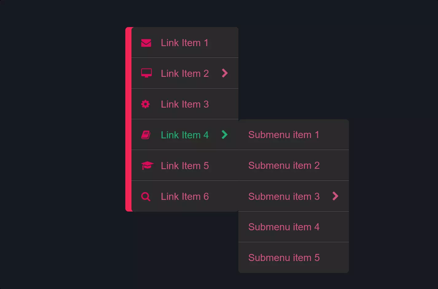
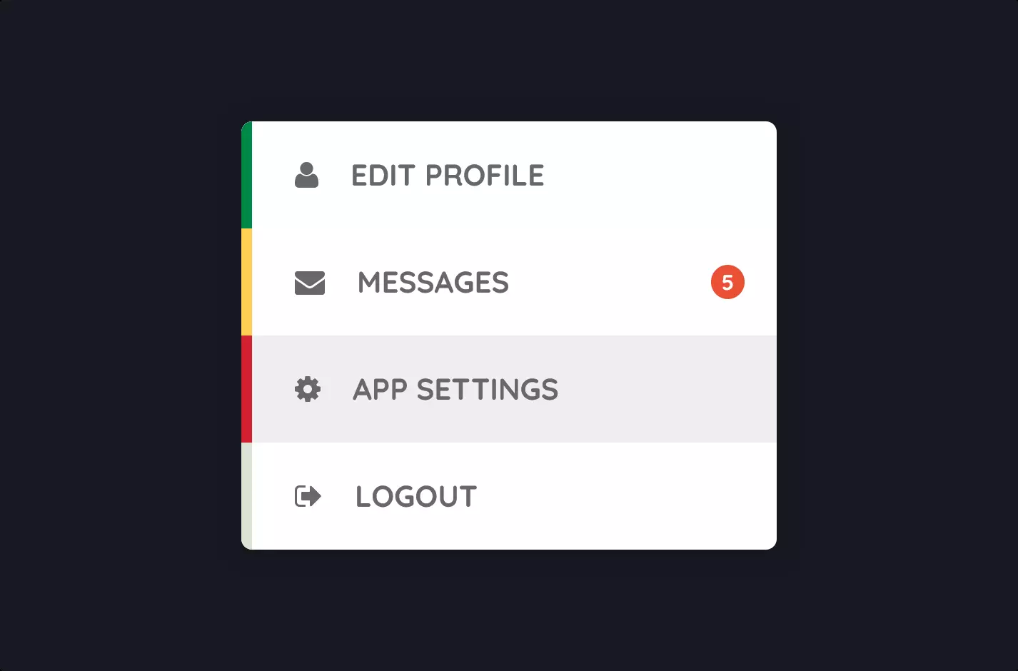
Next, we lay out our control panel (the navigation menu) using HTML. It’s a vertical list, where each item is a destination in our digital universe. Think of these as buttons on our spaceship’s dashboard, each leading to a different planet (or part of the website).
To make it look cool and futuristic, we style it with CSS. We’re talking about setting up the font to something modern, positioning the menu just right on the screen, and giving it a minimalistic, almost laser-like appearance with a skinny white line. Then, we add animations to make the menu items and their accompanying dots (little circles next to the text) pop in smoothly, as if they’re coming into existence out of thin air.
But here’s where it gets really space-age: When you click on a menu item, the magic of jQuery and GSAP combined moves a tracking dot to follow your journey through the menu. This isn’t just any movement; it’s calculated based on where you’re going in the menu, creating a fluid motion that feels like gliding through space. The speed and path of this dot adjust dynamically, making the experience interactive and responsive.
In essence, this code is about breathing life into a website’s navigation, turning it from a static list of links into an engaging, animated journey. It’s a way of enhancing the user’s experience, making the act of exploring a website not just functional, but also a bit of fun.