Menu #18
- 12+
- 26+
- 29+
- 12.1+
- 9+
- 26+
- 29+
- 14+
- 9+
- 1.5+
- 37+
- 2.87 KB
- HTML, CSS
- Menu
- vertical
- MIT License
<ul class="menu">
    <li title="home"><a href="#" class="home">home</a></li>
    <li title="search"><a href="#" class="search">search</a></li>
    <li title="pencil"><a href="#" class="pencil">pencil</a></li>
    <li title="about"><a href="#" class="active about">about</a></li>
    <li title="archive"><a href="#" class="archive">archive</a></li>
    <li title="contact"><a href="#" class="contact">contact</a></li>
</ul>
@import url("https://fonts.googleapis.com/css2?family=Protest+Riot&display=swap");
@import url("//cdnjs.cloudflare.com/ajax/libs/font-awesome/4.0.3/css/font-awesome.min.css");
.menu {
    font-family: "Protest Riot", sans-serif;
    position: fixed;
    top: 0;
    left: 0;
    height: 100%;
    list-style-type: none;
    margin: 0;
    padding: 0;
    background: #fff4f5;
}
.menu li a {
    display: block;
    height: em;
    width: 5em;
    text-indent: -500em;
    line-height: 5em;
    text-align: center;
    color: #ff5c62;
    background: #fff4f5;
    position: relative;
    border-bottom: 1px solid #ffe2e3;
    -webkit-transition: background 0.3s ease-in-out;
    -o-transition: background 0.3s ease-in-out;
    -moz-transition: background 0.3s ease-in-out;
    transition: background 0.3s ease-in-out;
}
.menu li a:before {
    font-family: FontAwesome;
    text-indent: 0em;
    position: absolute;
    top: 0;
    left: 0;
    width: 100%;
    height: 100%;
    font-size: 1.4em;
}
.menu li a.search:before {
    content: "\f002";
}
.menu li a.archive:before {
    content: "\f187";
}
.menu li a.pencil:before {
    content: "\f040";
}
.menu li a.contact:before {
    content: "\f003";
}
.menu li a.about:before {
    content: "\f007";
}
.menu li a.home:before {
    content: "\f015";
}
.menu li a:hover {
    background: #ff5c62;
    color: #fff;
}
.menu li.current a {
    background: #ff5e5e;
    color: #fff;
}
.menu li a.active {
    background: #ff5e5e;
    color: #fff;
}
.menu li a.active:after {
    position: absolute;
    left: 5em;
    top: 0;
    content: "";
    border: 2.5em solid transparent;
    border-left-color: #ff5c62;
    border-width: 2.5em 1em;
}
.menu li {
    position: relative;
}
.menu li:after {
    content: attr(title);
    position: absolute;
    left: 5em;
    top: 0;
    height: 5em;
    -webkit-box-sizing: border-box;
    -moz-box-sizing: border-box;
    box-sizing: border-box;
    text-transform: uppercase;
    background: #ff5c62;
    padding: 2em;
    -webkit-transition: all 0.3s ease-in-out;
    -o-transition: all 0.3s ease-in-out;
    -moz-transition: all 0.3s ease-in-out;
    transition: all 0.3s ease-in-out;
    visibility: hidden;
    opacity: 0;
    color: white;
}
.menu li:hover:after {
    visibility: visible;
    opacity: 1;
}
@media screen and (max-height: 34em) {
    .menu li {
        font-size: 70%;
    }
}
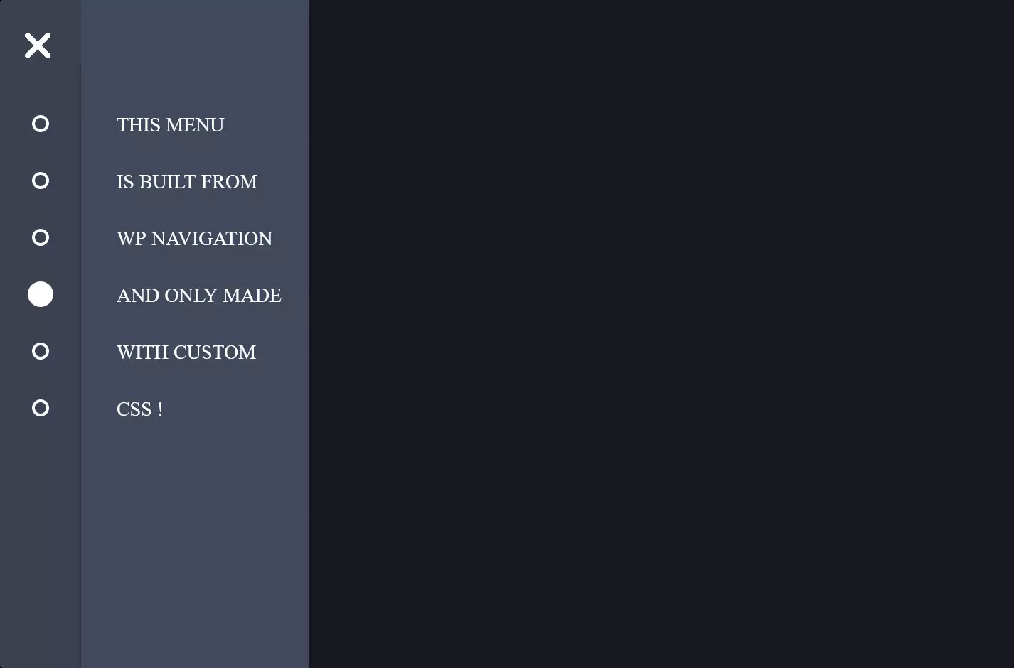
The code snippet you’re curious about creates a stylish vertical menu using HTML and CSS, incorporating a sleek and modern design that’s both functional and visually appealing. At its heart, the HTML structure is built around an unordered list <ul> with each item <li> representing a different section of the menu. These items are made clickable through anchor tags <a>, facilitating navigation.
Delving into the CSS, the menu is given a fixed position on the screen, ensuring it remains visible as you scroll down the page. The aesthetic choice of a soft pink background with items highlighted in red upon hover adds a warm and inviting touch. The use of FontAwesome icons before each menu item injects a dose of visual flair and helps users quickly identify the section they’re interested in. Additionally, CSS transitions are employed to smooth out the color change effects, enhancing the user interaction experience.
What makes this menu stand out is its responsive design element. When hovered over, each menu item reveals its title in a tooltip-like fashion to the right, elegantly expanding the menu’s width. This feature, combined with media queries that adjust the font size for smaller screens, ensures the menu remains user-friendly and accessible across a range of devices. The overall result is a vertical menu that’s not just a navigation tool, but a statement piece in the website’s design.