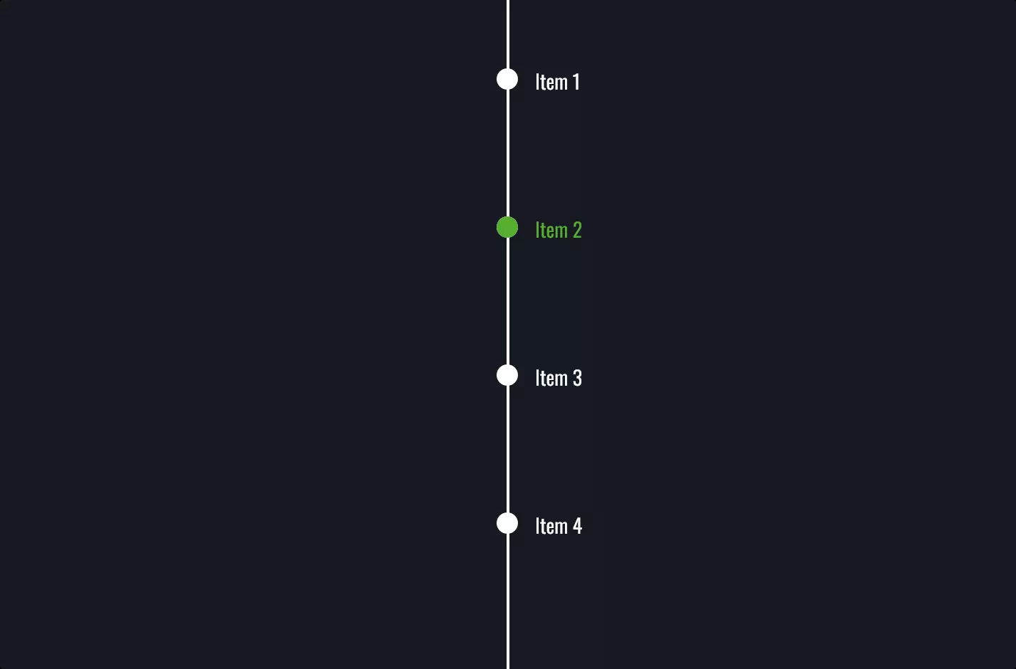
Menu #16
- 12+
- 43+
- 20+
- 30+
- 9+
- 43+
- 20+
- 30+
- 9+
- 4+
- 43+
- 80.48 KB
- HTML, CSS
- Menu
- animation, vertical
- MIT License
<link rel="stylesheet" href="https://cdnjs.cloudflare.com/ajax/libs/meyer-reset/2.0/reset.min.css" />
<script src="https://cdnjs.cloudflare.com/ajax/libs/prefixfree/1.0.7/prefixfree.min.js"></script>
<nav class="navbar">
    <ul class="navbar__menu">
        <li class="navbar__item">
            <a href="#" class="navbar__link">
                <svg xmlns="http://www.w3.org/2000/svg" width="24" height="24" viewBox="0 0 24 24" fill="none" stroke="currentColor" stroke-width="2" stroke-linecap="round" stroke-linejoin="round" class="feather feather-home">
                    <path d="M3 9l9-7 9 7v11a2 2 0 0 1-2 2H5a2 2 0 0 1-2-2z"></path>
                    <polyline points="9 22 9 12 15 12 15 22"></polyline>
                </svg>
                <span>Home</span>
            </a>
        </li>
        <li class="navbar__item">
            <a href="#" class="navbar__link">
                <svg xmlns="http://www.w3.org/2000/svg" width="24" height="24" viewBox="0 0 24 24" fill="none" stroke="currentColor" stroke-width="2" stroke-linecap="round" stroke-linejoin="round" class="feather feather-message-square">
                    <path d="M21 15a2 2 0 0 1-2 2H7l-4 4V5a2 2 0 0 1 2-2h14a2 2 0 0 1 2 2z"></path>
                </svg>
                <span>Messages</span>
            </a>
        </li>
        <li class="navbar__item">
            <a href="#" class="navbar__link">
                <svg xmlns="http://www.w3.org/2000/svg" width="24" height="24" viewBox="0 0 24 24" fill="none" stroke="currentColor" stroke-width="2" stroke-linecap="round" stroke-linejoin="round" class="feather feather-users">
                    <path d="M17 21v-2a4 4 0 0 0-4-4H5a4 4 0 0 0-4 4v2"></path>
                    <circle cx="9" cy="7" r="4"></circle>
                    <path d="M23 21v-2a4 4 0 0 0-3-3.87"></path>
                    <path d="M16 3.13a4 4 0 0 1 0 7.75"></path>
                </svg>
                <span>Customers</span>
            </a>
        </li>
        <li class="navbar__item">
            <a href="#" class="navbar__link">
                <svg xmlns="http://www.w3.org/2000/svg" width="24" height="24" viewBox="0 0 24 24" fill="none" stroke="currentColor" stroke-width="2" stroke-linecap="round" stroke-linejoin="round" class="feather feather-folder">
                    <path d="M22 19a2 2 0 0 1-2 2H4a2 2 0 0 1-2-2V5a2 2 0 0 1 2-2h5l2 3h9a2 2 0 0 1 2 2z"></path>
                </svg>
                <span>Projects</span>
            </a>
        </li>
        <li class="navbar__item">
            <a href="#" class="navbar__link">
                <svg xmlns="http://www.w3.org/2000/svg" width="24" height="24" viewBox="0 0 24 24" fill="none" stroke="currentColor" stroke-width="2" stroke-linecap="round" stroke-linejoin="round" class="feather feather-archive">
                    <polyline points="21 8 21 21 3 21 3 8"></polyline>
                    <rect x="1" y="3" width="22" height="5"></rect>
                    <line x1="10" y1="12" x2="14" y2="12"></line>
                </svg>
                <span>Resources</span>
            </a>
        </li>
        <li class="navbar__item">
            <a href="#" class="navbar__link">
                <svg xmlns="http://www.w3.org/2000/svg" width="24" height="24" viewBox="0 0 24 24" fill="none" stroke="currentColor" stroke-width="2" stroke-linecap="round" stroke-linejoin="round" class="feather feather-help-circle">
                    <circle cx="12" cy="12" r="10"></circle>
                    <path d="M9.09 9a3 3 0 0 1 5.83 1c0 2-3 3-3 3"></path>
                    <line x1="12" y1="17" x2="12.01" y2="17"></line>
                </svg>
                <span>Help</span>
            </a>
        </li>
        <li class="navbar__item">
            <a href="#" class="navbar__link">
                <svg xmlns="http://www.w3.org/2000/svg" width="24" height="24" viewBox="0 0 24 24" fill="none" stroke="currentColor" stroke-width="2" stroke-linecap="round" stroke-linejoin="round" class="feather feather-settings">
                    <circle cx="12" cy="12" r="3"></circle>
                    <path
                        d="M19.4 15a1.65 1.65 0 0 0 .33 1.82l.06.06a2 2 0 0 1 0 2.83 2 2 0 0 1-2.83 0l-.06-.06a1.65 1.65 0 0 0-1.82-.33 1.65 1.65 0 0 0-1 1.51V21a2 2 0 0 1-2 2 2 2 0 0 1-2-2v-.09A1.65 1.65 0 0 0 9 19.4a1.65 1.65 0 0 0-1.82.33l-.06.06a2 2 0 0 1-2.83 0 2 2 0 0 1 0-2.83l.06-.06a1.65 1.65 0 0 0 .33-1.82 1.65 1.65 0 0 0-1.51-1H3a2 2 0 0 1-2-2 2 2 0 0 1 2-2h.09A1.65 1.65 0 0 0 4.6 9a1.65 1.65 0 0 0-.33-1.82l-.06-.06a2 2 0 0 1 0-2.83 2 2 0 0 1 2.83 0l.06.06a1.65 1.65 0 0 0 1.82.33H9a1.65 1.65 0 0 0 1-1.51V3a2 2 0 0 1 2-2 2 2 0 0 1 2 2v.09a1.65 1.65 0 0 0 1 1.51 1.65 1.65 0 0 0 1.82-.33l.06-.06a2 2 0 0 1 2.83 0 2 2 0 0 1 0 2.83l-.06.06a1.65 1.65 0 0 0-.33 1.82V9a1.65 1.65 0 0 0 1.51 1H21a2 2 0 0 1 2 2 2 2 0 0 1-2 2h-.09a1.65 1.65 0 0 0-1.51 1z"
                    ></path>
                </svg>
                <span>Settings</span>
            </a>
        </li>
    </ul>
</nav>
@import url("https://fonts.googleapis.com/css2?family=Open+Sans:wght@600&display=swap");
body {
background: #eaeef6;
font-family: "Open Sans", sans-serif;
}
.navbar {
position: fixed;
top: 1rem;
left: 1rem;
background: #fff;
-webkit-border-radius: 10px;
-moz-border-radius: 10px;
border-radius: 10px;
padding: 1rem 0;
-webkit-box-shadow: 0 0 40px rgba(0, 0, 0, 0.03);
-moz-box-shadow: 0 0 40px rgba(0, 0, 0, 0.03);
box-shadow: 0 0 40px rgba(0, 0, 0, 0.03);
height: -webkit-calc(100vh - 4rem);
height: -moz-calc(100vh - 4rem);
height: calc(100vh - 4rem);
}
.navbar__link {
position: relative;
display: -webkit-box;
display: -webkit-flex;
display: -moz-box;
display: flex;
-webkit-box-align: center;
-webkit-align-items: center;
-moz-box-align: center;
align-items: center;
-webkit-box-pack: center;
-webkit-justify-content: center;
-moz-box-pack: center;
justify-content: center;
height: 3.5rem;
width: 5.5rem;
color: #6a778e;
-webkit-transition: 250ms ease all;
-o-transition: 250ms ease all;
-moz-transition: 250ms ease all;
transition: 250ms ease all;
}
.navbar__link span {
position: absolute;
left: 100%;
-webkit-transform: translate(-3rem);
-moz-transform: translate(-3rem);
-o-transform: translate(-3rem);
transform: translate(-3rem);
margin-left: 1rem;
opacity: 0;
pointer-events: none;
color: #406ff3;
background: #fff;
padding: 0.75rem;
-webkit-transition: 250ms ease all;
-o-transition: 250ms ease all;
-moz-transition: 250ms ease all;
transition: 250ms ease all;
-webkit-border-radius: 17.5px;
-moz-border-radius: 17.5px;
border-radius: 17.5px;
}
.navbar__link:hover {
color: #fff;
}
.navbar:not(:hover) .navbar__link:focus span,
.navbar__link:hover span {
opacity: 1;
-webkit-transform: translate(0);
-moz-transform: translate(0);
-o-transform: translate(0);
transform: translate(0);
}
.navbar__menu {
position: relative;
}
.navbar__item:last-child:before {
content: "";
position: absolute;
opacity: 0;
z-index: -1;
top: 0;
left: 1rem;
width: 3.5rem;
height: 3.5rem;
background: #406ff3;
-webkit-border-radius: 17.5px;
-moz-border-radius: 17.5px;
border-radius: 17.5px;
-webkit-transition: 250ms cubic-bezier(1, 0.2, 0.1, 1.2) all;
-o-transition: 250ms cubic-bezier(1, 0.2, 0.1, 1.2) all;
-moz-transition: 250ms cubic-bezier(1, 0.2, 0.1, 1.2) all;
transition: 250ms cubic-bezier(1, 0.2, 0.1, 1.2) all;
}
.navbar__item:first-child:nth-last-child(1):hover ~ li:last-child:before,
.navbar__item:first-child:nth-last-child(1) ~ li:hover ~ li:last-child:before {
opacity: 1;
}
.navbar__item:first-child:nth-last-child(1):last-child:hover:before,
.navbar__item:first-child:nth-last-child(1) ~ li:last-child:hover:before {
opacity: 1;
}
.navbar__item:first-child:nth-last-child(1):last-child:hover:before,
.navbar__item:first-child:nth-last-child(1) ~ li:last-child:hover:before {
top: 0%;
-webkit-animation: gooeyEffect-1 250ms 1;
-moz-animation: gooeyEffect-1 250ms 1;
-o-animation: gooeyEffect-1 250ms 1;
animation: gooeyEffect-1 250ms 1;
}
@-webkit-keyframes gooeyEffect-1 {
0% {
-webkit-transform: scale(1, 1);
transform: scale(1, 1);
}
50% {
-webkit-transform: scale(0.5, 1.5);
transform: scale(0.5, 1.5);
}
100% {
-webkit-transform: scale(1, 1);
transform: scale(1, 1);
}
}
@-moz-keyframes gooeyEffect-1 {
0% {
-moz-transform: scale(1, 1);
transform: scale(1, 1);
}
50% {
-moz-transform: scale(0.5, 1.5);
transform: scale(0.5, 1.5);
}
100% {
-moz-transform: scale(1, 1);
transform: scale(1, 1);
}
}
@-o-keyframes gooeyEffect-1 {
0% {
-o-transform: scale(1, 1);
transform: scale(1, 1);
}
50% {
-o-transform: scale(0.5, 1.5);
transform: scale(0.5, 1.5);
}
100% {
-o-transform: scale(1, 1);
transform: scale(1, 1);
}
}
@keyframes gooeyEffect-1 {
0% {
-webkit-transform: scale(1, 1);
-moz-transform: scale(1, 1);
-o-transform: scale(1, 1);
transform: scale(1, 1);
}
50% {
-webkit-transform: scale(0.5, 1.5);
-moz-transform: scale(0.5, 1.5);
-o-transform: scale(0.5, 1.5);
transform: scale(0.5, 1.5);
}
100% {
-webkit-transform: scale(1, 1);
-moz-transform: scale(1, 1);
-o-transform: scale(1, 1);
transform: scale(1, 1);
}
}
.navbar__item:first-child:nth-last-child(2):hover ~ li:last-child:before,
.navbar__item:first-child:nth-last-child(2) ~ li:hover ~ li:last-child:before {
opacity: 1;
}
.navbar__item:first-child:nth-last-child(2):last-child:hover:before,
.navbar__item:first-child:nth-last-child(2) ~ li:last-child:hover:before {
opacity: 1;
}
.navbar__item:first-child:nth-last-child(2):nth-child(1):hover ~ li:last-child:before,
.navbar__item:first-child:nth-last-child(2) ~ li:nth-child(1):hover ~ li:last-child:before {
top: 0%;
-webkit-animation: gooeyEffect-1 250ms 1;
-moz-animation: gooeyEffect-1 250ms 1;
-o-animation: gooeyEffect-1 250ms 1;
animation: gooeyEffect-1 250ms 1;
}
@keyframes gooeyEffect-1 {
0% {
-webkit-transform: scale(1, 1);
-moz-transform: scale(1, 1);
-o-transform: scale(1, 1);
transform: scale(1, 1);
}
50% {
-webkit-transform: scale(0.5, 1.5);
-moz-transform: scale(0.5, 1.5);
-o-transform: scale(0.5, 1.5);
transform: scale(0.5, 1.5);
}
100% {
-webkit-transform: scale(1, 1);
-moz-transform: scale(1, 1);
-o-transform: scale(1, 1);
transform: scale(1, 1);
}
}
.navbar__item:first-child:nth-last-child(2):last-child:hover:before,
.navbar__item:first-child:nth-last-child(2) ~ li:last-child:hover:before {
top: 50%;
-webkit-animation: gooeyEffect-2 250ms 1;
-moz-animation: gooeyEffect-2 250ms 1;
-o-animation: gooeyEffect-2 250ms 1;
animation: gooeyEffect-2 250ms 1;
}
@-webkit-keyframes gooeyEffect-2 {
0% {
-webkit-transform: scale(1, 1);
transform: scale(1, 1);
}
50% {
-webkit-transform: scale(0.5, 1.5);
transform: scale(0.5, 1.5);
}
100% {
-webkit-transform: scale(1, 1);
transform: scale(1, 1);
}
}
@-moz-keyframes gooeyEffect-2 {
0% {
-moz-transform: scale(1, 1);
transform: scale(1, 1);
}
50% {
-moz-transform: scale(0.5, 1.5);
transform: scale(0.5, 1.5);
}
100% {
-moz-transform: scale(1, 1);
transform: scale(1, 1);
}
}
@-o-keyframes gooeyEffect-2 {
0% {
-o-transform: scale(1, 1);
transform: scale(1, 1);
}
50% {
-o-transform: scale(0.5, 1.5);
transform: scale(0.5, 1.5);
}
100% {
-o-transform: scale(1, 1);
transform: scale(1, 1);
}
}
@keyframes gooeyEffect-2 {
0% {
-webkit-transform: scale(1, 1);
-moz-transform: scale(1, 1);
-o-transform: scale(1, 1);
transform: scale(1, 1);
}
50% {
-webkit-transform: scale(0.5, 1.5);
-moz-transform: scale(0.5, 1.5);
-o-transform: scale(0.5, 1.5);
transform: scale(0.5, 1.5);
}
100% {
-webkit-transform: scale(1, 1);
-moz-transform: scale(1, 1);
-o-transform: scale(1, 1);
transform: scale(1, 1);
}
}
.navbar__item:first-child:nth-last-child(3):hover ~ li:last-child:before,
.navbar__item:first-child:nth-last-child(3) ~ li:hover ~ li:last-child:before {
opacity: 1;
}
.navbar__item:first-child:nth-last-child(3):last-child:hover:before,
.navbar__item:first-child:nth-last-child(3) ~ li:last-child:hover:before {
opacity: 1;
}
.navbar__item:first-child:nth-last-child(3):nth-child(1):hover ~ li:last-child:before,
.navbar__item:first-child:nth-last-child(3) ~ li:nth-child(1):hover ~ li:last-child:before {
top: 0%;
-webkit-animation: gooeyEffect-1 250ms 1;
-moz-animation: gooeyEffect-1 250ms 1;
-o-animation: gooeyEffect-1 250ms 1;
animation: gooeyEffect-1 250ms 1;
}
@keyframes gooeyEffect-1 {
0% {
-webkit-transform: scale(1, 1);
-moz-transform: scale(1, 1);
-o-transform: scale(1, 1);
transform: scale(1, 1);
}
50% {
-webkit-transform: scale(0.5, 1.5);
-moz-transform: scale(0.5, 1.5);
-o-transform: scale(0.5, 1.5);
transform: scale(0.5, 1.5);
}
100% {
-webkit-transform: scale(1, 1);
-moz-transform: scale(1, 1);
-o-transform: scale(1, 1);
transform: scale(1, 1);
}
}
.navbar__item:first-child:nth-last-child(3):nth-child(2):hover ~ li:last-child:before,
.navbar__item:first-child:nth-last-child(3) ~ li:nth-child(2):hover ~ li:last-child:before {
top: 33.3333333333%;
-webkit-animation: gooeyEffect-2 250ms 1;
-moz-animation: gooeyEffect-2 250ms 1;
-o-animation: gooeyEffect-2 250ms 1;
animation: gooeyEffect-2 250ms 1;
}
@keyframes gooeyEffect-2 {
0% {
-webkit-transform: scale(1, 1);
-moz-transform: scale(1, 1);
-o-transform: scale(1, 1);
transform: scale(1, 1);
}
50% {
-webkit-transform: scale(0.5, 1.5);
-moz-transform: scale(0.5, 1.5);
-o-transform: scale(0.5, 1.5);
transform: scale(0.5, 1.5);
}
100% {
-webkit-transform: scale(1, 1);
-moz-transform: scale(1, 1);
-o-transform: scale(1, 1);
transform: scale(1, 1);
}
}
.navbar__item:first-child:nth-last-child(3):last-child:hover:before,
.navbar__item:first-child:nth-last-child(3) ~ li:last-child:hover:before {
top: 66.6666666667%;
-webkit-animation: gooeyEffect-3 250ms 1;
-moz-animation: gooeyEffect-3 250ms 1;
-o-animation: gooeyEffect-3 250ms 1;
animation: gooeyEffect-3 250ms 1;
}
@-webkit-keyframes gooeyEffect-3 {
0% {
-webkit-transform: scale(1, 1);
transform: scale(1, 1);
}
50% {
-webkit-transform: scale(0.5, 1.5);
transform: scale(0.5, 1.5);
}
100% {
-webkit-transform: scale(1, 1);
transform: scale(1, 1);
}
}
@-moz-keyframes gooeyEffect-3 {
0% {
-moz-transform: scale(1, 1);
transform: scale(1, 1);
}
50% {
-moz-transform: scale(0.5, 1.5);
transform: scale(0.5, 1.5);
}
100% {
-moz-transform: scale(1, 1);
transform: scale(1, 1);
}
}
@-o-keyframes gooeyEffect-3 {
0% {
-o-transform: scale(1, 1);
transform: scale(1, 1);
}
50% {
-o-transform: scale(0.5, 1.5);
transform: scale(0.5, 1.5);
}
100% {
-o-transform: scale(1, 1);
transform: scale(1, 1);
}
}
@keyframes gooeyEffect-3 {
0% {
-webkit-transform: scale(1, 1);
-moz-transform: scale(1, 1);
-o-transform: scale(1, 1);
transform: scale(1, 1);
}
50% {
-webkit-transform: scale(0.5, 1.5);
-moz-transform: scale(0.5, 1.5);
-o-transform: scale(0.5, 1.5);
transform: scale(0.5, 1.5);
}
100% {
-webkit-transform: scale(1, 1);
-moz-transform: scale(1, 1);
-o-transform: scale(1, 1);
transform: scale(1, 1);
}
}
.navbar__item:first-child:nth-last-child(4):hover ~ li:last-child:before,
.navbar__item:first-child:nth-last-child(4) ~ li:hover ~ li:last-child:before {
opacity: 1;
}
.navbar__item:first-child:nth-last-child(4):last-child:hover:before,
.navbar__item:first-child:nth-last-child(4) ~ li:last-child:hover:before {
opacity: 1;
}
.navbar__item:first-child:nth-last-child(4):nth-child(1):hover ~ li:last-child:before,
.navbar__item:first-child:nth-last-child(4) ~ li:nth-child(1):hover ~ li:last-child:before {
top: 0%;
-webkit-animation: gooeyEffect-1 250ms 1;
-moz-animation: gooeyEffect-1 250ms 1;
-o-animation: gooeyEffect-1 250ms 1;
animation: gooeyEffect-1 250ms 1;
}
@keyframes gooeyEffect-1 {
0% {
-webkit-transform: scale(1, 1);
-moz-transform: scale(1, 1);
-o-transform: scale(1, 1);
transform: scale(1, 1);
}
50% {
-webkit-transform: scale(0.5, 1.5);
-moz-transform: scale(0.5, 1.5);
-o-transform: scale(0.5, 1.5);
transform: scale(0.5, 1.5);
}
100% {
-webkit-transform: scale(1, 1);
-moz-transform: scale(1, 1);
-o-transform: scale(1, 1);
transform: scale(1, 1);
}
}
.navbar__item:first-child:nth-last-child(4):nth-child(2):hover ~ li:last-child:before,
.navbar__item:first-child:nth-last-child(4) ~ li:nth-child(2):hover ~ li:last-child:before {
top: 25%;
-webkit-animation: gooeyEffect-2 250ms 1;
-moz-animation: gooeyEffect-2 250ms 1;
-o-animation: gooeyEffect-2 250ms 1;
animation: gooeyEffect-2 250ms 1;
}
@keyframes gooeyEffect-2 {
0% {
-webkit-transform: scale(1, 1);
-moz-transform: scale(1, 1);
-o-transform: scale(1, 1);
transform: scale(1, 1);
}
50% {
-webkit-transform: scale(0.5, 1.5);
-moz-transform: scale(0.5, 1.5);
-o-transform: scale(0.5, 1.5);
transform: scale(0.5, 1.5);
}
100% {
-webkit-transform: scale(1, 1);
-moz-transform: scale(1, 1);
-o-transform: scale(1, 1);
transform: scale(1, 1);
}
}
.navbar__item:first-child:nth-last-child(4):nth-child(3):hover ~ li:last-child:before,
.navbar__item:first-child:nth-last-child(4) ~ li:nth-child(3):hover ~ li:last-child:before {
top: 50%;
-webkit-animation: gooeyEffect-3 250ms 1;
-moz-animation: gooeyEffect-3 250ms 1;
-o-animation: gooeyEffect-3 250ms 1;
animation: gooeyEffect-3 250ms 1;
}
@keyframes gooeyEffect-3 {
0% {
-webkit-transform: scale(1, 1);
-moz-transform: scale(1, 1);
-o-transform: scale(1, 1);
transform: scale(1, 1);
}
50% {
-webkit-transform: scale(0.5, 1.5);
-moz-transform: scale(0.5, 1.5);
-o-transform: scale(0.5, 1.5);
transform: scale(0.5, 1.5);
}
100% {
-webkit-transform: scale(1, 1);
-moz-transform: scale(1, 1);
-o-transform: scale(1, 1);
transform: scale(1, 1);
}
}
.navbar__item:first-child:nth-last-child(4):last-child:hover:before,
.navbar__item:first-child:nth-last-child(4) ~ li:last-child:hover:before {
top: 75%;
-webkit-animation: gooeyEffect-4 250ms 1;
-moz-animation: gooeyEffect-4 250ms 1;
-o-animation: gooeyEffect-4 250ms 1;
animation: gooeyEffect-4 250ms 1;
}
@-webkit-keyframes gooeyEffect-4 {
0% {
-webkit-transform: scale(1, 1);
transform: scale(1, 1);
}
50% {
-webkit-transform: scale(0.5, 1.5);
transform: scale(0.5, 1.5);
}
100% {
-webkit-transform: scale(1, 1);
transform: scale(1, 1);
}
}
@-moz-keyframes gooeyEffect-4 {
0% {
-moz-transform: scale(1, 1);
transform: scale(1, 1);
}
50% {
-moz-transform: scale(0.5, 1.5);
transform: scale(0.5, 1.5);
}
100% {
-moz-transform: scale(1, 1);
transform: scale(1, 1);
}
}
@-o-keyframes gooeyEffect-4 {
0% {
-o-transform: scale(1, 1);
transform: scale(1, 1);
}
50% {
-o-transform: scale(0.5, 1.5);
transform: scale(0.5, 1.5);
}
100% {
-o-transform: scale(1, 1);
transform: scale(1, 1);
}
}
@keyframes gooeyEffect-4 {
0% {
-webkit-transform: scale(1, 1);
-moz-transform: scale(1, 1);
-o-transform: scale(1, 1);
transform: scale(1, 1);
}
50% {
-webkit-transform: scale(0.5, 1.5);
-moz-transform: scale(0.5, 1.5);
-o-transform: scale(0.5, 1.5);
transform: scale(0.5, 1.5);
}
100% {
-webkit-transform: scale(1, 1);
-moz-transform: scale(1, 1);
-o-transform: scale(1, 1);
transform: scale(1, 1);
}
}
.navbar__item:first-child:nth-last-child(5):hover ~ li:last-child:before,
.navbar__item:first-child:nth-last-child(5) ~ li:hover ~ li:last-child:before {
opacity: 1;
}
.navbar__item:first-child:nth-last-child(5):last-child:hover:before,
.navbar__item:first-child:nth-last-child(5) ~ li:last-child:hover:before {
opacity: 1;
}
.navbar__item:first-child:nth-last-child(5):nth-child(1):hover ~ li:last-child:before,
.navbar__item:first-child:nth-last-child(5) ~ li:nth-child(1):hover ~ li:last-child:before {
top: 0%;
-webkit-animation: gooeyEffect-1 250ms 1;
-moz-animation: gooeyEffect-1 250ms 1;
-o-animation: gooeyEffect-1 250ms 1;
animation: gooeyEffect-1 250ms 1;
}
@keyframes gooeyEffect-1 {
0% {
-webkit-transform: scale(1, 1);
-moz-transform: scale(1, 1);
-o-transform: scale(1, 1);
transform: scale(1, 1);
}
50% {
-webkit-transform: scale(0.5, 1.5);
-moz-transform: scale(0.5, 1.5);
-o-transform: scale(0.5, 1.5);
transform: scale(0.5, 1.5);
}
100% {
-webkit-transform: scale(1, 1);
-moz-transform: scale(1, 1);
-o-transform: scale(1, 1);
transform: scale(1, 1);
}
}
.navbar__item:first-child:nth-last-child(5):nth-child(2):hover ~ li:last-child:before,
.navbar__item:first-child:nth-last-child(5) ~ li:nth-child(2):hover ~ li:last-child:before {
top: 20%;
-webkit-animation: gooeyEffect-2 250ms 1;
-moz-animation: gooeyEffect-2 250ms 1;
-o-animation: gooeyEffect-2 250ms 1;
animation: gooeyEffect-2 250ms 1;
}
@keyframes gooeyEffect-2 {
0% {
-webkit-transform: scale(1, 1);
-moz-transform: scale(1, 1);
-o-transform: scale(1, 1);
transform: scale(1, 1);
}
50% {
-webkit-transform: scale(0.5, 1.5);
-moz-transform: scale(0.5, 1.5);
-o-transform: scale(0.5, 1.5);
transform: scale(0.5, 1.5);
}
100% {
-webkit-transform: scale(1, 1);
-moz-transform: scale(1, 1);
-o-transform: scale(1, 1);
transform: scale(1, 1);
}
}
.navbar__item:first-child:nth-last-child(5):nth-child(3):hover ~ li:last-child:before,
.navbar__item:first-child:nth-last-child(5) ~ li:nth-child(3):hover ~ li:last-child:before {
top: 40%;
-webkit-animation: gooeyEffect-3 250ms 1;
-moz-animation: gooeyEffect-3 250ms 1;
-o-animation: gooeyEffect-3 250ms 1;
animation: gooeyEffect-3 250ms 1;
}
@keyframes gooeyEffect-3 {
0% {
-webkit-transform: scale(1, 1);
-moz-transform: scale(1, 1);
-o-transform: scale(1, 1);
transform: scale(1, 1);
}
50% {
-webkit-transform: scale(0.5, 1.5);
-moz-transform: scale(0.5, 1.5);
-o-transform: scale(0.5, 1.5);
transform: scale(0.5, 1.5);
}
100% {
-webkit-transform: scale(1, 1);
-moz-transform: scale(1, 1);
-o-transform: scale(1, 1);
transform: scale(1, 1);
}
}
.navbar__item:first-child:nth-last-child(5):nth-child(4):hover ~ li:last-child:before,
.navbar__item:first-child:nth-last-child(5) ~ li:nth-child(4):hover ~ li:last-child:before {
top: 60%;
-webkit-animation: gooeyEffect-4 250ms 1;
-moz-animation: gooeyEffect-4 250ms 1;
-o-animation: gooeyEffect-4 250ms 1;
animation: gooeyEffect-4 250ms 1;
}
@keyframes gooeyEffect-4 {
0% {
-webkit-transform: scale(1, 1);
-moz-transform: scale(1, 1);
-o-transform: scale(1, 1);
transform: scale(1, 1);
}
50% {
-webkit-transform: scale(0.5, 1.5);
-moz-transform: scale(0.5, 1.5);
-o-transform: scale(0.5, 1.5);
transform: scale(0.5, 1.5);
}
100% {
-webkit-transform: scale(1, 1);
-moz-transform: scale(1, 1);
-o-transform: scale(1, 1);
transform: scale(1, 1);
}
}
.navbar__item:first-child:nth-last-child(5):last-child:hover:before,
.navbar__item:first-child:nth-last-child(5) ~ li:last-child:hover:before {
top: 80%;
-webkit-animation: gooeyEffect-5 250ms 1;
-moz-animation: gooeyEffect-5 250ms 1;
-o-animation: gooeyEffect-5 250ms 1;
animation: gooeyEffect-5 250ms 1;
}
@-webkit-keyframes gooeyEffect-5 {
0% {
-webkit-transform: scale(1, 1);
transform: scale(1, 1);
}
50% {
-webkit-transform: scale(0.5, 1.5);
transform: scale(0.5, 1.5);
}
100% {
-webkit-transform: scale(1, 1);
transform: scale(1, 1);
}
}
@-moz-keyframes gooeyEffect-5 {
0% {
-moz-transform: scale(1, 1);
transform: scale(1, 1);
}
50% {
-moz-transform: scale(0.5, 1.5);
transform: scale(0.5, 1.5);
}
100% {
-moz-transform: scale(1, 1);
transform: scale(1, 1);
}
}
@-o-keyframes gooeyEffect-5 {
0% {
-o-transform: scale(1, 1);
transform: scale(1, 1);
}
50% {
-o-transform: scale(0.5, 1.5);
transform: scale(0.5, 1.5);
}
100% {
-o-transform: scale(1, 1);
transform: scale(1, 1);
}
}
@keyframes gooeyEffect-5 {
0% {
-webkit-transform: scale(1, 1);
-moz-transform: scale(1, 1);
-o-transform: scale(1, 1);
transform: scale(1, 1);
}
50% {
-webkit-transform: scale(0.5, 1.5);
-moz-transform: scale(0.5, 1.5);
-o-transform: scale(0.5, 1.5);
transform: scale(0.5, 1.5);
}
100% {
-webkit-transform: scale(1, 1);
-moz-transform: scale(1, 1);
-o-transform: scale(1, 1);
transform: scale(1, 1);
}
}
.navbar__item:first-child:nth-last-child(6):hover ~ li:last-child:before,
.navbar__item:first-child:nth-last-child(6) ~ li:hover ~ li:last-child:before {
opacity: 1;
}
.navbar__item:first-child:nth-last-child(6):last-child:hover:before,
.navbar__item:first-child:nth-last-child(6) ~ li:last-child:hover:before {
opacity: 1;
}
.navbar__item:first-child:nth-last-child(6):nth-child(1):hover ~ li:last-child:before,
.navbar__item:first-child:nth-last-child(6) ~ li:nth-child(1):hover ~ li:last-child:before {
top: 0%;
-webkit-animation: gooeyEffect-1 250ms 1;
-moz-animation: gooeyEffect-1 250ms 1;
-o-animation: gooeyEffect-1 250ms 1;
animation: gooeyEffect-1 250ms 1;
}
@keyframes gooeyEffect-1 {
0% {
-webkit-transform: scale(1, 1);
-moz-transform: scale(1, 1);
-o-transform: scale(1, 1);
transform: scale(1, 1);
}
50% {
-webkit-transform: scale(0.5, 1.5);
-moz-transform: scale(0.5, 1.5);
-o-transform: scale(0.5, 1.5);
transform: scale(0.5, 1.5);
}
100% {
-webkit-transform: scale(1, 1);
-moz-transform: scale(1, 1);
-o-transform: scale(1, 1);
transform: scale(1, 1);
}
}
.navbar__item:first-child:nth-last-child(6):nth-child(2):hover ~ li:last-child:before,
.navbar__item:first-child:nth-last-child(6) ~ li:nth-child(2):hover ~ li:last-child:before {
top: 16.6666666667%;
-webkit-animation: gooeyEffect-2 250ms 1;
-moz-animation: gooeyEffect-2 250ms 1;
-o-animation: gooeyEffect-2 250ms 1;
animation: gooeyEffect-2 250ms 1;
}
@keyframes gooeyEffect-2 {
0% {
-webkit-transform: scale(1, 1);
-moz-transform: scale(1, 1);
-o-transform: scale(1, 1);
transform: scale(1, 1);
}
50% {
-webkit-transform: scale(0.5, 1.5);
-moz-transform: scale(0.5, 1.5);
-o-transform: scale(0.5, 1.5);
transform: scale(0.5, 1.5);
}
100% {
-webkit-transform: scale(1, 1);
-moz-transform: scale(1, 1);
-o-transform: scale(1, 1);
transform: scale(1, 1);
}
}
.navbar__item:first-child:nth-last-child(6):nth-child(3):hover ~ li:last-child:before,
.navbar__item:first-child:nth-last-child(6) ~ li:nth-child(3):hover ~ li:last-child:before {
top: 33.3333333333%;
-webkit-animation: gooeyEffect-3 250ms 1;
-moz-animation: gooeyEffect-3 250ms 1;
-o-animation: gooeyEffect-3 250ms 1;
animation: gooeyEffect-3 250ms 1;
}
@keyframes gooeyEffect-3 {
0% {
-webkit-transform: scale(1, 1);
-moz-transform: scale(1, 1);
-o-transform: scale(1, 1);
transform: scale(1, 1);
}
50% {
-webkit-transform: scale(0.5, 1.5);
-moz-transform: scale(0.5, 1.5);
-o-transform: scale(0.5, 1.5);
transform: scale(0.5, 1.5);
}
100% {
-webkit-transform: scale(1, 1);
-moz-transform: scale(1, 1);
-o-transform: scale(1, 1);
transform: scale(1, 1);
}
}
.navbar__item:first-child:nth-last-child(6):nth-child(4):hover ~ li:last-child:before,
.navbar__item:first-child:nth-last-child(6) ~ li:nth-child(4):hover ~ li:last-child:before {
top: 50%;
-webkit-animation: gooeyEffect-4 250ms 1;
-moz-animation: gooeyEffect-4 250ms 1;
-o-animation: gooeyEffect-4 250ms 1;
animation: gooeyEffect-4 250ms 1;
}
@keyframes gooeyEffect-4 {
0% {
-webkit-transform: scale(1, 1);
-moz-transform: scale(1, 1);
-o-transform: scale(1, 1);
transform: scale(1, 1);
}
50% {
-webkit-transform: scale(0.5, 1.5);
-moz-transform: scale(0.5, 1.5);
-o-transform: scale(0.5, 1.5);
transform: scale(0.5, 1.5);
}
100% {
-webkit-transform: scale(1, 1);
-moz-transform: scale(1, 1);
-o-transform: scale(1, 1);
transform: scale(1, 1);
}
}
.navbar__item:first-child:nth-last-child(6):nth-child(5):hover ~ li:last-child:before,
.navbar__item:first-child:nth-last-child(6) ~ li:nth-child(5):hover ~ li:last-child:before {
top: 66.6666666667%;
-webkit-animation: gooeyEffect-5 250ms 1;
-moz-animation: gooeyEffect-5 250ms 1;
-o-animation: gooeyEffect-5 250ms 1;
animation: gooeyEffect-5 250ms 1;
}
@keyframes gooeyEffect-5 {
0% {
-webkit-transform: scale(1, 1);
-moz-transform: scale(1, 1);
-o-transform: scale(1, 1);
transform: scale(1, 1);
}
50% {
-webkit-transform: scale(0.5, 1.5);
-moz-transform: scale(0.5, 1.5);
-o-transform: scale(0.5, 1.5);
transform: scale(0.5, 1.5);
}
100% {
-webkit-transform: scale(1, 1);
-moz-transform: scale(1, 1);
-o-transform: scale(1, 1);
transform: scale(1, 1);
}
}
.navbar__item:first-child:nth-last-child(6):last-child:hover:before,
.navbar__item:first-child:nth-last-child(6) ~ li:last-child:hover:before {
top: 83.3333333333%;
-webkit-animation: gooeyEffect-6 250ms 1;
-moz-animation: gooeyEffect-6 250ms 1;
-o-animation: gooeyEffect-6 250ms 1;
animation: gooeyEffect-6 250ms 1;
}
@-webkit-keyframes gooeyEffect-6 {
0% {
-webkit-transform: scale(1, 1);
transform: scale(1, 1);
}
50% {
-webkit-transform: scale(0.5, 1.5);
transform: scale(0.5, 1.5);
}
100% {
-webkit-transform: scale(1, 1);
transform: scale(1, 1);
}
}
@-moz-keyframes gooeyEffect-6 {
0% {
-moz-transform: scale(1, 1);
transform: scale(1, 1);
}
50% {
-moz-transform: scale(0.5, 1.5);
transform: scale(0.5, 1.5);
}
100% {
-moz-transform: scale(1, 1);
transform: scale(1, 1);
}
}
@-o-keyframes gooeyEffect-6 {
0% {
-o-transform: scale(1, 1);
transform: scale(1, 1);
}
50% {
-o-transform: scale(0.5, 1.5);
transform: scale(0.5, 1.5);
}
100% {
-o-transform: scale(1, 1);
transform: scale(1, 1);
}
}
@keyframes gooeyEffect-6 {
0% {
-webkit-transform: scale(1, 1);
-moz-transform: scale(1, 1);
-o-transform: scale(1, 1);
transform: scale(1, 1);
}
50% {
-webkit-transform: scale(0.5, 1.5);
-moz-transform: scale(0.5, 1.5);
-o-transform: scale(0.5, 1.5);
transform: scale(0.5, 1.5);
}
100% {
-webkit-transform: scale(1, 1);
-moz-transform: scale(1, 1);
-o-transform: scale(1, 1);
transform: scale(1, 1);
}
}
.navbar__item:first-child:nth-last-child(7):hover ~ li:last-child:before,
.navbar__item:first-child:nth-last-child(7) ~ li:hover ~ li:last-child:before {
opacity: 1;
}
.navbar__item:first-child:nth-last-child(7):last-child:hover:before,
.navbar__item:first-child:nth-last-child(7) ~ li:last-child:hover:before {
opacity: 1;
}
.navbar__item:first-child:nth-last-child(7):nth-child(1):hover ~ li:last-child:before,
.navbar__item:first-child:nth-last-child(7) ~ li:nth-child(1):hover ~ li:last-child:before {
top: 0%;
-webkit-animation: gooeyEffect-1 250ms 1;
-moz-animation: gooeyEffect-1 250ms 1;
-o-animation: gooeyEffect-1 250ms 1;
animation: gooeyEffect-1 250ms 1;
}
@keyframes gooeyEffect-1 {
0% {
-webkit-transform: scale(1, 1);
-moz-transform: scale(1, 1);
-o-transform: scale(1, 1);
transform: scale(1, 1);
}
50% {
-webkit-transform: scale(0.5, 1.5);
-moz-transform: scale(0.5, 1.5);
-o-transform: scale(0.5, 1.5);
transform: scale(0.5, 1.5);
}
100% {
-webkit-transform: scale(1, 1);
-moz-transform: scale(1, 1);
-o-transform: scale(1, 1);
transform: scale(1, 1);
}
}
.navbar__item:first-child:nth-last-child(7):nth-child(2):hover ~ li:last-child:before,
.navbar__item:first-child:nth-last-child(7) ~ li:nth-child(2):hover ~ li:last-child:before {
top: 14.2857142857%;
-webkit-animation: gooeyEffect-2 250ms 1;
-moz-animation: gooeyEffect-2 250ms 1;
-o-animation: gooeyEffect-2 250ms 1;
animation: gooeyEffect-2 250ms 1;
}
@keyframes gooeyEffect-2 {
0% {
-webkit-transform: scale(1, 1);
-moz-transform: scale(1, 1);
-o-transform: scale(1, 1);
transform: scale(1, 1);
}
50% {
-webkit-transform: scale(0.5, 1.5);
-moz-transform: scale(0.5, 1.5);
-o-transform: scale(0.5, 1.5);
transform: scale(0.5, 1.5);
}
100% {
-webkit-transform: scale(1, 1);
-moz-transform: scale(1, 1);
-o-transform: scale(1, 1);
transform: scale(1, 1);
}
}
.navbar__item:first-child:nth-last-child(7):nth-child(3):hover ~ li:last-child:before,
.navbar__item:first-child:nth-last-child(7) ~ li:nth-child(3):hover ~ li:last-child:before {
top: 28.5714285714%;
-webkit-animation: gooeyEffect-3 250ms 1;
-moz-animation: gooeyEffect-3 250ms 1;
-o-animation: gooeyEffect-3 250ms 1;
animation: gooeyEffect-3 250ms 1;
}
@keyframes gooeyEffect-3 {
0% {
-webkit-transform: scale(1, 1);
-moz-transform: scale(1, 1);
-o-transform: scale(1, 1);
transform: scale(1, 1);
}
50% {
-webkit-transform: scale(0.5, 1.5);
-moz-transform: scale(0.5, 1.5);
-o-transform: scale(0.5, 1.5);
transform: scale(0.5, 1.5);
}
100% {
-webkit-transform: scale(1, 1);
-moz-transform: scale(1, 1);
-o-transform: scale(1, 1);
transform: scale(1, 1);
}
}
.navbar__item:first-child:nth-last-child(7):nth-child(4):hover ~ li:last-child:before,
.navbar__item:first-child:nth-last-child(7) ~ li:nth-child(4):hover ~ li:last-child:before {
top: 42.8571428571%;
-webkit-animation: gooeyEffect-4 250ms 1;
-moz-animation: gooeyEffect-4 250ms 1;
-o-animation: gooeyEffect-4 250ms 1;
animation: gooeyEffect-4 250ms 1;
}
@keyframes gooeyEffect-4 {
0% {
-webkit-transform: scale(1, 1);
-moz-transform: scale(1, 1);
-o-transform: scale(1, 1);
transform: scale(1, 1);
}
50% {
-webkit-transform: scale(0.5, 1.5);
-moz-transform: scale(0.5, 1.5);
-o-transform: scale(0.5, 1.5);
transform: scale(0.5, 1.5);
}
100% {
-webkit-transform: scale(1, 1);
-moz-transform: scale(1, 1);
-o-transform: scale(1, 1);
transform: scale(1, 1);
}
}
.navbar__item:first-child:nth-last-child(7):nth-child(5):hover ~ li:last-child:before,
.navbar__item:first-child:nth-last-child(7) ~ li:nth-child(5):hover ~ li:last-child:before {
top: 57.1428571429%;
-webkit-animation: gooeyEffect-5 250ms 1;
-moz-animation: gooeyEffect-5 250ms 1;
-o-animation: gooeyEffect-5 250ms 1;
animation: gooeyEffect-5 250ms 1;
}
@keyframes gooeyEffect-5 {
0% {
-webkit-transform: scale(1, 1);
-moz-transform: scale(1, 1);
-o-transform: scale(1, 1);
transform: scale(1, 1);
}
50% {
-webkit-transform: scale(0.5, 1.5);
-moz-transform: scale(0.5, 1.5);
-o-transform: scale(0.5, 1.5);
transform: scale(0.5, 1.5);
}
100% {
-webkit-transform: scale(1, 1);
-moz-transform: scale(1, 1);
-o-transform: scale(1, 1);
transform: scale(1, 1);
}
}
.navbar__item:first-child:nth-last-child(7):nth-child(6):hover ~ li:last-child:before,
.navbar__item:first-child:nth-last-child(7) ~ li:nth-child(6):hover ~ li:last-child:before {
top: 71.4285714286%;
-webkit-animation: gooeyEffect-6 250ms 1;
-moz-animation: gooeyEffect-6 250ms 1;
-o-animation: gooeyEffect-6 250ms 1;
animation: gooeyEffect-6 250ms 1;
}
@keyframes gooeyEffect-6 {
0% {
-webkit-transform: scale(1, 1);
-moz-transform: scale(1, 1);
-o-transform: scale(1, 1);
transform: scale(1, 1);
}
50% {
-webkit-transform: scale(0.5, 1.5);
-moz-transform: scale(0.5, 1.5);
-o-transform: scale(0.5, 1.5);
transform: scale(0.5, 1.5);
}
100% {
-webkit-transform: scale(1, 1);
-moz-transform: scale(1, 1);
-o-transform: scale(1, 1);
transform: scale(1, 1);
}
}
.navbar__item:first-child:nth-last-child(7):last-child:hover:before,
.navbar__item:first-child:nth-last-child(7) ~ li:last-child:hover:before {
top: 85.7142857143%;
-webkit-animation: gooeyEffect-7 250ms 1;
-moz-animation: gooeyEffect-7 250ms 1;
-o-animation: gooeyEffect-7 250ms 1;
animation: gooeyEffect-7 250ms 1;
}
@-webkit-keyframes gooeyEffect-7 {
0% {
-webkit-transform: scale(1, 1);
transform: scale(1, 1);
}
50% {
-webkit-transform: scale(0.5, 1.5);
transform: scale(0.5, 1.5);
}
100% {
-webkit-transform: scale(1, 1);
transform: scale(1, 1);
}
}
@-moz-keyframes gooeyEffect-7 {
0% {
-moz-transform: scale(1, 1);
transform: scale(1, 1);
}
50% {
-moz-transform: scale(0.5, 1.5);
transform: scale(0.5, 1.5);
}
100% {
-moz-transform: scale(1, 1);
transform: scale(1, 1);
}
}
@-o-keyframes gooeyEffect-7 {
0% {
-o-transform: scale(1, 1);
transform: scale(1, 1);
}
50% {
-o-transform: scale(0.5, 1.5);
transform: scale(0.5, 1.5);
}
100% {
-o-transform: scale(1, 1);
transform: scale(1, 1);
}
}
@keyframes gooeyEffect-7 {
0% {
-webkit-transform: scale(1, 1);
-moz-transform: scale(1, 1);
-o-transform: scale(1, 1);
transform: scale(1, 1);
}
50% {
-webkit-transform: scale(0.5, 1.5);
-moz-transform: scale(0.5, 1.5);
-o-transform: scale(0.5, 1.5);
transform: scale(0.5, 1.5);
}
100% {
-webkit-transform: scale(1, 1);
-moz-transform: scale(1, 1);
-o-transform: scale(1, 1);
transform: scale(1, 1);
}
}
.navbar__item:first-child:nth-last-child(8):hover ~ li:last-child:before,
.navbar__item:first-child:nth-last-child(8) ~ li:hover ~ li:last-child:before {
opacity: 1;
}
.navbar__item:first-child:nth-last-child(8):last-child:hover:before,
.navbar__item:first-child:nth-last-child(8) ~ li:last-child:hover:before {
opacity: 1;
}
.navbar__item:first-child:nth-last-child(8):nth-child(1):hover ~ li:last-child:before,
.navbar__item:first-child:nth-last-child(8) ~ li:nth-child(1):hover ~ li:last-child:before {
top: 0%;
-webkit-animation: gooeyEffect-1 250ms 1;
-moz-animation: gooeyEffect-1 250ms 1;
-o-animation: gooeyEffect-1 250ms 1;
animation: gooeyEffect-1 250ms 1;
}
@keyframes gooeyEffect-1 {
0% {
-webkit-transform: scale(1, 1);
-moz-transform: scale(1, 1);
-o-transform: scale(1, 1);
transform: scale(1, 1);
}
50% {
-webkit-transform: scale(0.5, 1.5);
-moz-transform: scale(0.5, 1.5);
-o-transform: scale(0.5, 1.5);
transform: scale(0.5, 1.5);
}
100% {
-webkit-transform: scale(1, 1);
-moz-transform: scale(1, 1);
-o-transform: scale(1, 1);
transform: scale(1, 1);
}
}
.navbar__item:first-child:nth-last-child(8):nth-child(2):hover ~ li:last-child:before,
.navbar__item:first-child:nth-last-child(8) ~ li:nth-child(2):hover ~ li:last-child:before {
top: 12.5%;
-webkit-animation: gooeyEffect-2 250ms 1;
-moz-animation: gooeyEffect-2 250ms 1;
-o-animation: gooeyEffect-2 250ms 1;
animation: gooeyEffect-2 250ms 1;
}
@keyframes gooeyEffect-2 {
0% {
-webkit-transform: scale(1, 1);
-moz-transform: scale(1, 1);
-o-transform: scale(1, 1);
transform: scale(1, 1);
}
50% {
-webkit-transform: scale(0.5, 1.5);
-moz-transform: scale(0.5, 1.5);
-o-transform: scale(0.5, 1.5);
transform: scale(0.5, 1.5);
}
100% {
-webkit-transform: scale(1, 1);
-moz-transform: scale(1, 1);
-o-transform: scale(1, 1);
transform: scale(1, 1);
}
}
.navbar__item:first-child:nth-last-child(8):nth-child(3):hover ~ li:last-child:before,
.navbar__item:first-child:nth-last-child(8) ~ li:nth-child(3):hover ~ li:last-child:before {
top: 25%;
-webkit-animation: gooeyEffect-3 250ms 1;
-moz-animation: gooeyEffect-3 250ms 1;
-o-animation: gooeyEffect-3 250ms 1;
animation: gooeyEffect-3 250ms 1;
}
@keyframes gooeyEffect-3 {
0% {
-webkit-transform: scale(1, 1);
-moz-transform: scale(1, 1);
-o-transform: scale(1, 1);
transform: scale(1, 1);
}
50% {
-webkit-transform: scale(0.5, 1.5);
-moz-transform: scale(0.5, 1.5);
-o-transform: scale(0.5, 1.5);
transform: scale(0.5, 1.5);
}
100% {
-webkit-transform: scale(1, 1);
-moz-transform: scale(1, 1);
-o-transform: scale(1, 1);
transform: scale(1, 1);
}
}
.navbar__item:first-child:nth-last-child(8):nth-child(4):hover ~ li:last-child:before,
.navbar__item:first-child:nth-last-child(8) ~ li:nth-child(4):hover ~ li:last-child:before {
top: 37.5%;
-webkit-animation: gooeyEffect-4 250ms 1;
-moz-animation: gooeyEffect-4 250ms 1;
-o-animation: gooeyEffect-4 250ms 1;
animation: gooeyEffect-4 250ms 1;
}
@keyframes gooeyEffect-4 {
0% {
-webkit-transform: scale(1, 1);
-moz-transform: scale(1, 1);
-o-transform: scale(1, 1);
transform: scale(1, 1);
}
50% {
-webkit-transform: scale(0.5, 1.5);
-moz-transform: scale(0.5, 1.5);
-o-transform: scale(0.5, 1.5);
transform: scale(0.5, 1.5);
}
100% {
-webkit-transform: scale(1, 1);
-moz-transform: scale(1, 1);
-o-transform: scale(1, 1);
transform: scale(1, 1);
}
}
.navbar__item:first-child:nth-last-child(8):nth-child(5):hover ~ li:last-child:before,
.navbar__item:first-child:nth-last-child(8) ~ li:nth-child(5):hover ~ li:last-child:before {
top: 50%;
-webkit-animation: gooeyEffect-5 250ms 1;
-moz-animation: gooeyEffect-5 250ms 1;
-o-animation: gooeyEffect-5 250ms 1;
animation: gooeyEffect-5 250ms 1;
}
@keyframes gooeyEffect-5 {
0% {
-webkit-transform: scale(1, 1);
-moz-transform: scale(1, 1);
-o-transform: scale(1, 1);
transform: scale(1, 1);
}
50% {
-webkit-transform: scale(0.5, 1.5);
-moz-transform: scale(0.5, 1.5);
-o-transform: scale(0.5, 1.5);
transform: scale(0.5, 1.5);
}
100% {
-webkit-transform: scale(1, 1);
-moz-transform: scale(1, 1);
-o-transform: scale(1, 1);
transform: scale(1, 1);
}
}
.navbar__item:first-child:nth-last-child(8):nth-child(6):hover ~ li:last-child:before,
.navbar__item:first-child:nth-last-child(8) ~ li:nth-child(6):hover ~ li:last-child:before {
top: 62.5%;
-webkit-animation: gooeyEffect-6 250ms 1;
-moz-animation: gooeyEffect-6 250ms 1;
-o-animation: gooeyEffect-6 250ms 1;
animation: gooeyEffect-6 250ms 1;
}
@keyframes gooeyEffect-6 {
0% {
-webkit-transform: scale(1, 1);
-moz-transform: scale(1, 1);
-o-transform: scale(1, 1);
transform: scale(1, 1);
}
50% {
-webkit-transform: scale(0.5, 1.5);
-moz-transform: scale(0.5, 1.5);
-o-transform: scale(0.5, 1.5);
transform: scale(0.5, 1.5);
}
100% {
-webkit-transform: scale(1, 1);
-moz-transform: scale(1, 1);
-o-transform: scale(1, 1);
transform: scale(1, 1);
}
}
.navbar__item:first-child:nth-last-child(8):nth-child(7):hover ~ li:last-child:before,
.navbar__item:first-child:nth-last-child(8) ~ li:nth-child(7):hover ~ li:last-child:before {
top: 75%;
-webkit-animation: gooeyEffect-7 250ms 1;
-moz-animation: gooeyEffect-7 250ms 1;
-o-animation: gooeyEffect-7 250ms 1;
animation: gooeyEffect-7 250ms 1;
}
@keyframes gooeyEffect-7 {
0% {
-webkit-transform: scale(1, 1);
-moz-transform: scale(1, 1);
-o-transform: scale(1, 1);
transform: scale(1, 1);
}
50% {
-webkit-transform: scale(0.5, 1.5);
-moz-transform: scale(0.5, 1.5);
-o-transform: scale(0.5, 1.5);
transform: scale(0.5, 1.5);
}
100% {
-webkit-transform: scale(1, 1);
-moz-transform: scale(1, 1);
-o-transform: scale(1, 1);
transform: scale(1, 1);
}
}
.navbar__item:first-child:nth-last-child(8):last-child:hover:before,
.navbar__item:first-child:nth-last-child(8) ~ li:last-child:hover:before {
top: 87.5%;
-webkit-animation: gooeyEffect-8 250ms 1;
-moz-animation: gooeyEffect-8 250ms 1;
-o-animation: gooeyEffect-8 250ms 1;
animation: gooeyEffect-8 250ms 1;
}
@-webkit-keyframes gooeyEffect-8 {
0% {
-webkit-transform: scale(1, 1);
transform: scale(1, 1);
}
50% {
-webkit-transform: scale(0.5, 1.5);
transform: scale(0.5, 1.5);
}
100% {
-webkit-transform: scale(1, 1);
transform: scale(1, 1);
}
}
@-moz-keyframes gooeyEffect-8 {
0% {
-moz-transform: scale(1, 1);
transform: scale(1, 1);
}
50% {
-moz-transform: scale(0.5, 1.5);
transform: scale(0.5, 1.5);
}
100% {
-moz-transform: scale(1, 1);
transform: scale(1, 1);
}
}
@-o-keyframes gooeyEffect-8 {
0% {
-o-transform: scale(1, 1);
transform: scale(1, 1);
}
50% {
-o-transform: scale(0.5, 1.5);
transform: scale(0.5, 1.5);
}
100% {
-o-transform: scale(1, 1);
transform: scale(1, 1);
}
}
@keyframes gooeyEffect-8 {
0% {
-webkit-transform: scale(1, 1);
-moz-transform: scale(1, 1);
-o-transform: scale(1, 1);
transform: scale(1, 1);
}
50% {
-webkit-transform: scale(0.5, 1.5);
-moz-transform: scale(0.5, 1.5);
-o-transform: scale(0.5, 1.5);
transform: scale(0.5, 1.5);
}
100% {
-webkit-transform: scale(1, 1);
-moz-transform: scale(1, 1);
-o-transform: scale(1, 1);
transform: scale(1, 1);
}
}
.navbar__item:first-child:nth-last-child(9):hover ~ li:last-child:before,
.navbar__item:first-child:nth-last-child(9) ~ li:hover ~ li:last-child:before {
opacity: 1;
}
.navbar__item:first-child:nth-last-child(9):last-child:hover:before,
.navbar__item:first-child:nth-last-child(9) ~ li:last-child:hover:before {
opacity: 1;
}
.navbar__item:first-child:nth-last-child(9):nth-child(1):hover ~ li:last-child:before,
.navbar__item:first-child:nth-last-child(9) ~ li:nth-child(1):hover ~ li:last-child:before {
top: 0%;
-webkit-animation: gooeyEffect-1 250ms 1;
-moz-animation: gooeyEffect-1 250ms 1;
-o-animation: gooeyEffect-1 250ms 1;
animation: gooeyEffect-1 250ms 1;
}
@keyframes gooeyEffect-1 {
0% {
-webkit-transform: scale(1, 1);
-moz-transform: scale(1, 1);
-o-transform: scale(1, 1);
transform: scale(1, 1);
}
50% {
-webkit-transform: scale(0.5, 1.5);
-moz-transform: scale(0.5, 1.5);
-o-transform: scale(0.5, 1.5);
transform: scale(0.5, 1.5);
}
100% {
-webkit-transform: scale(1, 1);
-moz-transform: scale(1, 1);
-o-transform: scale(1, 1);
transform: scale(1, 1);
}
}
.navbar__item:first-child:nth-last-child(9):nth-child(2):hover ~ li:last-child:before,
.navbar__item:first-child:nth-last-child(9) ~ li:nth-child(2):hover ~ li:last-child:before {
top: 11.1111111111%;
-webkit-animation: gooeyEffect-2 250ms 1;
-moz-animation: gooeyEffect-2 250ms 1;
-o-animation: gooeyEffect-2 250ms 1;
animation: gooeyEffect-2 250ms 1;
}
@keyframes gooeyEffect-2 {
0% {
-webkit-transform: scale(1, 1);
-moz-transform: scale(1, 1);
-o-transform: scale(1, 1);
transform: scale(1, 1);
}
50% {
-webkit-transform: scale(0.5, 1.5);
-moz-transform: scale(0.5, 1.5);
-o-transform: scale(0.5, 1.5);
transform: scale(0.5, 1.5);
}
100% {
-webkit-transform: scale(1, 1);
-moz-transform: scale(1, 1);
-o-transform: scale(1, 1);
transform: scale(1, 1);
}
}
.navbar__item:first-child:nth-last-child(9):nth-child(3):hover ~ li:last-child:before,
.navbar__item:first-child:nth-last-child(9) ~ li:nth-child(3):hover ~ li:last-child:before {
top: 22.2222222222%;
-webkit-animation: gooeyEffect-3 250ms 1;
-moz-animation: gooeyEffect-3 250ms 1;
-o-animation: gooeyEffect-3 250ms 1;
animation: gooeyEffect-3 250ms 1;
}
@keyframes gooeyEffect-3 {
0% {
-webkit-transform: scale(1, 1);
-moz-transform: scale(1, 1);
-o-transform: scale(1, 1);
transform: scale(1, 1);
}
50% {
-webkit-transform: scale(0.5, 1.5);
-moz-transform: scale(0.5, 1.5);
-o-transform: scale(0.5, 1.5);
transform: scale(0.5, 1.5);
}
100% {
-webkit-transform: scale(1, 1);
-moz-transform: scale(1, 1);
-o-transform: scale(1, 1);
transform: scale(1, 1);
}
}
.navbar__item:first-child:nth-last-child(9):nth-child(4):hover ~ li:last-child:before,
.navbar__item:first-child:nth-last-child(9) ~ li:nth-child(4):hover ~ li:last-child:before {
top: 33.3333333333%;
-webkit-animation: gooeyEffect-4 250ms 1;
-moz-animation: gooeyEffect-4 250ms 1;
-o-animation: gooeyEffect-4 250ms 1;
animation: gooeyEffect-4 250ms 1;
}
@keyframes gooeyEffect-4 {
0% {
-webkit-transform: scale(1, 1);
-moz-transform: scale(1, 1);
-o-transform: scale(1, 1);
transform: scale(1, 1);
}
50% {
-webkit-transform: scale(0.5, 1.5);
-moz-transform: scale(0.5, 1.5);
-o-transform: scale(0.5, 1.5);
transform: scale(0.5, 1.5);
}
100% {
-webkit-transform: scale(1, 1);
-moz-transform: scale(1, 1);
-o-transform: scale(1, 1);
transform: scale(1, 1);
}
}
.navbar__item:first-child:nth-last-child(9):nth-child(5):hover ~ li:last-child:before,
.navbar__item:first-child:nth-last-child(9) ~ li:nth-child(5):hover ~ li:last-child:before {
top: 44.4444444444%;
-webkit-animation: gooeyEffect-5 250ms 1;
-moz-animation: gooeyEffect-5 250ms 1;
-o-animation: gooeyEffect-5 250ms 1;
animation: gooeyEffect-5 250ms 1;
}
@keyframes gooeyEffect-5 {
0% {
-webkit-transform: scale(1, 1);
-moz-transform: scale(1, 1);
-o-transform: scale(1, 1);
transform: scale(1, 1);
}
50% {
-webkit-transform: scale(0.5, 1.5);
-moz-transform: scale(0.5, 1.5);
-o-transform: scale(0.5, 1.5);
transform: scale(0.5, 1.5);
}
100% {
-webkit-transform: scale(1, 1);
-moz-transform: scale(1, 1);
-o-transform: scale(1, 1);
transform: scale(1, 1);
}
}
.navbar__item:first-child:nth-last-child(9):nth-child(6):hover ~ li:last-child:before,
.navbar__item:first-child:nth-last-child(9) ~ li:nth-child(6):hover ~ li:last-child:before {
top: 55.5555555556%;
-webkit-animation: gooeyEffect-6 250ms 1;
-moz-animation: gooeyEffect-6 250ms 1;
-o-animation: gooeyEffect-6 250ms 1;
animation: gooeyEffect-6 250ms 1;
}
@keyframes gooeyEffect-6 {
0% {
-webkit-transform: scale(1, 1);
-moz-transform: scale(1, 1);
-o-transform: scale(1, 1);
transform: scale(1, 1);
}
50% {
-webkit-transform: scale(0.5, 1.5);
-moz-transform: scale(0.5, 1.5);
-o-transform: scale(0.5, 1.5);
transform: scale(0.5, 1.5);
}
100% {
-webkit-transform: scale(1, 1);
-moz-transform: scale(1, 1);
-o-transform: scale(1, 1);
transform: scale(1, 1);
}
}
.navbar__item:first-child:nth-last-child(9):nth-child(7):hover ~ li:last-child:before,
.navbar__item:first-child:nth-last-child(9) ~ li:nth-child(7):hover ~ li:last-child:before {
top: 66.6666666667%;
-webkit-animation: gooeyEffect-7 250ms 1;
-moz-animation: gooeyEffect-7 250ms 1;
-o-animation: gooeyEffect-7 250ms 1;
animation: gooeyEffect-7 250ms 1;
}
@keyframes gooeyEffect-7 {
0% {
-webkit-transform: scale(1, 1);
-moz-transform: scale(1, 1);
-o-transform: scale(1, 1);
transform: scale(1, 1);
}
50% {
-webkit-transform: scale(0.5, 1.5);
-moz-transform: scale(0.5, 1.5);
-o-transform: scale(0.5, 1.5);
transform: scale(0.5, 1.5);
}
100% {
-webkit-transform: scale(1, 1);
-moz-transform: scale(1, 1);
-o-transform: scale(1, 1);
transform: scale(1, 1);
}
}
.navbar__item:first-child:nth-last-child(9):nth-child(8):hover ~ li:last-child:before,
.navbar__item:first-child:nth-last-child(9) ~ li:nth-child(8):hover ~ li:last-child:before {
top: 77.7777777778%;
-webkit-animation: gooeyEffect-8 250ms 1;
-moz-animation: gooeyEffect-8 250ms 1;
-o-animation: gooeyEffect-8 250ms 1;
animation: gooeyEffect-8 250ms 1;
}
@keyframes gooeyEffect-8 {
0% {
-webkit-transform: scale(1, 1);
-moz-transform: scale(1, 1);
-o-transform: scale(1, 1);
transform: scale(1, 1);
}
50% {
-webkit-transform: scale(0.5, 1.5);
-moz-transform: scale(0.5, 1.5);
-o-transform: scale(0.5, 1.5);
transform: scale(0.5, 1.5);
}
100% {
-webkit-transform: scale(1, 1);
-moz-transform: scale(1, 1);
-o-transform: scale(1, 1);
transform: scale(1, 1);
}
}
.navbar__item:first-child:nth-last-child(9):last-child:hover:before,
.navbar__item:first-child:nth-last-child(9) ~ li:last-child:hover:before {
top: 88.8888888889%;
-webkit-animation: gooeyEffect-9 250ms 1;
-moz-animation: gooeyEffect-9 250ms 1;
-o-animation: gooeyEffect-9 250ms 1;
animation: gooeyEffect-9 250ms 1;
}
@-webkit-keyframes gooeyEffect-9 {
0% {
-webkit-transform: scale(1, 1);
transform: scale(1, 1);
}
50% {
-webkit-transform: scale(0.5, 1.5);
transform: scale(0.5, 1.5);
}
100% {
-webkit-transform: scale(1, 1);
transform: scale(1, 1);
}
}
@-moz-keyframes gooeyEffect-9 {
0% {
-moz-transform: scale(1, 1);
transform: scale(1, 1);
}
50% {
-moz-transform: scale(0.5, 1.5);
transform: scale(0.5, 1.5);
}
100% {
-moz-transform: scale(1, 1);
transform: scale(1, 1);
}
}
@-o-keyframes gooeyEffect-9 {
0% {
-o-transform: scale(1, 1);
transform: scale(1, 1);
}
50% {
-o-transform: scale(0.5, 1.5);
transform: scale(0.5, 1.5);
}
100% {
-o-transform: scale(1, 1);
transform: scale(1, 1);
}
}
@keyframes gooeyEffect-9 {
0% {
-webkit-transform: scale(1, 1);
-moz-transform: scale(1, 1);
-o-transform: scale(1, 1);
transform: scale(1, 1);
}
50% {
-webkit-transform: scale(0.5, 1.5);
-moz-transform: scale(0.5, 1.5);
-o-transform: scale(0.5, 1.5);
transform: scale(0.5, 1.5);
}
100% {
-webkit-transform: scale(1, 1);
-moz-transform: scale(1, 1);
-o-transform: scale(1, 1);
transform: scale(1, 1);
}
}
.navbar__item:first-child:nth-last-child(10):hover ~ li:last-child:before,
.navbar__item:first-child:nth-last-child(10) ~ li:hover ~ li:last-child:before {
opacity: 1;
}
.navbar__item:first-child:nth-last-child(10):last-child:hover:before,
.navbar__item:first-child:nth-last-child(10) ~ li:last-child:hover:before {
opacity: 1;
}
.navbar__item:first-child:nth-last-child(10):nth-child(1):hover ~ li:last-child:before,
.navbar__item:first-child:nth-last-child(10) ~ li:nth-child(1):hover ~ li:last-child:before {
top: 0%;
-webkit-animation: gooeyEffect-1 250ms 1;
-moz-animation: gooeyEffect-1 250ms 1;
-o-animation: gooeyEffect-1 250ms 1;
animation: gooeyEffect-1 250ms 1;
}
@keyframes gooeyEffect-1 {
0% {
-webkit-transform: scale(1, 1);
-moz-transform: scale(1, 1);
-o-transform: scale(1, 1);
transform: scale(1, 1);
}
50% {
-webkit-transform: scale(0.5, 1.5);
-moz-transform: scale(0.5, 1.5);
-o-transform: scale(0.5, 1.5);
transform: scale(0.5, 1.5);
}
100% {
-webkit-transform: scale(1, 1);
-moz-transform: scale(1, 1);
-o-transform: scale(1, 1);
transform: scale(1, 1);
}
}
.navbar__item:first-child:nth-last-child(10):nth-child(2):hover ~ li:last-child:before,
.navbar__item:first-child:nth-last-child(10) ~ li:nth-child(2):hover ~ li:last-child:before {
top: 10%;
-webkit-animation: gooeyEffect-2 250ms 1;
-moz-animation: gooeyEffect-2 250ms 1;
-o-animation: gooeyEffect-2 250ms 1;
animation: gooeyEffect-2 250ms 1;
}
@keyframes gooeyEffect-2 {
0% {
-webkit-transform: scale(1, 1);
-moz-transform: scale(1, 1);
-o-transform: scale(1, 1);
transform: scale(1, 1);
}
50% {
-webkit-transform: scale(0.5, 1.5);
-moz-transform: scale(0.5, 1.5);
-o-transform: scale(0.5, 1.5);
transform: scale(0.5, 1.5);
}
100% {
-webkit-transform: scale(1, 1);
-moz-transform: scale(1, 1);
-o-transform: scale(1, 1);
transform: scale(1, 1);
}
}
.navbar__item:first-child:nth-last-child(10):nth-child(3):hover ~ li:last-child:before,
.navbar__item:first-child:nth-last-child(10) ~ li:nth-child(3):hover ~ li:last-child:before {
top: 20%;
-webkit-animation: gooeyEffect-3 250ms 1;
-moz-animation: gooeyEffect-3 250ms 1;
-o-animation: gooeyEffect-3 250ms 1;
animation: gooeyEffect-3 250ms 1;
}
@keyframes gooeyEffect-3 {
0% {
-webkit-transform: scale(1, 1);
-moz-transform: scale(1, 1);
-o-transform: scale(1, 1);
transform: scale(1, 1);
}
50% {
-webkit-transform: scale(0.5, 1.5);
-moz-transform: scale(0.5, 1.5);
-o-transform: scale(0.5, 1.5);
transform: scale(0.5, 1.5);
}
100% {
-webkit-transform: scale(1, 1);
-moz-transform: scale(1, 1);
-o-transform: scale(1, 1);
transform: scale(1, 1);
}
}
.navbar__item:first-child:nth-last-child(10):nth-child(4):hover ~ li:last-child:before,
.navbar__item:first-child:nth-last-child(10) ~ li:nth-child(4):hover ~ li:last-child:before {
top: 30%;
-webkit-animation: gooeyEffect-4 250ms 1;
-moz-animation: gooeyEffect-4 250ms 1;
-o-animation: gooeyEffect-4 250ms 1;
animation: gooeyEffect-4 250ms 1;
}
@keyframes gooeyEffect-4 {
0% {
-webkit-transform: scale(1, 1);
-moz-transform: scale(1, 1);
-o-transform: scale(1, 1);
transform: scale(1, 1);
}
50% {
-webkit-transform: scale(0.5, 1.5);
-moz-transform: scale(0.5, 1.5);
-o-transform: scale(0.5, 1.5);
transform: scale(0.5, 1.5);
}
100% {
-webkit-transform: scale(1, 1);
-moz-transform: scale(1, 1);
-o-transform: scale(1, 1);
transform: scale(1, 1);
}
}
.navbar__item:first-child:nth-last-child(10):nth-child(5):hover ~ li:last-child:before,
.navbar__item:first-child:nth-last-child(10) ~ li:nth-child(5):hover ~ li:last-child:before {
top: 40%;
-webkit-animation: gooeyEffect-5 250ms 1;
-moz-animation: gooeyEffect-5 250ms 1;
-o-animation: gooeyEffect-5 250ms 1;
animation: gooeyEffect-5 250ms 1;
}
@keyframes gooeyEffect-5 {
0% {
-webkit-transform: scale(1, 1);
-moz-transform: scale(1, 1);
-o-transform: scale(1, 1);
transform: scale(1, 1);
}
50% {
-webkit-transform: scale(0.5, 1.5);
-moz-transform: scale(0.5, 1.5);
-o-transform: scale(0.5, 1.5);
transform: scale(0.5, 1.5);
}
100% {
-webkit-transform: scale(1, 1);
-moz-transform: scale(1, 1);
-o-transform: scale(1, 1);
transform: scale(1, 1);
}
}
.navbar__item:first-child:nth-last-child(10):nth-child(6):hover ~ li:last-child:before,
.navbar__item:first-child:nth-last-child(10) ~ li:nth-child(6):hover ~ li:last-child:before {
top: 50%;
-webkit-animation: gooeyEffect-6 250ms 1;
-moz-animation: gooeyEffect-6 250ms 1;
-o-animation: gooeyEffect-6 250ms 1;
animation: gooeyEffect-6 250ms 1;
}
@keyframes gooeyEffect-6 {
0% {
-webkit-transform: scale(1, 1);
-moz-transform: scale(1, 1);
-o-transform: scale(1, 1);
transform: scale(1, 1);
}
50% {
-webkit-transform: scale(0.5, 1.5);
-moz-transform: scale(0.5, 1.5);
-o-transform: scale(0.5, 1.5);
transform: scale(0.5, 1.5);
}
100% {
-webkit-transform: scale(1, 1);
-moz-transform: scale(1, 1);
-o-transform: scale(1, 1);
transform: scale(1, 1);
}
}
.navbar__item:first-child:nth-last-child(10):nth-child(7):hover ~ li:last-child:before,
.navbar__item:first-child:nth-last-child(10) ~ li:nth-child(7):hover ~ li:last-child:before {
top: 60%;
-webkit-animation: gooeyEffect-7 250ms 1;
-moz-animation: gooeyEffect-7 250ms 1;
-o-animation: gooeyEffect-7 250ms 1;
animation: gooeyEffect-7 250ms 1;
}
@keyframes gooeyEffect-7 {
0% {
-webkit-transform: scale(1, 1);
-moz-transform: scale(1, 1);
-o-transform: scale(1, 1);
transform: scale(1, 1);
}
50% {
-webkit-transform: scale(0.5, 1.5);
-moz-transform: scale(0.5, 1.5);
-o-transform: scale(0.5, 1.5);
transform: scale(0.5, 1.5);
}
100% {
-webkit-transform: scale(1, 1);
-moz-transform: scale(1, 1);
-o-transform: scale(1, 1);
transform: scale(1, 1);
}
}
.navbar__item:first-child:nth-last-child(10):nth-child(8):hover ~ li:last-child:before,
.navbar__item:first-child:nth-last-child(10) ~ li:nth-child(8):hover ~ li:last-child:before {
top: 70%;
-webkit-animation: gooeyEffect-8 250ms 1;
-moz-animation: gooeyEffect-8 250ms 1;
-o-animation: gooeyEffect-8 250ms 1;
animation: gooeyEffect-8 250ms 1;
}
@keyframes gooeyEffect-8 {
0% {
-webkit-transform: scale(1, 1);
-moz-transform: scale(1, 1);
-o-transform: scale(1, 1);
transform: scale(1, 1);
}
50% {
-webkit-transform: scale(0.5, 1.5);
-moz-transform: scale(0.5, 1.5);
-o-transform: scale(0.5, 1.5);
transform: scale(0.5, 1.5);
}
100% {
-webkit-transform: scale(1, 1);
-moz-transform: scale(1, 1);
-o-transform: scale(1, 1);
transform: scale(1, 1);
}
}
.navbar__item:first-child:nth-last-child(10):nth-child(9):hover ~ li:last-child:before,
.navbar__item:first-child:nth-last-child(10) ~ li:nth-child(9):hover ~ li:last-child:before {
top: 80%;
-webkit-animation: gooeyEffect-9 250ms 1;
-moz-animation: gooeyEffect-9 250ms 1;
-o-animation: gooeyEffect-9 250ms 1;
animation: gooeyEffect-9 250ms 1;
}
@keyframes gooeyEffect-9 {
0% {
-webkit-transform: scale(1, 1);
-moz-transform: scale(1, 1);
-o-transform: scale(1, 1);
transform: scale(1, 1);
}
50% {
-webkit-transform: scale(0.5, 1.5);
-moz-transform: scale(0.5, 1.5);
-o-transform: scale(0.5, 1.5);
transform: scale(0.5, 1.5);
}
100% {
-webkit-transform: scale(1, 1);
-moz-transform: scale(1, 1);
-o-transform: scale(1, 1);
transform: scale(1, 1);
}
}
.navbar__item:first-child:nth-last-child(10):last-child:hover:before,
.navbar__item:first-child:nth-last-child(10) ~ li:last-child:hover:before {
top: 90%;
-webkit-animation: gooeyEffect-10 250ms 1;
-moz-animation: gooeyEffect-10 250ms 1;
-o-animation: gooeyEffect-10 250ms 1;
animation: gooeyEffect-10 250ms 1;
}
@-webkit-keyframes gooeyEffect-10 {
0% {
-webkit-transform: scale(1, 1);
transform: scale(1, 1);
}
50% {
-webkit-transform: scale(0.5, 1.5);
transform: scale(0.5, 1.5);
}
100% {
-webkit-transform: scale(1, 1);
transform: scale(1, 1);
}
}
@-moz-keyframes gooeyEffect-10 {
0% {
-moz-transform: scale(1, 1);
transform: scale(1, 1);
}
50% {
-moz-transform: scale(0.5, 1.5);
transform: scale(0.5, 1.5);
}
100% {
-moz-transform: scale(1, 1);
transform: scale(1, 1);
}
}
@-o-keyframes gooeyEffect-10 {
0% {
-o-transform: scale(1, 1);
transform: scale(1, 1);
}
50% {
-o-transform: scale(0.5, 1.5);
transform: scale(0.5, 1.5);
}
100% {
-o-transform: scale(1, 1);
transform: scale(1, 1);
}
}
@keyframes gooeyEffect-10 {
0% {
-webkit-transform: scale(1, 1);
-moz-transform: scale(1, 1);
-o-transform: scale(1, 1);
transform: scale(1, 1);
}
50% {
-webkit-transform: scale(0.5, 1.5);
-moz-transform: scale(0.5, 1.5);
-o-transform: scale(0.5, 1.5);
transform: scale(0.5, 1.5);
}
100% {
-webkit-transform: scale(1, 1);
-moz-transform: scale(1, 1);
-o-transform: scale(1, 1);
transform: scale(1, 1);
}
}
.navbar__item:first-child:nth-last-child(11):hover ~ li:last-child:before,
.navbar__item:first-child:nth-last-child(11) ~ li:hover ~ li:last-child:before {
opacity: 1;
}
.navbar__item:first-child:nth-last-child(11):last-child:hover:before,
.navbar__item:first-child:nth-last-child(11) ~ li:last-child:hover:before {
opacity: 1;
}
.navbar__item:first-child:nth-last-child(11):nth-child(1):hover ~ li:last-child:before,
.navbar__item:first-child:nth-last-child(11) ~ li:nth-child(1):hover ~ li:last-child:before {
top: 0%;
-webkit-animation: gooeyEffect-1 250ms 1;
-moz-animation: gooeyEffect-1 250ms 1;
-o-animation: gooeyEffect-1 250ms 1;
animation: gooeyEffect-1 250ms 1;
}
@keyframes gooeyEffect-1 {
0% {
-webkit-transform: scale(1, 1);
-moz-transform: scale(1, 1);
-o-transform: scale(1, 1);
transform: scale(1, 1);
}
50% {
-webkit-transform: scale(0.5, 1.5);
-moz-transform: scale(0.5, 1.5);
-o-transform: scale(0.5, 1.5);
transform: scale(0.5, 1.5);
}
100% {
-webkit-transform: scale(1, 1);
-moz-transform: scale(1, 1);
-o-transform: scale(1, 1);
transform: scale(1, 1);
}
}
.navbar__item:first-child:nth-last-child(11):nth-child(2):hover ~ li:last-child:before,
.navbar__item:first-child:nth-last-child(11) ~ li:nth-child(2):hover ~ li:last-child:before {
top: 9.0909090909%;
-webkit-animation: gooeyEffect-2 250ms 1;
-moz-animation: gooeyEffect-2 250ms 1;
-o-animation: gooeyEffect-2 250ms 1;
animation: gooeyEffect-2 250ms 1;
}
@keyframes gooeyEffect-2 {
0% {
-webkit-transform: scale(1, 1);
-moz-transform: scale(1, 1);
-o-transform: scale(1, 1);
transform: scale(1, 1);
}
50% {
-webkit-transform: scale(0.5, 1.5);
-moz-transform: scale(0.5, 1.5);
-o-transform: scale(0.5, 1.5);
transform: scale(0.5, 1.5);
}
100% {
-webkit-transform: scale(1, 1);
-moz-transform: scale(1, 1);
-o-transform: scale(1, 1);
transform: scale(1, 1);
}
}
.navbar__item:first-child:nth-last-child(11):nth-child(3):hover ~ li:last-child:before,
.navbar__item:first-child:nth-last-child(11) ~ li:nth-child(3):hover ~ li:last-child:before {
top: 18.1818181818%;
-webkit-animation: gooeyEffect-3 250ms 1;
-moz-animation: gooeyEffect-3 250ms 1;
-o-animation: gooeyEffect-3 250ms 1;
animation: gooeyEffect-3 250ms 1;
}
@keyframes gooeyEffect-3 {
0% {
-webkit-transform: scale(1, 1);
-moz-transform: scale(1, 1);
-o-transform: scale(1, 1);
transform: scale(1, 1);
}
50% {
-webkit-transform: scale(0.5, 1.5);
-moz-transform: scale(0.5, 1.5);
-o-transform: scale(0.5, 1.5);
transform: scale(0.5, 1.5);
}
100% {
-webkit-transform: scale(1, 1);
-moz-transform: scale(1, 1);
-o-transform: scale(1, 1);
transform: scale(1, 1);
}
}
.navbar__item:first-child:nth-last-child(11):nth-child(4):hover ~ li:last-child:before,
.navbar__item:first-child:nth-last-child(11) ~ li:nth-child(4):hover ~ li:last-child:before {
top: 27.2727272727%;
-webkit-animation: gooeyEffect-4 250ms 1;
-moz-animation: gooeyEffect-4 250ms 1;
-o-animation: gooeyEffect-4 250ms 1;
animation: gooeyEffect-4 250ms 1;
}
@keyframes gooeyEffect-4 {
0% {
-webkit-transform: scale(1, 1);
-moz-transform: scale(1, 1);
-o-transform: scale(1, 1);
transform: scale(1, 1);
}
50% {
-webkit-transform: scale(0.5, 1.5);
-moz-transform: scale(0.5, 1.5);
-o-transform: scale(0.5, 1.5);
transform: scale(0.5, 1.5);
}
100% {
-webkit-transform: scale(1, 1);
-moz-transform: scale(1, 1);
-o-transform: scale(1, 1);
transform: scale(1, 1);
}
}
.navbar__item:first-child:nth-last-child(11):nth-child(5):hover ~ li:last-child:before,
.navbar__item:first-child:nth-last-child(11) ~ li:nth-child(5):hover ~ li:last-child:before {
top: 36.3636363636%;
-webkit-animation: gooeyEffect-5 250ms 1;
-moz-animation: gooeyEffect-5 250ms 1;
-o-animation: gooeyEffect-5 250ms 1;
animation: gooeyEffect-5 250ms 1;
}
@keyframes gooeyEffect-5 {
0% {
-webkit-transform: scale(1, 1);
-moz-transform: scale(1, 1);
-o-transform: scale(1, 1);
transform: scale(1, 1);
}
50% {
-webkit-transform: scale(0.5, 1.5);
-moz-transform: scale(0.5, 1.5);
-o-transform: scale(0.5, 1.5);
transform: scale(0.5, 1.5);
}
100% {
-webkit-transform: scale(1, 1);
-moz-transform: scale(1, 1);
-o-transform: scale(1, 1);
transform: scale(1, 1);
}
}
.navbar__item:first-child:nth-last-child(11):nth-child(6):hover ~ li:last-child:before,
.navbar__item:first-child:nth-last-child(11) ~ li:nth-child(6):hover ~ li:last-child:before {
top: 45.4545454545%;
-webkit-animation: gooeyEffect-6 250ms 1;
-moz-animation: gooeyEffect-6 250ms 1;
-o-animation: gooeyEffect-6 250ms 1;
animation: gooeyEffect-6 250ms 1;
}
@keyframes gooeyEffect-6 {
0% {
-webkit-transform: scale(1, 1);
-moz-transform: scale(1, 1);
-o-transform: scale(1, 1);
transform: scale(1, 1);
}
50% {
-webkit-transform: scale(0.5, 1.5);
-moz-transform: scale(0.5, 1.5);
-o-transform: scale(0.5, 1.5);
transform: scale(0.5, 1.5);
}
100% {
-webkit-transform: scale(1, 1);
-moz-transform: scale(1, 1);
-o-transform: scale(1, 1);
transform: scale(1, 1);
}
}
.navbar__item:first-child:nth-last-child(11):nth-child(7):hover ~ li:last-child:before,
.navbar__item:first-child:nth-last-child(11) ~ li:nth-child(7):hover ~ li:last-child:before {
top: 54.5454545455%;
-webkit-animation: gooeyEffect-7 250ms 1;
-moz-animation: gooeyEffect-7 250ms 1;
-o-animation: gooeyEffect-7 250ms 1;
animation: gooeyEffect-7 250ms 1;
}
@keyframes gooeyEffect-7 {
0% {
-webkit-transform: scale(1, 1);
-moz-transform: scale(1, 1);
-o-transform: scale(1, 1);
transform: scale(1, 1);
}
50% {
-webkit-transform: scale(0.5, 1.5);
-moz-transform: scale(0.5, 1.5);
-o-transform: scale(0.5, 1.5);
transform: scale(0.5, 1.5);
}
100% {
-webkit-transform: scale(1, 1);
-moz-transform: scale(1, 1);
-o-transform: scale(1, 1);
transform: scale(1, 1);
}
}
.navbar__item:first-child:nth-last-child(11):nth-child(8):hover ~ li:last-child:before,
.navbar__item:first-child:nth-last-child(11) ~ li:nth-child(8):hover ~ li:last-child:before {
top: 63.6363636364%;
-webkit-animation: gooeyEffect-8 250ms 1;
-moz-animation: gooeyEffect-8 250ms 1;
-o-animation: gooeyEffect-8 250ms 1;
animation: gooeyEffect-8 250ms 1;
}
@keyframes gooeyEffect-8 {
0% {
-webkit-transform: scale(1, 1);
-moz-transform: scale(1, 1);
-o-transform: scale(1, 1);
transform: scale(1, 1);
}
50% {
-webkit-transform: scale(0.5, 1.5);
-moz-transform: scale(0.5, 1.5);
-o-transform: scale(0.5, 1.5);
transform: scale(0.5, 1.5);
}
100% {
-webkit-transform: scale(1, 1);
-moz-transform: scale(1, 1);
-o-transform: scale(1, 1);
transform: scale(1, 1);
}
}
.navbar__item:first-child:nth-last-child(11):nth-child(9):hover ~ li:last-child:before,
.navbar__item:first-child:nth-last-child(11) ~ li:nth-child(9):hover ~ li:last-child:before {
top: 72.7272727273%;
-webkit-animation: gooeyEffect-9 250ms 1;
-moz-animation: gooeyEffect-9 250ms 1;
-o-animation: gooeyEffect-9 250ms 1;
animation: gooeyEffect-9 250ms 1;
}
@keyframes gooeyEffect-9 {
0% {
-webkit-transform: scale(1, 1);
-moz-transform: scale(1, 1);
-o-transform: scale(1, 1);
transform: scale(1, 1);
}
50% {
-webkit-transform: scale(0.5, 1.5);
-moz-transform: scale(0.5, 1.5);
-o-transform: scale(0.5, 1.5);
transform: scale(0.5, 1.5);
}
100% {
-webkit-transform: scale(1, 1);
-moz-transform: scale(1, 1);
-o-transform: scale(1, 1);
transform: scale(1, 1);
}
}
.navbar__item:first-child:nth-last-child(11):nth-child(10):hover ~ li:last-child:before,
.navbar__item:first-child:nth-last-child(11) ~ li:nth-child(10):hover ~ li:last-child:before {
top: 81.8181818182%;
-webkit-animation: gooeyEffect-10 250ms 1;
-moz-animation: gooeyEffect-10 250ms 1;
-o-animation: gooeyEffect-10 250ms 1;
animation: gooeyEffect-10 250ms 1;
}
@keyframes gooeyEffect-10 {
0% {
-webkit-transform: scale(1, 1);
-moz-transform: scale(1, 1);
-o-transform: scale(1, 1);
transform: scale(1, 1);
}
50% {
-webkit-transform: scale(0.5, 1.5);
-moz-transform: scale(0.5, 1.5);
-o-transform: scale(0.5, 1.5);
transform: scale(0.5, 1.5);
}
100% {
-webkit-transform: scale(1, 1);
-moz-transform: scale(1, 1);
-o-transform: scale(1, 1);
transform: scale(1, 1);
}
}
.navbar__item:first-child:nth-last-child(11):last-child:hover:before,
.navbar__item:first-child:nth-last-child(11) ~ li:last-child:hover:before {
top: 90.9090909091%;
-webkit-animation: gooeyEffect-11 250ms 1;
-moz-animation: gooeyEffect-11 250ms 1;
-o-animation: gooeyEffect-11 250ms 1;
animation: gooeyEffect-11 250ms 1;
}
@-webkit-keyframes gooeyEffect-11 {
0% {
-webkit-transform: scale(1, 1);
transform: scale(1, 1);
}
50% {
-webkit-transform: scale(0.5, 1.5);
transform: scale(0.5, 1.5);
}
100% {
-webkit-transform: scale(1, 1);
transform: scale(1, 1);
}
}
@-moz-keyframes gooeyEffect-11 {
0% {
-moz-transform: scale(1, 1);
transform: scale(1, 1);
}
50% {
-moz-transform: scale(0.5, 1.5);
transform: scale(0.5, 1.5);
}
100% {
-moz-transform: scale(1, 1);
transform: scale(1, 1);
}
}
@-o-keyframes gooeyEffect-11 {
0% {
-o-transform: scale(1, 1);
transform: scale(1, 1);
}
50% {
-o-transform: scale(0.5, 1.5);
transform: scale(0.5, 1.5);
}
100% {
-o-transform: scale(1, 1);
transform: scale(1, 1);
}
}
@keyframes gooeyEffect-11 {
0% {
-webkit-transform: scale(1, 1);
-moz-transform: scale(1, 1);
-o-transform: scale(1, 1);
transform: scale(1, 1);
}
50% {
-webkit-transform: scale(0.5, 1.5);
-moz-transform: scale(0.5, 1.5);
-o-transform: scale(0.5, 1.5);
transform: scale(0.5, 1.5);
}
100% {
-webkit-transform: scale(1, 1);
-moz-transform: scale(1, 1);
-o-transform: scale(1, 1);
transform: scale(1, 1);
}
}
The code snippet we’re diving into today crafts a slick, vertical menu that’s not just functional but also adds a dash of cool animation, making your web navigation experience far from mundane. Picture this: a compact, vertical navigation bar, sticking to the side of your webpage, each item ready to reveal more about itself upon a hover. It’s like each menu item is shy, but once you show interest, it blooms to show its label brightly against the background, thanks to some clever CSS tricks.
Now, let’s talk about the heart of this vertical menu – its animation. The animation breathes life into the menu, making each interaction feel responsive and dynamic. As you hover over the menu items, a background animation kicks in, smoothly transitioning in color and shape. This isn’t your run-of-the-mill transition; it’s a well-thought-out effect that uses CSS animations to create a gooey, almost liquid-like effect, giving a sense of depth and interactivity. The keyframes defined in the CSS meticulously control this animation, ensuring it feels natural and engaging.
Wrapping up, this menu isn’t just about getting from point A to B on a website. It’s a statement. With its vertical orientation, it ensures a minimal footprint on your layout, perfect for today’s sleek, content-focused designs. The animation adds an element of surprise and delight, making the act of navigation a little adventure on its own. Whether you’re a seasoned developer or a curious newbie, understanding how this piece of code weaves together HTML structure with CSS styling and animation can open up new avenues for designing interactive, engaging web experiences.