Menu #15
- 12+
- 36+
- 16+
- 23+
- 15.4+
- 36+
- 16+
- 24+
- 15.4+
- 3+
- 37+
- 3.40 KB
- HTML, CSS
- Menu
- vertical
- MIT License
<link rel="stylesheet" href="https://netdna.bootstrapcdn.com/font-awesome/3.1.1/css/font-awesome.min.css" />
<nav class="vert-nav">
    <ul>
        <li class="var_nav">
            <div class="link_bg"></div>
            <div class="link_title">
                <div class="icon">
                    <i class="icon-mobile-phone icon-2x"></i>
                </div>
                <a href="#"><span>About Us</span></a>
            </div>
        </li>
        <li class="var_nav">
            <div class="link_bg"></div>
            <div class="link_title">
                <div class="icon">
                    <i class="icon-lightbulb icon-2x"></i>
                </div>
                <a href="#"><span>Ideas</span></a>
            </div>
        </li>
        <li class="var_nav">
            <div class="link_bg"></div>
            <div class="link_title">
                <div class="icon">
                    <i class="icon-wrench icon-2x"></i>
                </div>
                <a href="#"><span>Services</span></a>
            </div>
        </li>
        <li class="var_nav">
            <div class="link_bg"></div>
            <div class="link_title">
                <div class="icon">
                    <i class="icon-briefcase icon-2x"></i>
                </div>
                <a href="#"><span>Marketing</span></a>
            </div>
        </li>
    </ul>
</nav>
.vert-nav ul {
    margin: 0px;
    padding: 0px;
    list-style-type: none;
    -webkit-backface-visibility: hidden;
    -moz-backface-visibility: hidden;
    backface-visibility: hidden;
}
.vert-nav .var_nav {
    position: relative;
    background: #ccc;
    width: 300px;
    height: 70px;
    margin-bottom: 5px;
}
.vert-nav .link_bg {
    width: 70px;
    height: 70px;
    position: absolute;
    background: #e01b6a;
    color: #fff;
    z-index: 2;
}
.vert-nav .link_bg i {
    position: relative;
}
.vert-nav .link_title {
    position: absolute;
    width: 100%;
    z-index: 3;
    color: #fff;
}
.vert-nav .link_title:hover .icon {
    -webkit-transform: rotate(360deg);
    -moz-transform: rotate(360deg);
    -o-transform: rotate(360deg);
    transform: rotate(360deg);
}
.vert-nav .var_nav:hover .link_bg {
    width: 100%;
    background: #e01b6a;
    -webkit-transition: all 0.3s ease-in-out;
    -moz-transition: all 0.3s ease-in-out;
    -o-transition: all 0.3s ease-in-out;
    transition: all 0.3s ease-in-out;
}
.vert-nav .var_nav:hover a {
    font-weight: bold;
    -webkit-transition: all 0.5s ease-in-out;
    -moz-transition: all 0.5s ease-in-out;
    -o-transition: all 0.5s ease-in-out;
    transition: all 0.5s ease-in-out;
}
.vert-nav .icon {
    position: relative;
    width: 70px;
    height: 70px;
    text-align: center;
    color: #fff;
    -webkit-transition: all 0.5s ease-in-out;
    -moz-transition: all 0.5s ease-in-out;
    -o-transition: all 0.5s ease-in-out;
    -ms-transition: all 0.5s ease-in-out;
    float: left;
    transition: all 0.5s ease-in-out;
    float: left;
}
.vert-nav .icon i {
    top: 22px;
    position: relative;
}
.vert-nav a {
    display: block;
    position: absolute;
    float: left;
    font-family: arial;
    color: #fff;
    text-decoration: none;
    width: 100%;
    height: 70px;
    text-align: center;
}
.vert-nav span {
    margin-top: 25px;
    display: block;
}
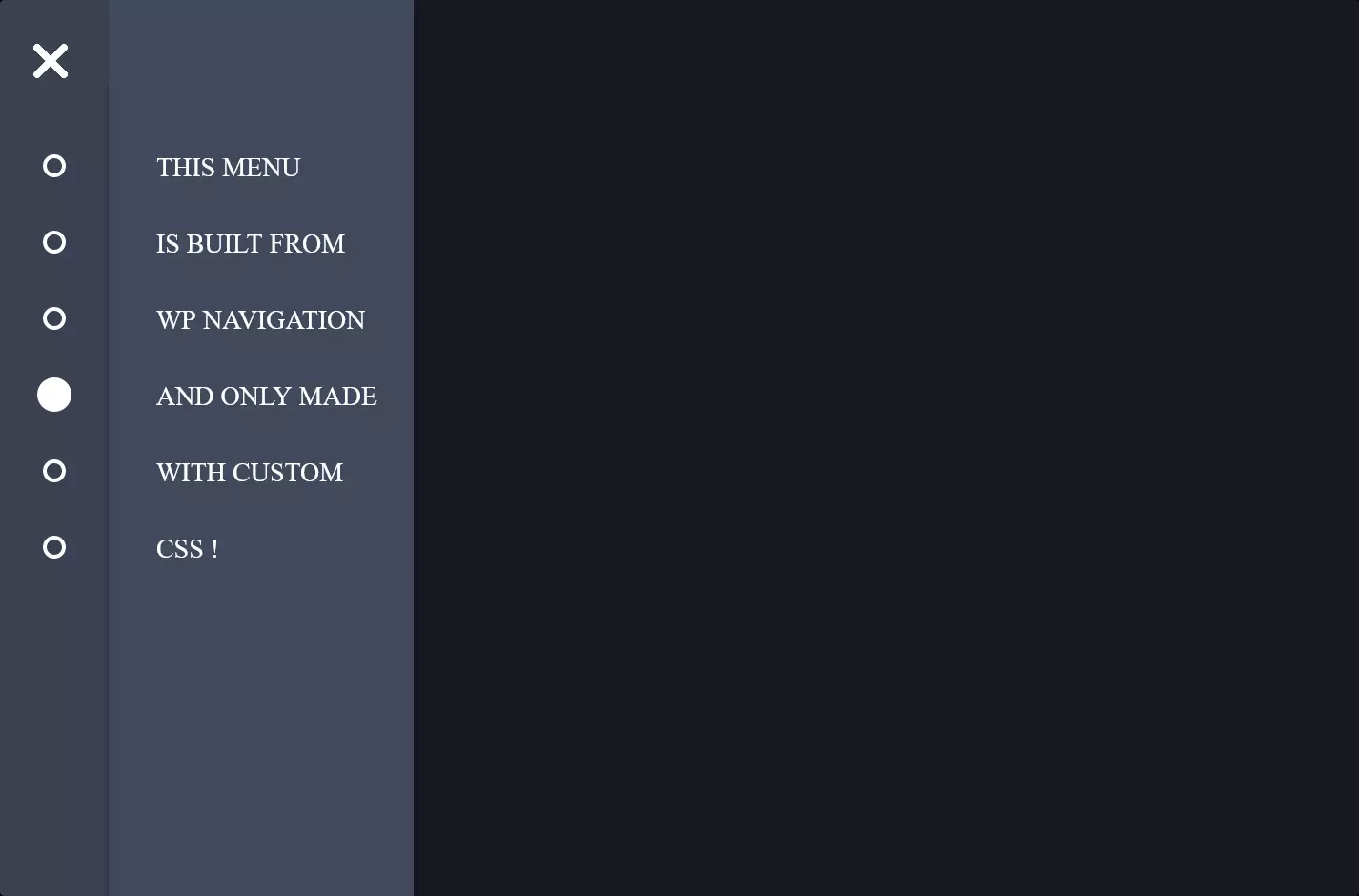
The code snippet we’re diving into today is all about creating a sleek and interactive vertical menu using HTML and CSS, a real gem for anyone looking to add some pizzazz to their website. First off, the HTML part lays down the structure of our menu. It uses a <nav> element to wrap around an unordered list <ul>, where each list item <li> represents a different menu option. Each option has its own icon and text, making it visually appealing and user-friendly.
Now, let’s talk style with CSS, the real magic behind the curtain. The CSS targets the vertical menu with classes like .vert-nav to apply some cool styling. It ensures our menu not only looks good but feels good to interact with. For example, it sets a fixed width for each menu item but adds a fun twist: when you hover over an item, its background color changes and expands to fill the entire width, thanks to some smooth transition effects. This not only catches the eye but also provides a visual cue to the user about their current selection.
The icons within the menu aren’t left out; they rotate upon hovering, adding a dynamic touch to the interaction. This is achieved with CSS transitions and transform properties. The combination of these visual effects enhances the user experience by making the navigation through the menu not just functional but also engaging and enjoyable. So, in summary, this code snippet shows us how to create a vertical menu that’s not just visually appealing with its icons and colors but also interactive, thanks to some neat CSS tricks.