Menu #13
- 87+
- 87+
- 81+
- 73+
- 12.1+
- 87+
- 81+
- 62+
- 12.2+
- 14+
- 87+
- 4.30 KB
- HTML, CSS
- Menu
- horizontal, responsive, vertical
- tricksforweb.dev
- MIT License
<div class="menu-block">
    <div class="logo">
        <a href="#">
            <img src="https://tricksforweb.dev/wp-content/uploads/2024/01/logo-site.webp" alt="logo" />
        </a>
    </div>
    <nav class="menu" role="navigation">
        <ul class="menu-links">
            <li><a href="#">About</a></li>
            <li><a href="#">Blog</a></li>
            <li><a href="#">Partnership</a></li>
            <li><a href="#">Contact</a></li>
        </ul>
    </nav>
</div>
.menu-block,
.logo,
.menu,
.menu-links,
.logo > a {
    -webkit-box-sizing: border-box;
    -moz-box-sizing: border-box;
    box-sizing: border-box;
    margin: 0;
    padding: 0;
    border: 0;
}

.menu-block {
    background-color: #ffffff;
    position: fixed;
    width: 100%;
    left: 0;
    top: 0;
    z-index: 999;
    display: -webkit-box;
    display: -webkit-flex;
    display: -moz-box;
    display: flex;
    -webkit-box-orient: horizontal;
    -webkit-box-direction: normal;
    -webkit-flex-direction: row;
    -moz-box-orient: horizontal;
    -moz-box-direction: normal;
    flex-direction: row;
    -webkit-box-shadow: 0px 12px 24px 0px rgba(0, 0, 0, 0.36);
    -moz-box-shadow: 0px 12px 24px 0px rgba(0, 0, 0, 0.36);
    box-shadow: 0px 12px 24px 0px rgba(0, 0, 0, 0.36);
}

.logo {
    margin: 0 15px;
}

.logo > a {
    height: 100px;
    line-height: 100px;
    padding: 50px 0;
}

.logo > a > img {
    max-height: 40px;
}
.menu-links a {
    -webkit-text-decoration: underline 0 rgba(255, 255, 255, 0);
    -moz-text-decoration: underline 0 rgba(255, 255, 255, 0);
    text-decoration: underline 0 rgba(255, 255, 255, 0);
    text-underline-offset: 1px;
    text-transform: uppercase;
    color: black;
    -webkit-transition: all 0.15s linear;
    -o-transition: all 0.15s linear;
    -moz-transition: all 0.15s linear;
    transition: all 0.15s linear;
}
.menu-links a:hover {
    text-decoration: underline;
    color: blue;
    -webkit-text-decoration-color: blue;
    -moz-text-decoration-color: blue;
    text-decoration-color: blue;
}

.logo > a {
    display: block;
    height: 50px;
    line-height: 50px;
    padding: 5px 0;
}

.logo > a > img {
    max-height: 40px;
}

.menu-links {
    list-style: none;
    margin: 0 auto;
    text-align: center;
    width: 100%;
    display: -webkit-box;
    display: -webkit-flex;
    display: -moz-box;
    display: flex;
    -webkit-box-orient: horizontal;
    -webkit-box-direction: normal;
    -webkit-flex-direction: row;
    -moz-box-orient: horizontal;
    -moz-box-direction: normal;
    flex-direction: row;
}

.menu {
    margin: auto 0;
}
.menu-links li:not(:last-child) {
    margin-right: 10px;
}

@media only screen and (min-width: 1240px) {
    .menu-block {
        width: 250px;
        height: 100%;
        top: 0;
        left: 0;
        -webkit-box-orient: vertical;
        -webkit-box-direction: normal;
        -webkit-flex-direction: column;
        -moz-box-orient: vertical;
        -moz-box-direction: normal;
        flex-direction: column;
        -webkit-box-shadow: 11px 0 28px 4px rgba(0, 0, 0, 0.22);
        -moz-box-shadow: 11px 0 28px 4px rgba(0, 0, 0, 0.22);
        box-shadow: 11px 0 28px 4px rgba(0, 0, 0, 0.22);
    }

    .logo {
        -webkit-box-sizing: border-box;
        -moz-box-sizing: border-box;
        box-sizing: border-box;
        text-align: center;
        margin: 15px 0;
    }

    .logo > a {
        -webkit-box-sizing: content-box;
        -moz-box-sizing: content-box;
        box-sizing: content-box;
        height: 100px;
        line-height: 100px;
        padding: 50px 0;
    }

    .logo > a > img {
        width: 100%;
        max-height: 100%;
    }

    .menu {
        display: -webkit-box;
        display: -webkit-flex;
        display: -moz-box;
        display: flex;
        margin-top: 0;
    }

    .menu-links {
        -webkit-box-orient: vertical;
        -webkit-box-direction: normal;
        -webkit-flex-direction: column;
        -moz-box-orient: vertical;
        -moz-box-direction: normal;
        flex-direction: column;
    }

    .menu-links li {
        width: 100%;
    }

    .menu-links li:not(:last-child) {
        margin-bottom: 15px;
    }
}
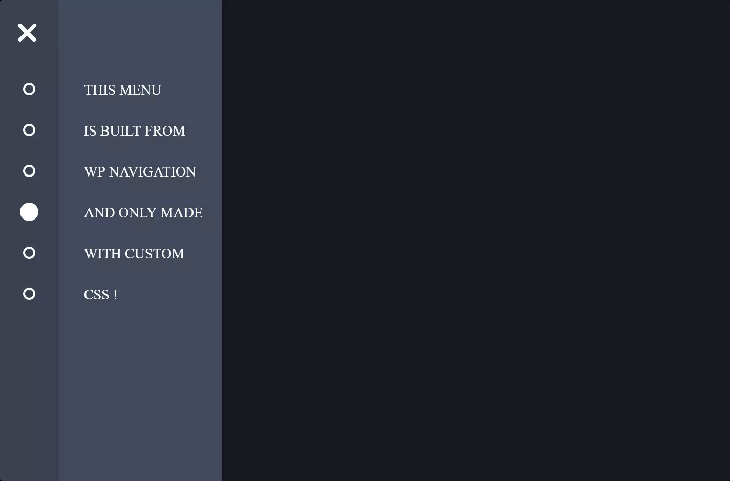
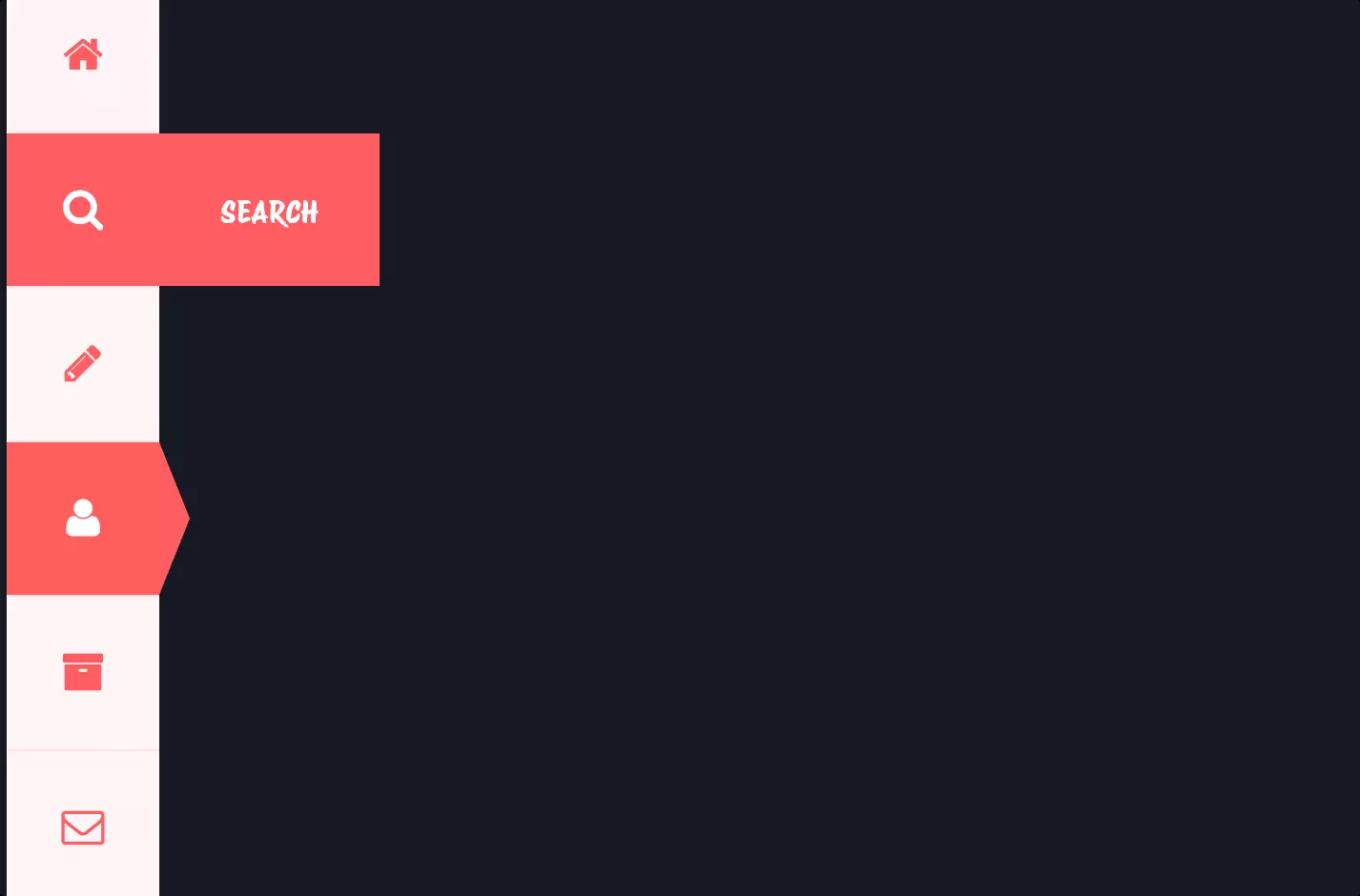
The code snippet we’re looking at is all about making a website navigation menu both eye-catching and functional. Picture this: at the top of a webpage, there’s a sleek horizontal menu. This menu is your guide, leading you to different parts of the site. It’s fixed at the top, meaning it sticks with you, a constant companion as you scroll down the page. It’s designed to be the first thing you see, with a clean white background and a shadow that gives it a subtle lift off the page, making it pop just a bit.
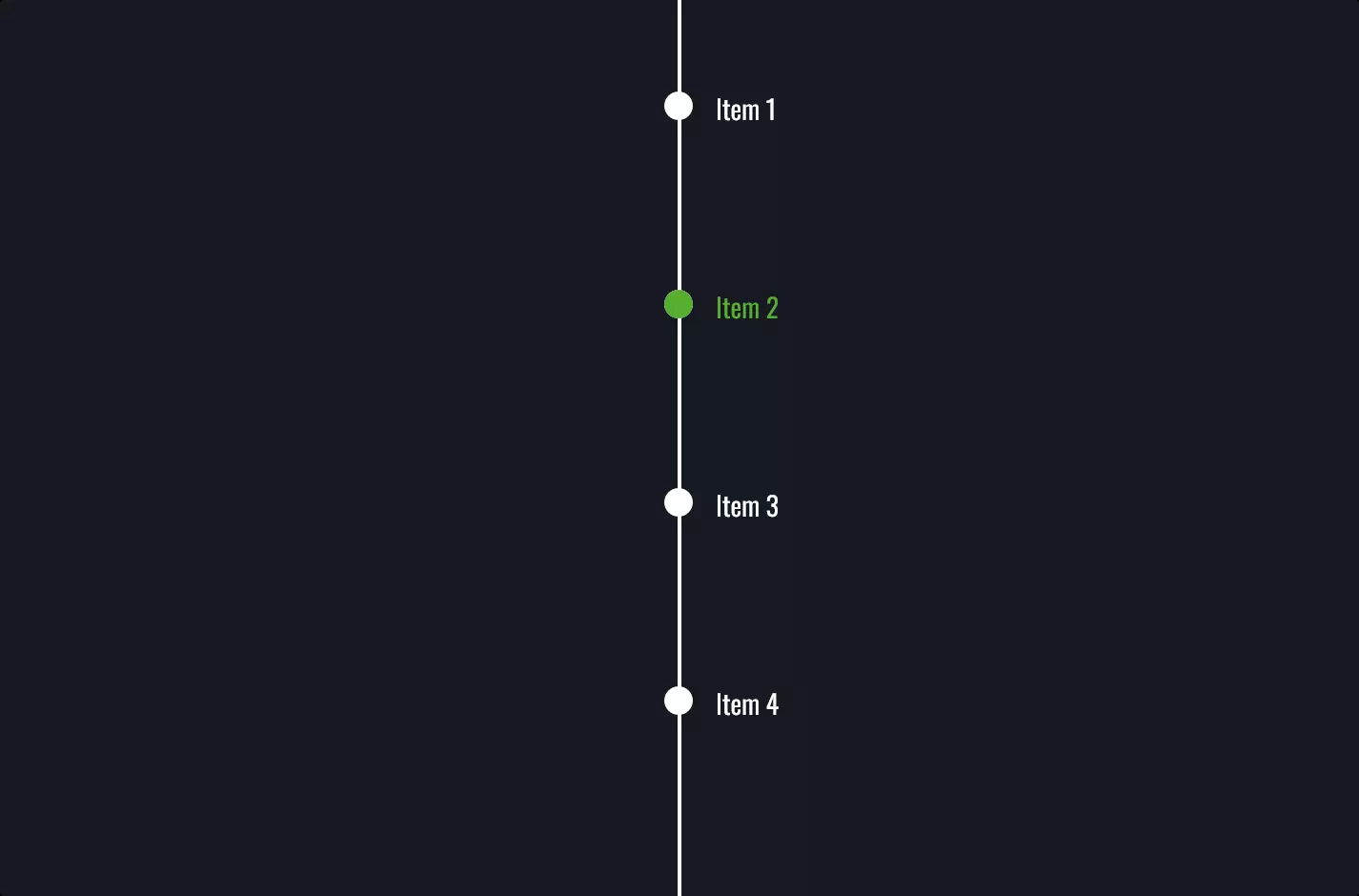
But here’s where it gets really cool. This menu isn’t just a pretty face; it’s built to adapt. When the screen size hits a certain width—thanks to the magic of CSS media queries—the menu shifts from its horizontal layout to a vertical one. This is what we call a responsive menu. It’s like the menu knows the screen is getting too tight and says, “No problem, I can change!” Suddenly, the menu stretches down the side of your screen, making better use of space and keeping everything accessible, no matter the device size.
The CSS styling is what brings this transformation to life. It ensures that the menu’s appearance is consistent across different devices, with settings for how links look and behave when you hover over them. It’s all about making the menu not just functional, but also a part of the site’s overall design. The shift from a horizontal to a vertical menu layout on smaller screens is a prime example of designing with the user in mind, ensuring that the site is easy to navigate, regardless of how you’re accessing it. This adaptability is essential in today’s world, where we switch between devices like it’s nothing.