List #6
- 4.45 KB
- HTML, CSS
- List
- MIT License
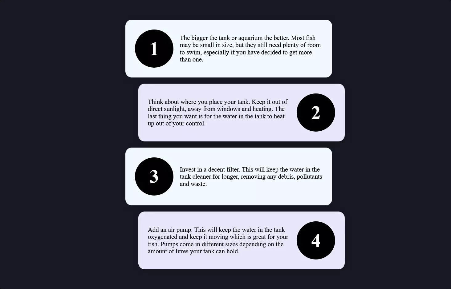
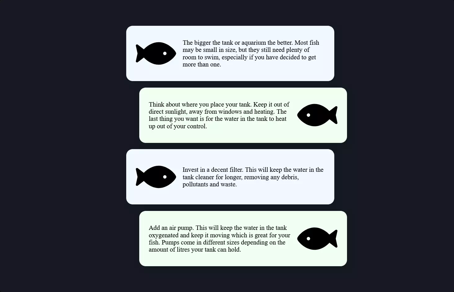
<ol style="--length: 5;" role="list">
    <li style="--i: 1;">
        <h3>Discovery and assessment</h3>
        <p>Lorem ipsum dolor sit amet, consectetur adipiscing elit, sed do eiusmod tempor incididunt ut labore et dolore magna aliqua. Adipiscing diam donec adipiscing tristique risus.</p>
    </li>
    <li style="--i: 2;">
        <h3>Information gathering and analysis</h3>
        <p>Lorem ipsum dolor sit amet, consectetur adipiscing elit, sed do eiusmod tempor incididunt ut labore et dolore magna aliqua. Adipiscing diam donec adipiscing tristique risus.</p>
    </li>
    <li style="--i: 3;">
        <h3>Creating your claim</h3>
        <p>Lorem ipsum dolor sit amet, consectetur adipiscing elit, sed do eiusmod tempor incididunt ut labore et dolore magna aliqua. Adipiscing diam donec adipiscing tristique risus.</p>
    </li>
    <li style="--i: 4;">
        <h3>Approvals and submission</h3>
        <p>Lorem ipsum dolor sit amet, consectetur adipiscing elit, sed do eiusmod tempor incididunt ut labore et dolore magna aliqua. Adipiscing diam donec adipiscing tristique risus.</p>
    </li>
    <li style="--i: 5;">
        <h3>Receiving your benefit</h3>
        <p>Lorem ipsum dolor sit amet, consectetur adipiscing elit, sed do eiusmod tempor incididunt ut labore et dolore magna aliqua. Adipiscing diam donec adipiscing tristique risus.</p>
    </li>
</ol>
@import url("https://fonts.googleapis.com/css?family=Montserrat:400,700");
body {
    --h: 212deg;
    --l: 43%;
    --brandColor: hsl(var(--h), 71%, var(--l));
    font-family: Montserrat, sans-serif;
}
p {
    margin: 0;
    line-height: 1.6;
}

ol {
    list-style: none;
    counter-reset: list;
    padding: 0 1rem;
}

li {
    --stop: -webkit-calc(100% / var(--length) * var(--i));
    --stop: -moz-calc(100% / var(--length) * var(--i));
    --stop: calc(100% / var(--length) * var(--i));
    --l: 62%;
    --l2: 88%;
    --h: -webkit-calc((var(--i) - 1) * (180 / var(--length)));
    --h: -moz-calc((var(--i) - 1) * (180 / var(--length)));
    --h: calc((var(--i) - 1) * (180 / var(--length)));
    --c1: hsl(var(--h), 71%, var(--l));
    --c2: hsl(var(--h), 71%, var(--l2));

    position: relative;
    counter-increment: list;
    max-width: 45rem;
    margin: 2rem auto;
    padding: 2rem 1rem 1rem;
    -webkit-box-shadow: 0.1rem 0.1rem 1.5rem rgba(0, 0, 0, 0.3);
    -moz-box-shadow: 0.1rem 0.1rem 1.5rem rgba(0, 0, 0, 0.3);
    box-shadow: 0.1rem 0.1rem 1.5rem rgba(0, 0, 0, 0.3);
    -webkit-border-radius: 0.25rem;
    -moz-border-radius: 0.25rem;
    border-radius: 0.25rem;
    overflow: hidden;
    background-color: white;
}

li::before {
    content: "";
    display: block;
    width: 100%;
    height: 1rem;
    position: absolute;
    top: 0;
    left: 0;
    background: -webkit-gradient(linear, left top, right top, from(var(--c1)), to(var(--c2)));
    background: -webkit-linear-gradient(left, var(--c1) var(--stop), var(--c2) var(--stop));
    background: -moz-linear-gradient(left, var(--c1) var(--stop), var(--c2) var(--stop));
    background: -o-linear-gradient(left, var(--c1) var(--stop), var(--c2) var(--stop));
    background: linear-gradient(to right, var(--c1) var(--stop), var(--c2) var(--stop));
}

h3 {
    display: -webkit-box;
    display: -webkit-flex;
    display: -moz-box;
    display: flex;
    -webkit-box-align: baseline;
    -webkit-align-items: baseline;
    -moz-box-align: baseline;
    align-items: baseline;
    margin: 0 0 1rem;
    color: rgb(70 70 70);
}

h3::before {
    display: -webkit-box;
    display: -webkit-flex;
    display: -moz-box;
    display: flex;
    -webkit-box-pack: center;
    -webkit-justify-content: center;
    -moz-box-pack: center;
    justify-content: center;
    -webkit-box-align: center;
    -webkit-align-items: center;
    -moz-box-align: center;
    align-items: center;
    -webkit-box-flex: 0;
    -webkit-flex: 0 0 auto;
    -moz-box-flex: 0;
    flex: 0 0 auto;
    margin-right: 1rem;
    width: 3rem;
    height: 3rem;
    content: counter(list);
    padding: 1rem;
    -webkit-border-radius: 50%;
    -moz-border-radius: 50%;
    border-radius: 50%;
    background-color: var(--c1);
    color: white;
}

@media (min-width: 40em) {
    li {
        margin: 3rem auto;
        padding: 3rem 2rem 2rem;
    }

    h3 {
        font-size: 2.25rem;
        margin: 0 0 2rem;
    }

    h3::before {
        margin-right: 1.5rem;
    }
}
Let’s take a stroll through a creative blend of HTML, CSS, and a hint of magic where no JavaScript was needed this time around. Imagine you’re crafting a stunning list, not your average grocery list, but one that visually pops and dances with color. This particular setup uses an ordered list <ol> as the stage for our content, with each item <li> getting its own moment in the spotlight.
Each list item is like a mini canvas, where headings <h3> and paragraphs <p> tell a story. But here’s where it gets fun: the CSS. It’s not just about making things look pretty; it’s about adding a layer of dynamism without complicating things.
First off, the CSS imports a sleek font from Google Fonts, giving our text a smooth, modern look. Then, it dives into custom properties (or CSS variables), setting the scene with colors that are more than just static values. They adapt and create gradients that flow from one list item to the next, giving the illusion of a colorful journey through the list. Each item’s background gradient is calculated based on its position in the list, making each one uniquely vibrant.
The magic doesn’t stop there. The CSS also shapes the overall layout, ensuring the list is neatly centered and each item is spaciously arranged for readability. Shadows and rounded corners are the cherries on top, adding depth and softness to the list’s appearance.
For devices with wider screens, media queries step in to adjust margins and paddings, ensuring the content looks great across all devices. It’s a thoughtful touch that says, “Hey, no matter where you’re viewing this from, we’ve got you covered.”
In the world of web design, this is a classic example of how HTML and CSS work hand in hand to create something that’s not only functional but also visually appealing. It’s a testament to the power of CSS in adding personality and life to web content, turning a simple list into a visually engaging piece of art.