List #2
- 6.54 KB
- HTML, CSS
- List
- MIT License
<ul>
    <li class="curved-arrow">When you are old and grey and full of sleep,</li>
    <li class="cross">And nodding by the fire, take down this book,</li>
    <li class="heart">And slowly read, and dream of the soft look</li>
    <li class="star">Your eyes had once, and of their shadows deep;</li>
    <li class="circle-checkmark">How many loved your moments of glad grace,</li>
    <li class="checkmark">And loved your beauty with love false or true,</li>
    <li class="diamond">But one man loved the pilgrim soul in you,</li>
    <li class="plus">And loved the sorrows of your changing face;</li>
    <li class="line">And bending down beside the glowing bars,</li>
    <li class="arrow">Murmur, a little sadly, how Love fled</li>
    <li class="triangle">And paced upon the mountains overhead</li>
    <li class="square">And hid his face amid a crowd of stars.</li>
</ul>
li {
    list-style: none;
    position: relative;
    padding: 0 0 0 20px;
    color: #9c9fa3;
}

li.square:before {
    content: "";
    position: absolute;
    left: 0;
    top: 5px;
    width: 10px;
    height: 10px;
    background-color: rgb(0, 102, 204);
}

li.triangle:before {
    content: "";
    position: absolute;
    left: 0;
    top: 5px;
    width: 0;
    height: 0;
    border-left: 5px solid transparent;
    border-right: 5px solid transparent;
    border-bottom: 10px solid rgb(0, 102, 204);
}

li.arrow:before {
    content: "";
    position: absolute;
    left: 0;
    top: 6px;
    height: 5px;
    width: 5px;
    border: 1px solid rgb(0, 102, 204);
    border-width: 2px 2px 0 0;
    -webkit-transform: rotate(45deg);
    -moz-transform: rotate(45deg);
    -o-transform: rotate(45deg);
    transform: rotate(45deg);
}

li.line:before {
    content: "";
    position: absolute;
    left: 0;
    top: 9px;
    width: 8px;
    display: block;
    border-top: 2px solid rgb(0, 102, 204);
}

li.plus:before {
    content: "";
    position: absolute;
    background: rgb(0, 102, 204);
    left: 0;
    top: 9px;
    height: 2px;
    width: 8px;
}

li.plus:after {
    content: "";
    position: absolute;
    background: rgb(0, 102, 204);
    left: 3px;
    top: 5px;
    height: 10px;
    width: 2px;
}

li.diamond:before {
    content: "";
    position: absolute;
    left: 0px;
    top: 0px;
    width: 0;
    height: 0;
    border: 5px solid transparent;
    border-bottom-color: rgb(0, 102, 204);
}

li.diamond:after {
    content: "";
    position: absolute;
    left: 0px;
    top: 10px;
    width: 0;
    height: 0;
    border: 5px solid transparent;
    border-top-color: rgb(0, 102, 204);
}

li.checkmark:before {
    content: "";
    position: absolute;
    left: 2px;
    top: 5px;
    width: 3px;
    height: 6px;
    border: solid rgb(0, 102, 204);
    border-width: 0 2px 2px 0;
    -webkit-transform: rotate(45deg);
    -moz-transform: rotate(45deg);
    -o-transform: rotate(45deg);
    transform: rotate(45deg);
}

li.circle-checkmark:before {
    content: "";
    position: absolute;
    left: 0;
    top: 2px;
    border: solid 8px rgb(0, 102, 204);
    -webkit-border-radius: 8px;
    -moz-border-radius: 8px;
    border-radius: 8px;
}

li.circle-checkmark:after {
    content: "";
    position: absolute;
    left: 5px;
    top: 5px;
    width: 3px;
    height: 6px;
    border: solid rgb(22, 26, 34);
    border-width: 0 2px 2px 0;
    -webkit-transform: rotate(45deg);
    -moz-transform: rotate(45deg);
    -o-transform: rotate(45deg);
    transform: rotate(45deg);
}

li.star:before {
    content: "";
    position: absolute;
    left: 0;
    top: 5px;
    background: rgb(0, 102, 204);
    width: 10px;
    height: 10px;
    text-align: center;
    -webkit-transform: rotate(0deg);
    -moz-transform: rotate(0deg);
    -o-transform: rotate(0deg);
    transform: rotate(0deg);
}

li.star:after {
    content: "";
    position: absolute;
    top: 5px;
    left: 0;
    height: 10px;
    width: 10px;
    background: rgb(0, 102, 204);
    -webkit-transform: rotate(45deg);
    -moz-transform: rotate(45deg);
    -o-transform: rotate(45deg);
    transform: rotate(45deg);
}

li.heart:before,
li.heart:after {
    content: "";
    position: absolute;
    left: 7px;
    top: 5px;
    width: 7px;
    height: 12px;
    background: rgb(0, 102, 204);
    -webkit-border-radius: 50px 50px 0 0;
    -moz-border-radius: 50px 50px 0 0;
    border-radius: 50px 50px 0 0;
    -webkit-transform: rotate(-45deg);
    -moz-transform: rotate(-45deg);
    -o-transform: rotate(-45deg);
    transform: rotate(-45deg);
    -webkit-transform-origin: 0 100%;
    -moz-transform-origin: 0 100%;
    -o-transform-origin: 0 100%;
    transform-origin: 0 100%;
}

li.heart:after {
    content: "";
    position: absolute;
    top: 5px;
    left: 0;
    -webkit-transform: rotate(45deg);
    -moz-transform: rotate(45deg);
    -o-transform: rotate(45deg);
    transform: rotate(45deg);
    -webkit-transform-origin: 100% 100%;
    -moz-transform-origin: 100% 100%;
    -o-transform-origin: 100% 100%;
    transform-origin: 100% 100%;
}

li.cross:before {
    content: "";
    position: absolute;
    height: 15px;
    border-left: 2px solid rgb(0, 102, 204);
    -webkit-transform: rotate(45deg);
    -moz-transform: rotate(45deg);
    -o-transform: rotate(45deg);
    transform: rotate(45deg);
    top: 2px;
    left: 5px;
}

li.cross:after {
    content: "";
    position: absolute;
    height: 15px;
    border-left: 2px solid rgb(0, 102, 204);
    -webkit-transform: rotate(-45deg);
    -moz-transform: rotate(-45deg);
    -o-transform: rotate(-45deg);
    transform: rotate(-45deg);
    top: 2px;
    left: 5px;
}

li.curved-arrow:before {
    content: "";
    position: absolute;
    width: 0;
    height: 0;
    left: 4px;
    top: 3px;
    border-top: 9px solid transparent;
    border-right: 9px solid rgb(0, 102, 204);
    -webkit-transform: rotate(10deg);
    -moz-transform: rotate(10deg);
    -o-transform: rotate(10deg);
    transform: rotate(10deg);
}

li.curved-arrow:after {
    content: "";
    position: absolute;
    border: 0 solid transparent;
    border-top: 3px solid rgb(0, 102, 204);
    -webkit-border-radius: 20px 0 0 0;
    -moz-border-radius: 20px 0 0 0;
    border-radius: 20px 0 0 0;
    top: 0;
    left: -5px;
    width: 12px;
    height: 12px;
    -webkit-transform: rotate(45deg);
    -moz-transform: rotate(45deg);
    -o-transform: rotate(45deg);
    transform: rotate(45deg);
}
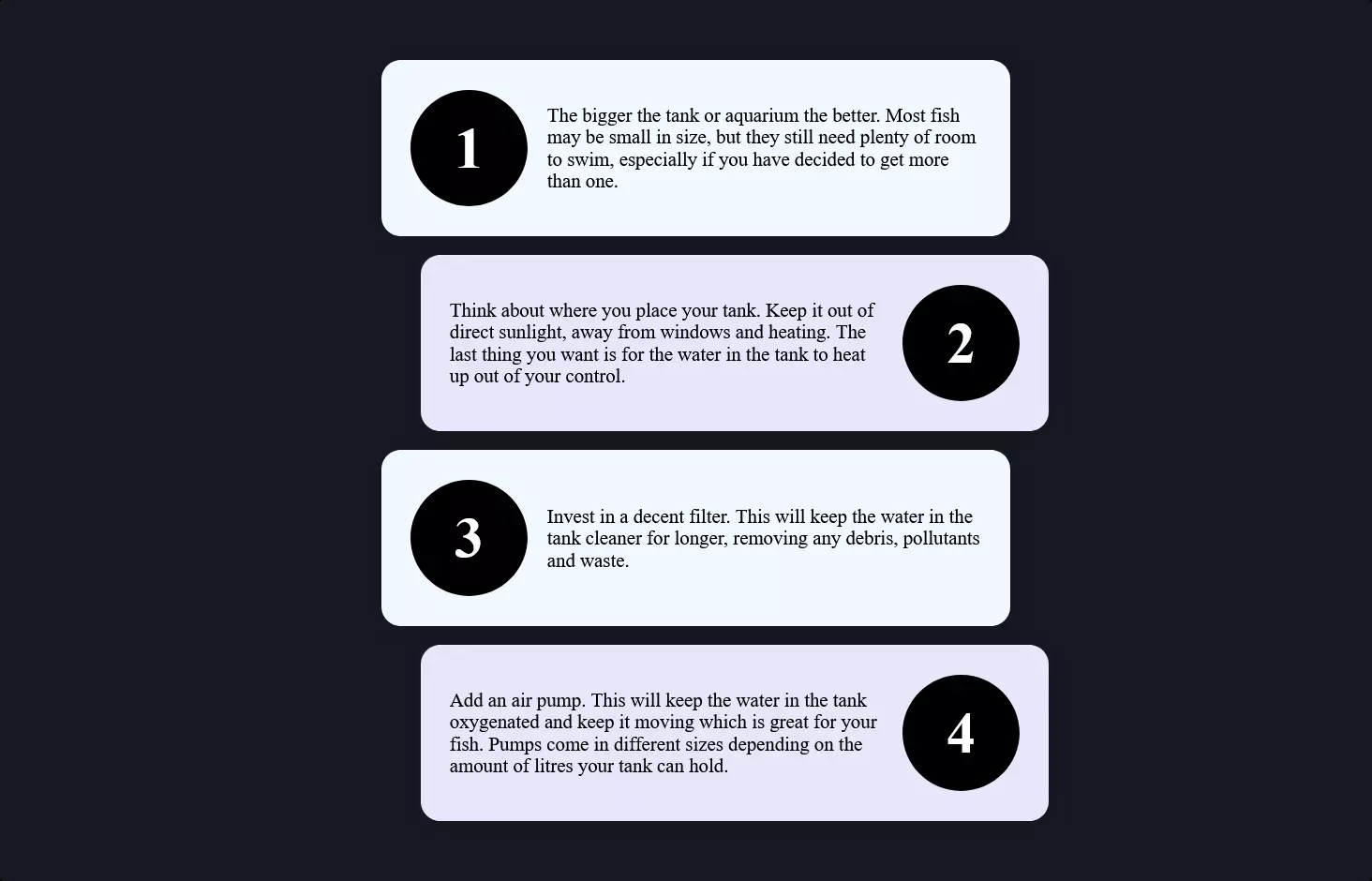
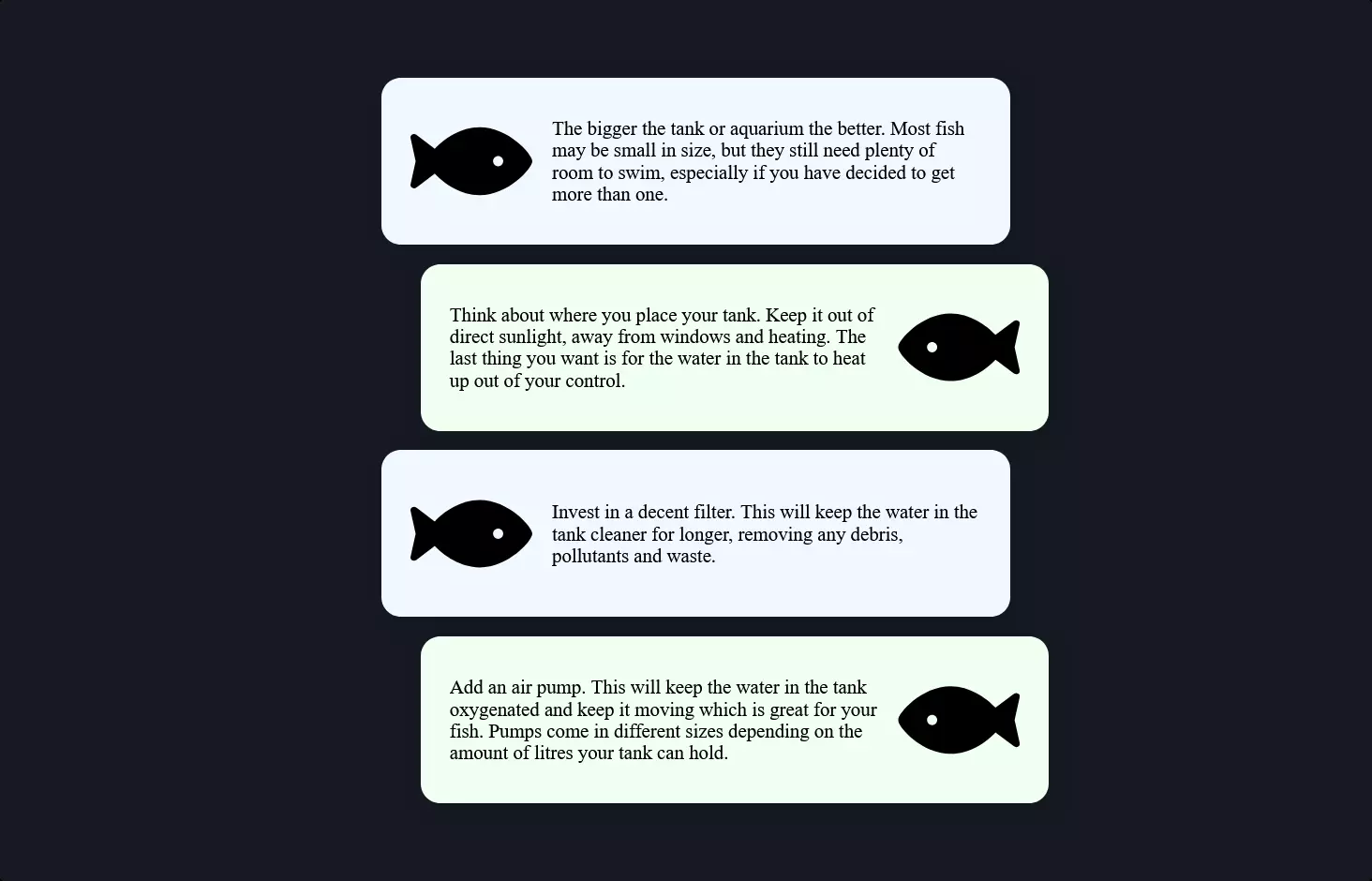
Alright, let’s break down this cool piece of code that’s all about jazzing up a list with some fancy icons using CSS. Imagine you’ve got a plain old list, like a grocery list on your fridge. Now, instead of just having boring bullet points, you want to spice things up with unique icons for each item—like a heart for your loved one’s favorite ice cream or a star for that must-have new snack. That’s what this code is doing, but for a web page.
First up, we’ve got a bunch of list items (<li> tags), each with its own class like heart or star. These aren’t your average list items; they’re about to get a makeover.
Then, the magic happens in the CSS part (that’s the styling wizardry). The CSS targets each list item based on its class and uses the :before and :after pseudo-elements to create those nifty icons before the text of each item. It’s like saying, “Hey, before you show this text, pop in a cool icon right here.” For example, a heart icon is made by combining two shapes with rounded tops, while a star icon gets its points from overlapping squares rotated at an angle. Each shape is carefully placed and colored to look just right.
Colors, shapes, and even rotation are all meticulously defined to transform each list item from plain to eye-catching. It’s a perfect way to make important stuff stand out or just to add a little personality to a page.
So, next time you’re looking at a webpage with some snazzy icons next to the text, remember, there’s some clever CSS behind the scenes, making those lists a lot more fun to look at!